While working with a recent client, we tried to answer which product categories their business should keep investing in and which categories are not worth the effort of selling. At this point, I remembered the strategic marketing classes I took during my time at university. One of the tools that we learned about was the BCG Growth-Share Matrix. The NetMBA Business Knowledge Center describes the BCG Growth-Share Matrix as follows:
“The BCG Growth-Share Matrix is a portfolio planning model developed by Bruce Henderson of the Boston Consulting Group in the early 1970s. It is based on the observation that a company’s business can be classified into four categories based on combinations of market growth and market share relative to the largest competitor, hence the name “growth-share.” Market growth serves as a proxy for industry attractiveness, and relative market share serves as a proxy for competitive advantage. The Growth-Share Matrix thus maps the business unit positions within these two important determinants of profitability.”
Despite criticism that the Growth-Share Matrix oversimplifies complex relationships in a market, it can be a useful tool to gain a quick overview of mixed business products. Even when there is no market data available (market growth rate and market size), this model can be used to classify a company’s products in an easy-to-digest way.
So, I set out to create my client’s own Growth-Share Matrix in Tableau. This has the obvious advantages of always being up-to-date and interactive. It can also filter a cross-tab with individual products or line charts to show the development of a product category over time. And that’s exactly what I want to demonstrate in this blog.
What You Need
- Tableau Desktop
- A dataset with two periods (years, quarters or months) worth of data. This should include a sales or profit measure and a product group, category or individual product dimension
- Four PNG graphics: a star, a cow, a dog and a question mark, ideally with a transparent background
Getting Started
For this example, I am using the Superstore dataset that comes with Tableau to create the Growth-Share Matrix, but you will be able to use any data source that fulfils the above requirements.
To create the basic matrix, follow these steps:
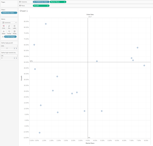
- Drag the date field to Columns (needs to be a discrete dimension).
- Filter the date field, so you only have two columns in your visualisation. You can make this dynamic by using a calculated field or parameter.
- Drag Sales (or Profit, but Sales is easier to interpret since it’s always positive) to Columns and to Rows.
- Apply the table calculations. For the measure in Columns, add the quick table calculation Percent Difference. For the measure in Rows, add the quick table calculation Percent of Total. These table calculations will later show the growth rate and the market share in the Growth-Share Matrix.
- Hide your previous period (in my example it’s 2016) by right-clicking the Column header and clicking on Hide.
- Add your Category Dimension to Detail
- Next, we need to define the four quadrants, i.e. what is a high market share and what is high growth? This really depends on what you want to do with your matrix. Do you want to base business decisions on it? If so, it might make sense to look at the industry average from trusted sources like the Passport Euromonitor International Database. Do you just want to use your matrix for orientation and filtering on a dashboard? In that case, use your own experience with your colleague. I’m using two parameters that allow me to change my high and low definitions for both axes later, if need be.
- Add two float parameters: Define high market share and Define high growth with current values of 0.04 ( = 4%) and 0.5 ( = 50%), respectively. Both should be formatted as a percentage with zero decimal places with values ranging from 0.01 to 1 with a step size of 0.01. You can save time by duplicating your first parameter and changing fields where needed.
- To visually show the four quadrants, we will add a horizontal and vertical reference line. To do this, go to the Analytics pane and drag a reference line on the first SUM(Sales) table calculation. Then set the value to Define high market share (your parameter) and set the label to Value. Repeat these steps for the horizontal reference line.
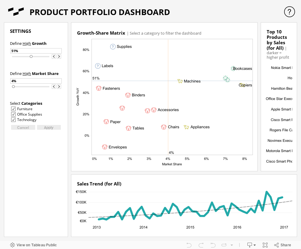
At this point, you already have a basic Growth-Share Matrix that explains which are your fastest-growing products and which have the highest share within your portfolio.
Can We Make it Look Better?
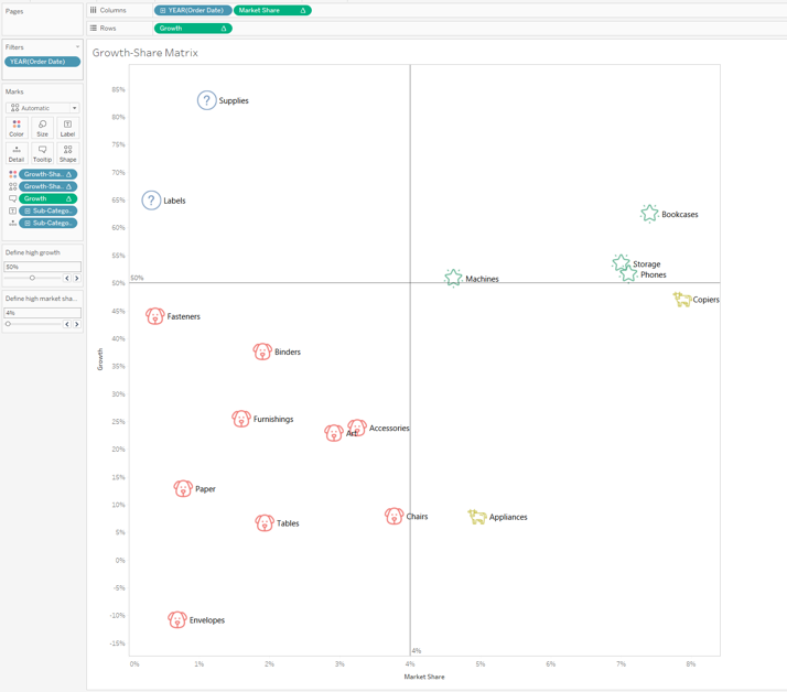
Of course, we can! This is Tableau, after all. To colour categories in each quadrant to be more distinguishable, we can create a calculated field. Before you create the calculated field, hold down the Ctrl key and drag your two SUM(Sales) table calculations to the Data pane and name them Market Share and Growth. This way, you can easily use them in your calculation.
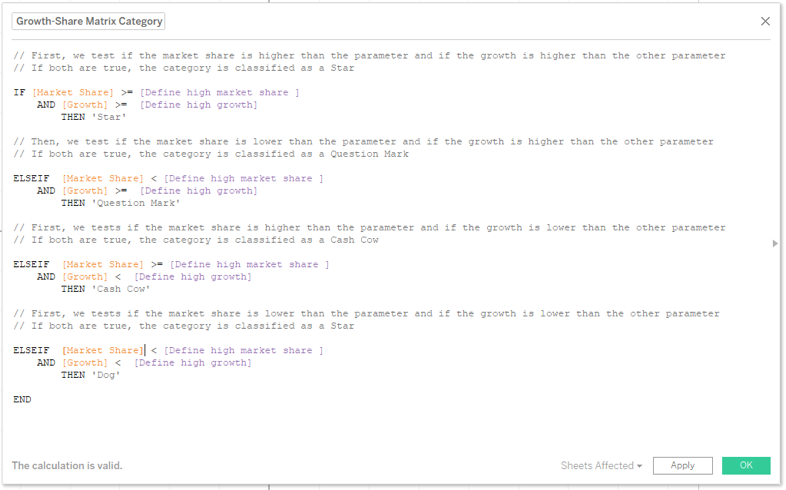
The calculation should look like the screenshot above, however, you can leave out the comments. Now, you can drag the newly created field onto Colour and Shape. I would recommend using the graphics mentioned above as custom shapes. Some final touches I would recommend include increasing the size of the shapes, removing the header for your date field, adding labels and formatting the visualisation to your liking.
Now, you can use your Growth-Share Matrix as a category selection as well as a portfolio planning tool that updates as your sales data does. Below is an example of how this can look on a dashboard.