It’s a common trope in the data analytics community to tsk tsk at any mention or appearance of the poor pie chart. There’s no other chart type that collects such derision and disdain. But why? Let’s tackle the pie chart and explain how it is one of the most overused and misused visualizations.
And then we’ll look at silly pie charts I found on the internet.
The Purpose of Pie
The sole purpose of a pie chart is to show the relationship of the individual slices of pie to the whole. The arc length of one section, and thereby also the area, shows the size of the relative portion to the entirety of the sample. Sounds obvious, right? The problem is that most people use them to show actuals. Most articles you see in popular media mistakenly use a pie chart when a bar chart is the better choice.
There are several problems that pie charts present to your data customer. Let’s explore them.
Perceptual Limitations
The best place to start is how human beings perceive data. There are certain attributes that are intuitive and obvious to the human eye, such as spatial position, color and length. Our brains are extremely good at noticing minute differences for those types of “pre-attentive attributes.”
We are not as good at noticing area and angle, and those just so happen to be the two main aspects of a pie chart. Let’s give you a quick visual test to prove my point. Which angle is larger – orange or blue?
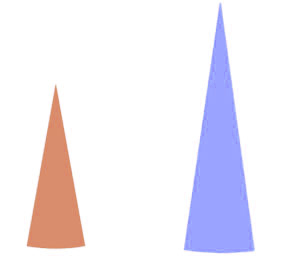
Not an easy task, is it?
If I overlay the angles for a perfect comparison, then you can more clearly see the difference between the angles, and the orange slice of pie is the clear winner.

It was very hard for our eye to see the difference, because angles are poor attributes for the way our visual perception functions. If we had put the same slices of pie into a bar chart, we’d immediately see even a pixel’s difference in width.
I made this even more difficult by moving the slices of pie away from each other. Exploded pie charts are even worse than the normal pie chart for conveying information, and that’s the reason that Tableau does not give you the option of making them.
Membership
Pie charts are also severely limited in their membership. Human beings can maintain about seven things in active memory. Anything more than that and we start to struggle. That’s why we limit pie charts to two to six slices. Compare the following pie charts:
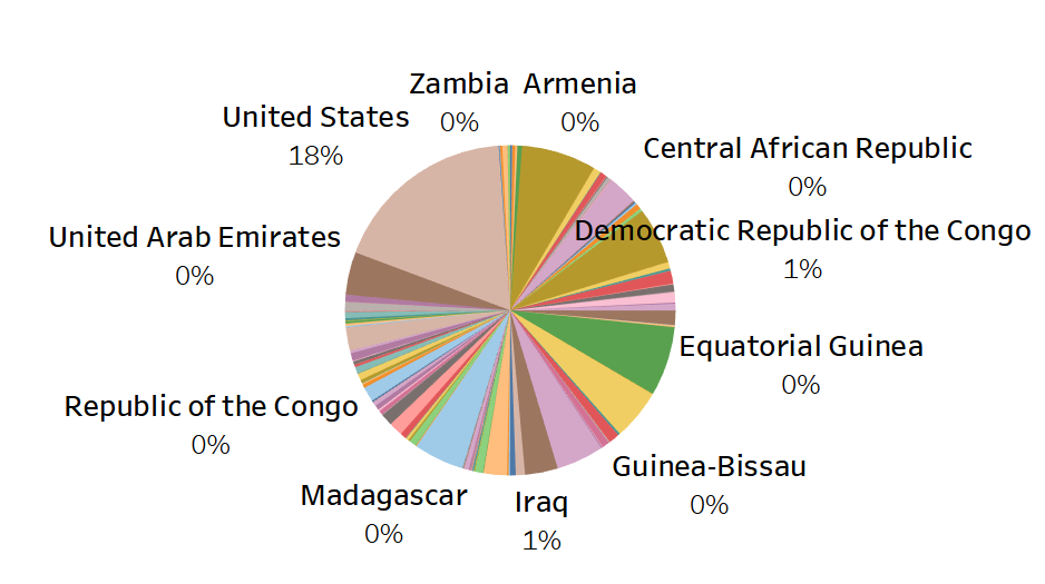
The pie chart on the left has four members. It’s concise and easy to read. The pie chart on the right is quite simply horrible. There’s so many slices and colors that it puts a cognitive load on the user to decipher what in the blazes is happening there. If you’ve got a large membership, then use Groups to combine smaller members into something useful.
Negatives
Area and angles cannot show a negative number. And no, contrary to my Tableau students, this is not how you show a negative on a pie chart:
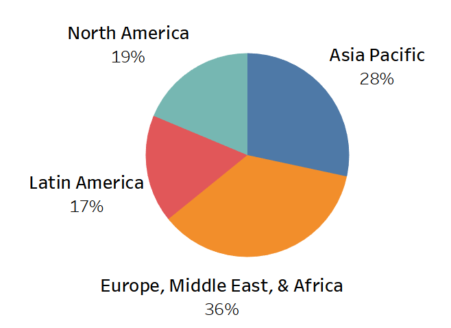
Instead, Tableau uses absolute values to show the size of a piece of pie, ignoring whether it’s a positive number or a negative. Have a look at this breakdown of profit by region:
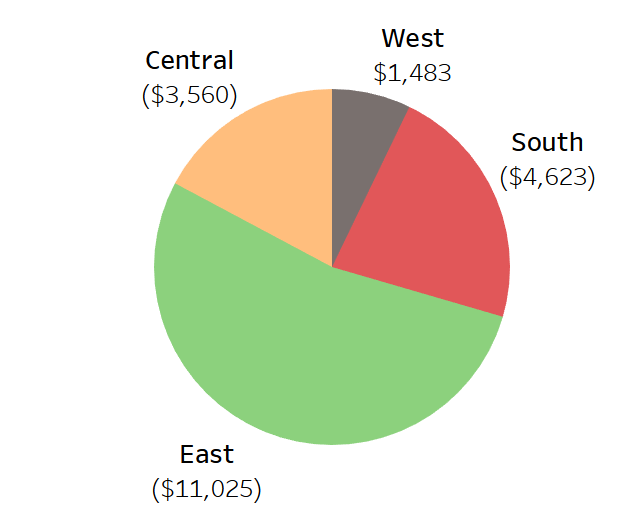
Very confusing. Again, a bar chart is far more effective here by using the length of the bar on either side of the zero line.
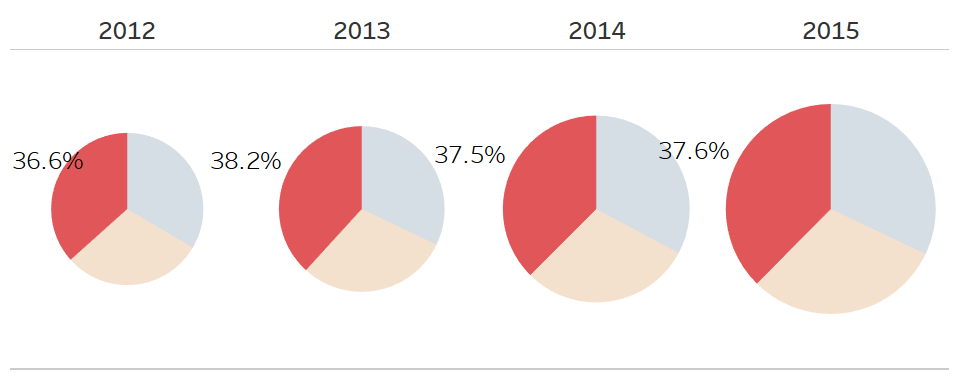
Comparisons
Finally, pie charts are poor for comparisons across multiple visualizations. If you standardize the size of the pie charts, then how will your data consumer know if Pie Chart A represents $10 million and Pie Chart B represents $100 million. Labels? Why not just use a text table then? The other option gets a bit silly: resizing the pie charts relative to each other. You can do this by bringing a measure onto the Size button as well as onto the Angle button.
It compounds a couple of the items we’ve talked about above. First, our brains are not great at assessing area or angles, which is only exacerbated when the angles are not within close proximity.
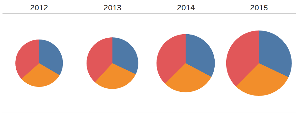
Could you rank order the red slices of pie by year? Me neither.
The Pie Chart of Doom
For the next part of this article, I’m going to give you fair warning. Whenever an Arctic traveler recounts their moment of first seeing Cthluhlu, it involves a permanent departure from sanity. The following pie chart was constructed by a former student of mine, Russell, out of Perth, Western Australia. I tried. I really, really tried to convince him to abandon this abomination of analytics, but he insisted.
And thus, I give you a choice. Click here if you want to see the Pie Chart of Doom.
It’s like abstract art. I may hang this on my wall.
No Pie?
Listen, I’m not saying you can’t have your pie (and eat it too), but I am saying you’re going to have to go a bit beyond the basic pie chart to not elicit eye rolls from the data visualization world. Tableau is an incredibly powerful tool, because of the flexibility you have in constructing your worksheets and applying style to them.
Rather than a plain, boring pie chart, why not spend a little bit of time to give it some extra attention. Here’s what I came up with:
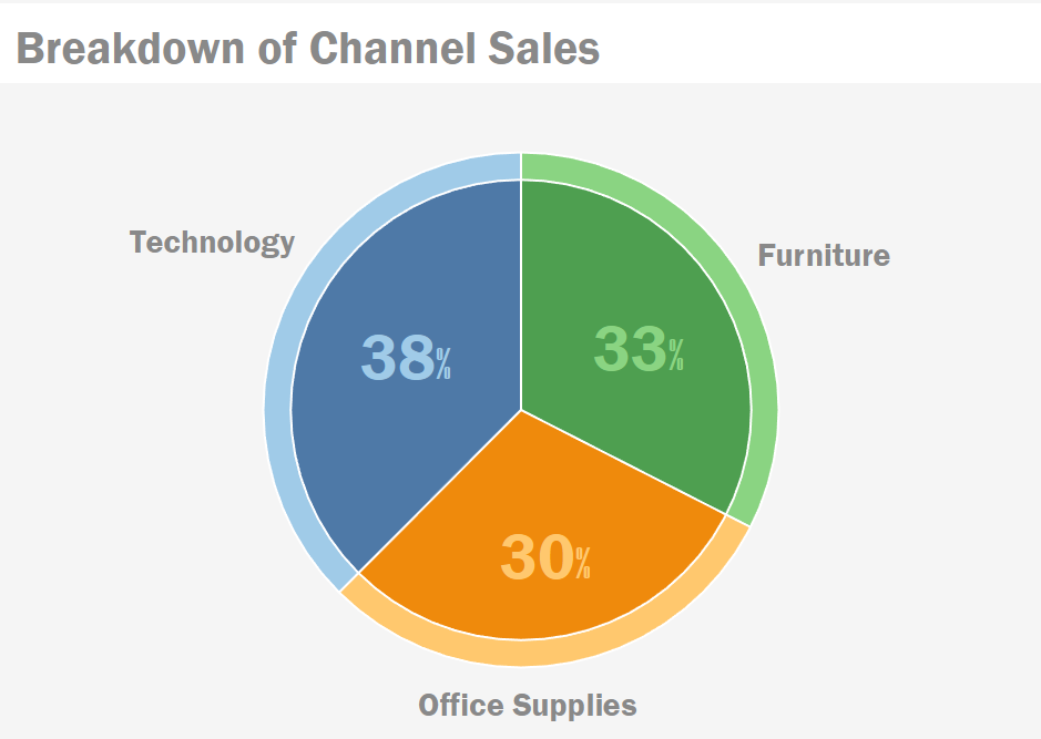
Not very difficult to make at all and we’re ticking all the boxes on an effective pie chart: limited membership (three slices), no negatives and relative size to the whole (% of total table calculation). Check the embedded visualization at the bottom of this article for the Tableau Packaged Workbook (TWBX). You can download it and see how to build it. Be sure to click on the Stylized Pie Chart tab to see the chart above.
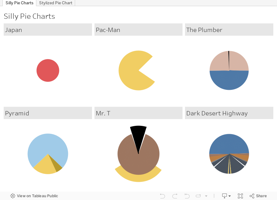
And Now for Something Completely Different
I promised you silly pie charts from the Interwebs … all faithfully recreated in Tableau.