When we hear waterfall charts, we expect to see a visualization showcasing the cumulative effect across various categorical-based data to see the positive or negative change between them. But we have not talked about using a waterfall chart to represent parts of the whole. Pie charts, treemaps or stacked bar charts come to mind when trying to represent proportions and should be considered in addition to this rendition. Ultimately, it’s adding more options to our toolkit. If you came here looking to build a traditional waterfall in Tableau (but an improved version), Ben Bausili has you taken care of. If you are curious about this different Tableau waterfall chart, read on!
I’m going to be using our favorite Superstore dataset to demonstrate this chart. The goal here is to represent all 17 Sub-Categories. 17 elements would be too much to cram into a pie chart or stacked bar chart. Normally, we should consider building a treemap. In our case, let’s concentrate on the waterfall. The first step is to create the waterfall chart.
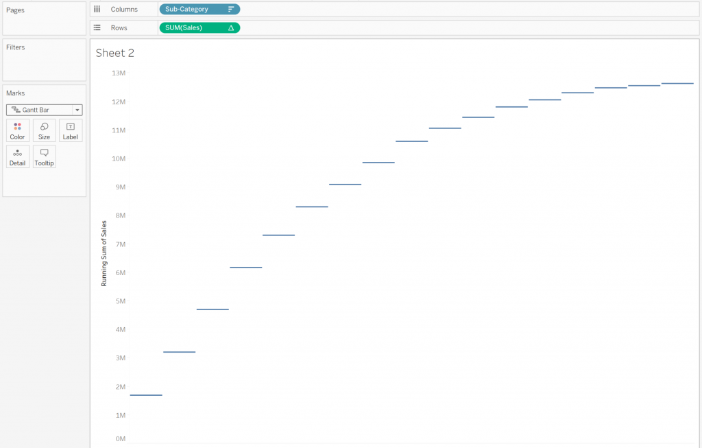
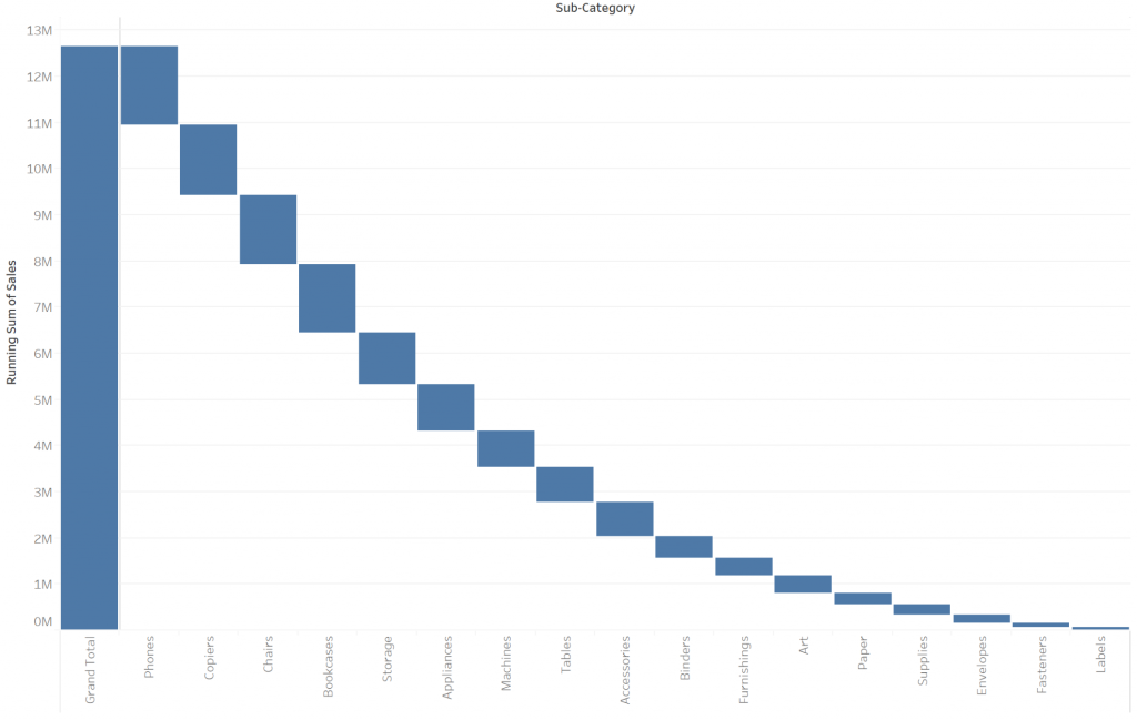
Starting off with Sub-Categories in Rows and Sales in Columns, we need to do a Quick Table Calculation on Sales using Running Total. We then change our Mark type to Gantt Bar. You should get the result below:
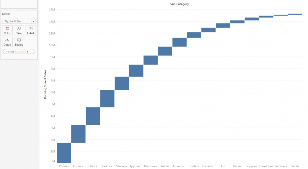
Now its time to fill in those gaps. Dragging another instance of Sales onto Size on the Marks card, we make it negative utilizing an ad hoc calculation that fills the gaps in-between our bars. I have also increased the size of my bars so they just barely touch:
As a visual best practice, it’s easiest for users to see the items largest to smallest from top to bottom. To do that, we go back to Sales on Rows and click Edit Table Calculation. We utilize Specific Dimensions to get access to the Custom Sort:
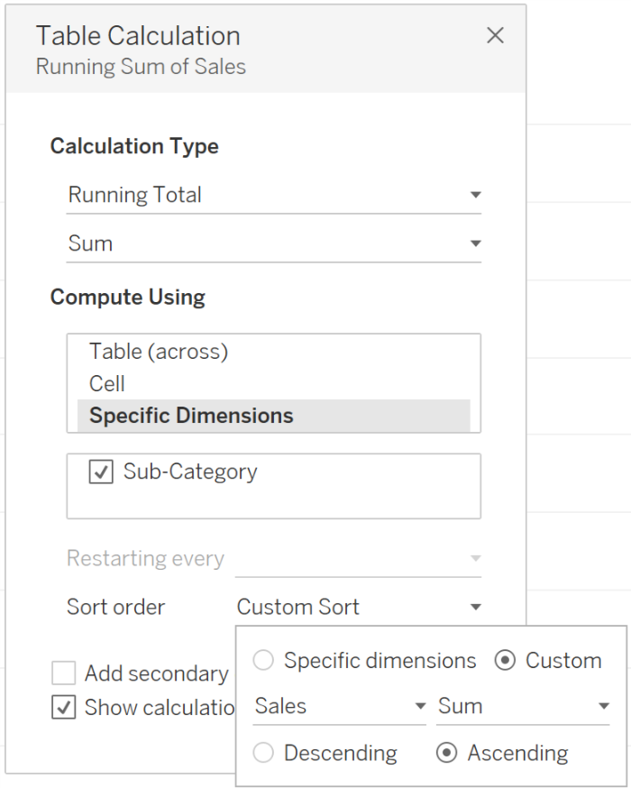
By doing a Custom Sort by Ascending Sum Sales, we get a modified chart that is easier for our audience to process. I’ve also added Row Grand Totals to the left so the user has a reference to compare to:
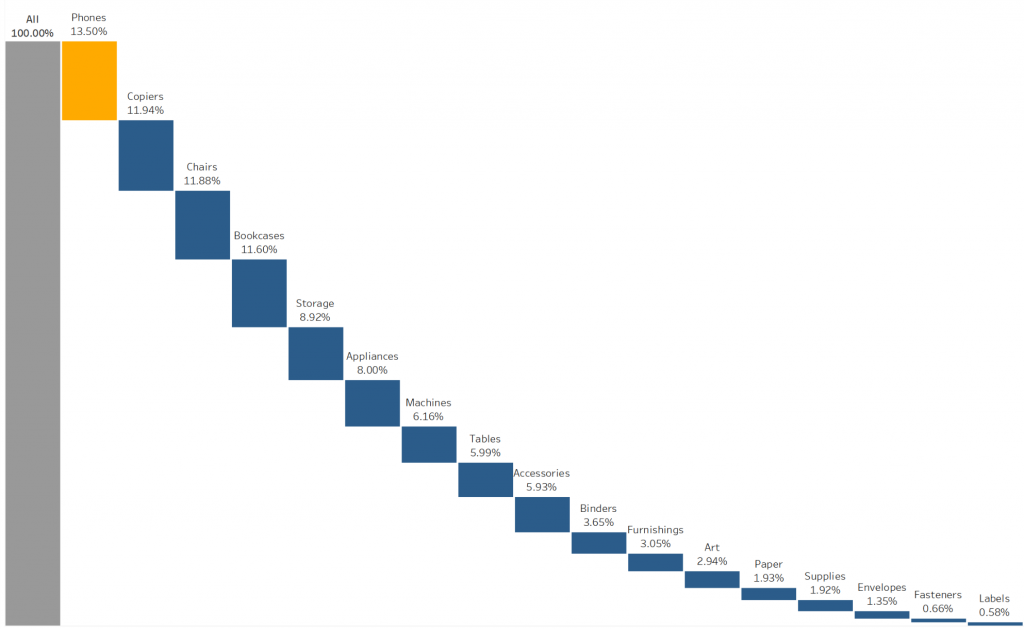
Let’s hide that Axis and Headers for the Sub-Categories. We are going to add labels to give our user context for each bar instead. We can also do some formatting to get rid of those distracting gridlines and borders. Taking another instance of Sales to Label on the Marks card, we can add a Percent of Total Table Calculation. When possible, avoid using the default label alignment that forces your user to tilt their head to an uncomfortable 90 degrees. We can also employ color to differentiate the Total Bar from the other elements using a diverging palette with Include Totals Checked. With these changes, you should end up with the result below:
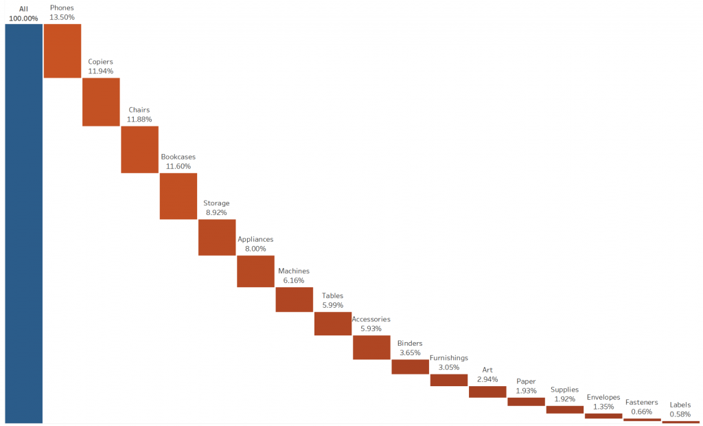
This rendition of the waterfall chart is almost like a dissected stacked bar chart. It makes it easier for our audience to see each of the Sub-Categories and read each label without overlapping, which would be difficult in a stacked bar. Some pitfalls to watch for:
- Be careful with the length of labels. Longer texts will start to overlap the marks.
- The smaller Sub-Categories are hard to compare to the total bar due to the distance between them.
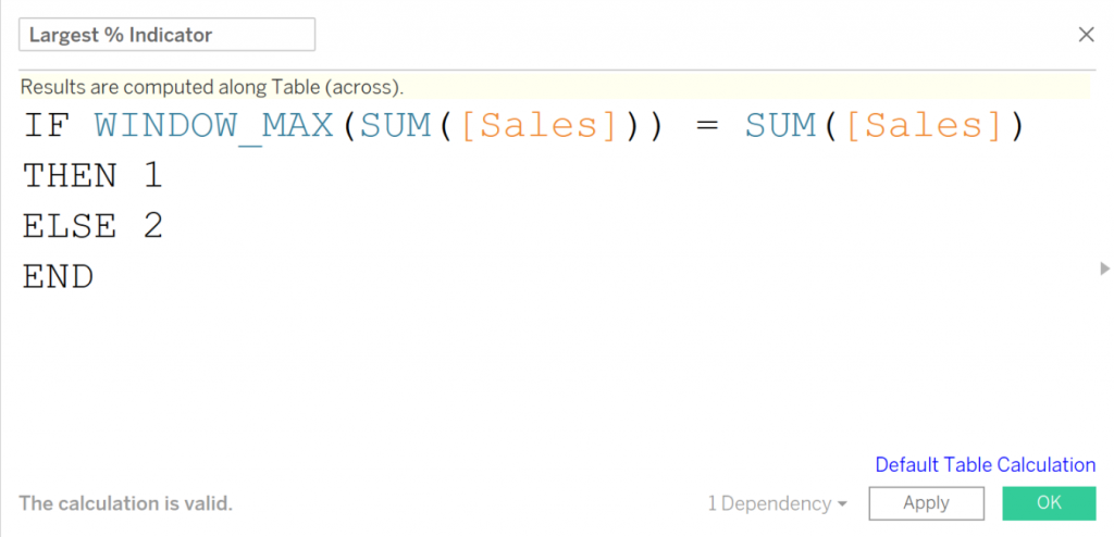
We would mainly use a graph like this to focus our users’ attention on the largest proportions. We can draw their attention to the largest sub-category by creating a calculated field and dropping the field to color and using a diverging palette.