So many times in history one person’s valuable contribution ends up being eclipsed by another for no good or fair reason.
Think of Galileo, who was not (and never claimed to be) the inventor of the refracting telescope – it was invented by Dutch spectacle makers. Isaac Newton is usually held out as the father of calculus but Leibniz had a similar method developed at much the same time. Charles Darwin‘s ‘On The Origin of Species‘ lays the basis for Darwin’s position as the discoverer of evolution but of course Alfred Wallace independently conceived of the same theory and was jointly published with Darwin’s writings in 1858. Yet, like so many others, this contribution seems to have been eclipsed by that of Darwin over the years.
Even in the world of data visualisation such errors abound. Some believe that Florence Nightingale developed the pie chart when most know that it was first developed by William Playfair in his Statistical Breviary of 1801.

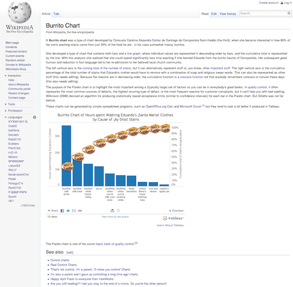
I feel I must alert you passionate visualisers of data to another travesty of chart type under our very noses. Recent research has led me to uncover the Wikipedia page above lying dusty and unread which explains the true origin of what we have come to call the pareto chart. Like Ada Lovelace‘s contribution to Babbage’s Analytical Engine we need the community to rise up and right this wrong and ensure that this contribution to a fabulous chart type is not overshadowed by the mere coincidence of some Italian mathematician happening to have a similar sounding name – it’s the Fibonacci series all over again.
Tweet. Shout. Lobby Wikipedia. Tut loudly within ear shot of two or more other people. Write to your local government data visualisation representative. Tut again if you have to. Go without sugar in your tea to show solidarity. Whatever it takes to get this travesty addressed.
Use this hashtag #ConsuelaCatalinaAlejandraCortezdeSantiagodeCompostelaSemi-freddo(thethird)inventedtheburritochart or #isayburrito Ay Thank yew – collapses exhausted

