
Last week, our Australian based Analytics Consultant, Robert Curtis, took part in the annual Tableau Fringe Festival. Several industry leaders took part in the day-long webinar to teach, give advice and share Tableau best practices. Although the webinar was primarily attended by our friends in the Aussie data community, we wanted to share Robert’s highly insightful session about dashboard design with everyone. Check out the link above to experience his whole talk or keep scrolling and read through our recap.
What Makes an Effective Dashboard?
Overall, Robert wanted to share his experience with Tableau and provide concrete details to look at whenever a Tableau user is designing a dashboard. So, what exactly is an effective dashboard and how do we measure its success? Only by user adoption! If no one uses the tool, it is a useless tool. That’s exactly what a dashboard is, a tool to be used in a specific way. He then explained the three different types of memory to help us better understand how our brains see and process information.
- Perceptual – Unconsciously register, what you want for dashboard design
- Short-Term – Anything that requires concentration, active processing
- Long-Term – Access knowledge when you see something and connect meaning to it
Planning Your Dashboard
Next, he shares his six essential steps for planning a dashboard. He also just happened to write a Deep Dive series over dashboard design recently. Definitely check it out for a closer look at each of these steps.
- Ask Questions
- Structure and Layout
- Build and Test
- Interactivity
- Visual Best Practices
- Performance Testing (really important)
Step 1: Questions to Ask First
Before you can actually start planning what will go on your dashboard and where, you must first ask the “W” questions: the who, why and what. What is your objective? To monitor, compare, inspect or solve?
Next, ask who your audience is. It’s important to note that your audience is not the Tableau community. As a self-proclaimed data geek, Robert understands the need analysts may feel to create really complex visualizations. But your audience will likely be executives, managers and other analysts. You can’t walk into a business meeting with a dashboard no one can read. Less is definitely more in this sense.
Step 2: Structure and Layout
You know Robert has put a lot detail and thought into his session when he starts discussing eye tracking studies. However, it makes sense that marketing companies would want to know where our eyes go first on a page. After many eye tracking studies, the F-Pattern was unequivocally the most popular. English speakers read from top left to the right. Applying this knowledge to our dashboards, you should make all your important information on the left side of the dashboard and everything else to the right
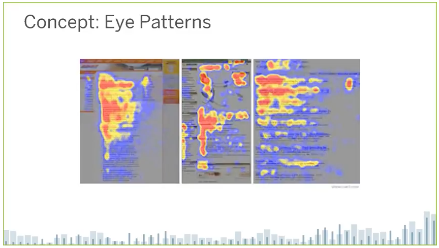
Above: Demonstration of the F-Pattern
Another detail to take into account is the weight of objects. This is similar to planets and their ability pull things towards it because of gravity. Look at your dashboard and ask what is gravity for your eyes. Typically, it’s going to be a bright color. In Robert’s example, he chose red, a very heavy color.
Structure and layout may be one of the more important steps. There are a lot of aspects to take into consideration, like what type of chart is best for your data. In his talk, Robert goes through the different types and what they are good for. There is one type of chart that he adamantly refuses to use though. Can you guess which it is? The pie chart is extremely overused, in his opinion, and isn’t necessarily the best option anymore for relaying information.
Robert likes to sketch out his dashboards as a rough draft before he actually starts building in Tableau. Know where you want the important things, like logo and filters, to go. Make a plan for your Tableau objects to make everything work as a unified tool. A great tip Robert slips in is to try and keep your dashboard under six visualizations to keep from cluttering your space.
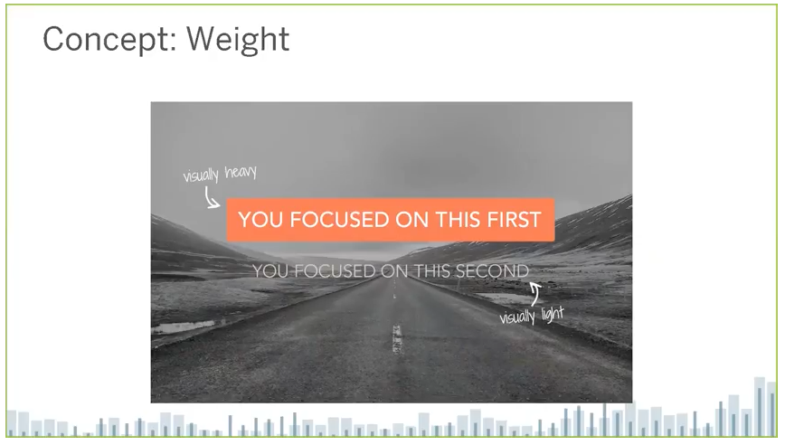
Above: Demonstrating how weight works
Step 3: Build and Test
For Robert, the process of building and testing a visualization on his audience is circular. It’s important to keep your audience or user in the loop, so they understand what they’re getting. Incorporate rapid prototyping, review, refine and iterate your changes, and then you start with prototyping again. A lot of user adoption is acquired from this process and is a great way to get people involved with the visualization.
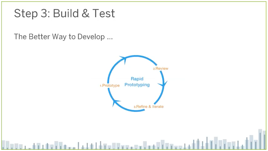
Above: Prototyping process
Step 4: Add Interactivity
Adding useful interaction features to your dashboard is critical for building user adoption. The most important features are:
- Filters
- Parameters
- Filter action
- Highlight action
- URL action
But these aren’t all you should be working with. Don’t forget about these other key aspects:
- Tooltips: “Make your tools not just Tableau-y, but friendly.” – Robert
- Dynamic titles and labels
- Appendix dashboards and more
Step 5: Visual Best Practices
Our brain is a super computer. If we give it the right type of data, it can be really good at processing fast information. Our brains are particularly great at processing color quickly. There’s an important link between color and human psychology. We can use color and other style elements to guide user perception of our data.
A few rules for color:
- Limited palette: Try to use only three or four colors
- Consistency across worksheets
- Use “alarm colors” with purpose, such as red
Titles and text:
- Tell your users what to do, i.e. “Select a Year”
- Ask a question of your worksheet
- Label your interactive elements
- Remove chart junk: This is the most important rule, as your eyes can easily gloss over certain areas of your dashboard if it’s too cluttered.
Remember, you’re trying to achieve the F-Pattern.
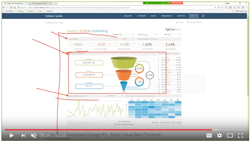
Above: Robert shows what draws attention on his dashboard
Step 6: Performance Testing
In his session, Robert emphasizes the importance of user testing. So, this step may be the most important part. Conduct a blind test on your users and no, we don’t mean cover their eyes. Simply find someone who has enough background knowledge of your analysis or business. This is who you ideally want using your dashboard anyway. Watch and notice where they move their mouse and what they click on. You’ll see how the structure and weight of your objects holds up to the users attention.
What’s Next?
The process doesn’t just end here. You still have to take into consideration governance, quality assurance, accessibility and ad hoc templates. Remember, the internet can be your friend in your research, especially the Tableau community. Design is a skill and with enough practice, anyone can perfect it.
If you would like more in depth design training, take the online Tableau visual analytics course. In the sessions Robert teaches, he gives you an ugly dashboard and you have to figure out how to make it better. Easy enough now that you’ve got all the steps in writing! For a deeper look into each of these steps, check out Robert’s Dashboard Design series and always reach out to our analysts for questions.