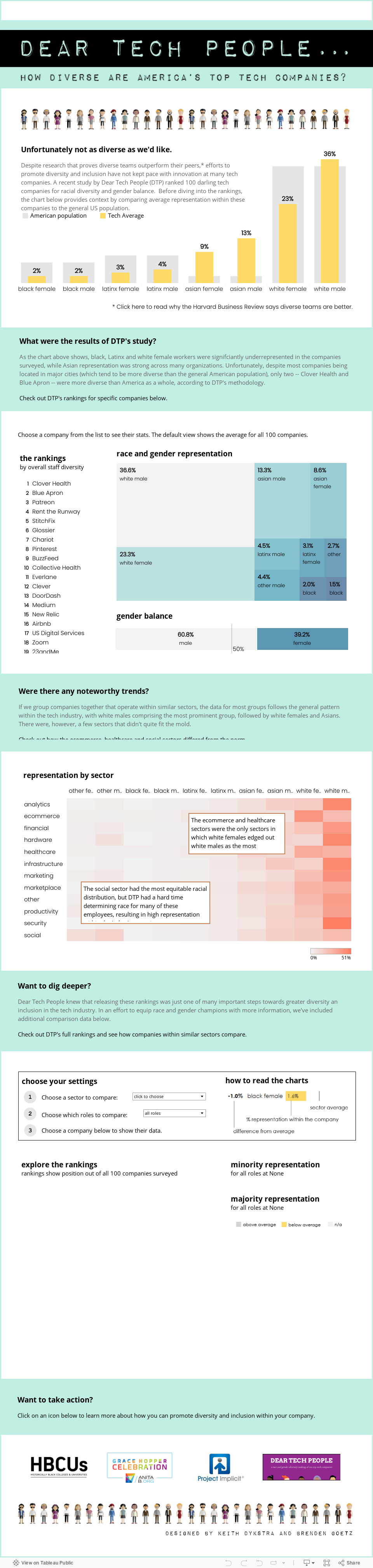
It should be no secret by now that diverse teams solve problems more effectively and are simply a good thing to have as we work toward building a more inclusive world. But how are top tech companies doing at building diverse teams? Dear Tech People has enabled responses to this question by scraping data from sources such as LinkedIn for 100 top tech companies and partnering with Viz for Social Good to make the data publicly available.
A detailed description of the Dear Tech People methodology is available on their website, but the high-level overview is that diversity attributes, such as race and gender, were determined programmatically using name analysis and facial recognition, as well as manually with humans identifying employee profiles. Job roles were categorized based on job titles. While the methodology can certainly be improved, this is an amazing first effort to make this type of data so widely available.
Tableau Dashboard Design
With the data ready to go, the next step was to build a dashboard in Tableau (which you can find at the bottom of this post). My colleague Brenden Goetz deserves a big shoutout here for his invaluable insight throughout the whole process. The goal of the dashboard is to provide context to compare race and gender representation within companies across different sectors, as well as provide context for how those companies compare to others within their same sector. Most importantly, we wanted users to be able to take action, so we provided a few options at the bottom. These are only a few of many possible ways to improve inclusion and diversity within your organization, so let us know if you have more ideas. Just post in the comments sections below.
In terms of the design itself, we wanted to mimic trends in website design, such as creating distinct sections that you can digest in chunks as you scroll down the page. We found inspiration from the design community on dribbble.com and decided to use color blocks that stretch across the page to offset sections of explanatory text. The people image icon was downloaded from dreamstime.com and guided the color palette for the rest of the dashboard.
We also used font size and weight to create a clear visual hierarchy of text. Large Courier New fonts ensure that headers are obvious at first glance, while longer sections of paragraph text are shown in a smaller gray Century Gothic. The gray font de-emphasizes the longer text blocks in case viewers don’t have time to read it all, while the black fonts showcase critical information and make the dashboard easily skimmable. The dashboard title is a custom font from 1001freefonts.com and uploaded as an image so it would render correctly on all browsers.
Now go explore!