
Yes, I know. Documentation is not a sexy topic. It is not easy to keep documentation updated. It is not always easy to identify the right level of technicality. Finally, we are all more the dashboard builder and tinkerer in our hearts than we are the nitty-gritty writer of documentation.
First, let’s get a motivation boost.
Why Is Documentation Necessary?
We may sometimes feel like an isolated worker creating dashboards – maybe because we work remotely or the users of the dashboards we build are at least distant from us. But in truth, we do not work isolated. If not as a consultant, at the very least, we do produce content for users. We can have the very best visual design, following visual best practices with a fantastic color palette, and the user can still feel overwhelmed. The reasons they are overwhelmed are often questions that are data related: How is the KPI calculated? What filters are applied to the data? When was the data last updated, etc.?
One reaction can quickly be that the user is at fault. “The user should know the answer to that stupid question.” Or, “Why don’t they fire up Tableau themselves to answer that question?” Sometimes, this may be the case. But way more often, I see the designer in the responsibility. With the power to tweak data, manipulate it and decide how to look at it comes a responsibility. Don’t become Spiderman but an educator.

Lastly, I can tell from my very own experience that with better documentation, the user acceptance of your dashboards increases. Apart from a good look and feel and short load times, users need to understand the meaning of the KPIs and data that they look at. Without that understanding, they will hardly use the dashboard at all in their daily routine.
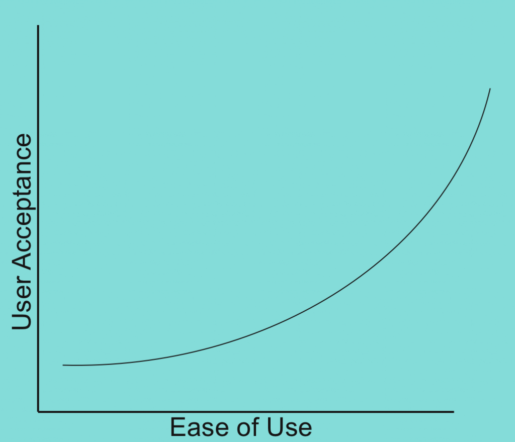
(Warning this is self-made stats based on subjective perception.)
How Can Documentation Be Done?
I have been spending quite some time on different versions and the takes on them. It would probably be even worth spending time on a complete blog series about documentation of Tableau Dashboards. The reason this is so complex is because there are different audiences with different interests. In connection to Tableau dashboarding and projects, I have seen:
- Technical documentation
- Data source audits
- Documenting design choices
- Project documentation
- End-user documentation
- High-level management documentation
I do see an issue when discussing documentation that stakeholders can hardly make a choice. Documentation is great, but as with many things, you need to know your audience well.

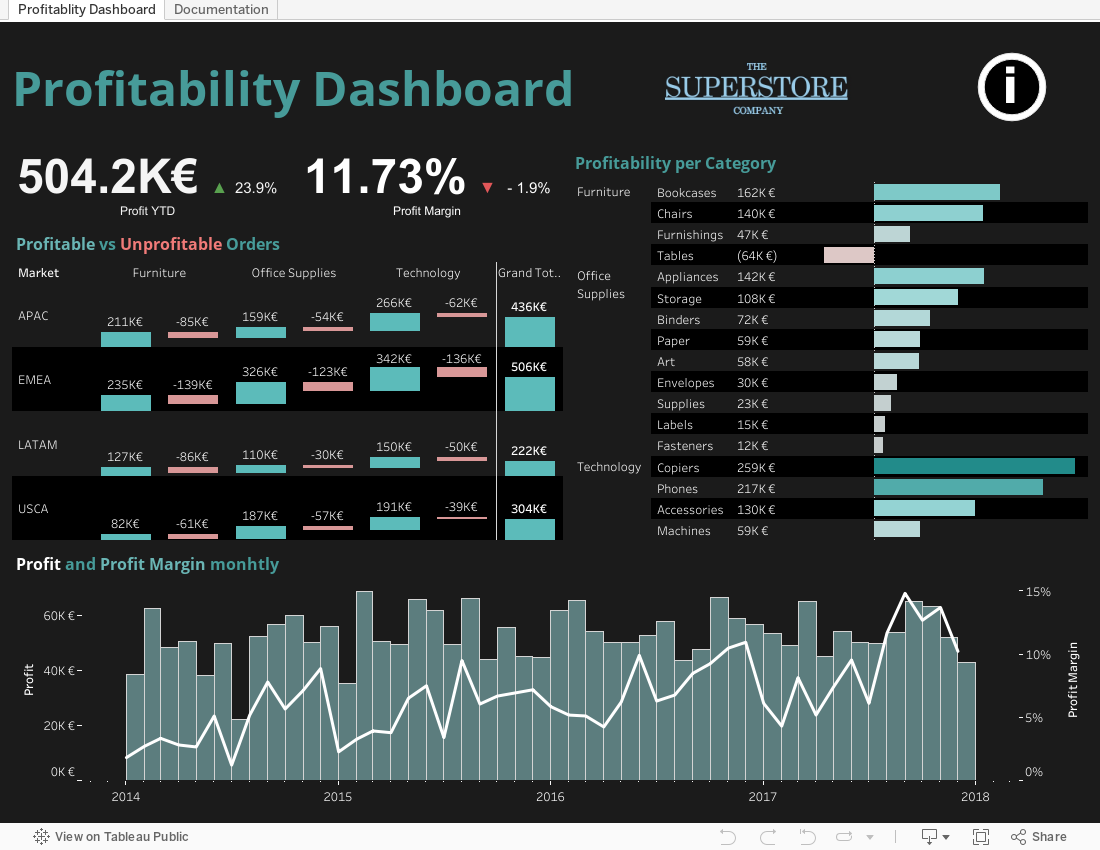
Today, I want to focus on documenting for end-user consumption. KPI-driven businesses are great, but unless you have been involved in the dashboard development, how are you going to know exactly what you are looking at? How are the KPIs calculated? What are the applied filters? Ultimately, we want end users to trust the numbers we put in front of them, otherwise our work is meaningless. I want a high user adoption of my dashboard. Therefore, we need to give explanations to our users. This is the type of documentation I am looking at in this article. Figuratively speaking, I want to enable this guy:
My Method for End-User Documentation
I have been experimenting with many things, but one solution struck me as the best one so far. If anyone has an even better solution, feel free to comment below.
First of all, I realized at some point, I do not want to change the medium to read documentation. If I look at data, I should immediately have a way to find out how the KPIs are calculated. I have seen users pull out physical copies of end-user manuals under their desk to look up specifics of a dashboard. That is a pretty extreme case, the user should not even be pulling out a pdf. The dashboard should already include documentation.

Secondly, I think it is important to give more people the possibility to edit or add information to the documentation than the person who builds the dashboard. Documentation should be a living document. As the author, I do not want the sole responsibility to adjust wordings or formulations. Co-workers or other stakeholders should equally get access to the documentation.

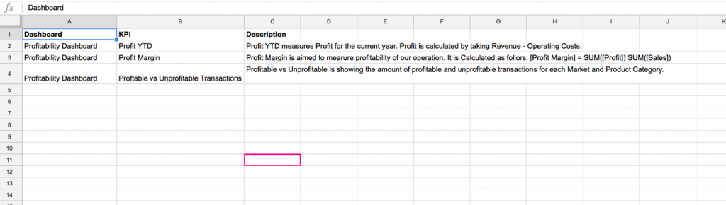
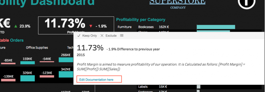
Therefore, the solution we started deploying is putting documentation right in the tooltips. At the same time, there is a pure documentation dashboard that includes process diagram, KPI definition and filter settings. To enable other people to edit the documentation we included this documentation in a google sheet. That way, if a point is missing or a piece is not well formulated, it can be adjusted by anyone with sufficient permissions.
So, how to set this up? I am adding the example workbook to Tableau Public with a public Google Sheet as an example:
In my example, I have three KPIs that I want to document. I am describing them in the Google Sheet and blending that Google Sheet to the respective worksheet. In the worksheet, I filter the KPI name to the KPI to be displayed and insert the documentation in the tooltip. The Google Sheet looks like the following:
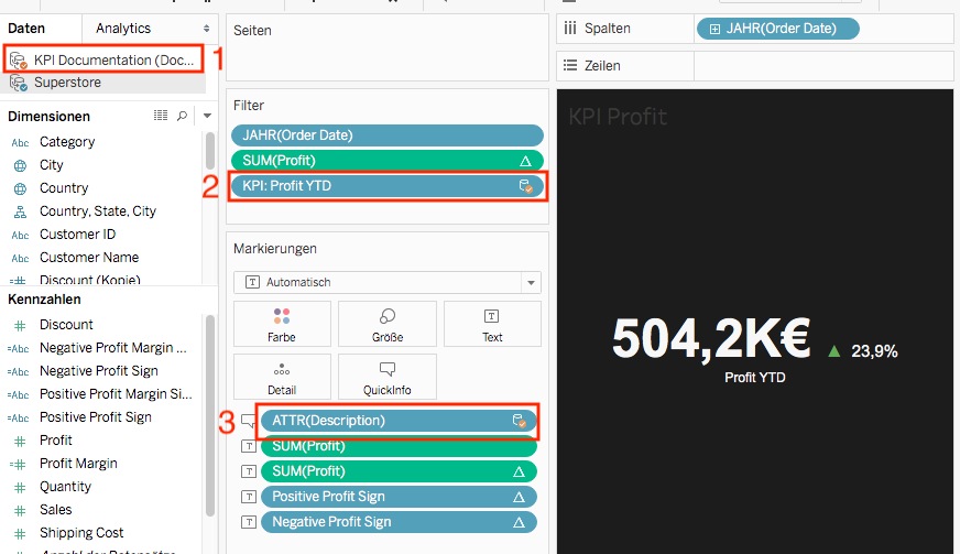
In a worksheet, I blend in the Google Sheet without any relationship (1) and filter the KPI to the respective row in the Google Sheet(2). The description is then simply added to the tooltip(3):
In the dashboard, I allow users to jump directly to the Google Sheet in order to edit the documentation or read more details and what not. I do this using URL action in the menu. A nice feature with Google Sheets is also that I easily can manage permissions for access and editing. Using the revision history, I can also easily check out who changed the documentation:
Talking about the dashboard, I also have my obligatory information button at the top-right corner. This button serves to welcome the user and points them to the documentation dashboard and the Google Sheet. Using standard dashboard navigation actions, I navigate the user to the documentation dashboard:
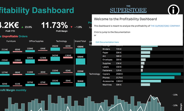
The documentation dashboards include the list of all KPIs from the Google Sheet as well as process charts or illustrations for the KPIs. My colleague Raphael Teufel is a huge fan and expert of these process charts, and I must say that users and stakeholders have responded extremely positively to them. We often look at data without rethinking the underlying process that produces the data. Consolidating this understanding right where you look at the data that is usually the result of a process is extremely powerful.
I am pretty excited about this solution. I use it in every dashboard I produce that should reach a wider audience. It is simple and powerful. Please share your thoughts in the comments below.