By default, Tableau won’t label a bar. The axis is enough for viewers. However, a lot of our users say to us, “We like the bar, but we want to see the numbers as well”. Rather than reproduce a bar chart as a table, labelling the bars is the obvious way to go. Tableau provides an obvious way to do this, but this viz below shows 3 other ways you can label the bars.
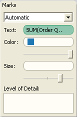
Example one in the above viz is the default – just copy the Measure that’s on the Columns shelf to the Text shelf of the Marks card:

In Example two, I’ve added Color to the Marks shelf to get a stacked bar chart. By default, the Text marks would now appear in each segment. If you still want the total label visible, you need to add a Reference Line. Right-click on the axis and choose Add Reference Line…
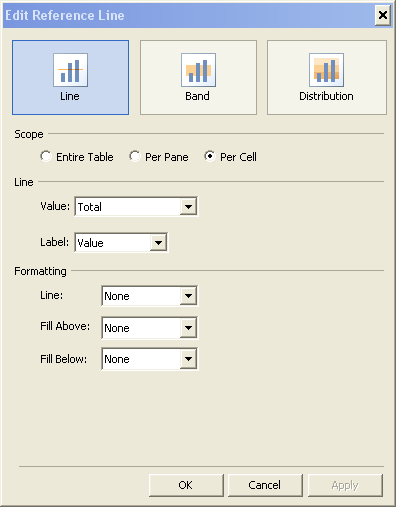
You then need to add a Line with the following settings:

That’s cool – you’ve done some labelling that is outside of Tableau’s default behaviour. What if you want to add some allowable bling to your chart, ie do something visually attractive, but stick to the principles of good visualisation? Well, you can put the text label inside the bar.
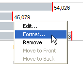
The third example, with the white text inside the right-hand edge of the bar, is also acheived with a Reference Line. To do this, create a reference line with the same settings as the previous example. Now select the Reference Line and choose Format…

On the Format panel, set the Reference Line Label Alignment to Left-Align (horizontal) and centrally aligned (vertical). Change the Shading to 0% and the Font to white. Bingo! Your text is now inside the right-hand edge of the bar.
The fourth example, aligning the text at the left-hand edge of the bar, next to the category label, was something of a quest for me after seeing that it can be done relatively simply in Excel. To achieve this, we need to twist some of Tableau’s other functionality to suit our needs!
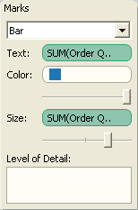
The first step is to remove the Measure mark from the Columns shelf, and put it onto the Text shelf. Yes, that means we have just created a table, not a chart. Stick with me, we’ll get there. Now put a copy of the same Measure onto the Size shelf. Still looking a bit wacky? Ok, the final step is to change the Mark type from Automatic to Bar:

You should now have your left-aligned labelled bar.
The techniques for examples 3 and 4 can enhance your Tableau charts. There are some restrictions to these two though:
- They only work on horizontal bars
- If one value is very low, the label may not appear correctly
- For the left-aligned text (example 4), it works best with a big range of values.
You may also have noticed that I have hidden the axes on all of the charts above. I believe that if you are going to put text-labels on the bars, it’s bad practice to also show an axis.
To get a better idea of how to do this, download the workbook to see how I built it all up.
