What can an InterWorks consultant put together in an hour with unfamiliar data?
This blog is designed to give a look at how an InterWorks consultant approaches developing a Tableau dashboard. Along the way, you will see some tricks employed to speed up the development process, as well as insight into some of the design choices made.
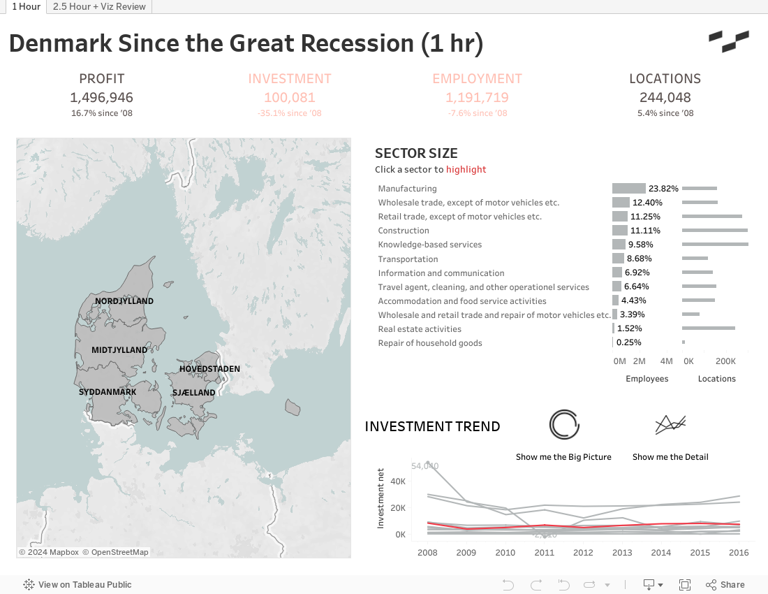
The data we are dealing with in this case is data on the different sectors of the Danish economy from the Danish Government’s StatBank, their repository of statistical data. It is not the cleanest data to bring into Tableau, so I ran it through Alteryx to prepare it for Tableau Desktop. The prep work and validation of data is a large and important part of any project, but in this case, we are focusing primarily on the development within Tableau Desktop.
I break down the video with the timer value, subject, and video timestamp above each section of the blog:
e.g. Timer Subject (Timestamp)
00:00 Slope Chart (00:00)
00:00 Join Calculation
Tableau only recognizes some geographies in Denmark, so I brought in an Excel file to join against to get me the regions that Tableau recognizes. How the regions are named differs in the files, so I used a join calculation to tie them together. Tableau can manage joins even when you do not have fields that are exactly the same; even if you have the components to tie two tables together, you can make it work.
6:30 Cleaning Dimension Member Names (1:00)
One of the ways you can create calculated fields in Tableau is through certain menus: custom dates, splits, etc. I always like to utilize these built-in functionalities when I can, just because Tableau is an intelligent software. Here, I used the Custom Split to isolate a portion of a field I eventually wanted to remove, and then I referenced that new split field in the calculation to do the replacement.
8:00 Exclude “Total” Rows (1:15)
This dataset includes a row for “All Denmark,” which could quickly skew any view I create if included. This occurs a lot in government tables and Excel reports being pulled into Tableau for ad hoc reporting. To quickly be able to filter these in individual sheets, I created a Set to exclude those rows. A set can be used as a saved filter, among other things. I can quickly drag my set to the Filters card to eliminate those rows from my data in the view.
From this point, I just started to explore the data a bit. A large decrease in investment in real estate eventually caught my eye. One other point in this area—when the absolute variation in a measure is small, I often go with relative variation: a % change.
Settling on Chart Types
21:00 Slope Graph (3:15)
This chart type is a great way to look at the big picture changes between two points in time when you are not so concerned with the variation in the intermittent periods. You will need to use Date Parts here, and just keep the first and last period you are interested in!
25:30 Bar Chart (3:55)
Next, I wanted an idea of the size of each sector in terms of its employment impact and locations. Just a couple of formatting notes here:
- I always left-justify my headers, so the viewer starts reading them all from the same point.
- I limit the use of color on charts unless I am highlighting a point (like meeting a budget figure) or something a user has selected.
29:00 Initial Dashboard Placement (4:30)
Here, I just started bringing my components out into the dashboard to see how stuff might fit together. At this point, I am about halfway through the challenge, so it might seem early, but often there is a lot more iteration once you see how views work together in a dashboard. I still have to do some formatting, set up any dashboard actions, etc., so there will be plenty left to do.
31:00-36:00 Setting up a Parameter Action Toggle Sheet (4:47)
I go off screen for a second to make an Excel file to help support a parameter action to toggle between the two line-chart options. This is a new feature in 2019.2 that allows parameter values to be driven by selections made in a sheet. My sheet, in this case, will pass through to a parameter that I will use to swap sheets in my Danish economic data. Check out Keith’s blog for a rundown on the how-to for this type of action.
Tweaking KPIs in the Dashboard
36:30-45:00 Validating KPIs (5:38)
Oh man … in this section, I began to put together the KPIs that headline the dashboard, and it was one of those days. It took me a bit too long to settle on the syntax for the calculations for percent change since 2008, and you can see quite a few views I built just to validate the numbers. Building views to validate your numbers is an important point in effectively using Tableau. In some ways, it is a bit of an art, but if you include all the relevant pieces of your calculation in a crosstab and maybe add in totals or subtotals, you can typically get a pretty good idea if things are working correctly.
45:00 Flushing out KPIs (6:56)
After I got my first KPI working correctly, I just started copying the function and dragging and dropping the other measures into the subsequent calculations to adjust them as needed. I find myself doing more of this drag and drop these days; I find it easier than typing. Maybe because I slacked in my sixth grade typing class.
47:30 Formatting KPIs (7:20)
My typical method for building out KPIs involves doing an ad hoc calculated field of MIN(0) on columns to get a centered axis and then placing each KPI on one of these, so I can format each one with its own independent Marks card. You can see that I just take a copy (CTRL+click, drag) of my MIN(0) calculation to get my other axes. The independent Marks cards mean I must remember my formatting, but it allows me to change formatting, colors, iconography, etc., as needed. I didn’t quite get the colors how I would have liked within our time frame, but you can see that I can highlight each KPI based on whether it increased or decreased over the period. There are lots of variations to this method and the coloring options available.
53:00 Final Dashboard Arranging (8:10)
KPIs need to be readily apparent to our end users. This means they need to go up top or maybe on the left-hand side; these are two areas we tend to approach first when interacting with webpages, book covers and things like business dashboards.
I typically tile my objects, so they maintain their positions better when publishing to Tableau Server or Public. That being said, I will float objects to save space and place them in logical positions. Things that are close together are typically interpreted as being related, so moving objects like filters and legends from the side to the elements they relate to can have a big impact on user experience. In this case, my icons being used for switching the view in the bottom-right corner are floated close to the title of that sheet to save space and make it apparent what visualization those icons will change.
Viz Review
From this point, I spent another 90 minutes or so cleaning up elements of the dashboard, like changing it to a dark theme, formatting the hovering tooltips and testing actions. After this, I submitted the dashboard for our internal Viz Review process. We have a team of talented UI/UX consultants that help us polish up the look and feel of our dashboards. I am a big believer in utilizing their skills because they bring a fresh perspective and clean solutions to design problems that I encounter all the time. Then I steal all their best stuff; let’s call it “sincere flattery.”
Check out both the one-hour time lapse video and the completed dashboard below. I hope you enjoyed this small look into the data and design process for this data set. As always, feel free to reach out with any questions!