Road Traffic Death Rates from the World Heath Organization

Data

Road Traffic Death Rates from the World Heath Organization

//

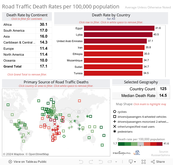
I enjoy reading many different blogs that include data visualizations, particularly those that include Tableau Public posts. A couple of weeks ago I ran across an interesting visualization at Russian Sphinx. Her post included a dashboard of World Health Organization data on road traffic deaths. I liked the style she used for her map visualization but wanted to see if I could create a version with the following goals:

1. Provide a high level view of the best and worst areas for traffic deaths (using color)
2. Utilize shape to classify the mod of transport related to the highest death rate (in each country)
3. Display specific metrics by continent and country based on selections made by the information consumer (filters/highlights)


KeepWatch by InterWorks

Whether you need support for one platform or many, our technical experts have you covered.

More About the Author

Dan Murray

Director of Strategic Innovations
Creating a Data Governance Framework That Drives User Adoption In this six-part series, we’ve discussed the adoption history, planning a BI Rollout, decentralizing ownership of data workflows and ...
Business Intelligence System Maintenance An issue and an opportunity for nearly every existing business intelligence system is keeping it running well and minimizing costs.   ...

See more from this author →

InterWorks uses cookies to allow us to better understand how the site is used. By continuing to use this site, you consent to this policy. Review Policy OK

×

Interworks GmbH
Ratinger Straße 9
40213 Düsseldorf
Germany
Geschäftsführer: Mel Stephenson

Kontaktaufnahme: markus@interworks.eu
Telefon: +49 (0)211 5408 5301

Amtsgericht Düsseldorf HRB 79752
UstldNr: DE 313 353 072

×

Love our blog? You should see our emails. Sign up for our newsletter!