
This blog post is Human-Centered Content: Written by humans for humans.
Come with me as I discuss my learnings transitioning from working in Tableau to working in PowerBI Desktop.
Learning a new BI tool is a great way to keep your skills sharp and today we see more and more businesses opting to use multiple tools. While lots of BI skills are definitely transferable, there are some differences between the tools. In this blog, I’m going to bring together some of the learnings that I found when working on my first Power BI project. This is a what I wish I knew before switching.
Creating New Fields and Calculations
One of the first things I wanted to do when diving into Power BI was to enrich the data and create new fields. Here was where I noticed the first difference with Tableau: In Power BI, if there is a choice to be made when creating new fields, should you create a measure or a column? In Tableau, it’s always a calculated field. So, which one do I need and in which scenario should each be used? Initially, I found this unclear as I seemed to be able to get the same result from both a calculated field and a calculated column, and that is because both can work in getting the same result!
Measure Versus a Calculated Column: What’s the Difference?
Calculated columns work at the row level, and you can see the new value in your data model. They provide a static value and, once created, can be viewed and used like any other column. As calculated columns create new values in your data model, this will increase the size of the data model and will consume more RAM. This option works well to add values that are to be used as slicers and filters, or displayed as rows and columns in a visual.
Measures, on the other hand, cannot be seen in the model view and the values are not added to each row in the table. Instead measures are calculated in the report and respond to any filters applied to the visual in which the measure is being used. Measures are normally used in the “value” field of a visual and return numerical results.
If I can use both a calculated column and a measure in my visual (I get the same value from both) which, then, should I use? As a general rule, it is recommended that you go with a measure by default. This will save on disk space and RAM — particularly useful when working with large datasets.
Aggregating and Granularity
The next difference is how I set up my data model in the two tools. Now, I’m sure there are multiple approaches here, but as a newbie to Power BI, I found that creating summary tables in my data model was an easy option when working with different aggregations and subsets of data.
I started off the project by connecting to my database and then creating relationships across the tables based on primary keys. In Tableau, I would have then visualised this data using aggregations or level of detail calculations. In my Power BI project, I had a similar initial set up, but as I built out my dashboard, I found there was no direct equivalents to a LOD calculation. So, I created summary tables within the data model to aggregate my data at different levels of granularity. The SUMMARIZE function gave me aggregated tables which I could then use to build specific charts. Now, I am aware that this may not be the most performant approach, and while there may be ways to get around this in DAX (Data Analysis Expressions or DAX is a formula language and library of functions used exclusively in Microsoft), for me, as a newbie to DAX, this was the quickest and easiest solution and one that worked well for my project.
Colours
Changing the colours is simple right? Well, only when you know how to do it. This took me longer to figure out than I would have liked, so here’s a quick guide…
How to Change Colours in a Chart with a Legend:
The scenario here is that you have a bar chart or line chart that uses a categorical field on legend giving a unique colour per bar or line.
- To change these colours from the default, you need to select your visual.
- On the visualizations pane, navigate to “Format your visual” (it may be a tab along the right rail depending on the version of Power BI Desktop you’re using):
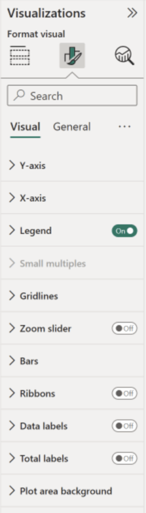
- Select the “Bars,” “Columns” or “Lines” menu.
- Here is where I got confused. The default settings will show a colour box which cannot be selected:
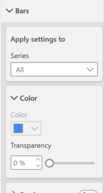
- In order to change the colours, you need to select the “Series” dropdown, select each value and assign the desired colour.
- Again, it’s easy when you know how! Conditional formatting might be a little more intuitive for a visualization veteran, but this one was unique for sure.
How do I Get a Custom Colour Palette in PowerBI?
I love creating custom colour palettes in Tableau. They can be a great time saver. The best alternative in Power BI is to use themes. Themes control more than just the colours in a report — they set fonts, text sizes and gridlines/table formatting. The view tab gives you access to preset themes. These can be altered by customising the theme, or you can upload your own themes using a JSON file. Go try it out and see if there’s one that can work for you right out of the box.
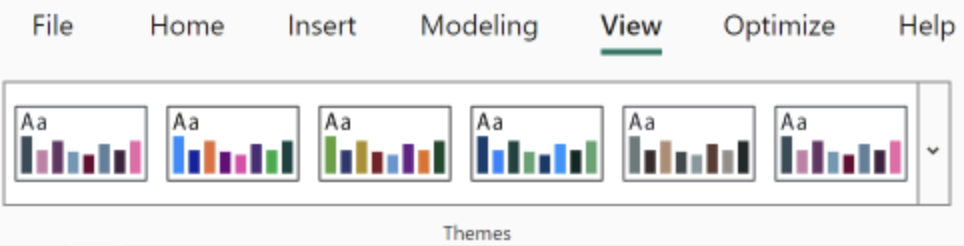
Above: The toolbar window for default themes.
Changing Aliases
In Tableau, changing aliases is a breeze, but there isn’t the same functionality in Power BI. Instead, I found that I needed to use Power query to map these changes when the data is queried rather than in the build UI like Tableau. To change the named values in Power BI, you will need to navigate to the model view along the left side of your report page and right click the table containing the field in question, then select “Edit query” From this window, you can choose the value’s “properties” option to replace the existing values with the new desired name. You may wish to copy the column and replace values on the copied column to retain the original values as well. There are other shortcuts, but for report-wide changes, you’ll likely want to do that in the model view within the global field or data itself.
Filters and Slicers
There are a few important differences that you need to know when working with filters in Power BI.
In Tableau, you can add filters to sheets. These can either be dimension or measure filters, or can be elevated to context filters. These can then be exposed on a dashboard and used as global filters driving the effect of one dropdown affecting the whole dashboard. Thus, the filters on the sheet are what your end users interact with.
In PowerBI, however, there are filters and slicers.
Filters work in a similar way to Tableau, fields can be added to the filter pane and can be configured to include/exclude values or set up advanced and conditional (e.g. Top 10) filters. Slicers, however, apply to all visuals in a report by default and are what end users interact with. Filters can be applied to single visuals/charts but are not used to interact with the report. Slicers will be able to affect all of the views within a single report page to drill down, highlight or segment as needed.
Tooltips
Tooltips in both Tableau and Power BI are generated automatically by default. In Tableau, tooltips can be easily edited to include additional data fields not shown in the view, or we can use “viz in tooltip” to add related visuals that aren’t included in the report (but will show upon a hover of the data inside of the view). In Power BI, there is less control over the auto generated tooltip, but we can customise them further or even create a separate tooltip page.
To customise the generated tooltip in Power BI, additional fields can be added to the tooltip section. These (and any other field in the tooltip) can be renamed by double clicking the field or using the “Rename for this visual” option on the dropdown. To create a more highly customised tooltip, we can use a specific tooltip page. These pages are set up by navigating to the page setting “Format your report page” and then setting the page to be used as a tooltip under “Page information,” or by setting the size as tooltip under the “Canvas settings.” It becomes more intuitive over time, as one of the last things you’ll do to cleanup and polish your report.
Show/Hide Containers
Show/Hide containers is a Tableau feature that allows us to create interactivity by which users can toggle the visibility of dashboard objects, thereby adding more context and features to a dashboard view without making it overwhelming on first view.
In Power BI, we can achieve a similar effect by using bookmarks. Now, there are a few ways of using bookmarks. Primarily, bookmarks are used to capture a report page in a given state, with certain filters and slicers applied. This gives a pre-defined state of the report which can easily be served up without having to potentially change lots of filters and slicers. Another way bookmarks can be used is in conjunction with an action. We can show and hide visuals in the selection pane and then bookmark them. The bookmark will “remember” any filters and which visuals are hidden. Next, we can link a button to an action driven by this bookmark (in the button formatting) so when the button is selected, we see the bookmarked setup!
My top tip when setting up these bookmarks is that if you need to tweak the bookmarked view, set up your visuals as you want them after clicking the button, and then select the ellipses of the bookmark in the bookmark pane. Finally, select “update.”
Now, go forth and conquer. As you do, let us know what interesting finds you think are noteworthy. Share with us some of your favorite features of Power BI as you elevate your skills in this powerful visualization platform.