
This blog post is Human-Centered Content: Written by humans for humans.
It was almost inevitable that I’d become a ski addict, born in a small Northern California town just two hours from Tahoe with a dad who worked at a ski resort. Over the years, I have lived up and down the West Coast, exploring an incredible variety of ski resorts. I have come to appreciate places like Mt. Bachelor and Whistler Blackcomb for their vast terrain and breathtaking size, and smaller gems like Willamette Pass for their low crowds and untouched snow in the right years.
Planning a ski trip involves countless factors. What will the weather be like? Do they have enough runs that match my skill level? How long is the drive? How much will it cost? The list never seems to end.
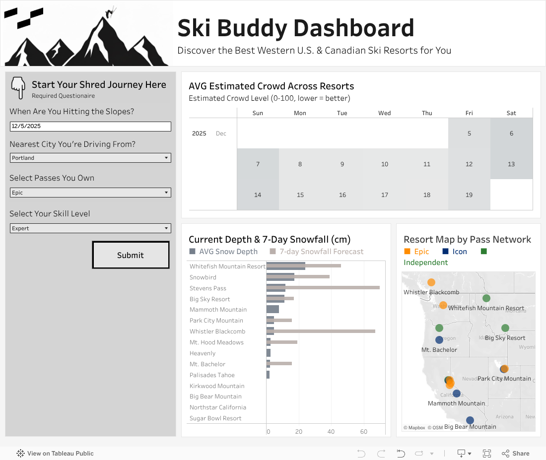
To help answer those questions and to finally prove to my friends which mountain truly deserves the title of the best, I created the Ski Buddy Dashboard. It is designed to give skiers and snowboarders a deeper understanding of the top resorts across the Western United States and Canada.
Sourcing the Data
I was stoked to use this project as an opportunity to explore n8n, a workflow automation tool, to orchestrate data collection from multiple APIs and load it into Snowflake, all while keeping the data current.
The APIs I worked with, and would like to acknowledge, include:
- OpenStreetMap (OSM) - For geocoding and location data
- Visual Crossing Weather API - For historical weather data (snow depth, snowfall, temperature, weather conditions)
- Open-Meteo API - For weather forecast data (16-day forecasts)
- Nager.Date API - For US and Canada holiday data
- OpenRouteService API - For calculating drive distances and times between cities and resorts
- I built a series of workflows in n8n to gather and update all data needed for my dashboard, load it into Snowflake and then push the relevant tables into Google Sheets so Tableau Public can refresh against a live data source.
Workflow 1: Holiday Data Loader
Runs annually
Populates a 12-year rolling window of U.S. and Canadian holidays, ensuring the dashboard recognizes holiday periods, which typically correspond with higher resort crowds.
Workflow 2: Monthly Resort Data Loader
Runs monthly
Populates resort characteristics that rarely change, including:
- Lift counts by type
- Run counts by difficulty level
- Drive distances from major cities
- Population density within proximity radiuses
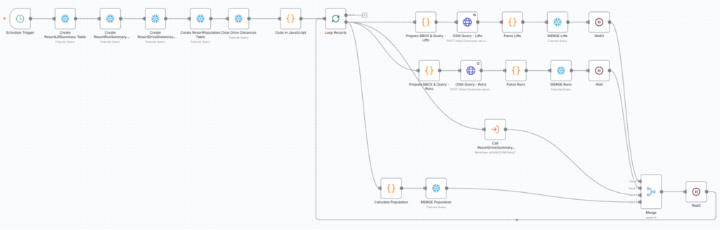
Note: This workflow initially required nested looping to iterate through every resort and each destination city for drive-time calculations. However, n8n does not support nested loops directly. The workaround is to design your workflow as if you were using nested loops, then highlight the nodes in the inner loop, right-click and select Convert nodes to sub-workflow. This creates a sub-workflow that functions correctly for every combination of the two variables. In my case, the ResortDriveSummary sub-workflow performs this nested loop behavior.
Workflow 3: Daily Weather Update
Runs daily
Keeps the dataset current by fetching the previous day’s actual weather conditions from Visual Crossing and the next 14 days of forecast data from Open-Meteo. Both APIs provide snowfall, temperatur, and weather conditions, while Visual Crossing also includes snow depth. This ensures the dashboard always reflects both current and forward-looking snow and weather data.
Workflow 4: Daily Google Sheets Sync
Runs daily
Updates the Google Sheet file with the current day’s actual weather and the next 14 days of forecast data. It also clears older weather information so that Tableau always pulls the latest short term conditions
Workflow 5: Monthly Google Sheets Sync
Runs monthly
Updates the Google Sheet with all monthly resort info, including drive distance from each city to each resort, lift counts, run counts and other attributes needed for monthly refreshes.
The Dashboard
Tableau Public does not support live data connections, so this version relies on the Google Sheet sync flows above. You can refresh the data at any time by clicking the Refresh Data button on Tableau Public to pull in today’s conditions and the latest forecast. If you’d like to enable refresh capabilities in your own Tableau Public workbooks, this blog is a helpful guide.
Note: Using a Google Sheet as your data source comes with limitations, including a maximum row count and the requirement that your Tableau Public workbook connects to only one sheet if you want refresh capabilities.
Here’s how you use the Dashboard:
- Answer a few questions: Pass type, home city, skill level and date.
- Get context: The right side shows aggregate snowfall, crowd estimates and a map of resort locations to help inform your choices.
- Hit submit: You get a ranked bar chart of resorts sorted by overall score.
- Click a resort: Dive into a detailed view showing how that mountain scores on five key factors — customized to your inputs.
How Scoring Works
Each resort gets an overall score (0-100) based on five factors:
-
- Drive Time (35%)
The most influential. Mountains within 2 hours score 100. Resorts 8+ hours away score lower. But even distant mountains get a minimum 10 points if they crush it elsewhere. - Snow Quality (20%)
Combines recent snowfall (last three days, 60%) and current base depth (40%). Fresh powder matters most, but a deep base keeps conditions consistent. - Terrain Match (20%)
How well does the mountain fit your skill level?- Lift vertical (30%): More vertical = more variety
- Total run length (50%): More terrain = more exploration
- Difficulty match (20%): Personalized to you. Experts get full credit for expert/advanced runs, partial for intermediate, zero for beginner.
- Crowd Factor (15%)
Estimates how busy it’ll be based on holidays, day of the week and resort capacity vs. nearby population. Lower crowds = higher scores. - Price Value (10%)
If you have an Epic or Ikon pass, those resorts score 100 as you no longer need the day pass! Otherwise, cheaper tickets score higher and vice versa.
- Drive Time (35%)
The radar chart breaks everything down visually, allowing you to see exactly why each resort scored the way it did and to make trade-offs based on what matters most to you. I created this with the help of a blog by The Flerlage Twin which you can find here.
Ultimately, this dashboard turns publicly available data into actionable insights. Whether you’re chasing powder, maximizing a weekend, or proving to your friends which mountain is actually the best, it can help you make smarter decisions. See you on the slopes!