
This blog post is Human-Centered Content: Written by humans for humans.
In a world of daily technological advances, many business analysts and executives continue to lean on the comfort of their crosstabs as a preferred mode of consuming their corporation’s data. A crosstab, more commonly known as a data table, displays a relationship between two or more variables from a dataset. The table displays summary information within a grid, where categorical variables can be aggregated, cross-referenced and correlated within columns and rows.
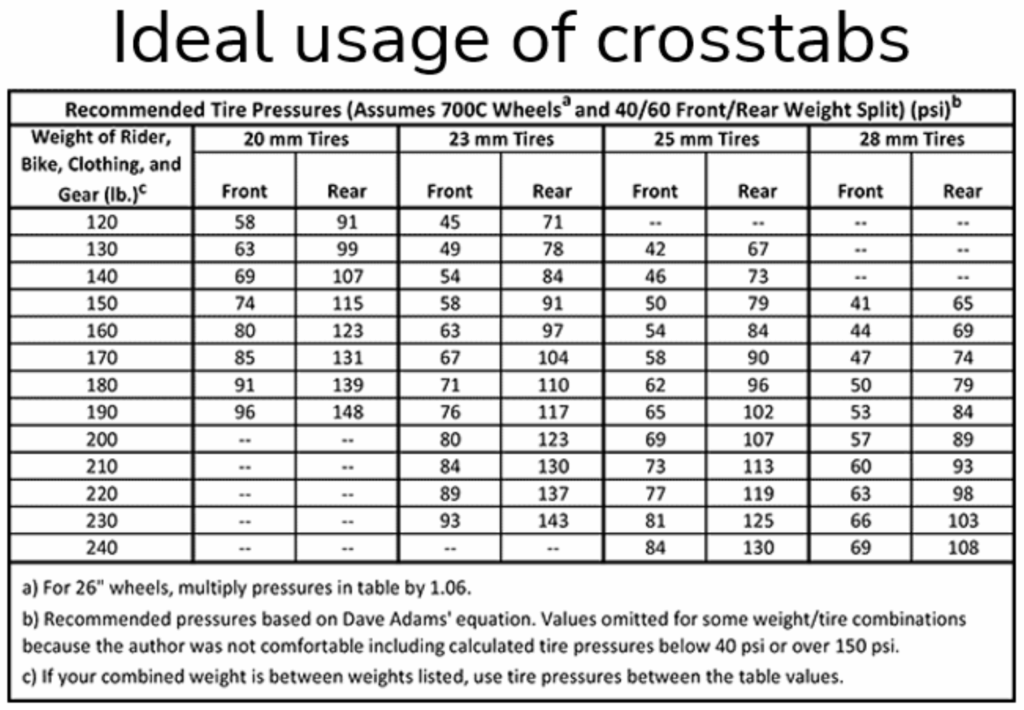
The matrix-style observation in a crosstab is a phenomenon that has made humans happy for more than a century. The ability to scan or scroll across a table for an exact value is something we’ve relied on for things like tire pressure, medication dosages, structural load-bearing capacities, fuel-air mixture engine ratios, etc. The tables offer continuous values based on formulas to divvy out a nominal measurement scale that can easily be read by humans for making decisions.
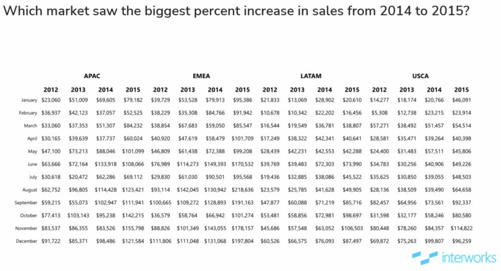
And it works:
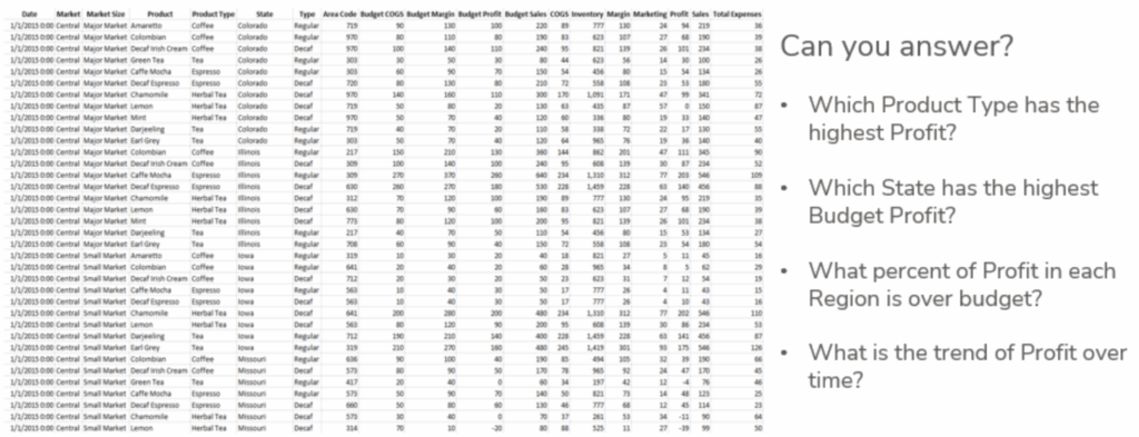
But what happens when we have dependency on something? We can get addicted. Even when it may not be good for us. If overused, or applied in the wrong scenarios, crosstabs can be a similar gateway that consumes excess time to get answers to data questions. Even worse, they can oversimplify complex relationships or provide misleading interpretations. I know I’ve misread a value in a table on occasion, so an element of human error is also something that may present risk.
Above: An example of a table with too much data and aggregation doesn’t match the question.
Innovation now moves at the speed of the internet. There are Business Intelligence tools that help breathe efficiency and accuracy across large datasets that have years of context. Gartner, a global research and advisory firm, will regularly provide findings into the biggest players for various markets, modern BI included. They’ve had a good deal of success in their 40 years of evaluating businesses, those who successfully push the world forward with applications and new technology:
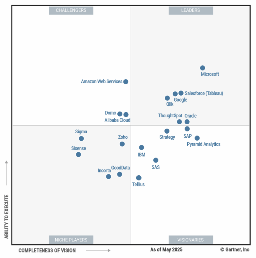
Gartner’s 2025 Magic Quadrant for Business Intelligence shows many of the same players who have been in the BI space for a decade or longer. Microsoft has a visual analytics tool called Power BI, which is widely known for its quick and low entry into data visualizations. Salesforce acquired Tableau, after their 15 years of independent dominance in the marketplace, in 2019. ThoughtSpot has delivered “Enterprise” tooling since 2012. And Sigma entered a couple of years after that.
Read: Our thoughts on market shifts and where things are heading.
These are a few of our supported partners, who our clients choose to do business with, but the world shifts quickly, and with so many new things to learn executives might simply rely on asking for their data in a crosstab. There’s a deep sense of control and clarity people associate with rows and columns, and for many, the leap to something more dynamic feels risky. The investment in “new tool” upskilling and enablement takes time. Time is money and we know Excel can deliver PivotTables with ease.
So how do we address the issue with those individuals or even organizations who might still be “Crosstab Happy”?
The challenge isn’t technology, its changing habits, mindsets, and the perception that data isn’t truly understood unless it comes in a table. We all know that it’s not because visual analytic tools are lacking in power — on the contrary, modern dashboards, liveboards, reports and dynamic charts are readily available in our supported partners’ tools. Within a few points and clicks, dragging fields around a workspace, or by typing text prompts, complex data visualizations can be created in seconds.
It’s science, too. Visual Analytics is based on long-established scientific research on the human brain’s ability to process information quickly from different types of data. During my training on using tools like Tableau, I will often quote Andy Kirk’s definition of Visual Analytics: “The representation and presentation of data that exploits our visual perception abilities in order to amplify cognition.” When we see answers to data questions we have, we know exactly what to do next.
And let’s call it like it is.
These visual displays are just an evolved form of crosstabs but designed to surface insights faster and in more intuitive ways. They translate raw numbers into visual stories, making it easier to spot trends, uncover anomalies and make faster, data-driven decisions. Yet, even in forward-thinking companies and industries full of imaginative thinkers, getting people to move away from their beloved grids can feel like trying to convince a wizard to trade in their scrolls for a touchscreen.
Read: A great example of data storytelling.
The InterWorks bench of analytics consultants worldwide are helping to change the mindset for company stakeholders by developing rich dashboards that give summary information but offer ways of seeing how that data trends overtime, broken down by using other visuals and dimension filters to really see what’s happening. There is generally added context for knowing, for example, how different geographic locations are performing, or which categories drive the most margins.
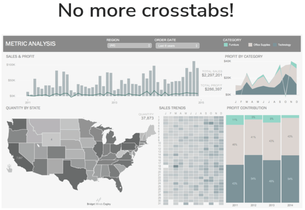
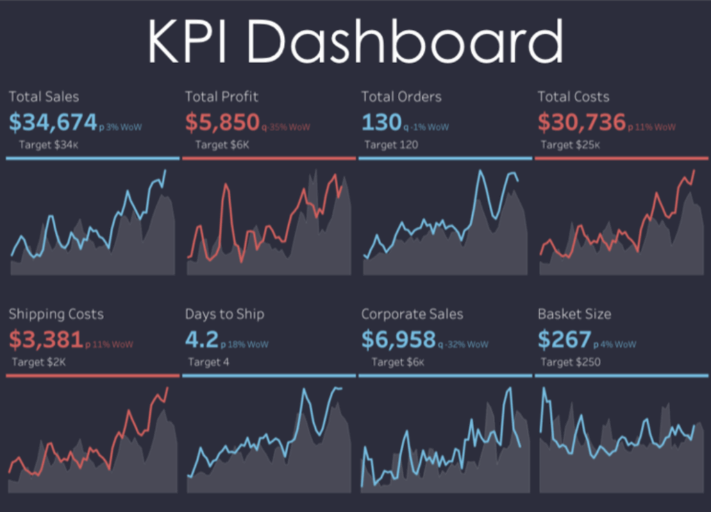
For executives, KPI cards and metric dashboards are more than crosstabs. They are the health of the company, and the signs of good (or bad) things to come. They show and validate transparent and explainable numbers (see below). At InterWorks, we move forward with our clients as they undergo digital transformation, via tooling or applications, offering strategic pathways and hands-on support, increasing speed to insights and uncovering value through our clients’ information assets.
With a rich partner ecosystem, InterWorks is well-positioned to deliver comprehensive, scalable and high-performance BI solutions — tailored to meet modern analytics demands from ingestion to visualization. Reach out and let us know how we can help you!