
This blog post is Human-Centered Content: Written by humans for humans.
When I first started working with Sigma I was not sure if the tool would be able to create dashboards with the same high fidelity look as their competitors, such as Tableau. The grid layout’s ease of use and approachability for newcomers was a plus, but I had reservations about limitations around graphics and formatting. However, after spending a lot of time with the tool, I realized there’s a lot more flexibility when it comes to visual design than at first it may appear, with the power of the grid layout and containers developers can achieve the polished, pixel perfect look that stakeholders love to see.
Setting up For Success with Workbook Settings
The Journey to successful spacing in Sigma begins with workbook settings. I prefer to set Spacing to “Small” for maximum flexibility. Spacing determines how far apart your elements will sit from each other the “Small” setting has elements as close to each other as possible. However, Element gap is automatically enabled for the entire workbook. Although element gap cannot be turned off for the entire workbook, developers still have full control over which elements can be adjacent to each other. Additionally, if you are worried about pixel perfect views you can also turn on “Always show grid” to keep an eye on how your elements are interacting with the grid:
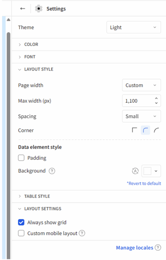
Additionally, I recommend defining your workbook Max Width (px) early in the development process to prevent having to adjust your elements many times. No matter what size you set the max width of the workbook there will always be 24 columns in the grid.
Page Overview
In case you didn’t know, in the bottom left corner of the screen, there is a little stacked lines icon. This is the page overview which shows all the elements in a page, and how they are related to each other:
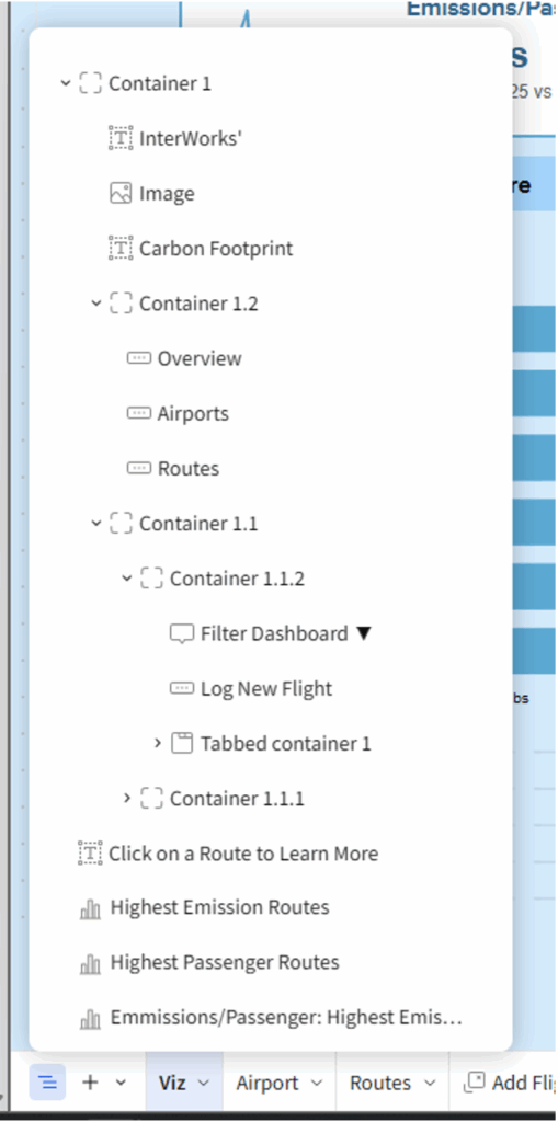
From this menu you can expand or contract elements within a container and select elements to highlight them on the page. For those familiar with Tableau this is essentially your item hierarchy. When working on design in a workbook I find myself referring to the Page overview often to understand why elements are behaving in any given way.
Understanding Container Settings and How to Use Them
Now we have set up our workbook and understand how to track the hierarchy of item management, we are ready to start building our data app. Although it is tempting to start throwing cool elements and visualizations up on the screen, the first thing you should put down is a container. Outside of containers elements will always have a gap between each other. However, in containers element gap is a setting which can be switched on and off. So, by using a container for the entire page, we gain maximum flexibility in our layout. Additionally, containers do not necessarily take up space, so we are not losing out on valuable digital real estate.
Now let’s dive into the settings for containers, what they do and how to use them.
First, under the properties pane we have Layout Grid Density. This setting controls the number of grid columns in said container.
- Low: 6 Columns
- Medium: 12 Columns
- High: 24 Columns
This is true regardless of the container’s width. Meaning if you want to jam in more elements, you can have multiple high-density containers adjacent to each other:
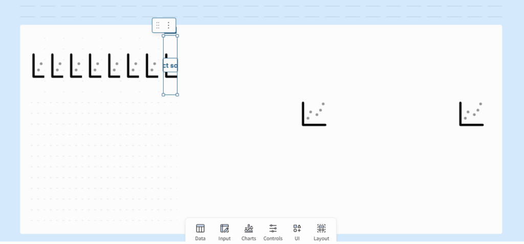
Here is an example of how three high density containers next to each other can look. Notice how the columns outside of the container are wider than those inside the container:
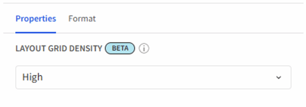
I recommend setting this to “High” on all containers as this will give you the most flexibility on element placement.
Next, we have the format settings:
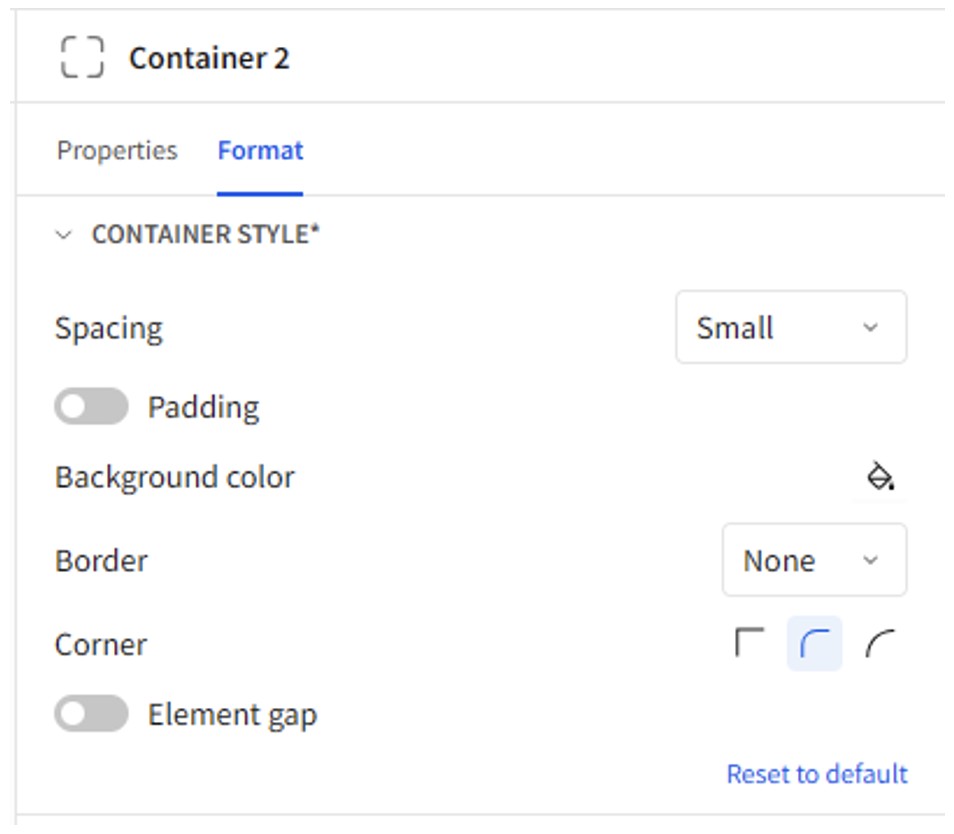
Spacing works just like the workbook setting but on a container level. Again, I prefer to set this to “Small” for most containers.
Padding essentially works like internal padding in Tableau, so when this is turned on in a container it prevents elements within that container from touching the border of the container.
Element gap is something we have already touched on. This tool controls whether elements within the container will touch or have some space between them.
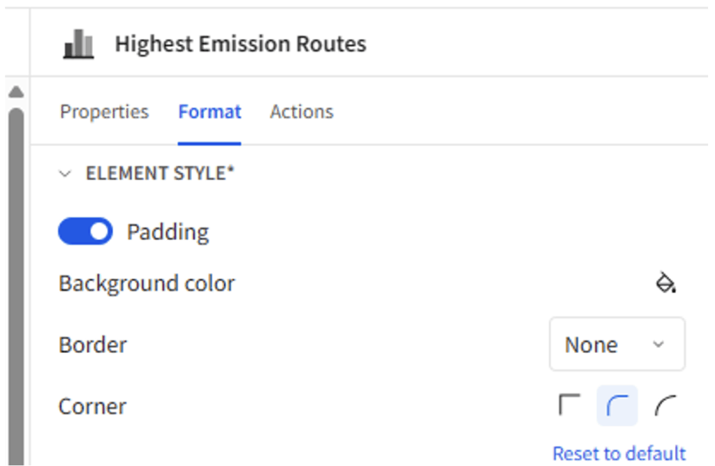
Element Padding
Just like there is a setting for padding in elements, there is such a setting for many element types. It works in the same way essentially as internal padding, adding space in between the content of the element and its border:
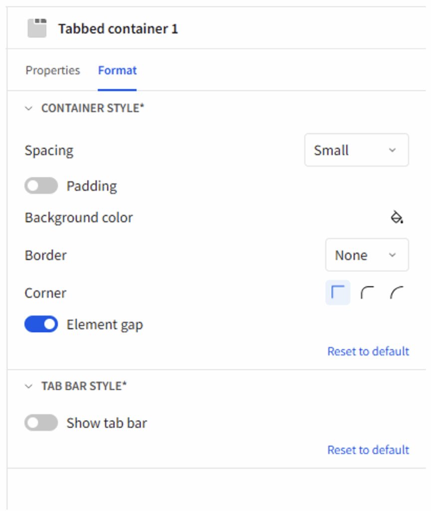
Hidden Tabbed Containers
I have one last trick for you that can really make your data apps look clean and professional: Hidden tabbed containers. The secret is that tabbed containers have an option where you can turn the tab bar off:
This allows you to cycle through different elements in the same space with ease. For example, I have this map in my data app:
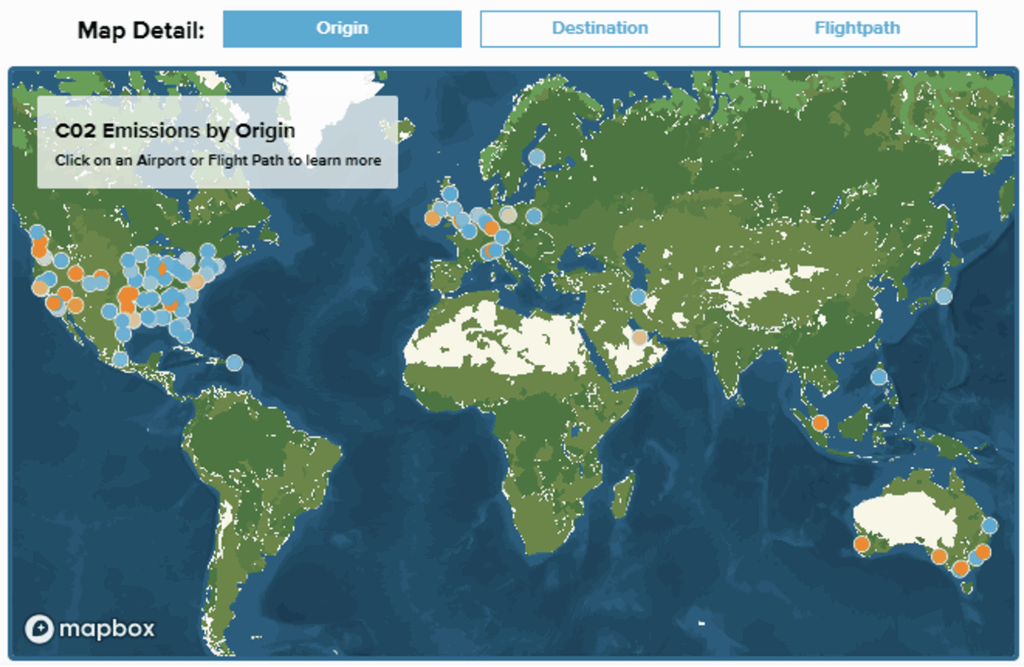
What is displayed on the map is changed by the buttons on top. However, there is no way to dynamically change what a button looks like when it is selected in Sigma. However, by Duplicating the buttons and putting the copies into separate tabs we can create a tab for each possible selection. Then we can add the select tab action to the buttons to have them switch tabs based on which button was pushed:
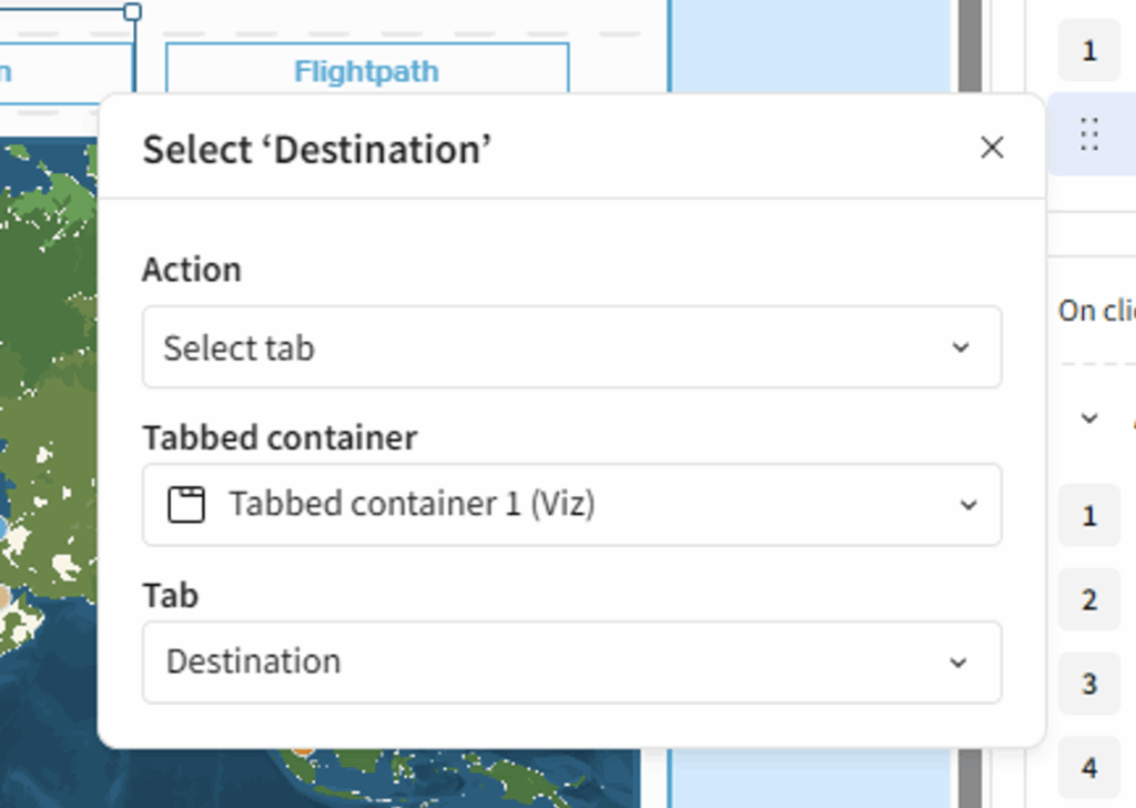
And finally, we can hide the tab headers to give the illusion of floating buttons which change color based on which is currently selected (in reality there are nine buttons in three tabs).
Wrapping Up
By combining all these settings and leveraging the grid system, we can quickly create apps which have elements that line up seamlessly. Pixel perfect pages are possible in Sigma because of the grid system not despite it.
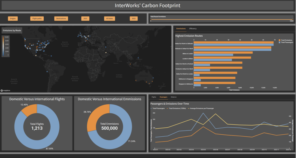
Here is a standard page of a data app before implementing pixel perfect techniques:
And here is the same view after using our techniques to clean it up:
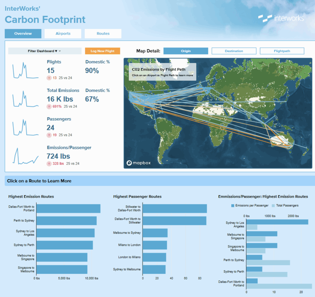
Notice how the Picture in the top right seamlessly transitions into the dashboard, but the buttons on the left still have padding. We achieved this by layering containers with different settings.
Now our app looks clean and pixel perfect. What do you want to learn about next in Sigma?