
Why Sigma?
For many data users, dashboards represent the end of the data lifecycle. Data is ingested, transformed, cleaned, analyzed and finally visualized to support understanding and decision-making. Dashboards may have different filters or ways to change views, but even with the most advanced visualization capabilities, this is where the story ends for most tools. Sigma alters the paradigm.
Sigma offers a powerful suite of visualization tools, but its capabilities are not limited to data preparation and visualization alone. In Sigma, data can be both visual and interactive; through Sigma Data Apps, decisions can be made inside of the tool itself and written back into the data.
After I finished my first dashboard in Sigma, I could not help but crave more. Sigma’s suite of visual tools exceeded my expectation but I had not begun to dive into the aspects of the tool which make it unique. It was time for an upgrade.
Popovers
The first unique tool I leveraged was one of Sigma’s newer features: the popover. Popovers are containers that appear on the screen only when activated. Additionally, they appear near where the popover button is placed. The cool thing is that they can be opened by any other element on the screen.

This allows developers to control what digital real estate will be taken up by the temporary container. One common use case for popovers is to create an expandable and compressible filters pane. This is exactly what I did. and speaking of digital real estate- wow! By using this one simple feature, I gained back a sizable portion of the screen.
Now, users can focus more of their attention on the interactive map. The map also received an upgrade.
Navigation
Sigma’s action system makes page navigation a breeze. I found it intuitive to set a conditional action that navigates the user only when they select a predefined part of the visualization, and then sets a filter control to the selected value.
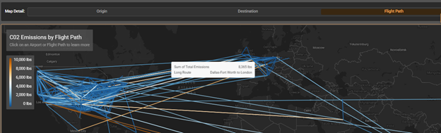
In our case, selecting a flightpath navigates the user to the “Routes” page and filters the data to the selected route.

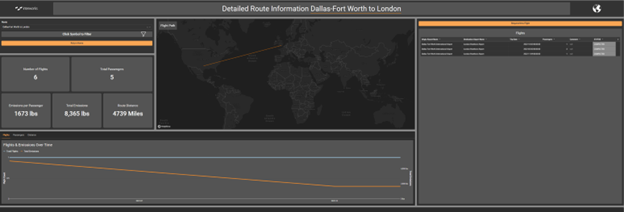
Next, a user can click on an airport name in the “Flights” table and be brought to a detailed view of the information for that airport.
This gives our data app seamless drill-through and drill-across capabilities. Sequences of actions clear and set filters or controls, navigating the user between pages with ease. The experience developed through Sigma’s navigation tools is both satisfying and intuitive. The next satisfying feature helps maintain consistency across the app while the user flies from page to page.
Synchronized Controls
Remember the filter popover from before? Well, there are three popovers in our app filled with synchronized filter controls. Popovers are stored in a particular sheet where the popover button is located. However, I wanted users to be able to access the global filters from any page. How can this be achieved in Sigma? All developers must do is duplicate the popover, then create synchronized duplicates of each filter within the popovers.
![]()
Now, when a filter is changed on one page, it is also changed on the other pages. Altogether, these synchronized popovers create the illusion of a single popover with controls that remember their settings from other pages.
Input Tables
I wanted to create not only a cool and interactive dashboard, but a functional data app where InterWorks’ team could not only analyze our carbon footprint but also interact with the data. Input tables are the heart of Sigma data apps, by using them developers can easily empower users to update or add to existing datasets. By turning the CO2 emissions dataset into an input table, that can be altered by Sigma’s row level actions, we officially cross the line from dashboard to app. Let us imagine a user who wants to add a new flight to the dataset but does not want to have to return to the data warehouse to achieve this.
The user will start by clicking a button which opens a modal:
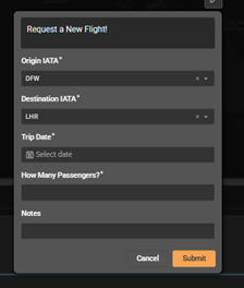
Notice how the controls for the airport code are preset for the origin and destination of the route page we were already looking at. Sigma’s actions make setting up a smooth user experience easy.
In this case, the modal contains a form which can be submitted to fill new data into the input table. The ability to make and modify input tables opens up a plethora of use-cases for Sigma. In our scenario, now users are not only able to see patterns in company carbon emissions, but also can update the app with more information. Additionally, input tables can be saved back into a data warehouse, which has implications for a myriad of use cases.
Taking It to the Next Level
I envisioned an application where employees could request company flights, and supervisors could review those flights and approve or reject the request based on the insights drawn from the visualizations – all hosted in the same app!
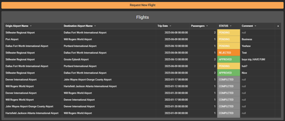
Here we see a table depicting flights with different states of approval in the STATUS column. Supervisors can click on a row in the STATUS column to update that flight request by completing the form on the modal below.
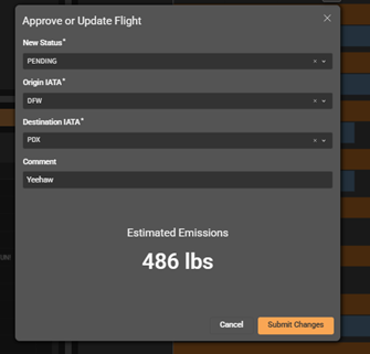
The best part is that those results are then saved back to the data warehouse, completing the data lifecycle. Data ingestion, insights and decision-making all in one place. Fully functional end-to-end data apps are entirely possible in Sigma.
Now We Are Getting Excited!
The possibilities for this tool are limitless. Keep a lookout for more Sigma blogs, guides and visualizations soon. What gets you excited about data apps?
Happy analyzing!