Oftentimes, I find myself in training or enablement sessions, showing the full list of possible functions available to use in Tableau. It’s quite a list of possibilities that starts with ABS (for the absolute value of an integer) and runs through the ZN (zero null function) — they run alphabetically top to bottom from the field helper menu:

Any formula shown in the list can be selected. This provides a definition of the function, plus example syntax on how to use the function successfully. I sometimes use it to confirm a suspicion of which formula among ones that sound very similar might work best based on the data question I have or the specific visual analysis that I need.
Remember, calculated fields are new fields that we can create in our dataset to use for further visual analysis, data exploration and breakdown in Tableau. These manually created fields will usually leverage the default data from your tables. Additionally, calculated fields can be combinations of any of your fields or parameters present in the data pane.
When you start using Tableau regularly, you’ll find that some of your best learning comes from when you are trying to accomplish a task but can’t. This was me recently when I was teaching “Level of Detail” calculations (when they are to be used, appropriate variations and why). If you’re not familiar, they are the functions called FIXED, INCLUDE and EXCLUDE.
I started my chart using my Global Superstore dataset that comes from some of the official Tableau Desktop 1 and Desktop 2 courses. These are courses that I’m certified to teach. It’s similar data to the built-in Sample Superstore, but has orders across global countries and markets, so we can customize training to specific geographic locations and make it relevant to our audiences.
The Setup
I put Category, Sub-Category onto Rows, and I put Sales onto Columns. I took a copy of Sales from the data pane, dropped it onto the Marks card on Detail. Made it discrete. Then, that Sales field was placed onto Rows next to Sub-Category. To finish my chart, I dropped Shipping Costs, Quantity, and Profit onto the Tooltip card.
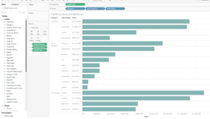
First Problem
I needed to get the total for each Category in my table, along with a total for all my Sub-Category fields combined, so I had to create a couple of FIXED calculated fields to bypass the granularity of the view, currently controlled by the Sub-Category breakdown. The FIXED formula lets me lock an aggregated value to a dimension/dimensions/no dimensions.
Calculated Field 1: { FIXED [Category] : SUM ([Sales]) } – Gives me total for each Category
Calculated Field 2: { FIXED : SUM ([Sales]) } – Gives me the total of my Sales records without a breakdown. I call this a fixed wildcard calculation since I’m using blank space as a character/field in place of a dimension.
I put both of my calculated fields onto the Detail in the Marks card, made them discrete, then moved them to Rows to generate my chart below. As your eyes scan the analysis left to right, you’re mindful of aggregated totals at each stepover. Finally, I put another copy of Sales onto Rows, converted it to a Table Calculation as Rank/Table Down, to give me ranks by Sub-Category sales:
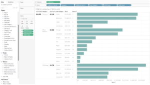
Second Problem
I needed to get a similar rank showing across my Category fields, and that’s where I hit a limitation with the view again. Seemingly, my ranking options give me the ability I need to choose a specific dimension (Category in this case), but Sub-Category is present in the view and still has a say in how things will be ranked as far as the view is concerned (rank appears broken):
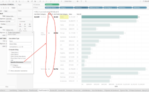
I knew that I could likely use the FIXED formula, but I wasn’t exactly sure what combination of functions I needed in order to get the ranking of my Category fields to be correct. My first thought was to lock the rank of my sales field onto Category and perform the table calculation in the calculated field directly. So, I tried that first (to no avail). I was close!
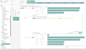
Since that still didn’t quite get me what I needed, I looked at the RANK function options and worked through a couple of edits to my original formula. The one that ended up getting me to the correct result, ended up being the RANK_DENSE, and I feel like I have conquered the world (at least for a day). I hope this is helpful to you as it was to me!
Calculated Field 3: RANK_DENSE (MIN( {FIXED [Category] : SUM ([Sales]) } )) – Gives me rank by Category sales:
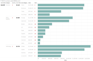
For my polished version above, obviously I made some formatting changes to the fields to make them easier for you to see. I covered formatting changes to fields in one of my other recent blogs if you’d like to check that out.
Again, some of your most memorable moments in Tableau will start as pain points. Don’t get frustrated — work it out and celebrate once you find your answer. Then, share it with the world!

