
Tableau Pulse is here! The newest development of the Tableau world, launched and driven by artificial intelligence. If you haven’t seen much about what Tableau Pulse is and how it works, check out some of the blogs my colleagues and I have already published to get you onboarded.
Here, I’ll give you detailed and practical guidance on how to actually implement Tableau Pulse: how to enable it, how to build your metric definition, then your metrics and how to get this going into your company’s communication workflow.
Tableau Pulse Requirements
- Tableau Pulse is only available in Tableau Cloud.
- Tableau Pulse works only on published data sources. If you need additional guidance on how to build them, check out these two detailed blogs on published data sources, and how to get them ready for Pulse.
- Remember to do your data prep on your published data sources before using Tableau Pulse. Your success using Tableau Pulse can only be as good as the quality of the data you’re using.
So, make sure you have clean, high-quality published data sources on Tableau Cloud before starting your Tableau Pulse experience. If you do, you’re ready to start exploring this exciting tool.
How To Enable Tableau Pulse
In order to enable Pulse, you’ll just have to go to the settings of your Tableau Cloud, scroll down a little and click on Tableau Pulse Deployment:
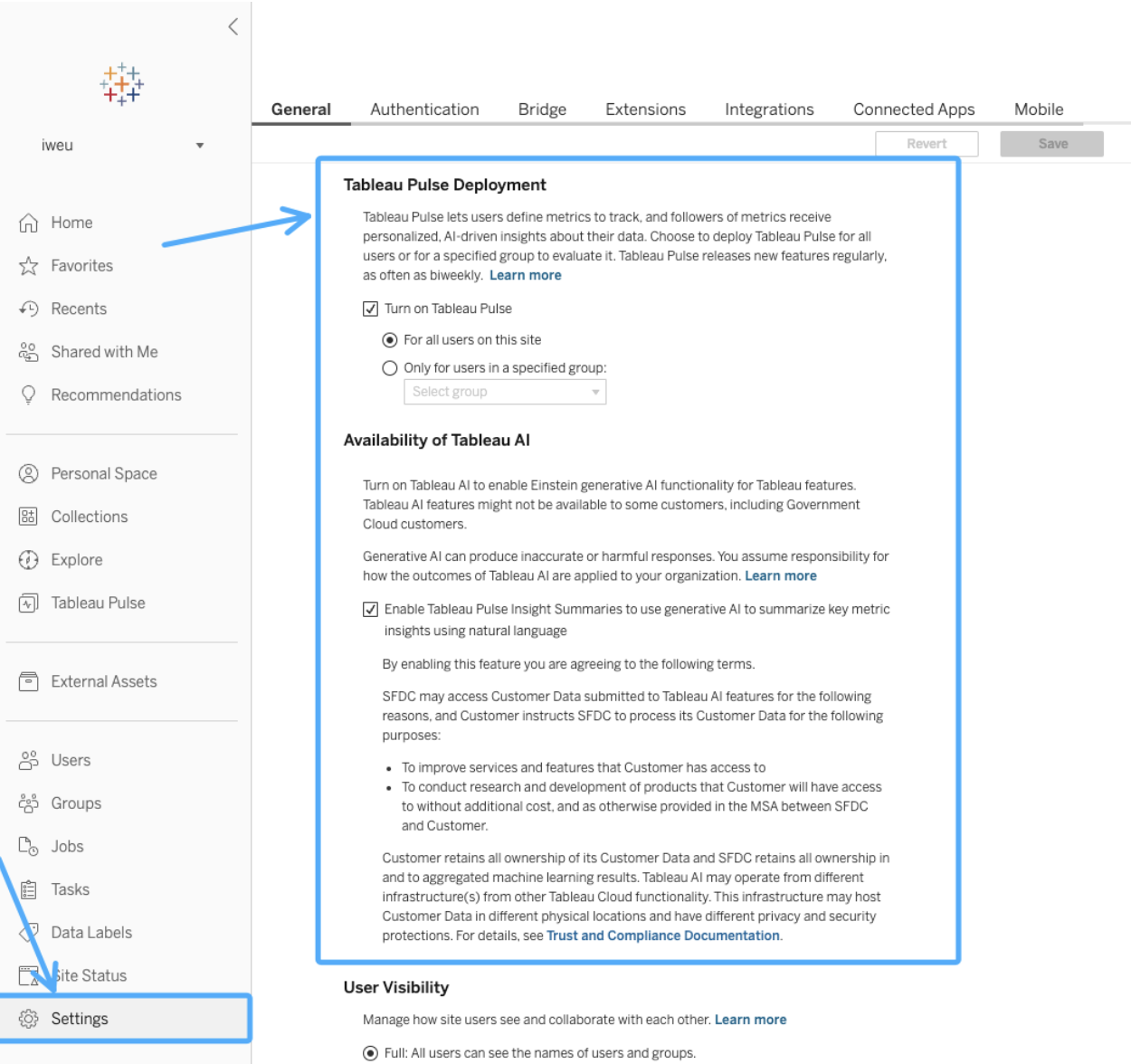
You’ll have the option to enable it for all users in the site, or just for a particular selection of groups of users. Make sure you read the Tableau AI availability section. This means that you authorize Tableau to use generative artificial intelligence to analyze your published data sources and get insights from them, which is one of the core elements of Tableau Pulse.
Regarding permission: Creators, Site Administrator Explorers or Explorers (users who can publish) are all able to create metric definitions. While the ability to see the data for a metric depends on access to the data in the data source that the metric is connected to, Tableau Pulse doesn’t prompt users to sign in to the database or data connection for the data source.
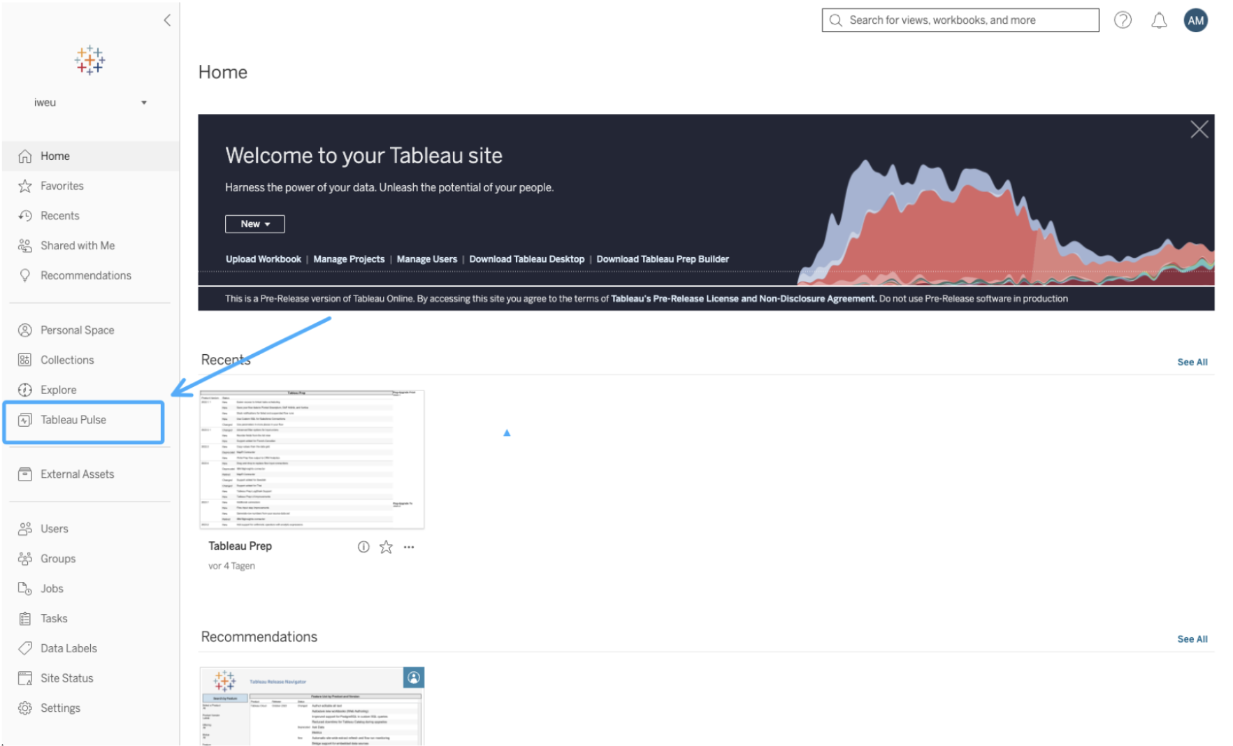
Once activated, you’ll see a new navigation button for Tableau Pulse on your left-hand side panel. Click on it:
The Tableau Pulse Environment
Tableau Pulse has a completely different environment than Tableau Cloud. You’ll be redirected to it:
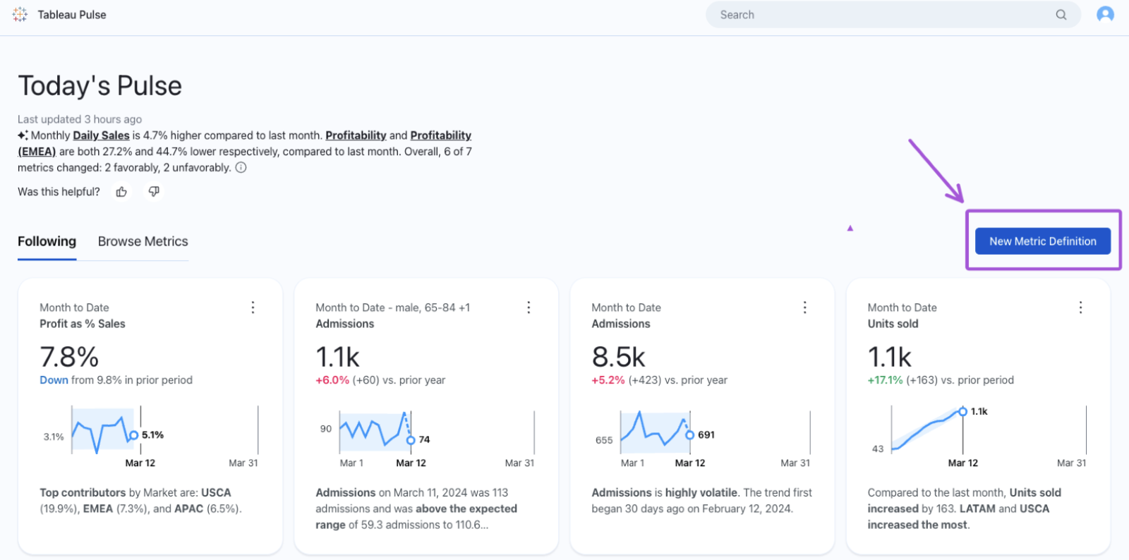
If this is your first time visiting Tableau Pulse, your screen should appear mostly empty. That’s because Pulse will show in the first tab those metrics that you’re following. You can also click on the second tab, Browse Metrics, to check any existing previously built metrics that you could start following. We’ll get back to this point.
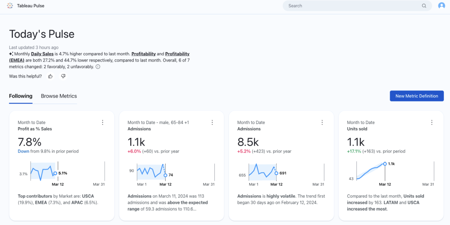
At this point, we’ll assume that no metric definition has been created and, as a result, no metric is to be found yet in our Pulse environment.
Metric Definitions and Metrics
To start building content, we need to build metric definitions, which is the foundation of Tableau Pulse. And for that, two concepts must be crystal clear:
A metric definition is a set of rules and lays out the base of metrics. We need first to build the definition and from it, we can build the metrics themselves. So, with a metric definition, we define the data source of the measure that we will analyze, the measure itself and its corresponding time dimension.
By establishment of a metric definition results in the creation of a chart, with a KPI and a Sparkline. That’s your first metric: a metric with no segmentation. By modifying the scope of that first metric through the use of filters, we can create other metrics, which are always a special cases of that first metric created and that are always restricted to our original definition.
The following chart summarizes these ideas:
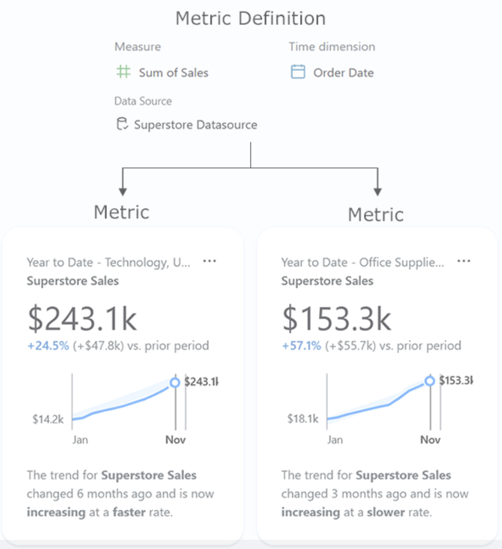
Note the “Technology” and “Office Supplies” are filters on the original metric definition creating two new metrics.
Create a Metric Definition
The process of creating a metric definition is relatively simple. However, it is worth to pay attention to all details and options, to make the best of them. Here are the steps, one by one:
1. Click on “New Metric Definition:”
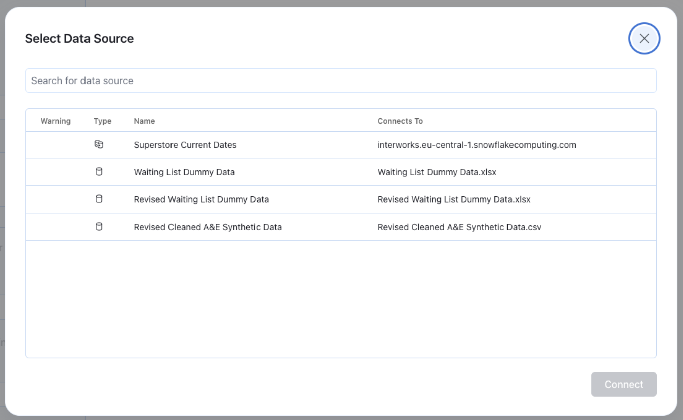
 2. Select the published data source:
Now we are in a new interface. Notice the two areas. A left-hand side panel where we will create the definition (blue selected) and an empty canvas, where our first metric will appear, once created the definition (purple selected):
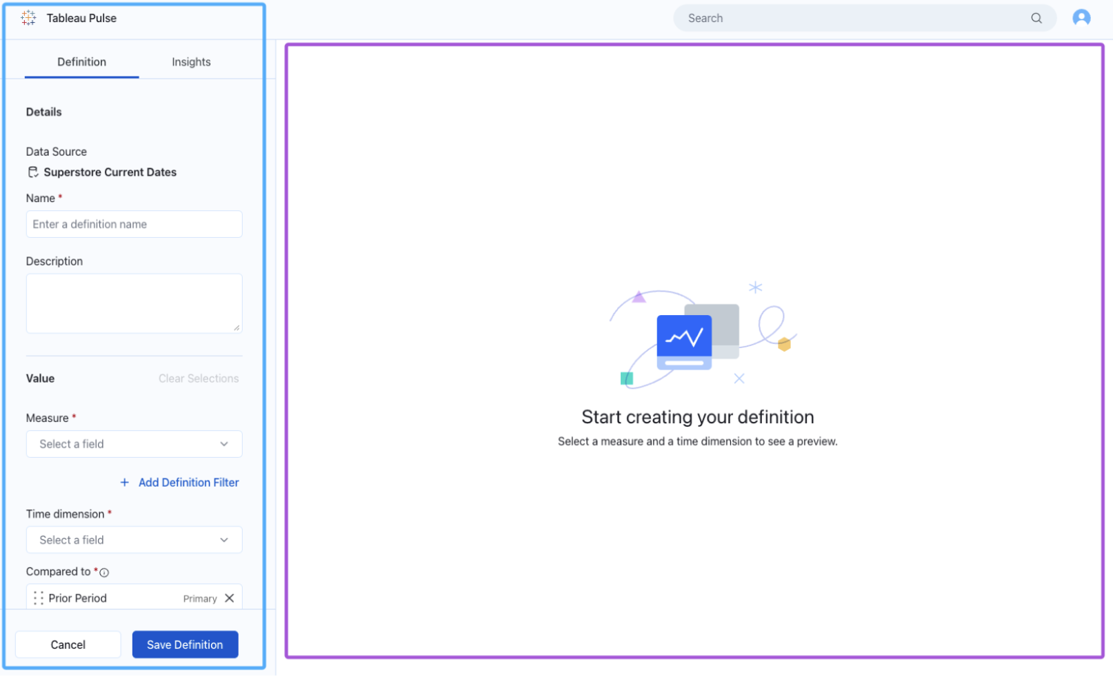
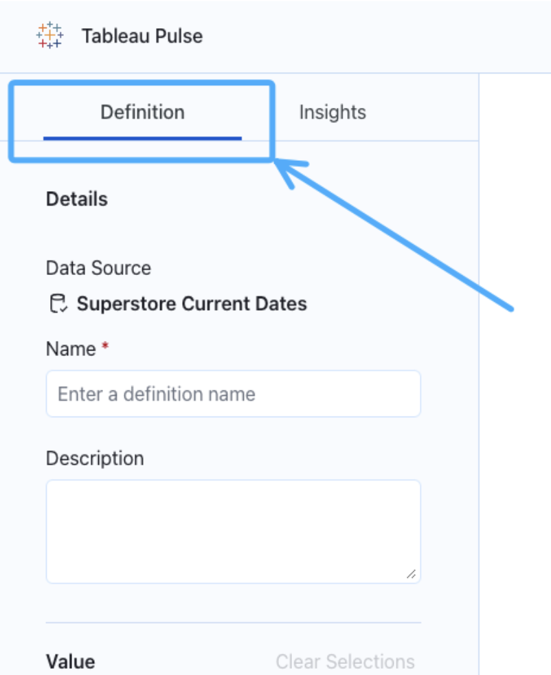
Notice that our panel has actually two sections: definition and insights. We will need them both. We’ll start with the definition, of course:
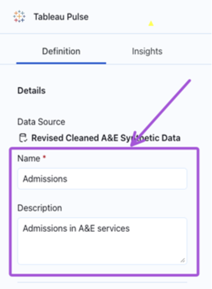
Remember: our definition possesses three essential elements: data source, measure and time dimension.
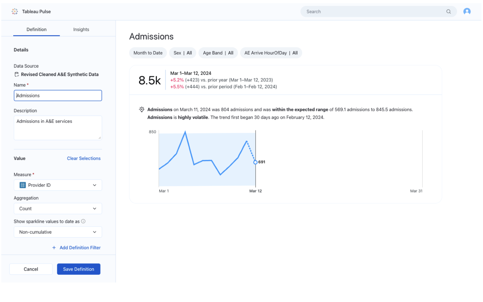
3. Now select the measure and add a corresponding description. I’ll show you using the example of admissions in accidents and emergencies services:
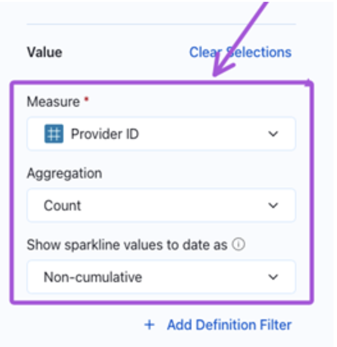
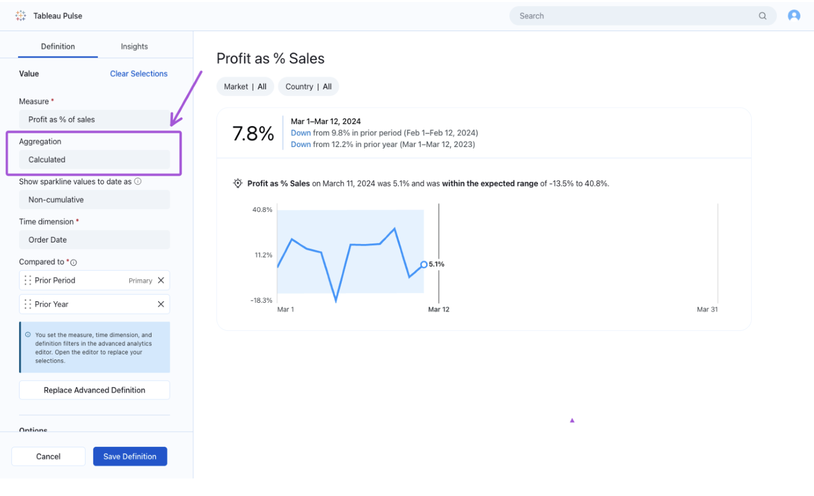
4. Now you must select the measure we will analyze in this metric definition. It has to be aggregated to some level: sum, average, count distinct, for instance. The typical aggregations in Tableau. The aggregation could also be a running total or non-cumulative. You have the option to add a definition filter, which is different from the filters that the users can use. This one will reduce the scope of the definition itself:
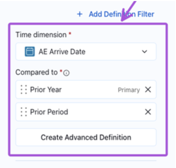
5. Next select the time dimension and the comparison periods, which could be prior year and/or prior period:
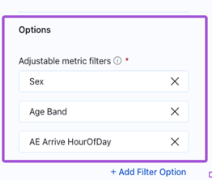
6. Those were the essential characteristics of a metric definition. Next steps are optional, but also desirable. Add adjustable filters. These can be manipulated by the end users and, through them, they can create new metrics from the definition. They will appear on top of the metric chart:
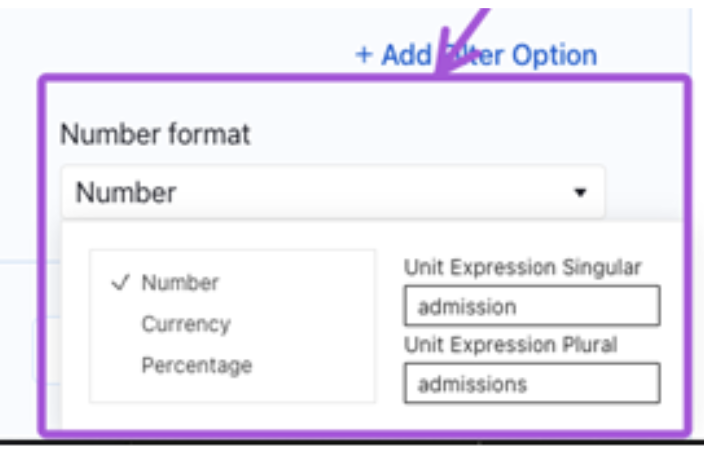
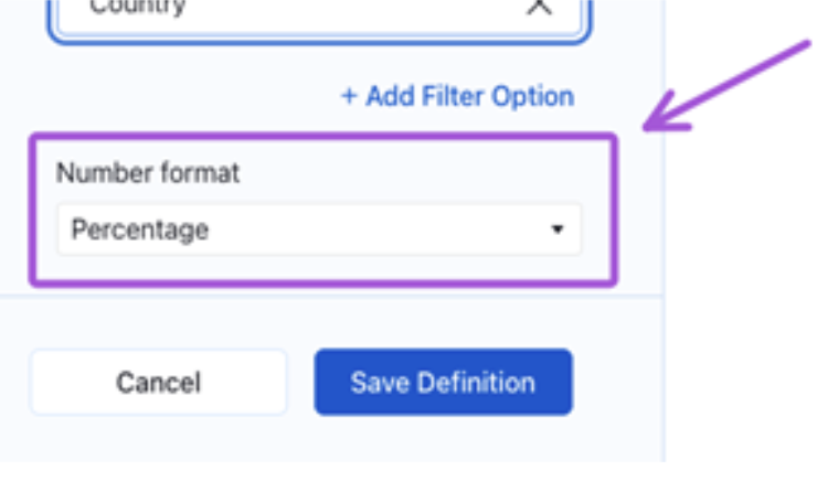
7. Final step on this is to select the format of the measure shown and add the terminology in singular and plural for the elements that we are analyzing in this metric definition. It will let texts become more natural in language:
The panel on the left-hand side is the metric definition, the chart itself is a metric:
It might appear that our metric is ready, but we still have more options to perfect our definition and adapt it to more what we’re looking for.
Metric Insights
8. Afterwards, go to the Insights section. Here you will be able to set an interpretation of if it’s favorable or not that the value increases. This will improve your insights and will better guide the AI behind Pulse. I’ll show you with two examples: sales, whose values going up is positive, and admissions, which is quite the opposite:
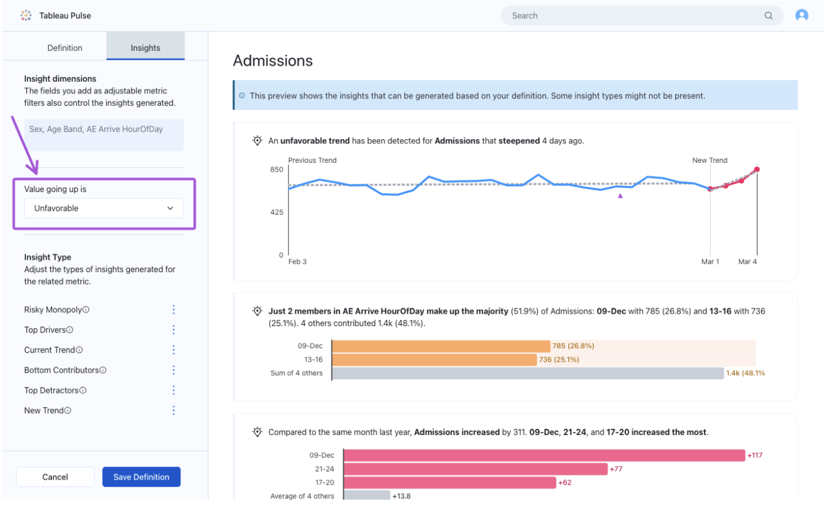
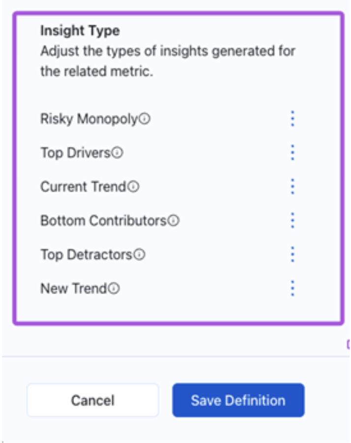
9. Plus, you can decide turning off any of the insight types Pulse offers. Tableau gives you the relevant information to decide. You’re able to deactivate those who you don’t find relevant. These are the types of insights Tableau Pulse creates:
- Risky monopoly: show dimensions with a concentration of very high values.
- Top drivers: shows which values for a metric that increased the most across a specific time offset.
- Current trend: shows current trends to communicate the rate of change direction and fluctuations for the metric value.
- Bottom contributors: shows the lowest values in a dimension for a metric within a given time range.
- Top detractors: Shows the values for a metric that decreased the most across a specified time offset.
- New trend: shows new trends to communicate the rate of change, direction and fluctuation for the metric value.
After this you are finally ready to hit the Save Definition button:
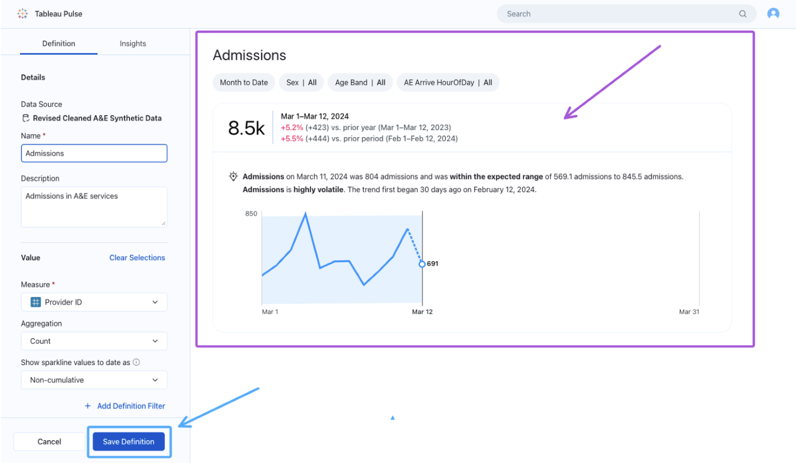
Again, you’ll see your first metric, or metric without segmentation, on your right-hand side.
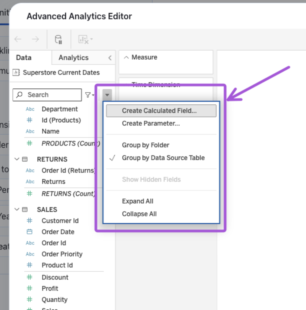
Use a Calculated Field as a Metric Definition
If the field that you’re using is not exactly the one that you need, you have the option to create a calculated field by using the advanced definition menu:
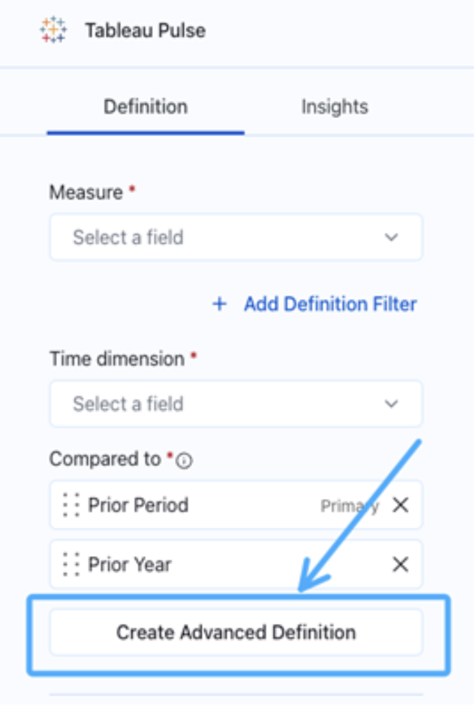
There, you’ll have the option to model, similar to when you open a published data source:
And you’ll have the option to create a calculated field:
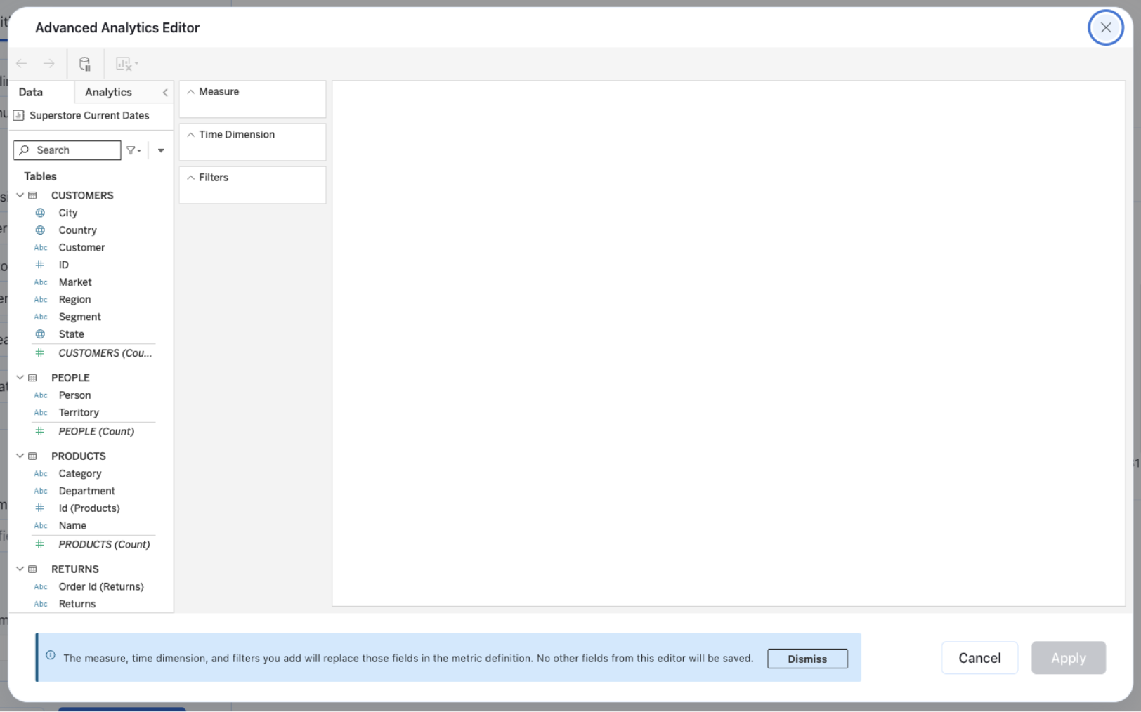
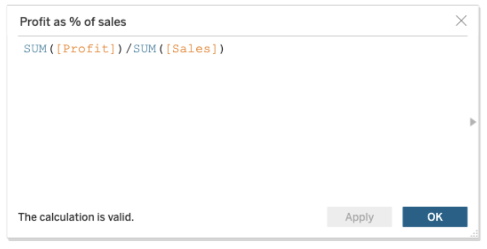
In this example, I’ll create the classic Profit as % of sales:
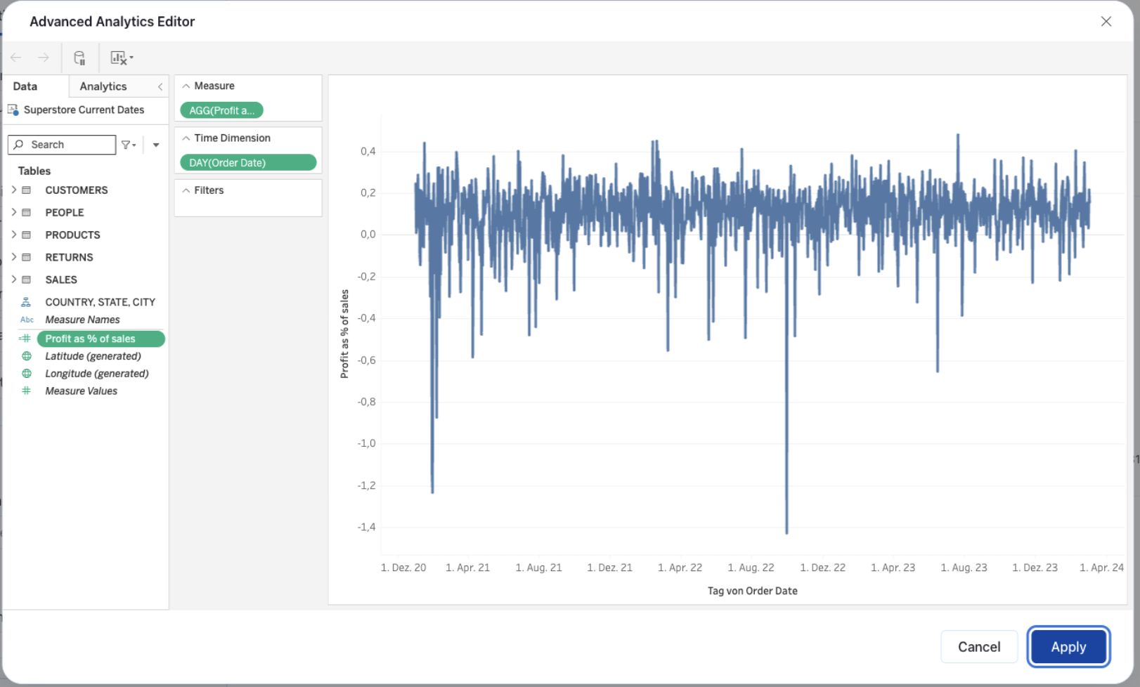
Next, you’ll have to add the new field to measure and then add a date field. Tableau will create a chart to visualize the result. It’s not actually the metric though. You can add a filter, which is not the same as the filters for the users, but a pre applied filter to reduce the scope. In other words, a definition filter, if wanted:
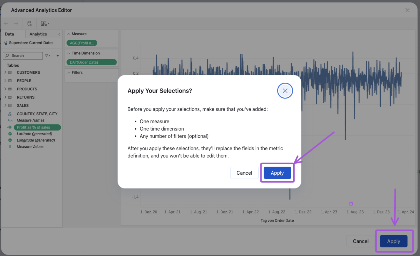
When you’re done, click on Save Definition, and the new metric definition will be created:
Now, you’ll notice that your measure in the definition is our newly created calculation. And again, what we see in the visual on the right-hand side is our metric without any segmentation:
Don’t forget to edit the format of the measure and also its insights, like we saw in the previous section:
Explore the Metric and Create Additional Ones
Once your metric definition is ready, you’ll land on a page like this one:
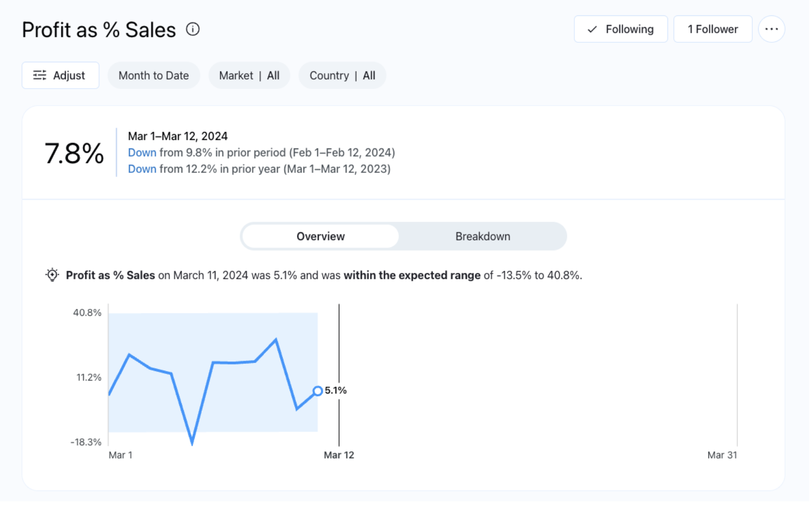
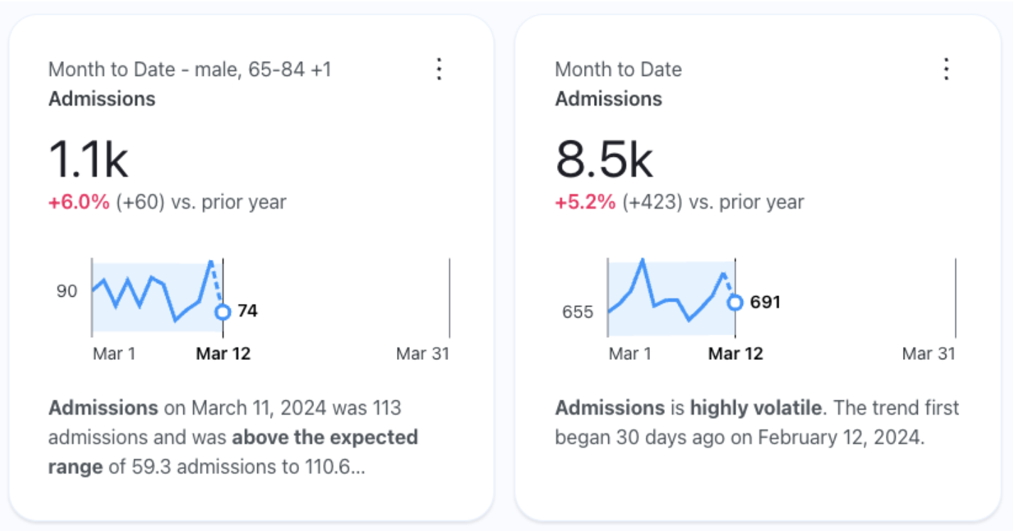
Here is our initial metric, without any segmentation. The data will always be referenced to today and by default set to month to date. For any other time segmentation, use the time filter. Explore it. Notice that the terminology we added, helps the selected summary become more natural in language. This is also generated by AI:
Once you select a different and particular segmentation, click on the blue check mark. The filters will be applied and the chart changes:
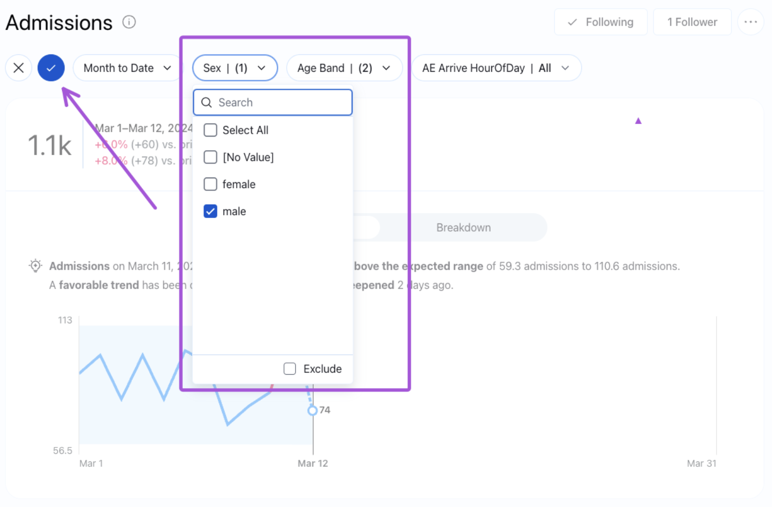
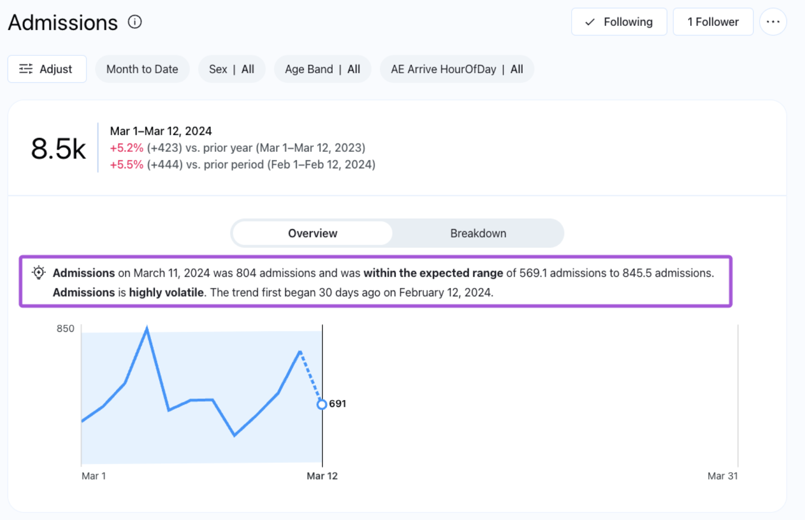
And just like that, you’ve created a new metric. You’ll noticed that now a new metric appears, according to the filters you applied. In this example, the admissions for male patients, older than 65 years old:
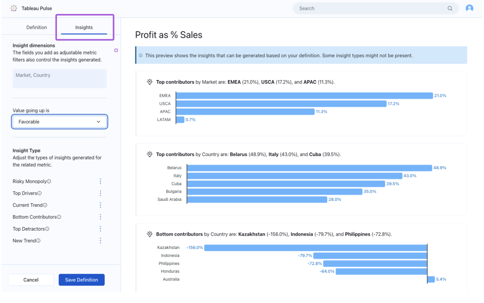
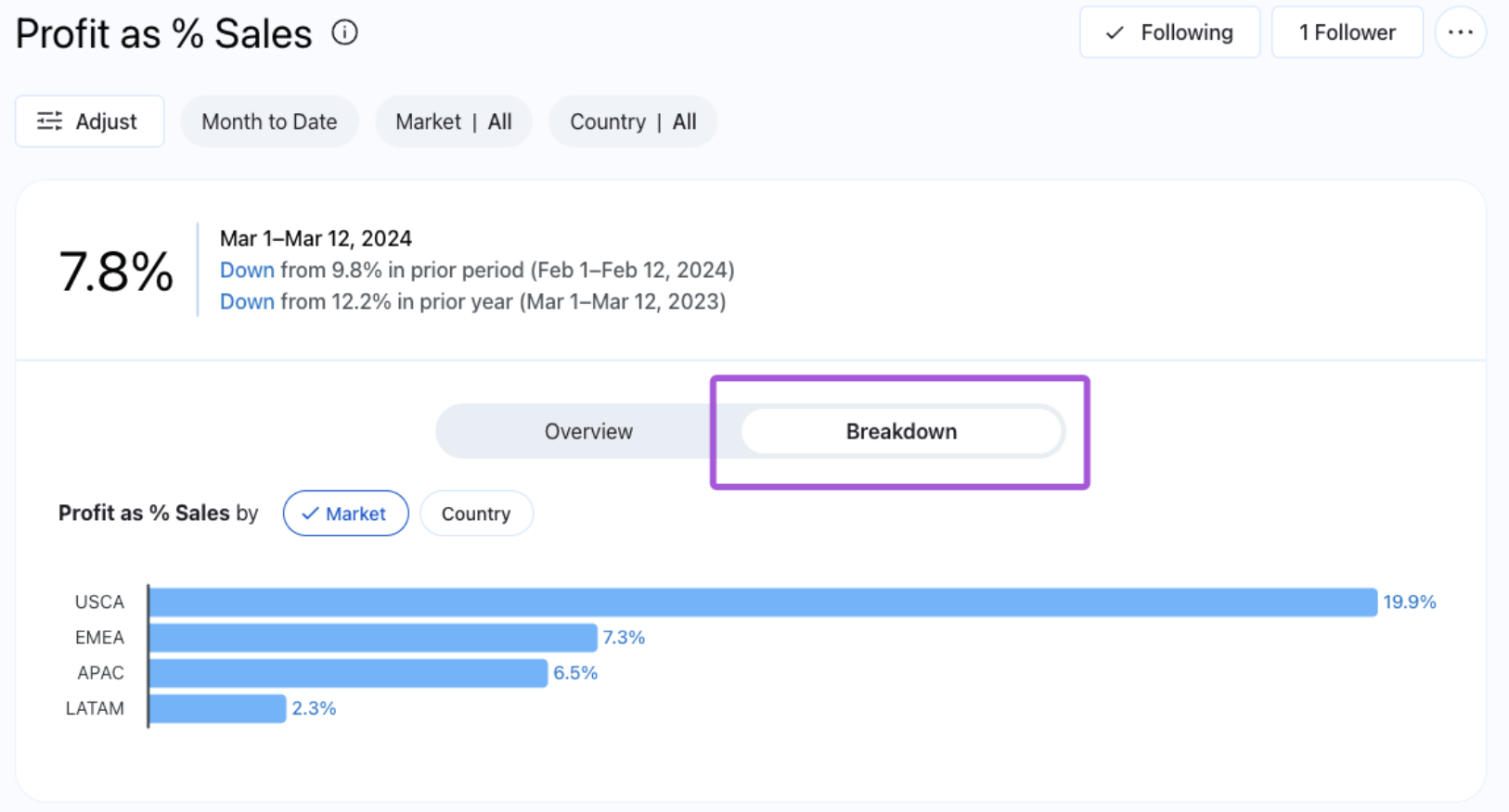
Explore the breakdowns too. Pulse breaks down your metric according to the filters you added to the definition, so those are worth analyzing, by clicking on one or another. In this example, we have Market and Country:
Afterwards, explore the insights. This is where the generative AI of Tableau Pulse enters. They are generated in your data sources and AI helps translate it into natural language:
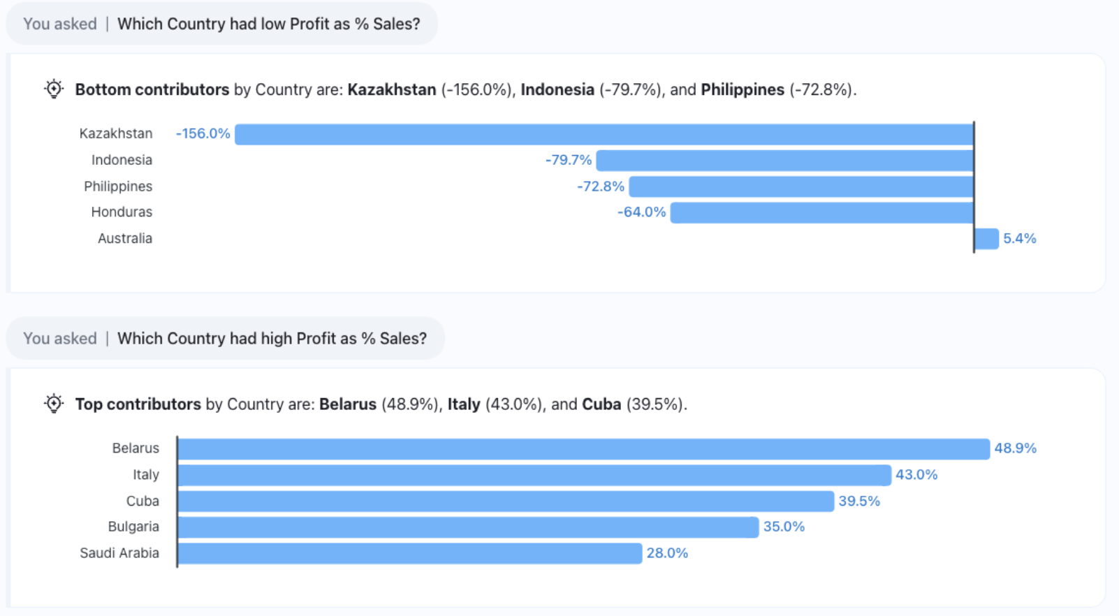
You’ll see the different type of insights, according to those you let activated in the definition and those who makes sense to your data. Click on a suggested questions to add more insights:
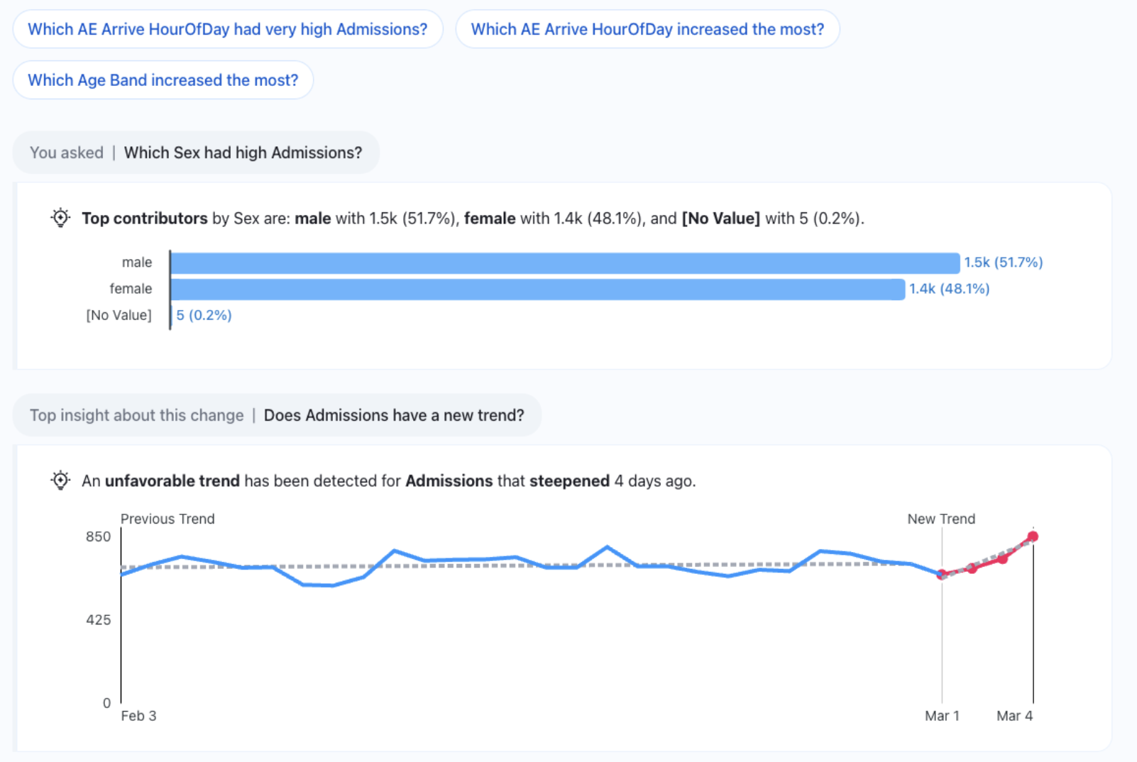
Additionally, you can give feedback to Tableau on the summaries.
Get Tableau Pulse Into Your Company’s Communication Flow
As important as creating your metrics is to subscribe to them and to add the digests into your channels. This enables communication, and completes the whole process of creating meaningful insights through the power of AI and communicating them to the people who make decisions.
So, the first step is to subscribe to the metrics that are relevant for you:
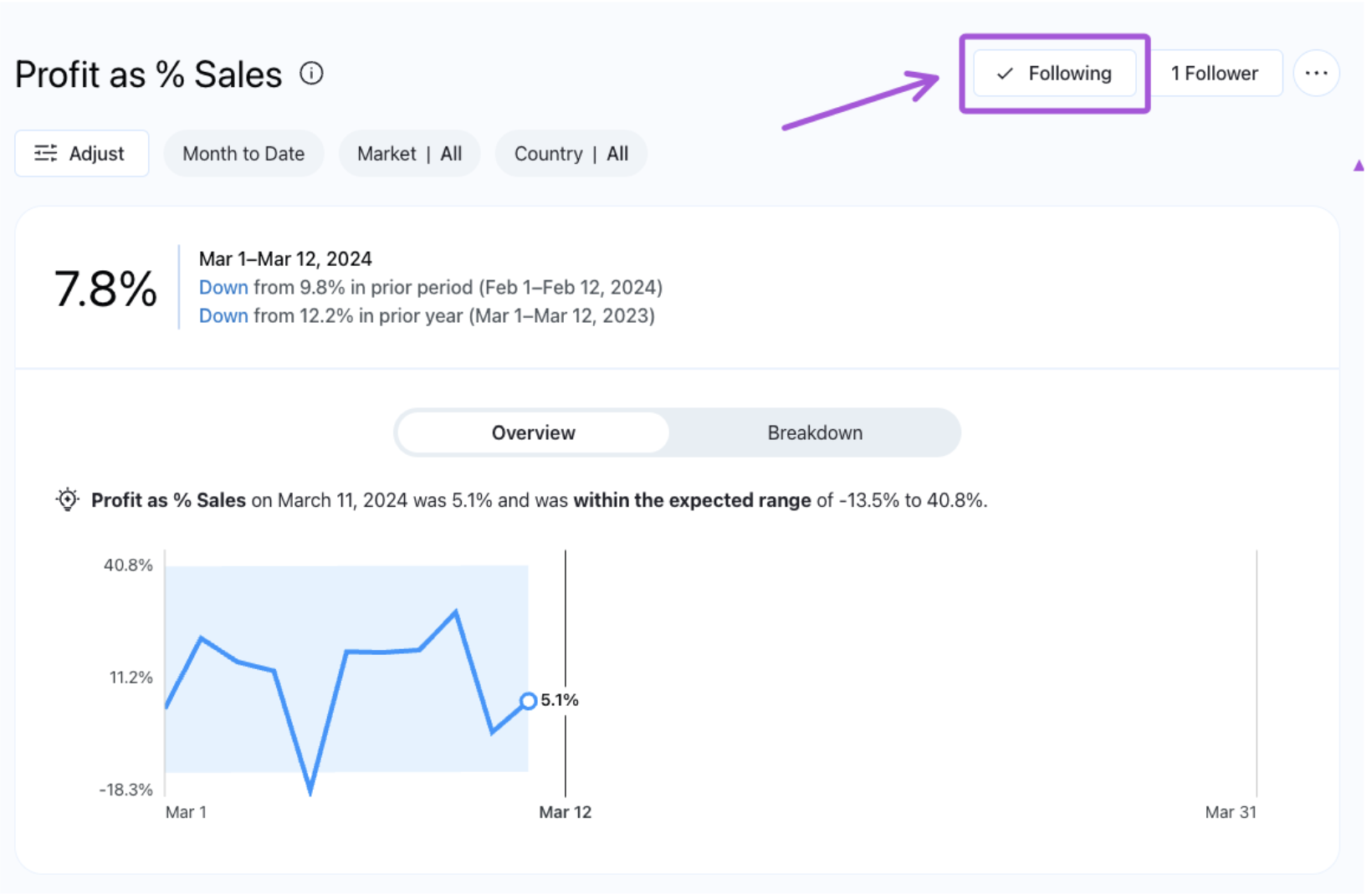
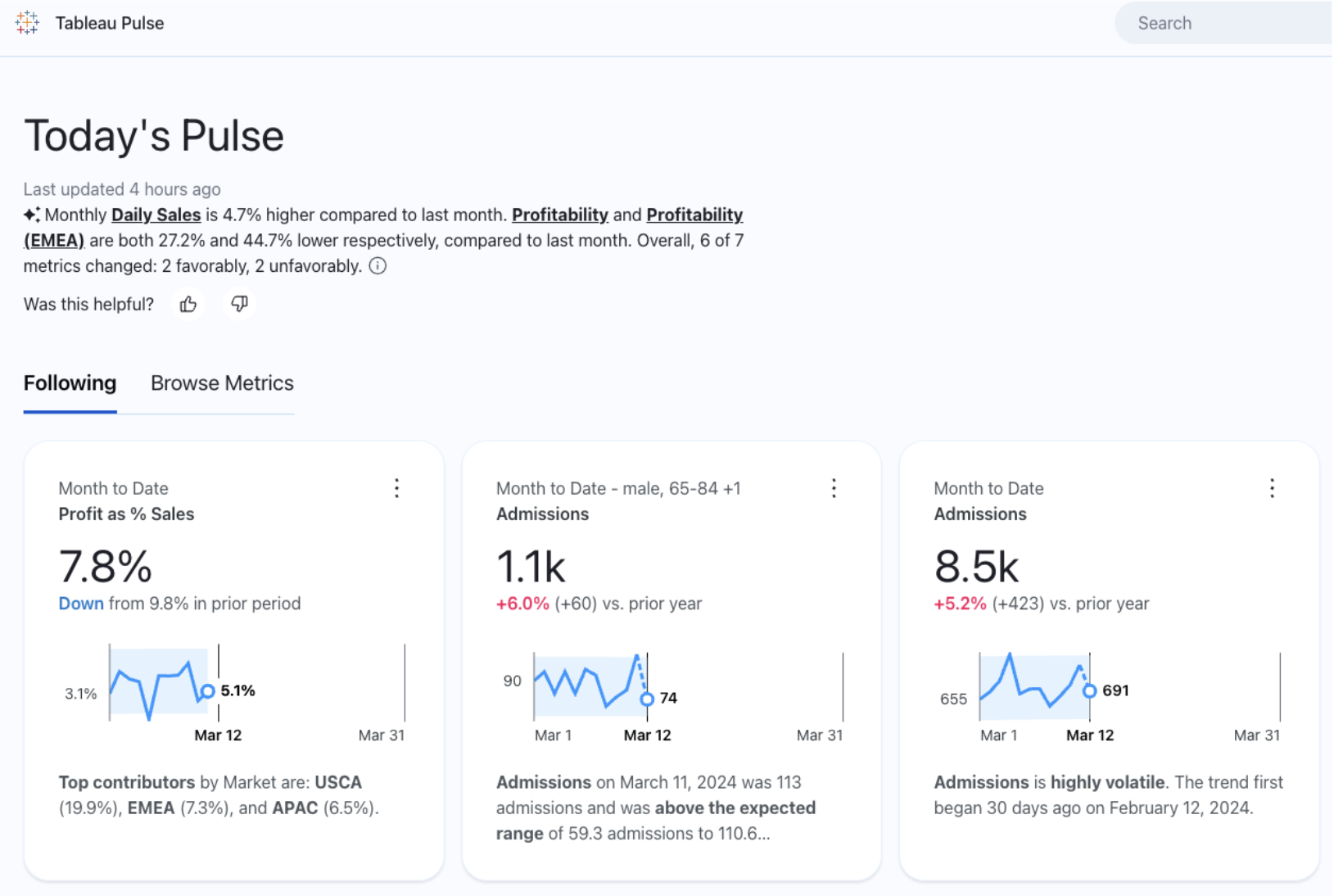
All those metrics will now appear on your Pulse starting site:
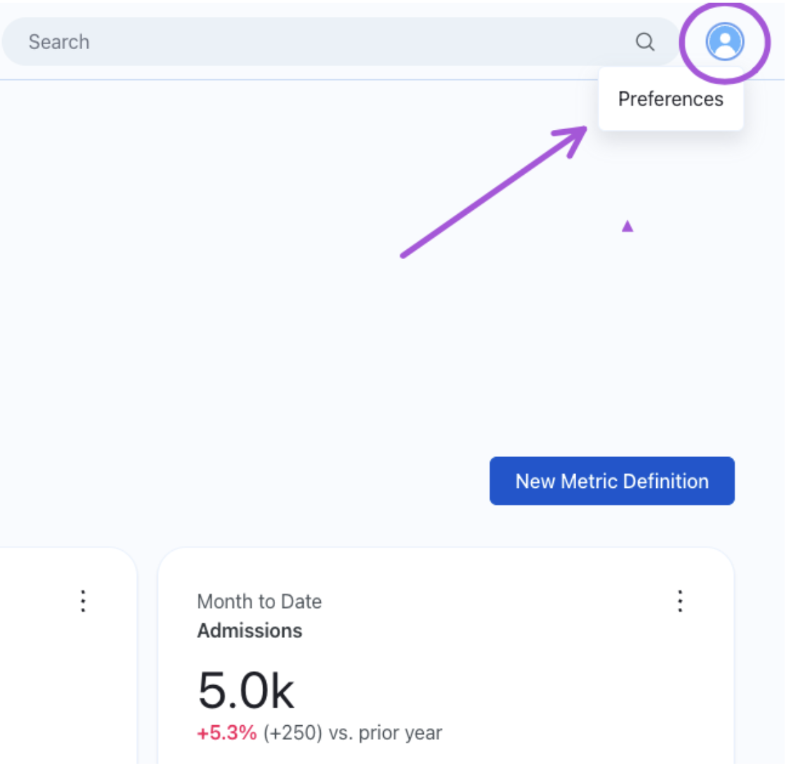
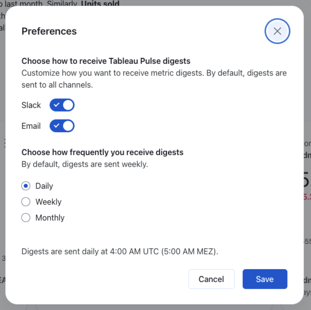
The second step is that Tableau Pulse prepares a digest, where it will show all your subscribed metrics. Could be sent daily, weekly or monthly. Remember, however, that Pulse updates daily. So, go to Preferences on Pulse:
And define the channels where you’d like to receive this digest, like an email or a message on Slack, and its frequency:
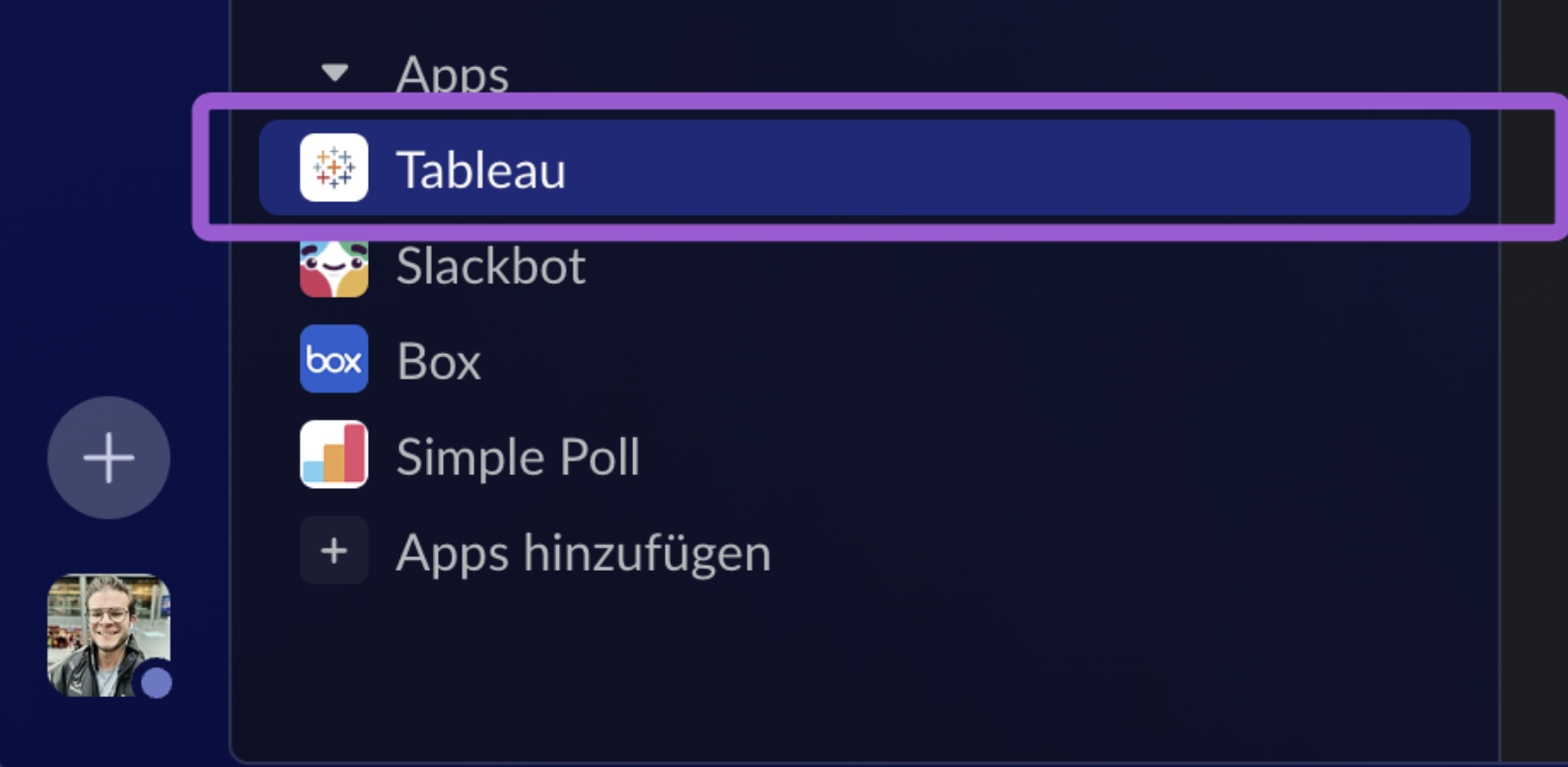
If you choose Slack, don’t forget to install the Tableau app in Slack. You may need to ask your Slack admin to add this:
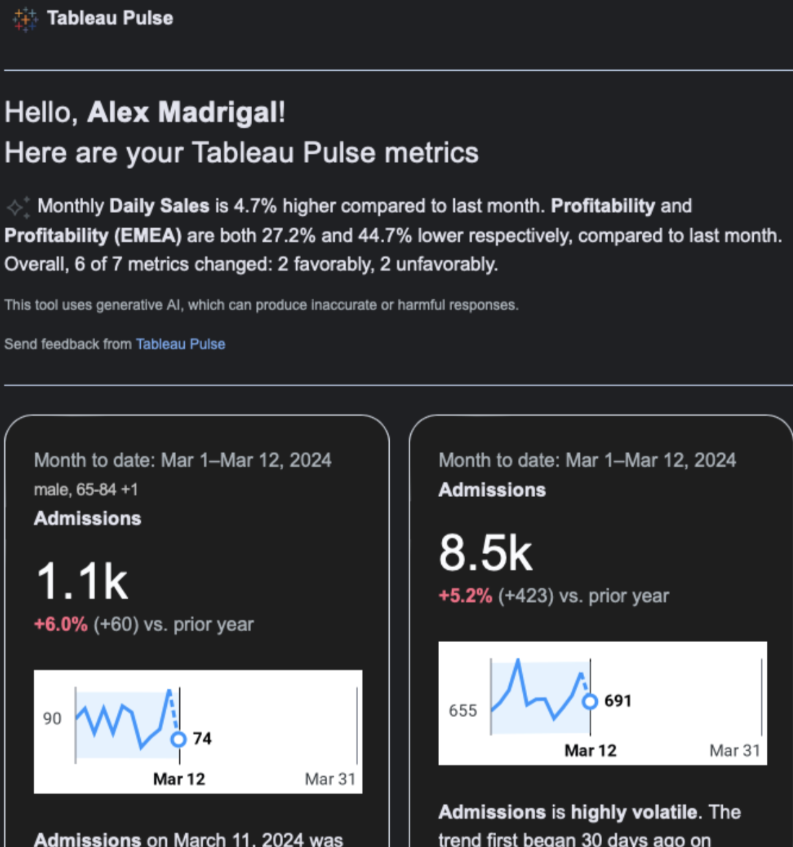
Your digests will arrive early in the morning through the selected channels to all those subscribed, and thus completing the analytics process we started by setting up Pulse and creating our definitions, with the always important effective communication.
I hope all Tableau users out there can make the best use of this powerful tool. If you need support implementing your data and AI strategy in your business or institution or assessing potential benefits of AI, please reach out to us. We’ll be glad to offer you technical support and guidance.