
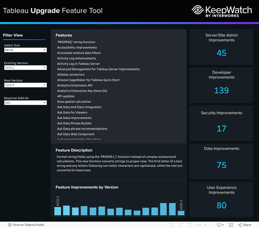
Comparing Upgrades for Different Versions of Tableau
I’ve built a Tableau dashboard here to help see the new features between your existing Tableau version and potential planned upgrades. It also includes options for Tableau Server, Desktop, Mobile and Cloud.
If you want to know more about why I made this and other supplemental information, check out the rest of the post below!
What Opportunity Did I See?
As part of our ServerCare offering here at InterWorks, we perform Tableau server upgrades for our clients, which allows them to not worry about the backend knowledge or effort required to complete their tasks. When I joined the team, I saw an opportunity to provide information to both our clients and the wider community.
Most front-end users care about the fantastic new features that Tableau launches with their major releases, but not always the differences between their current and intended versions. I took it upon myself to create a dataset of features, both by release and by Tableau product, from which I could then build a visualisation.
How Did I Go About Getting the Data?
I needed to understand what I wanted from my dashboard before I put my data together. This would mean I wouldn’t need to keep going back and changing the data or structure to reduce development time. I also needed to verify what I thought my end user might benefit from and what others thought by discussing options and changes with my peers. It would be pointless and unproductive for me to build something that others wouldn’t see value in (which is a fantastic approach for anything you create to ensure things land correctly the first time).
Once I knew the fields and visuals required, I set about finding the Data I needed to fulfil my needs. Fortunately, Tableau creates insightful and detailed feature release pages that contain the feature, description, product and version. I decided to take the quicker option to manually copy and paste the Data I needed rather than create code to web-scrape the page, though for future versions of my visual, I intend to do the latter to utilise the hotfixes between minor releases. One piece of Data I believe would be fruitful to my end-user would be where the feature may fit within their requirements, such as Developer, Security, Data, User Experience or Server/Site Admin Improvements.
How Did I Build the Visual?
I had a few intricate calculations and actions I wanted to take advantage of. Because I had pre-planned the measure and information I needed and pre-built the data, creating the Tableau sheets was much quicker than it would have been without this prep. I wanted to move on to making this dashboard stand out from others in Tableau Public with a custom design, so I started arranging my sheets in a Tableau dashboard and sized them accurately to take a screenshot and paste it into Adobe Photoshop. With this pasted, I could begin to create layers over the Tableau draft with custom shapes and gradients to match the InterWorks styles used in blogs and dashboards, allowing me to create a visual matching to our brand and much more attractive if shared publicly.
I used this image background within my Tableau Dashboard. I started to layer the sheets as floating objects over their desired locations, making sure to check that the x and y locations aligned to create an accurately formatted dashboard. Once happy that everything was set out and matched to my original draft, I worked with our BI Consultants to tweak some of the calculations and actions to ensure the descriptions of the feature showed only one option for the feature you hover over to reduce clutter within the dashboard. Finally, I sent the view to our graphics and branding team to make final tweaks to the colour and imagery to ensure everything met our internal style guide.