
The Eyeo Festival can probably be best described by the way in which it was named, which you can find in a Medium article from one of the festival’s founders:
“I came up with the name, Eyeo, which doesn’t mean anything specific, but riffs on the idea of eye-opening and I/O at the same time. It’s non-specific on purpose. We wanted the flexibility to evolve.”
-Dave Schroeder, Eyeo Festival Co-Founder
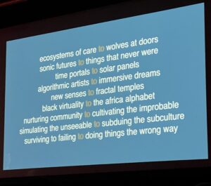
For the last 10 years, Eyeo seems to have been just that, and this year was no different. Eyeo speakers shared research about anything from Black virtuality to immersive AI dreams, from algorithmic artists to cultivating the improbable. As the future of Eyeo shifts into the hands of the community, we’d like to celebrate by sharing some of the things we learned and cool stuff we did.
Why Did We Go?
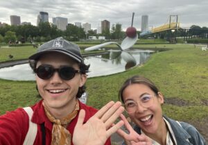
Above: Jack Hulbert and Emily Miley, authors extraordinaire, exploring the Walker Art Center while sightseeing in Minneapolis during the Festival
Emily:
I have wanted to go to Eyeo ever since I learned that data visualization extended past Tufte and what I learned in Intro to Cartography. I really like the idea of “data humanism” (probably coined by someone, but I heard it from Gioria Lupi), and really pushing the boundaries of why and how we use data to tell stories (but more on that later 😀).
Jack:
Eyeo wasn’t on my radar until Emily Slacked me saying, “Hey, this looks awesome! Let’s go.” At first, I saw a few names jump off of the page that were familiar to anyone who has worked in the data viz space, including Alberto Cairo and Giorgia Lupi. Upon further inspection, I noticed speaker names I would never imagine seeing at a technology conference, such as instrument maker Walter Kitundu and AI art pioneer Gene Kogan. This conference clearly had latitude and variety in the content, and I loved that it was oriented towards the democratization of technology and the open-source movement.
Eye-Opening Workshops
Emily:
Honestly if someone told me I could learn to explore data by drawing with charcoal, I probably wouldn’t believe them. I’ve always dabbled in the creative world, but wasn’t really sure how closely I could bridge the gap between art and data analytics. So, when I realized that Eyeo was hosting a workshop that was a marriage between art and analytics AND it was put on by Stefanie Posavec (Twitter: @stefpos), I signed up so dang quick.
First of all, I’d like to point out that Posavec has such a vivid and colorful imagination. Her body of work spans from complicated process mapping turned art masterpiece to arguably the coolest children’s book I’ve ever seen, which was the winner of the Royal Society Young People’s Book Prize in 2021. Her (and Giorgia Lupi’s) work is featured in MoMA in an exhibit as a way to document day-to-day experiences with data.
During the workshop, she did an incredible job of distilling really complicated artistic principals and practices into simple exercises that got us thinking about how we look at data and data projects. She took us through multiple iterations of practicing with materials, then gathering inspiration from the class, then exploring small datasets visually. In a later presentation, she told the audience that she adopted a mindset of “calculated wrongness,” and took us on a journey as she talked about “twisting, turning, reacting, subverting, breaking and pushing without knowing – the rules.”
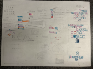
Above: An example of my second draft processing a dataset about bestselling books and corresponding information about them.
From her presentations, my favorite quote that she used to illustrate the value of starting data exploration in an analog way was:
“Each person draws a line differently and each person understands words differently”
– Sol LeWitt
Jack:
Of the three workshops offered at Eyeo this year, I chose to attend the interactive machine learning session with programmer and artist Gene Kogan, whose work I have closely followed over the years through Twitter and Github. The goal of this workshop was to simply show the art of possibility with artificial intelligence (AI) and what Kogan describes as a “collective imagination.”
Part one of the workshop was a crash course in AI and debunking some popular myths around the capabilities, limitations and future of AI. Kogan went into exceptional depth in demonstrating how popular machine learning models can be made accessible to non-coders to carry out creative tasks such as video editing, text generation and interactive digital art. The bulk of this time was spent working with a tool called RunwayML, a platform designed for digital artists to bring creative coding and no-code machine learning into their projects. A few sample projects we covered in the workshop included the automated captioning of images, generating photorealistic images from doodles made in Microsoft Paint and generating images based on text.
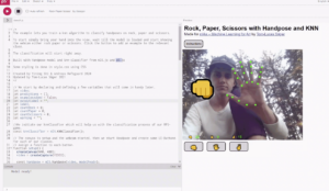
Above: Training a rock, paper, scissors classifier using my own hand movements and my webcam.
Part two of the workshop focused heavily on what Kogan calls the “collective imagination,” which is rooted in the idea that all of the data like images, words, videos and art can be collectivized and paired with AI to create novel creative works, also known as “AI Art.” While the concept is rather abstract for us in the data space, it is likely that you have come across some of the tools created under this umbrella of the collective imagination, the most prominent being Dall-e by OpenAI. If you haven’t heard of Dall-e, hold your horses and heed my warning that it will suck up a considerable amount of your free time.
Dall-e is built on a language model trained with 12 billion parameters. In layman’s terms, this is a model that has been trained on a massive quantity of data points including words, images and media. With Dall-e, a user can enter any random combination of keywords and the engine will generate a unique, anthropomorphized, high-resolution image of a dream-like landscape that is closely related to the keywords entered. In the workshop, Kogan introduced us to a project he co-leads, Abraham AI, which functions similarly to Dall-e.
Abraham AI returned these results for the following queries:

Above: “Cutting a wedding cake with a chainsaw”
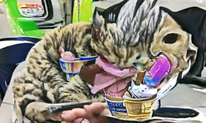
Above: “Cat eating ice cream”
Who We Saw
Giorgia Lupi (Twitter: @giorgialupi)
For those in the data visualization world, Giorgia Lupi needs no introduction. An Italian designer who recently joined Pentagram and formally co-founded Accurat, Lupi has been one of the most influential data designers of modern history. A multi-year speaker at Eyeo, she took us through her Eyeo history, talking about various steps in her journey to becoming a data designer. She spoke of her love of data from an early age, charting out the appeal of different middle-school crushes by the day. It may have been moments like this that led Lupi to her larger interest in “Data Humanism.”
She talked about her recent shift in mindset from big data to small data, descriptive data to inspiring data, and the idea that data will make us, as she wrote it out, “more efficient human.” That shift has led to works like “Dear Data” with Stefanie Posavec, now featured in MoMA as an analog data-drawing correspondence, as well as Lupi’s documentation of the details of her life stitched into a massive moleskin notebook. All of these are exciting examples of the ways in which data can make us more human.
Agyei Archer (Twitter: @agyeidesign, Instagram: @agyei.design)
Agyei Archer is an interdisciplinary designer from Trinidad & Tobago who works with a variety of creative mediums, whose talk pointedly highlighted the biases that exist in the type world. He spoke about the ways in which hand-lettering has evolved due to factors like the cost of printing and the unwillingness of predominantly white and Eurocentric typographers to support African dialects and other non-Latin based languages.
He mentioned that “type = the right to express yourself.” and that we often take for granted a world in which most of us can pick from any number of fonts and be able to express ourselves in our native language online. An important reminder when creating data visualizations that are intended to reach a wide variety of audiences.
Walter Kitundu is an artist, composer and MacArthur fellow based in the Bay Area. Walter closed out Eyeo festival with a brief retrospective of his artistic practice and how he has adopted a “listening mindset.” He encourages his students and audience members to take their imagination seriously in his impossibility course, where he asks students to create an “impossible” scenario and then find a way to make it work.
Walter’s works act as both submissions and responses to the mystery of the natural world. His works include trophies made of arctic ice cores, hand-made phonoharps and a robust portfolio of nature photography. While not related to data analytics, Walter’s talk left me inspired to adopt better active listening and interrogative methods to use when working with diverse teams and data. He left us with a powerful quote:
“As artists, our role is to share our process of seeing, so that others can share it.”
-Walter Kitundu
Above: Ending slide in Eyeo’s final presentation talking about the topics that were covered over the course of the week.
Nadja Popovich (Twitter: @PopovichN)
Nadja Popovich is a data journalist at the New York Times who has been working on long-form stories covering climate change across the world. In Nadja’s talk, she outlined her approach to putting stories with large magnitude and a macro perspective into a format that is palatable and localized. I really enjoyed the example she gave around reporting the national increase in average summer temperatures and breaking it down into a data tool that allowed readers to compare their city’s five-year rolling temperature compared to the year they were born in. Overall, her talk encouraged the personalization of data, whether it be hyper localization or “going beyond the average.”
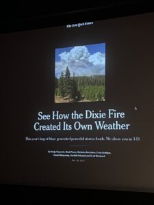
Above: Slide from Nadja Popovich’s work at the New York Times about the Dixie Fire
Alberto Cairo (Twitter: @AlbertoCairo)
Alberto Cairo has been a thought leader and educator in the data visualization space for a long time. In his Eyeo talk, he postulated the idea of “breaking the rules” of visualization in order to better contextualize and communicate data to an audience. In his classes, he reminds students that, “what you design is not what people see,” and in 2020, published a paper in IEEE called “If Anything on This Graphic Causes Confusion, Discard The Entire Product” – which may be my favorite paper title ever. It’s a great lesson on what visualizations need to be, what should not be assumed and that visualizations “are not self-explanatory” and need conscious reasons for any and all reasons and decisions.
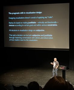
Above: A still from Alberto Cairo’s talk about finding reasons instead of following rules.
Key Takeaways/Ideas We ❤️
Emily:
“Converge to inspire” feels incredibly accurate, that’s exactly what we did. Wo left feeling energized by the different branches that the data visualization world is taking. On the one hand, you have leaders like Agyei Archer and Salome Asega (Twitter: @suhlomay, Instagram: @computers_puting) who are pushing the boundaries of tech education in their communities. On the other hand, you have Suzanne Kite (an Oglála Lakȟóta performance artist, Twitter: @kite_kite_), Alex Nathanson (a multimedia artist, Twitter: @alexnathanson) and Shirley Wu (a data visualization artist, Twitter: @sxywu) who are creating incredible multi-art-discipline installations.
Then, there are creatives like Stefanie Posavec and Giorgia Lupi are combining art, journaling, process mapping and identity in such a unique and inspiring way. I walked away with so much that I want to do (and so little time), but I’m grateful for all the lessons I learned at Eyeo!
Jack:
The biggest takeaway for me from Eyeo is that “best practices” and “guidelines” are sometimes meant to be broken and modified, especially when it comes to working with data. The variety of artistic practices that were present at Eyeo really pushed me outside of my comfort zone and gave me new perspective on how this thought process could carry over to data visualization and data strategy.
Engaging with artists, designers, business domain experts and developers was critical in learning what rules should be broken in order to get our points across to our audience and how engagement with users is never one-size fits all. I am really excited to take the divergent thinking strategies exhibited at this conference into my own artistic practice and the work I do at InterWorks.
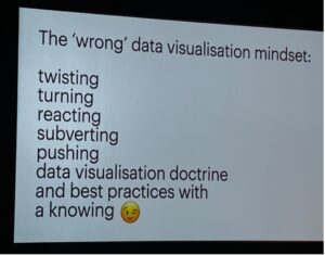
Above: A slide from Stefanie Posavec’s presentation of doing things “wrong.”