
While it’s March and not January, the Experience Design team has been reflecting on some of our favorite work from the last year or so as we look ahead to the rest of 2022. Our team consistently works on a variety of Tableau and dashboarding projects. These aren’t just chances to serve the best clients with creativity and efficiency—they’re also opportunities for our team to think even more deeply about how best to tell data stories through intuitive, flexible UX. This blog post captures some of our favorite efforts at this. But first, a refresher.
What’s a KPI and Why Is It Important?
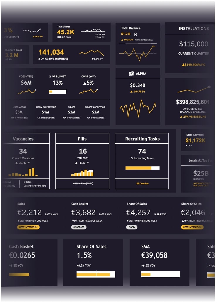
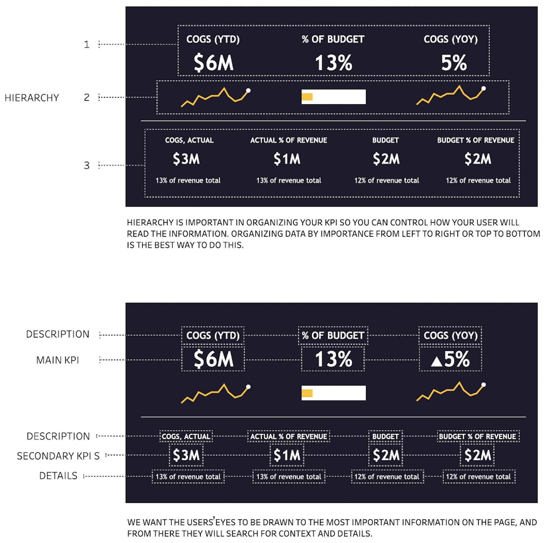
KPIs, or key performance indicators, are the most important metrics on a dashboard. These highlight the main information the user is looking for when viewing a dashboard, whereas the rest of the data is secondary. KPIs are important for simplicity and hierarchy, so the user can find and understand the most critical insights quickly and clearly.
So, let’s take a look at some of our favorite KPIs from the past year. You can also explore some of our notable KPI work in 2019-2020.
Dissecting a KPI
Each KPI’s job is to convey the most important information efficiently and be visually different from the other data on a dashboard. This makes it easy for the user to find the most pertinent information without having to search for it. Keeping these things in mind, it’s also important to make sure your KPI matches your dashboard aesthetically. So how are you supposed to make something stand out and blend in at the same time? It can be hard to find the perfect balance between these two things, but it’s very possible and can completely change how the user sees and understands the data.
Now that we understand what a KPI is and how it’s used to benefit the user and the data, let’s walk through how to create a “balanced” KPI:
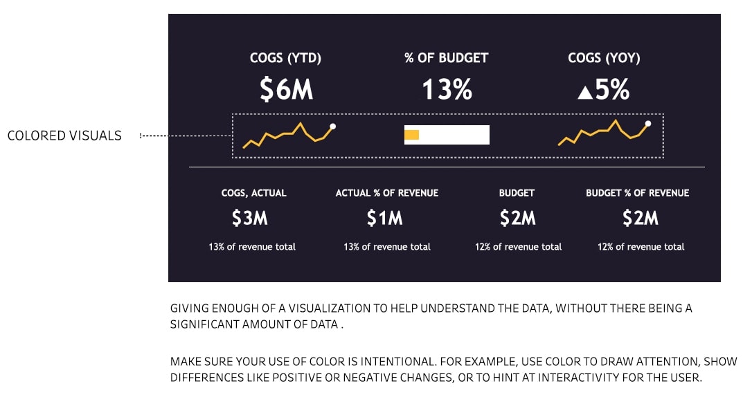
Like most things in life, KPIs need to have a balance of elements working together to do their job. When we put KPIs under a microscope, we see they can be broken down by hierarchy, size, visuals and color. The most effective KPIs implement each of these elements in a harmonious way. Hopefully now you have a better picture of how to craft effective, visually striking KPI designs. Feel free to reach out if you have questions or would like to connect with our team directly. Happy visualizing!