
There is a plethora of elements that go into a successful dashboard. Organizing these elements can be incredibly intimidating. So, how can we make the design process easy to understand and implement?
What Are Design Principles? Why Are They Important for Dashboarding?
Design principles are the tenets that define users’ interpretation of what they’re consuming and how they consume it. They are present in everything around you, whether intentional or not. In dashboarding, they’re crucial to understand and apply intentionally because you want your users to have a consistent experience no matter their region, background, experience, etc. Design principles are incredibly important in dashboarding because they are the key to telling the dashboards story.
What Are the Main Design Principles Used in Dashboarding?
There are quite a few design elements, but the ones we’ll be talking about today are, consistency, hierarchy, scale and whitespace.
Let’s break these down one-by-one and see an example of them being used in a dashboard.
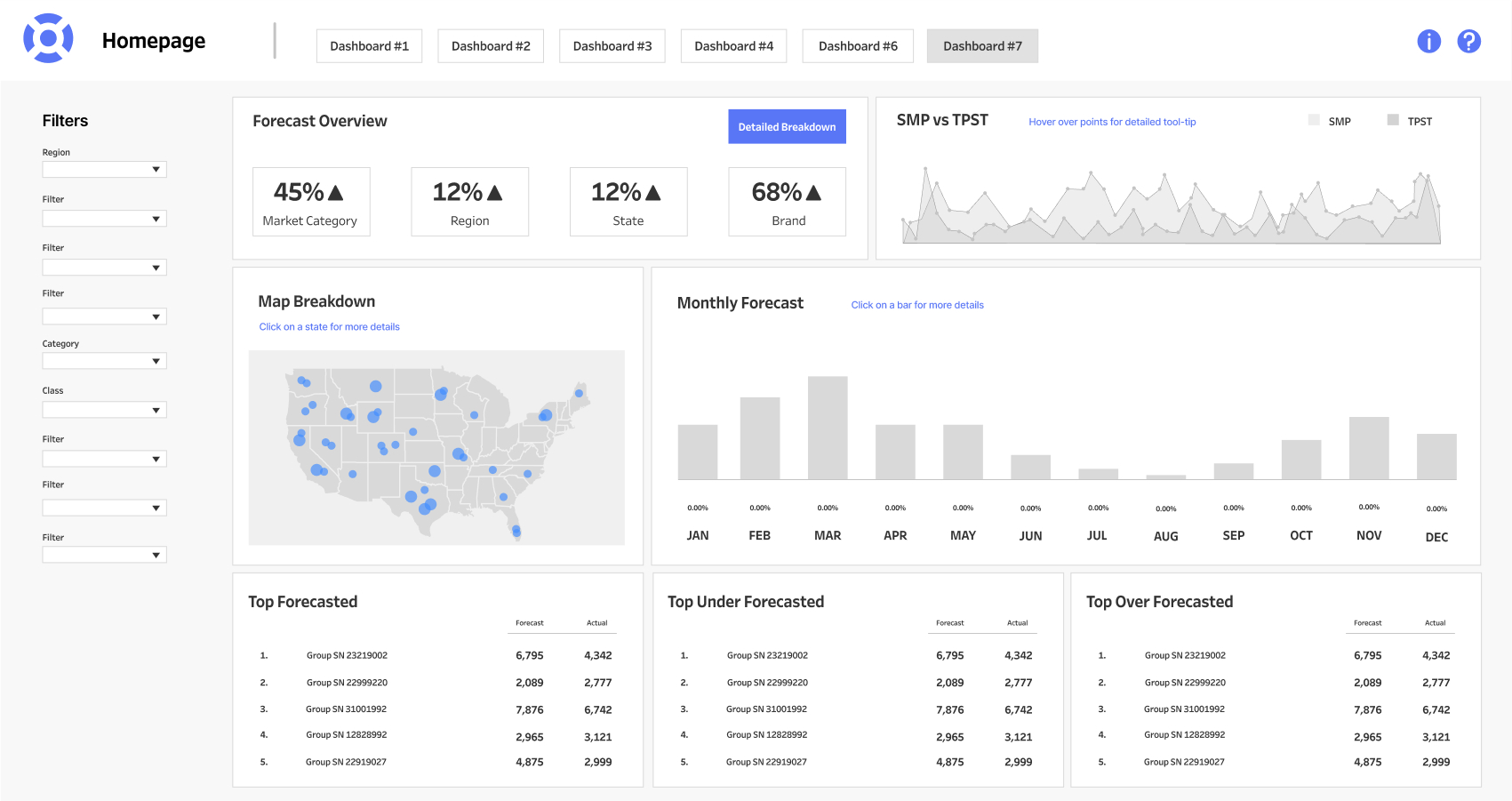
We’ll be breaking down an anonymized dashboard above made by InterWorks to show these design principles in context with a dashboard.
Consistency
Consistency in design is the presence of uniformity across several elements. Having them look and behave in the same way helps with navigation and builds familiarity for your users. Strive for consistency in the application of iconography; icons should be all the same style, line weight and size. Implement color consistently so you can bake in meaning for the color and use it throughout. When users learn what the color means once, they’re likely to assign that same meaning to other things that utilize the same color. It’s crucial to help the user reinforce these connections so they can successfully navigate and understand their data.
We can look at color as an example of consistency above. The use of the color blue is used throughout the dashboard as a visual callout to something important.
Hierarchy
Hierarchy in design is the manipulation of an elements characteristics in order to show a relationship between said elements. This refers to elements like type and data visualizations. Hierarchy is also important for the overall dashboard layout. Common scan-patterns on pages are an F shape and a Z shape. Users often scan the left edge of a page, and move their eyes across horizontally when they find something interesting. We can use this way of thinking to our advantage when arranging and manipulating elements.
Hierarchy is present everywhere we look and give some real-world examples for users to consider outside of dashboarding. An example of this would be a Netflix description of a movie: Title is huge, details like release date and rating are usually right under that, bolded. Then, right below that, is a description of the movie. It’s a few different “checks” in place to appeal to how people want to consume information. They want to know what they’re looking at and if it’s relevant to them (genre, rating, etc.). Then, if they’re interested, they can choose to opt into reading the description.
Now imagine if those things were inverted, and instead of huge titles on Netflix, it was huge descriptions, with tiny titles. It wouldn’t make sense to most users and can be aggravating if the user can’t find the information they’re looking for.
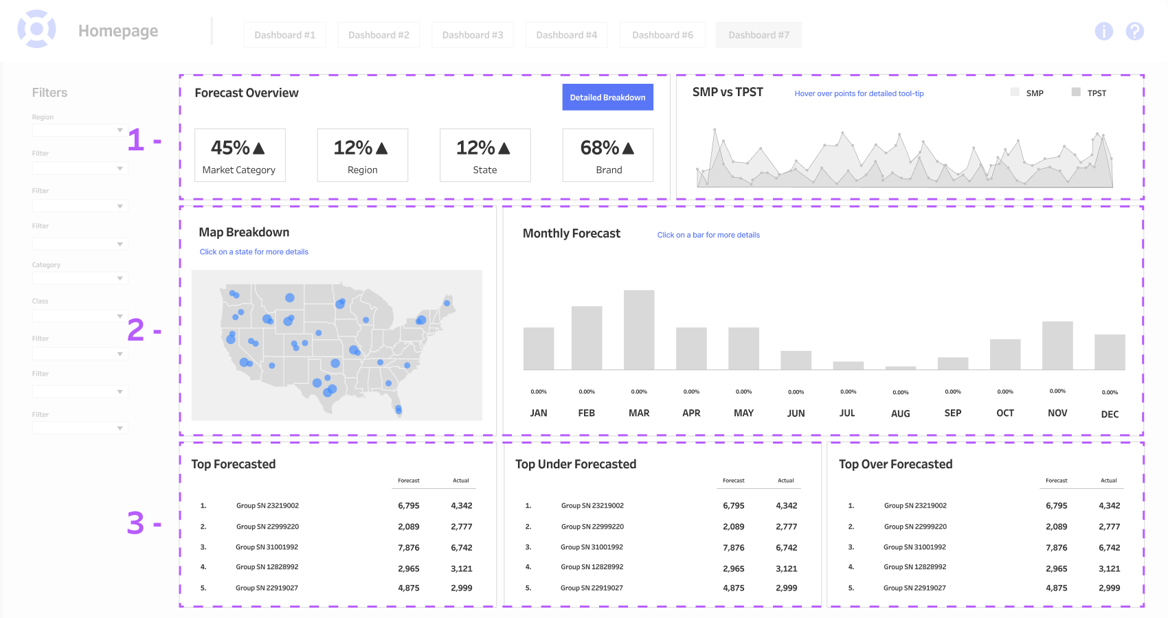
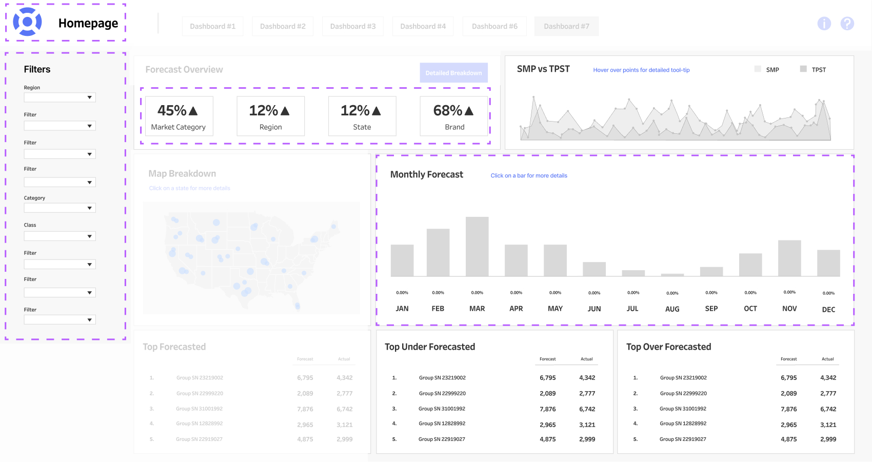
Let’s look above at an example of hierarchy in terms of our dashboard layout, section 1 being your most important set of data, section 2 being a more detailed breakdown of your most important or supporting data, and section 3 being your tertiary of extra data.
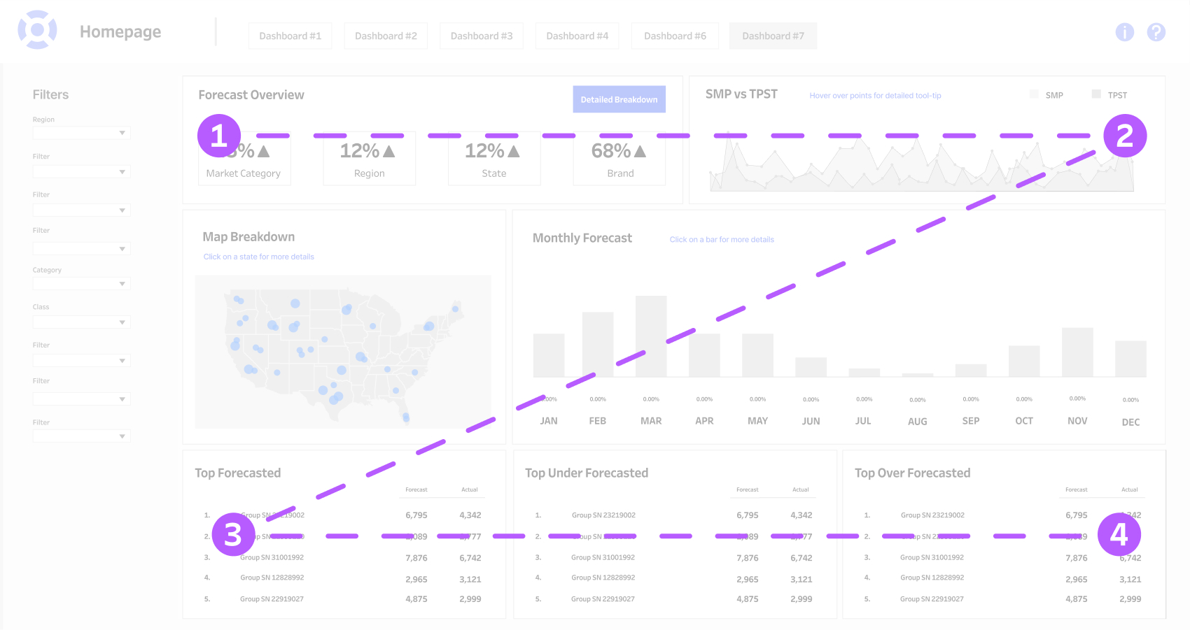
Above is how the Z pattern is used by users when viewing a dashboard. The user’s eye will instinctively go from 1-2-3-4 as a means to take in the visual.
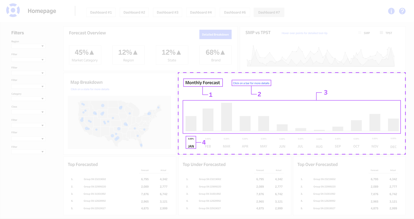
Now let’s look at hierarchy at a more contained scale. When looking at the Monthly Forecast container, we can see there are four different type sizes being used as well as type weights. Box 1 is our title, so it’s the largest type size being used and is bolded to show it’s importance. Box 2 is in blue as a call to action to the user and in a smaller type size so it’s not competing with the title. Box 3 is our visualization, which is the largest in the container as it’s the most important information. Box 4 has our smallest type size, representing the data in our visualization. By keeping the percentage smaller, we can infer that the exact number may not be as important as the overall visualization. The month is also represented in this container.
Scale
Scale, as many of you can guess, is referring to the size of elements. This is where you want to think of what size to make your visualizations, depending on the importance of the data. Simply put, when there is a large item next to a smaller item, the viewer is forced to look and give attention to the larger item first.
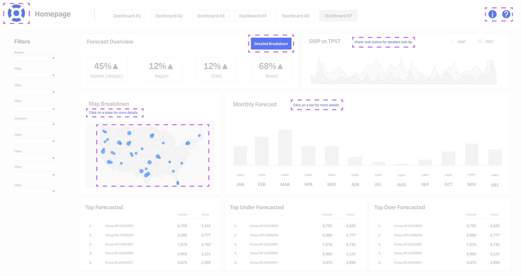
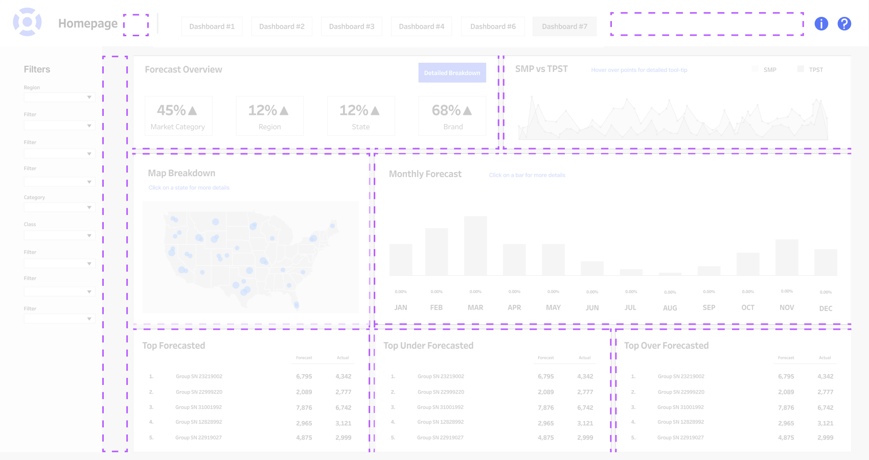
When we talk about scale, we want to take an overall view of the dashboard and pick out the things that are demanding the most space and ask why. We can infer from the sizing of elements how important they are, thus telling us how much attention to give said element. The elements highlighted include our KPIs, filters, dashboard title and company logo, and one of the visualizations.
Whitespace
Lastly, Whitespace is the spacing between elements. White space allows your user a visual “breather” for them to process the data and other visuals in order to understand them better. It’s extremely important to allow whitespace in between areas of data so they aren’t confused with each other. A great example of whitespace is the way art is displayed in a museum. The most important pieces have lots of breathing room around them, because they demand our undivided attention. Other pieces are placed more closely together maybe because they belong to a collection, but usually things are spaced further apart to delineate a change in content.
Out of all the design principles, whitespace creates tension in a space and is probably the easiest to understand and implement. Highlight above are some examples of whitespace around the board, though there are plenty of other areas of whitespace. Adding these “blank” areas allows the user to take a visual break before looking at the next set of data and keeps them from mixing separate data areas together.
If you think about it, hierarchy is a coalescence of consistency, scale, and whitespace. Even with informative data and visualizations, a dashboard cannot be successful without the use of these basic design principles. We hope you enjoyed the ride, and hopefully you learned something helpful whether you’re a beginner or experienced in dashboarding.
Related