
At InterWorks, we want to help users create insightful, intuitive data experiences and empower them with the tools and best practices to navigate those data experiences in the most natural way possible. At this year’s Tableau Conference, we hosted a session that took a closer look at the practical ways we do that and our thinking and approach to creating intuitive design.
What Makes a Dashboard Great?
A guiding quote that we reference often during the design process is this: “The shortest distance between two people is great design.” What does this mean in the context of dashboards? Well, just because the data is complex doesn’t mean that a user’s journey through that data has to be complex, too.
When we are faced with a blank Tableau screen, this empty canvas can be intimidating. A default tendency is to provide all the available information, so end users can access everything they may need regarding the data. However, this isn’t necessarily the best path forward. With too many elements and an overly busy visual presentation, a dashboard can be bogged down. You might think you’re helping by providing all the context and details, but in actuality, you’re making the cognitive load too heavy. This means users won’t be able to retain any of it. They’ll spend too much time trying to parse through and assess what they’re looking at, unsure of where they should start. This is definitely not what you want. When implementing intentional design, we want to eliminate that guesswork and confusion. So how do we do that?
Build a Dashboard Like You’d Build a House
An analogy that our team uses quite a bit is that building a dashboard is a lot like building a house. There are countless layouts, constraints and customizations to consider, but no matter what your end product finally looks like, the process is the same. There are important factors to consider at each level of the creation process, and we start with the most foundational elements first:
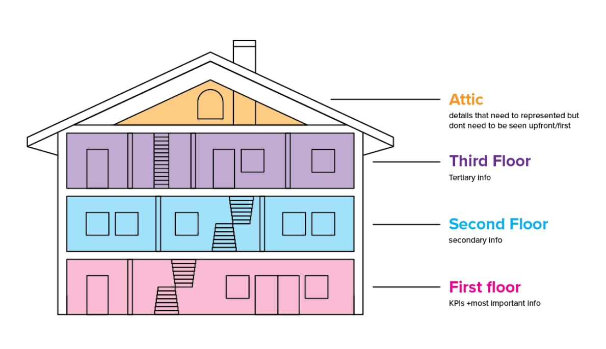
In breaking down this analogy, there are parallels that guide me as a designer in my process:
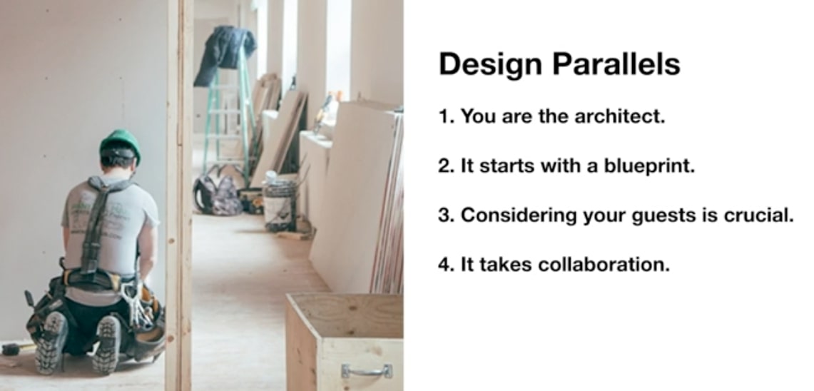
Design Like an Architect
1. You are the architect. When you sit down to start building a dashboard from the ground up, think like an architect or designer. When our team does this, we follow a few principles of design thinking to help us begin with the right steps:
-
- Empathize – put yourself in someone else’s shoes. A great way to do this is by interviewing the users who are going to be using this dashboard most and asking the right pointed questions. What insights are they really trying to surface? What are they wanting to lead users to do next after seeing and interacting with the dashboard?
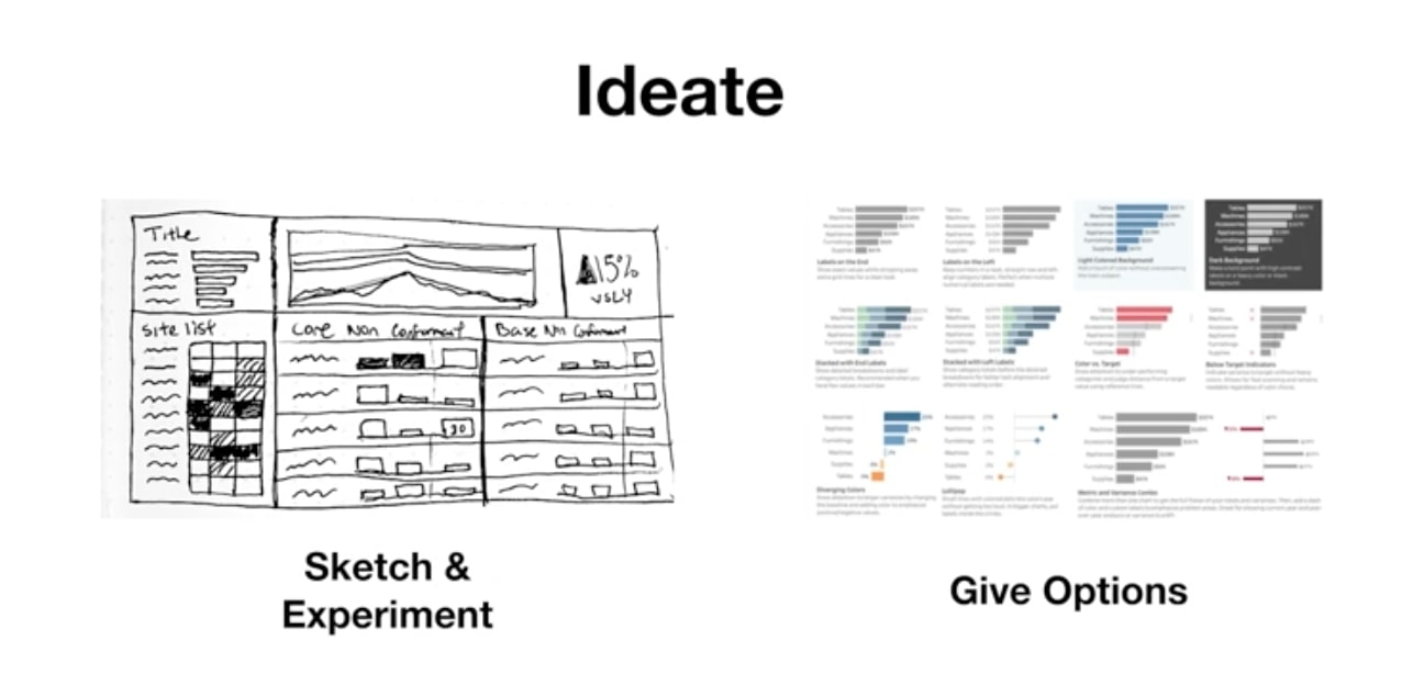
- Ideate – sketch, experiment and give options. Sketching is your best friend when it comes to landing on the best layout for the current use case. Don’t be afraid to try out big ideas when brainstorming and provide a variety of options to arrive at the best fit. For example, rather than just reference a simple bar chart, weigh the different customization options that exist within that to pinpoint the user’s exact needs. The good news in this phase? You can always crumple up that piece of paper and start again.
-
- Prototype – take previous stages and move them into a more high-fidelity stage. Put the prototype in front of people. Observe how people are interacting with it and collect feedback to deliver a more refined product and experience.
- Implement – hand off from designer to developer (or from one builder to the next) for to the next step in the process. This is when a solution is ready to be finalized, and you want to be sure everything is in place to ensure success.
Make a Plan Forward
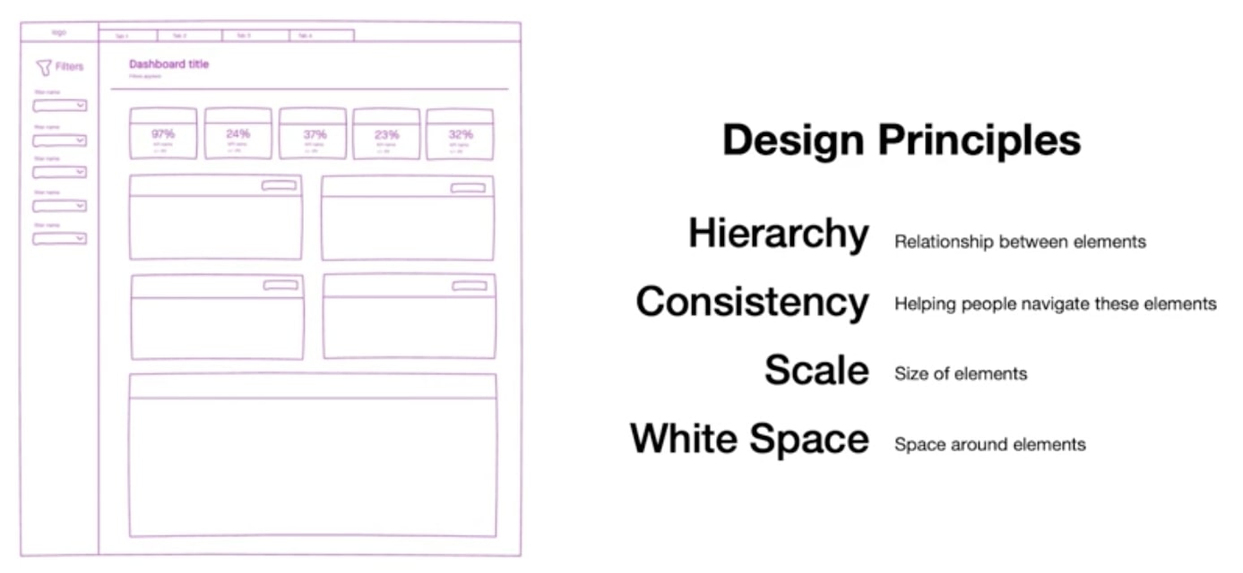
2. It starts with a blueprint. Any structure deserves and requires a plan. Below are the building blocks we use when creating any sort of design blueprint for a new solution:
-
- Hierarchy – use size and order of info, guide the user’s eye through the dashboard. Hierarchy helps users understand what is most important and where they should go next when navigating through the dashboard.
- Consistency – the process of creating patterns. Create patterns using reliable formatting, weight, color, placement, size, etc. of dashboard elements. These consistent patterns help users know what to expect and how to respond to what they’re encountering. People will assign meaning to things unless you assign it for them, and this is a crucial step in delivering a clear, meaningful experience.
- Scale – use visual weight to confer more importance and value upon certain elements in a dashboard.
- White space – space between disparate parts that indicates their relationship to one another. Considering the amount of space between elements can clearly guide users in determining how items are related or not. White space creates breathing room, balance and a more visually pleasing effect.
Involve Others in the Build
3. Consider your guests. Who is your audience, and what are they looking for when they come to your dashboard? Are you designing for frontline analysts or executives in the C-suite? Make sure you not only know the answers to these questions, but that you also are building a dashboard that facilitates the accomplishment of their goals. Accessibility is important, and there are practical considerations to ensure your dashboard is inclusive for all viewers.
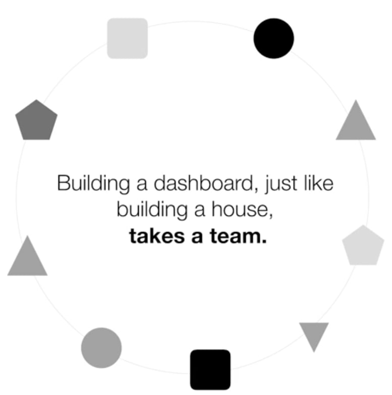
4. Collaboration is key. In the same way that building a house doesn’t solely fall on the shoulders of the architect or construction professionals, building a dashboard isn’t solely the responsibility of one individual. It requires everyone bringing their expertise and perspective to the table to create the best solution, from data architects, analytics consultants to designers and beyond. You don’t need to go it alone.
InterWorks Is Here to Help
So where do you go now? InterWorks is here to help. You’re already in the right place: the InterWorks blog! We have tons of resources specifically aimed at Tableau, dashboarding, design and more. And if you’re looking for the pinnacle of customized analytics, look no further than Curator by InterWorks. It’s the go-to solution for embedding tailor-made visualizations and user interfaces within a single ecosystem. Visit the Curator site to learn more, and reach out to us here at InterWorks if you want more guidance and support around dashboard design. We’d love to collaborate!
In the meantime, catch the session replay below: