
The world of design is extremely fun to navigate. Considering form, color, scale, style and more is what I love doing. Over the years, I’ve found it difficult to discuss these more nebulous terms in the more rigid world of data. So, when it comes to approaching your data from a design mindset, it’s helpful to have an analogy to fall back on. We like to consider creating a dashboard like designing a house.
On a small scale, you might be configuring your workspace: a single desk. The desk needs to have the basics at hand for you to meet your goals: a flat surface, a device of some sort and probably a beverage to keep you hydrated. This is like creating a single chart in your dashboard. It needs to have its necessities to be functional and provide the best ramp for opportunity.
Slightly larger than that could be designing a room – this would be like designing a dashboard. In this room, we have multiple desks, cabinets, rugs, seating, etc. We need to consider how all these different elements play together to make a functional room for everybody.
Finally, on a large scale, you’re designing the entire house. This could be your data environment. We want to bring smart design to every aspect of your data experience from the most nuanced, granular elements to the largest. How do these rooms connect? Are they easy to access? Are we distracted by things that should be in a different room?
Design a Floor Plan
The first thing we want to do when we sit down to begin a new design project is to have a plan. The way we like to gather intel and begin our considerations is through asking the right questions of the users, figuring out appropriate constraints and defining the data narrative that we want to tell.
- Ask the right questions
- Who will be using this dashboard? Who’s maintaining it?
- What answers are we really looking for when we consider the data? Are we asking the right questions to get to these conclusions?
- Where do the current analytics fall short? Why are we upgrading in the first place, and how did we discover that there was a gap we needed to fill?
These answers usually give us great tips and shortcuts as to how to achieve a successful design.
- Figure out restraints
- Is the data ready to be visualized on a dashboard? What kind of device and screen size will these dashboards ultimately be shown on? Are there device-specific logistics we need to consider in our design process?
These elements are crucial to understanding where to take the design.
- Define your story
- How are we going to introduce the data story we want to tell, and how will we get someone to care about it?
We recommend trying to define a beginning, middle and end, and figure out how you can effectively carry the audience through the entire flow. It might help to consider what would be the “main character” or focal point of the narrative, while also defining what would be the “supporting cast” to help boost the main character. We don’t want too many things begging for attention at the same time.
-
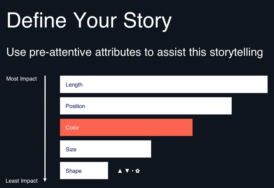
- Use pre-attentive attributes to help develop and tell your story through visual cues and strong design. This is how we might lead someone’s eye throughout visualizations.
Above: Considerations when thinking through the data narrative you want to tell and how to present it
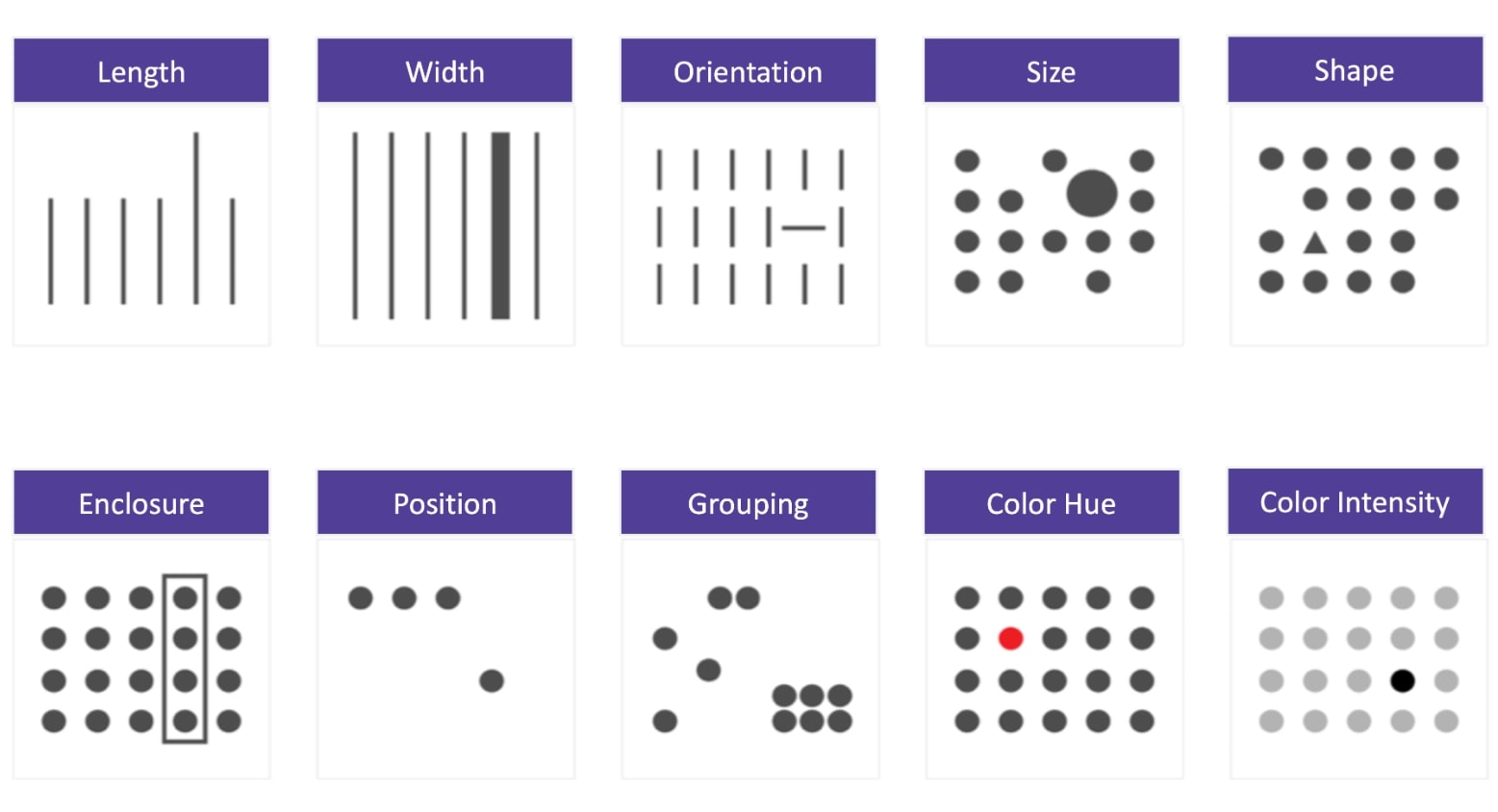
Above: Examples of pre-attentive attributes to help guide the user through a visualization
4. Get inspired
-
- Save dashboards or visuals that evoke a strong emotion or elicit a positive response in you. Try to mimic that response in what you create. I recommend Behance as a great source. Another great resource is the InterWorks blog – one of my favorite posts is the Tableau Bar Chart Menu. It’s full of different options for bar charts and advice on how to use them best. I recommend downloading the workbook and reverse-engineering it. Use these tools to your advantage!
5. Prepare to wireframe
-
- Pull from resources and charts that you’ve seen be successful in the past. Get comfortable in sketching and drafting out ideas in a really raw form by hand. These loose sketches allow for quick iteration and better feedback from teammates. If you’re collaborating with someone, these sketches are 100% crucial to helping make sure you’re on the same page. Don’t worry about it looking great; we’re trying to figure out what goes where at this stage.
- Once you’re ready to move your handwritten drafts to the digital realm, the Experience Team’s go-to tools are Sketch and InVision.
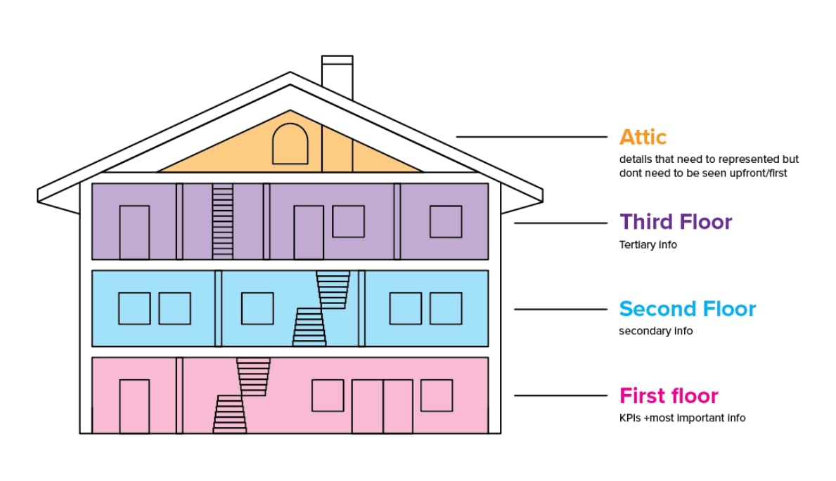
Begin to map out all your data using the concept of a house. What elements should go next to each other? What should be the first things someone sees when entering this environment? What are the 2 or 3 MUST-HAVES for your “guests” in this environment?
Go Through a Dashboard Design Checklist
A crucial step in dashboard design is to go through a checklist to be sure that you’re taking everything into account. The checklist we use can be found here: A Lite UI Checklist for Dashboard Design. Here are the steps we go through that help us put together the best end product we can:
- Keep titles simple yet descriptive – use these titles to define your space and create a basic floor plan of where you want content to go in your dashboard.
- Call out important info with subtitles, whitespace and color. Keep everything else in a lighter grey or white so that it’s not screaming for attention.
- Use text hierarchy to control user attention – consider the spacing, weight and size of your type. I recommend trying to use a single typeface, but with three distinct sizes/weights.
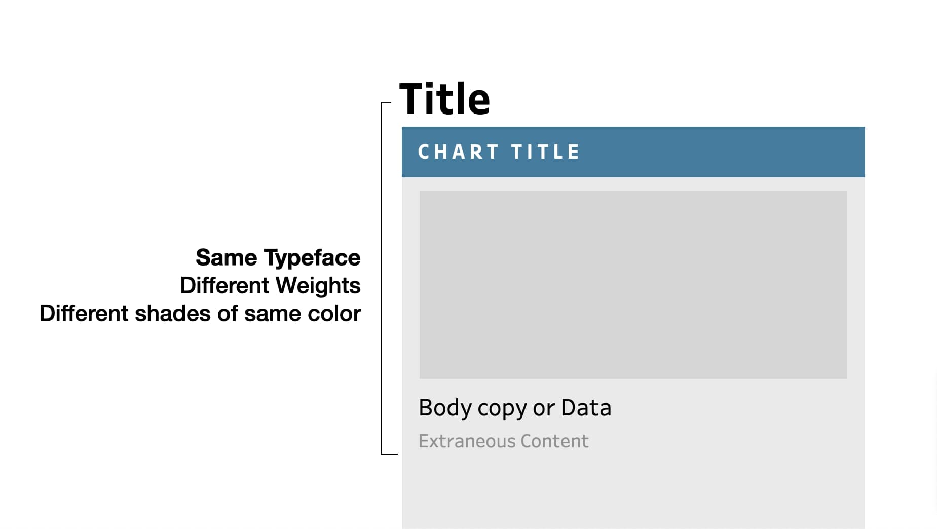
Above: An illustration to help when defining text hierarchy in dashboards
- Axes are aligned – the simplest of the bunch; just make sure your bars and line charts share an invisible axis. We want this complex dashboard to adhere to a grid, so any wonkiness here will be distracting.
- Logical chart placement – no piece of content feels like it is crowding any other type of content. Consider placing the most “high-level” content at the top or left side of your dashboard and the most granular bits in the bottom-right.
- Graphics are placed sparingly – when using icons, just make sure they look like they belong in the same family!
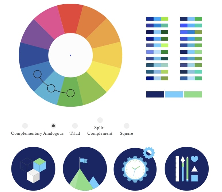
- Accessibility – use color intentionally and be aware of colorblind pitfalls. For more info on this, Chelsea and Kendra recently wrote a blog about how to incorporate color beautifully and effectively
- When in doubt about making choices for maximum accessibility, ask people. Watch how they use it. Let that inform your decision-making, and if you’re on the fence about making a particular choice around design details, lean toward simple.
Above: A screenshot from Colorsupplyyy, one of the resources I recommend for incorporating color into your dashboard
- Intentional lines and borders – if they can’t be included intentionally or in a way that facilitates a better UX, eliminate these where you can. Opt for whitespace; your users will thank you!
- Add value – seize opportunities to enhance the experience and make insights more digestible. This is just taking things one further step before calling it on the checklist.
Take It Further
If someone interacts with it, how can we make it more enjoyable? We want to get to a place where we’re comfortable and willing to iterate often, so collaborate with others on your team and invite different perspectives and experiences when building out a dashboard. Experiment with new features and different layouts. Try your hand at things you’ve seen be successful in other areas that maybe you haven’t yet taken the opportunity to implement yourself. Finally, ask for specific critique. The objective is to create a final product that will serve users and delight them, and it’s important to be able work with others and welcome their feedback to get to the best version of the your final product.
Keep the User at the Heart of Design
Our goals really are to increase pride, simplify and bring joy. We want our consultants to be proud of their work, and we want our clients to be proud of their dashboards and see them as an authentic reflection of their brand, company and value. In simplifying design, you’re allowing your dashboard assets and insights more room to breathe and resonate with the audience viewing them. The ultimate aim is for people to experience joy when they interact with a dashboard. In considering them as you make every choice in the creative process, you’re likely to end up with a final product that prioritizes users and their experience above all. These methods will improve your work and boost adoption of your dashboards, more understanding of complex data and a bit of happiness once it’s all complete. It goes a long way.