Every now and then, you want to customise your viz in Tableau just a little bit outside of the standard functionalities, without spending more time on customising the viz than building it initially. I recently came across a chart I had never seen before, but it looked good for the data it was used for. It was relatively small as well, so I felt it was a good use of dashboard real estate.
Since I couldn’t find any other references to this type of viz, I’ve named it the Stacked Impact Super Chart. If you know this graph by another name, or if you know a better name, please drop me a line.
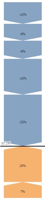
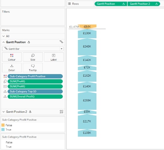
The chart below visualises the impact of positive and negative predictor features on an overall probability of an event happening. Initially, I built this as a waterfall graph, which took up about five times as much space on my dashboard, leaving hardly any space to add a bit of context. When I noticed this graph as an example, I immediately thought it was a more concise way of visualising what is relevant:
How Did I Build This Viz?
As an example, we’ll use the Order sheet from the Global Superstore dataset. Although perhaps not the best way to visualise this data, I want to visualise the contribution (positive or negative) of individual sub-category profit to the overall profit.
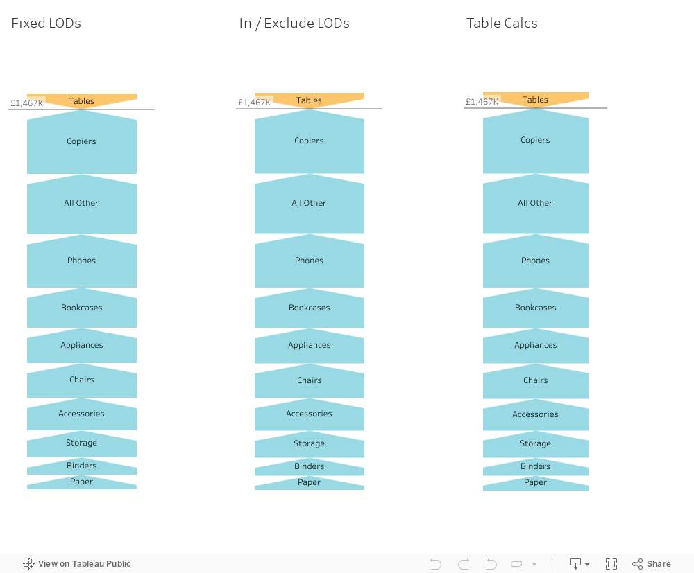
We first need to create a number of calculations to be able to build this viz. Here, I’m using mainly FIXED LODs, but the example workbook contains options for using INCLUDE/EXCLUDE LODs and Table Calcs for more flexibility:
- Overall profit = {SUM([Profit]}
- Sub-Category Profit Positive = {FIXED Sub-Category: SUM([Profit] >=0}
- Gantt position = SUM([Overall Profit]) – RUNNING_SUM(SUM([Profit]))
- Gantt position 2 = [Gantt Position] + SUM([Profit])
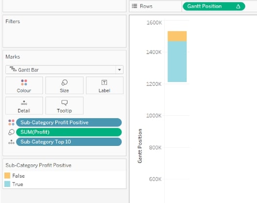
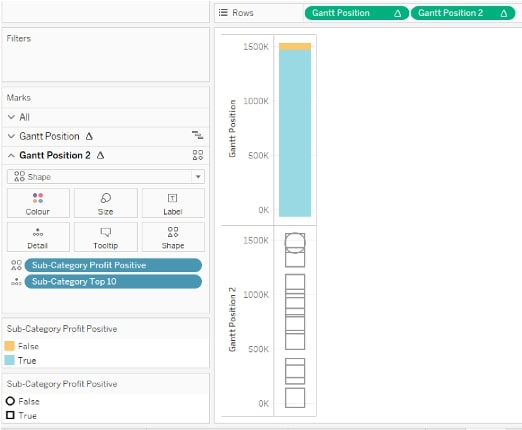
Now, let’s build the viz. Start with changing the chart type to a Gantt chart. Drop Gantt Position on Rows, Sub-Category Profit Positive on Colour, Sub-Category Top 10 on Detail and Sum([Profit]) on Size:
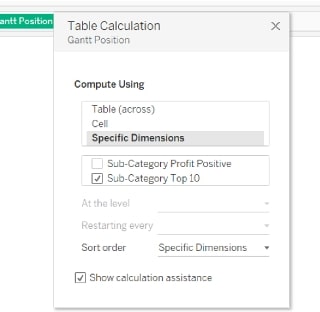
Right-click Gantt Position on Rows, and make sure that the Table Calculation is calculated using Sub-Category Top 10:
Drop Gantt Position 2 next to Gantt Position on the Rows shelf and remove SUM([Profit]). Next, change chart type to Shape, and move Sub-Category Profit Positive to Shape on Gantt Position 2 within the Marks shelf. Then apply the transparent shapes to the Gantt Position 2 in the Marks shelf. How to create and add the transparent shapes can be found further on in this post:
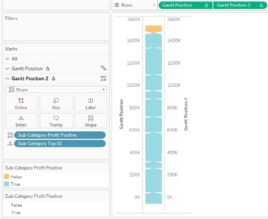
Make the chart dual axis, synchronise the axis and adjust the size of the shapes to make them as wide as the bars. Drop Overall Profit on Detail, add as a Reference Line if required, and finalise the formatting. You can find the example chart via this link:
Creating the Transparent Shapes
To get Tableau to change the stacked bars in this chart to become block arrows, I needed to pull another trick out of my Tableau hat. Luckily, I had just come across a blog post about transparent shapes, and while this particular use case is completely different, it did make me think it was possible to do something with transparent shapes.
What we need to keep in mind when working with shapes is that the centre of the shape is the data point on your graph. However, I want to make sure that the arrow shape is pointing to my data point and not overlapping it. You could use a calculation to move your data points, but this is pretty high maintenance. You could also make your shapes is such a way that the arrow points to the middle of the shape itself.
Finally, the shape is NOT an arrow itself—just a transparent square with some non-transparent white bits that we use to cut off the top of the Gantt segments to make it look like arrows. What I did to create these shapes is to start creating them in Paint first (though other more professional tools are also available).
Start with a square canvas by going to File > Image Properties. Change the width and height to be the same, i.e. 2000 x 2000. Draw a thin line across the canvas, cutting it exactly in two (Tip: the cursor’s position on the canvas shows in the bottom-left corner of the screen). Draw a triangle shape underneath this line with the ‘apex’ touching the line exactly in the middle:
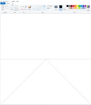
Next, fill the triangle and top rectangle with a solid colour and save the file as a PNG:

- Create a transparent PNG, or use some other tools to make PNGs transparent, like Paint 3D.
- Make the SOLID colour transparent, and download it to a new folder in your Tableau Repository\Shapes as Transparent Up.png.
- Do not open this file in Paint. As soon as you save the PNG in Paint, the transparency is lost.
- Copy the file, rename it as Transparent Down.png, and turn the file around by right-clicking and turning it left or right twice.
- You can also create left- and right-pointing transparent arrows in the same way.
Selecting the right transparent shapes in Tableau is tricky, as there is no way (that I know of) to be able to see the actual transparent shape in the Edit Shape menu; they just show up as white squares. One option is to put every transparent shape into its own folder in your Tableau Repository\Shapes.
Give It a Try
I hope you found this post helpful. This is an unconventional chart type in Tableau, but it can really be the best option depending on your data needs. Thanks for reading!