NOTE: The COVID-19 global pandemic continues to evolve. This data visualization is no longer being updated, and we recommend the Johns Hopkins Coronavirus Resource Center for regularly updated data and information.
As I write this article, approximately 100,000 people have officially died from COVID-19 around the world, and there are no indications that the pandemic is going to end. I live in Singapore where we have been dealing with this health crisis for the better part of three months and have anecdotally seen a vast range of responses between different countries.
The Global Spread of Coronavirus
Singapore, Japan, South Korea, Hong Kong and Taiwan were among the first countries outside of mainland China to see cases of COVID-19, but they responded exceptionally fast to contain the spread of the virus. As most of their populations live in high-density urban areas where the majority of residents take public transportation, the results could have been terrifying. But so far, there are fewer than 400 deaths in these places. In Singapore, most people were on high alert weeks before Chinese New Year (25-26 January) with concerns that mainland Chinese tourists or residents traveling to and from China for the holidays would transmit the virus. In the weeks following, many residents began wearing masks and many buildings began screening temperatures upon entry.
This success story stands out even more when compared with the United States (my home country) and many countries in Europe where the vast majority of official COVID-19 fatalities have occurred. As an American living in Asia, I could not understand why government and public health officials in Western countries were not taking the threat seriously until as late as mid-March.
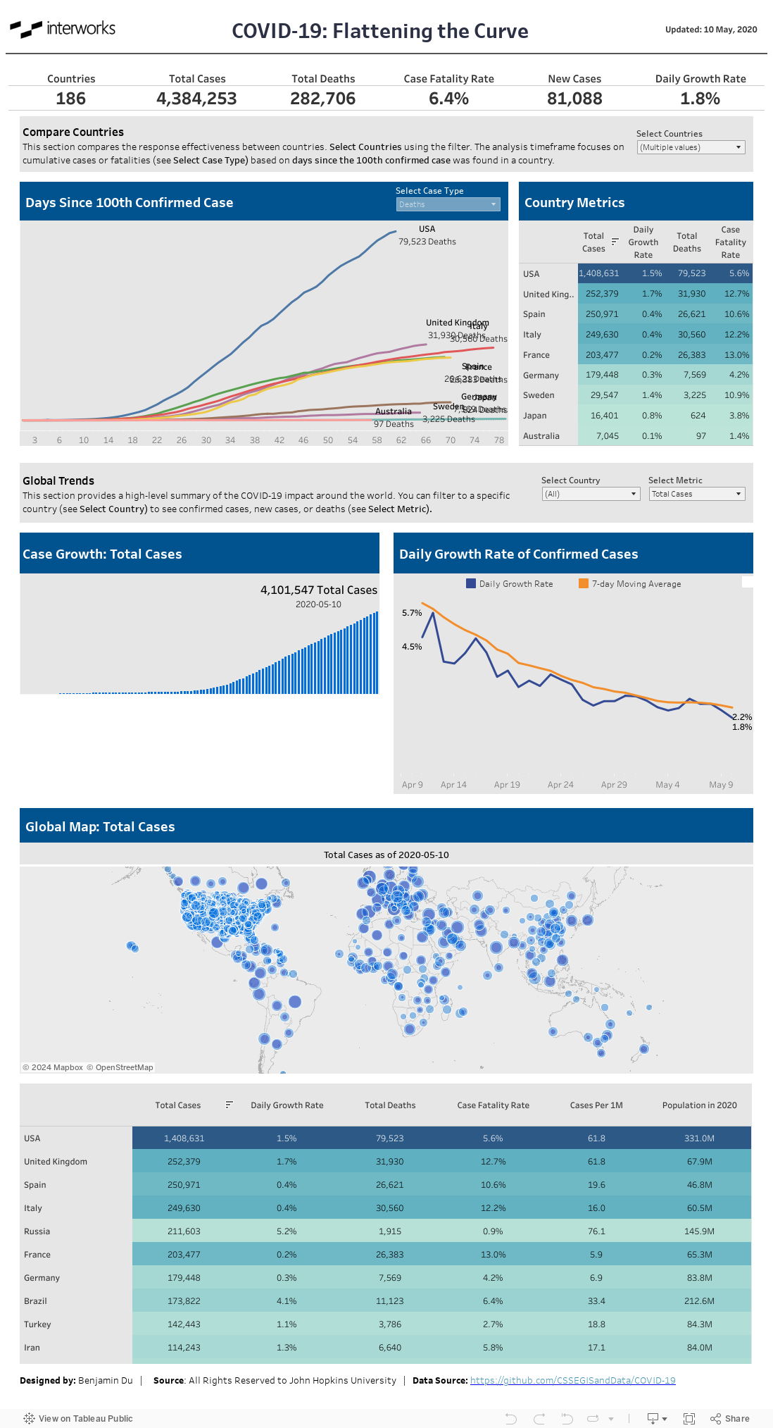
Measuring Impact with Data-Driven Analysis
While staying at home, I wanted to use the extra time and my analytical skillset to make a small contribution to the global effort against COVID-19, so I built a Tableau dashboard using the data provided by Johns Hopkins University. Beyond providing a summary of confirmed cases and deaths, I wanted to effectively compare the disease burden across countries along a similar timeframe. Same-day comparisons can be misleading because the outbreak started in countries at different times. However, by using a level of detail expression to identify what date a country saw its 100th confirmed case, I could use that as a starting point for analysis to see how coronavirus impacted a country at any particular day of the outbreak.
Take a look at my dashboard below, and let me know what you think!