
This blog post is AI-Assisted Content: Written by humans with a helping hand.
What unfolds in A Night at the Opera is not just a dashboard, but the visual retelling of a lifelong passion. The data behind it comes from an extraordinary personal archive: Decades of handwritten notes, programs and memories carefully collected since the early 1960s by a devoted opera lover, who began attending performances as a teenager and never stopped. This dashboard was created as a gift for him — a way to transform a deeply personal, lovingly messy dataset into something interactive, elegant and playful. For the first time, his nights at the opera are no longer just remembered; they can be explored.

The Dashboard
At the very top of the dashboard, the title sets the tone, followed by a clear subtitle explaining the scope: Operas seen by date, location and composers. Immediately beside it, a vertical bar chart lists opera titles, ordered by how many times each one was seen live. Works like Tosca, La Traviata and Rigoletto rise to the top, visually emphasizing recurring favorites across the years. Each bar is segmented by color, reflecting different composers and clicking on any title instantly filters all other views — narrowing the map, timeline, table and summary metrics to just that opera.
Directly below this ranking sits a striking composer panel, combining counts, names and portrait photography. Each composer is represented with a small numeric total above their name and an iconic black-and-white image beneath, grounding the data in history and personality. Verdi and Puccini dominate the view, but Rossini, Donizetti, Wagner and others are all present. Clicking on any composer acts as a global filter, highlighting only the performances written by that composer across every visualization. The portraits make this interaction feel almost like browsing a curated gallery of musical giants.
Running across the middle of the dashboard is a timeline of performances by year, stretching from the early 1960s to the present day. Vertical stacked bars show how many operas were attended each year, again colored by composer. This chart makes long-term patterns immediately visible: Early bursts of activity, quieter periods and later resurgences. The time axis is fully interactive — clicking on a single year or dragging across multiple years filters the entire dashboard, allowing users to focus on a specific era of this opera-going life.
The lower half of the dashboard is anchored by a world map, showing the geographical footprint of these performances. Countries are shaded, while white dots mark specific cities where operas were seen. Europe is densely populated, with clusters around Germany, Italy and neighboring countries, while the United States and Costa Rica especially, as the home country of our dear opera lover, also stand out. Clicking on a country or a city immediately filters all other views, revealing which operas were attended there, when and by whom they were composed. This map turns travel memories into a visual journey across continents.
To the right of the map, four bold summary KPI tiles provide instant context: Total operas seen, number of distinct operas, countries visited and cities visited. These numbers update dynamically with every click elsewhere in the dashboard, reinforcing the idea that no view stands alone — everything is connected. Above them, a compact genre selector displays counts for Opera, Operetta, Zarzuela, Teatro, Concierto and Arias. Clicking any genre filters the entire dashboard, making it easy to isolate, for example, only operettas or theatrical performances.
Finally, at the bottom, a detailed data table brings everything together at a granular level. Each row represents a single performance, listing the date, country, city, theater, title, genre and composer. This table responds to all filters and also acts as a filter itself: Clicking on any row highlights that exact performance across the map, timeline and rankings. It serves both as a reference and as a storytelling device — the place where individual nights at the opera re-emerge from the aggregate.
The Data Set
This visual product began with a table in a Microsoft Word document with almost two hundred entries. That had to be converted to an Excel file, which at the same time needed a lot of cleaning up. For that I used, of course, Tableau Prep Builder:
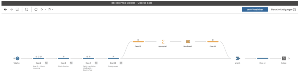
Columns had to be renamed, a row ID created, names grouped and standardized, the correct country field had to be created, etc. Besides that, I used the function “New Rows” in Tableau Prep in order to add dates of all the years in this timeframe, so that the time axis chart fully displays all years, and not only those for which there’s data.
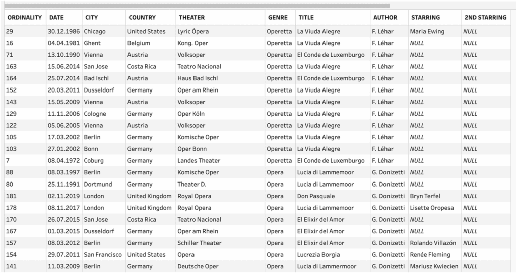
So, I ended up with a nice-looking structured data set like this one:
Closing Thoughts
One of the most powerful aspects of this dashboard is that everything is clickable. Titles, composers, years, countries, cities, genres, even table rows all act as filters or highlights. This encourages exploration without instructions: users can follow curiosity wherever it leads, uncovering patterns they didn’t know to look for.
As a closing thought, this dashboard is not just for reminiscing — it’s a source of inspiration. Opera lovers can use it to rediscover forgotten works, trace the evolution of their own tastes, or even plan future trips around composers, cities or genres they love most. It shows how personal data, when treated with care and creativity, can become a stage of its own — one where memory, music, and visualization perform together, night after night. 🎭