
As we explore new ways to leverage Sigma across the company, I had the opportunity to build a dashboard that would be featured in our Viz Gallery. This space showcases impactful visualizations created by our team, and contributing to it felt like both an honor and a challenge. It was a chance to apply what I’ve learned, test my design instincts and tell a story through data using a tool we’re championing throughout the organization. You can explore the Sigma dashboard below. Scroll past the bottom to read about the creation process.
Why This Superstore Sales Dashboard?
As many of you may recall, I am currently working as a BI intern at InterWorks, and Sigma has become our focus all through our training. Thus, I wanted to put my skills to the test by building a dashboard that showcases the system’s capabilities compared to other tools, such as Tableau, which remains the unrivaled leader in the BI space to date. That is why I ended up on Tableau Public website browsing some of the samples there to get some inspiration and finding a contestant to beat in this BI duel.
Next, since business is one of my two professional passions the theme of the dashboard had necessarily to be marketing or business-related. That was how I came across the Sample Superstore – Sales Performance by Pradeep Kumar G. I liked it as an initial concept because it merged sales data with marketing segmentation analysis in a wide variety of visualizations. Besides, very conveniently, Sigma shares a sample database: Plugs Electronics, which contains retail sales data very applicable for this case.
Inspiration: Process and Challenges
The stage was set, the gauntlet metaphorically thrown and the conditions ripe for a business intelligence duel. However, my first dead end was realizing that building dashboards to compare two different systems is not like replicating it from apples to apples. All data analysis and visualization tools boast their own set of competitive advantages that underpin market position and hence their value proposition to the users.
On the one hand, Tableau excels in advanced, interactive visualizations and is ideal for users who want to explore data creatively. On the other hand, Sigma offers cloud-native BI with a spreadsheet-like interface, making it accessible to non-technical users while connecting directly to cloud data warehouses. That introduced a new dimension to the challenge, but finding solutions to work around the problem was promising to make the endeavor funnier and more creative than expected.
Overall, my approach every time I face a project is to always be in the shoes of the end user. What would a marketing manager want to see in a dashboard about sales by geographical zone and product segments? Deductive reasoning tells us we need to go from the general to the specifics. For that reason, I decided to represent a sales visualization structured from total sales nationwide narrowing down through region to city, store and product line level. Also, since sales alone can be misleading, I paired sales performance with cost of goods sold (COGS) and profits provide a completer and more meaningful picture of business health.
Another important point to keep in mind is to stick to the principle used in software development, engineering and design to keep things simple (KISS). In BI, the KISS principle emphasizes the importance of simplicity in designing dashboards, data models and reports. By avoiding unnecessary complexity, we can create tools that are easier to understand, maintain and scale, leading to faster decision-making and broader user adoption. Clean visuals, intuitive layouts and straightforward data flows not only reduce errors but also make insights more accessible to non-technical stakeholders, turning simplicity into a strategic advantage.
Building the Sigma Dashboard: Problems That Sparked the Solution
Out of the whole dashboard, the most challenging technical intricacies lay on building the bump chart, because there is no dedicated control for that in Sigma. Still in the end, the bump chart is a line chart but with data displayed in a specific way. Hence, the solution here is to model the data to get the right set of outputs for which we created a child table out of the master sales data table to group the sales by date and city. The calculations were simple: One field ranked the total sales and another counted the number of distinct orders.
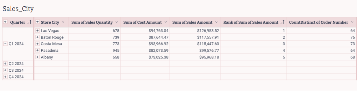
Figure 1: Table created to visualize the sales at city level both in the bump and donut chart. Note the grouping by quarter and city and the aggregations using the sum, rank and count functions.
Specifically, to have a well-tailored data set that will then become easy to display, we opted to filter the source table by rank and the sales amount. This is not necessary since we could have decided to filter on the line chart instead.
So, this is it from the data perspective. There are no major complications here, only that the date must be formatted to a scale that best suits our needs for the X-axis. In this case, we chose to display the timeline by quarters, so the custom format was set to show “QQ YYYY”.
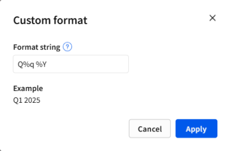
Figure 2: Custom format string to group the dates on the X-axis sorted by quarter and year.
On the visualization side, the tweaks are simple, as well. The line chart must use the same field for both Y-axes, which will be displayed on each side of the chart. In this case, we’re using a data field as the visual scale; specifically, the rank created in the previous step. The range was set from 1 to 5, and it is displaying the values reversed in both Y-Axis. That way, we set the rank for displaying the 1 as the top value and the 5 as the bottom one. For the X-axis, as expected, it displays dates aggregated by quarters. Finally, both the grouping and color categories use the same field, Store City, since it’s the column used to aggregate the data.
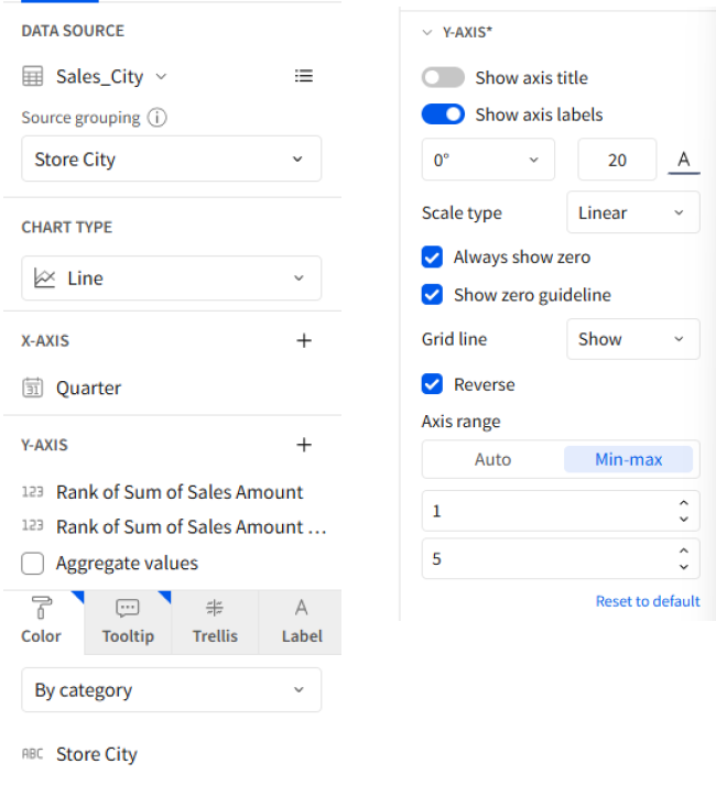
Figure 3: Configuration of the line chart to convert it to a bump chart.
The second most interesting part in the process of building this dashboard was dealing with the design. The original palette was a bit bland for my like, and I wanted to grant my version with more richness in terms of colors expressions without losing the connection with the sample from Tableau. Besides, I wanted to share the same color scheme between the line chart and the donut chart but using my own palette instead of the ones predefined by default.
Here came to hand a couple of interesting feature Sigma offers: the legend control and the custom palette. The legend control must have a source column from which it will create the assortment of value-color pairs. In this section of the dashboard, we are displaying the data at a city level thus we picked the city as the source column. Once the legend is connected to the data source, it works as a filter because we can choose what other objects we want to target to take control over their colors.
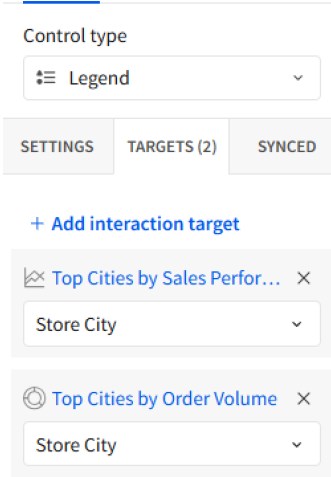
Figure 4: Selection of the interaction target in the legend control. The values of the data field must match otherwise it won’t work.
Next, changing the colors of our charts can be done quite straightforwardly using the color assignment feature and picking the custom palette from the very legend. I decided to keep the three primary colors from the original project in Tableau (but with some nuances within their gradients to preserve the visual harmony and, at the same time, widen the scope of emotions expressed).
Here, Sigma offers a feature that I hadn’t seen ever before in any other web or desktop development environment. It displays the colors we originally chose in the configuration of the workbook under a Theme Palette header to help the not-very-design-versed user to pick colors that match the overall look and feel of the project.
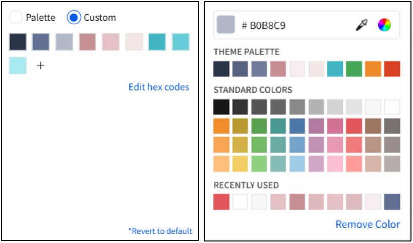
Figure 5: Color assignment and custom palette builder in Sigma. Specifically, here it is displayed under the legend control, but the feature is available for all the visualization objects.
Honestly, the result couldn’t make me happier like a parent watching their child shine. The dump chart exceeded my expectations for its simplicity and ease to configure so as the legend control to connect it to the donut chart.
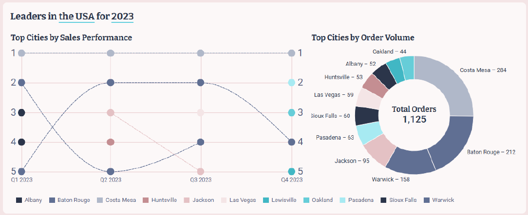
Figure 6: Final bump chart and donut chart.
One final feature that actually helped a lot in this project it was the ease to create and synchronize filters in Sigma. Just like we did with the legend object, designed to control two visualizations at once, all filtering controls in Sigma can be configured to target multiple objects simultaneously. If the same filter needs to appear in several locations, it’s possible to create synchronized copies of the control. These retain the same value selections across instances, even if they target different visualizations. This offers a clear advantage for both developers and users, improving both development speed and navigation experience.
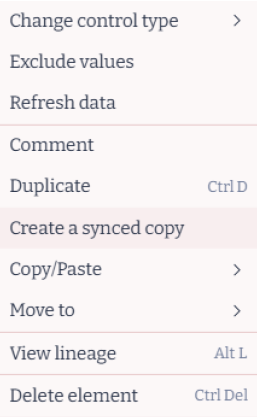
Figure 7. The context menu of a filter control allows to create a synced copy of the object. This makes it easy to maintain the same filter across different pages and sections of the workbook.
This capability proved especially useful in this project due to the dashboard’s vertical layout, which was designed with a maximum width of 1100 pixels. Instead of using a wide layout, many elements had to be arranged vertically. As a result, synchronized filters became essential, allowing users to select date ranges without the inconvenience of constantly scrolling up and down the dashboard.
Final Reflections
Overall, every project has its own set of complexities and challenges but in the end, it is an opportunity to learn and go beyond our comfort zone. Particularly, this dashboard posed an extra burden on my shoulders given the fact that it was destined for the company’s Viz Gallery.
Building dashboards to compare the features of Tableau and Sigma proved to be an intrepid challenge, as both platforms have their own distinctive capabilities that don’t lend themselves to a one-to-one comparison. Such is the case for the dump chart in Sigma which does not have a dedicated object for this type of visualization but still it is possible to create with some wit and tweaks in the source table. Alternatively, there is the example of the synchronized controls that are native to Sigma but are not as easy to set up in Tableau.
At the end of the day, no matter how intuitive or flexible a tool like Sigma may be, the true impact of any dashboard comes down to the skills, creativity and problem-solving mindset of the developer behind it. Building this dashboard taught me that even when certain features aren’t available out of the box, there’s almost always a way forward if you understand the data, know the tool and are willing to think outside the box. Tools empower us, but it’s how we use them that really brings the data to life.
So far, I couldn’t be happier with the results and the experiences gained throughout the development process. I’m especially grateful to our amazing BI and Marketing teams at InterWorks for their trust and support in giving me the opportunity to showcase my work in the company’s Viz Gallery. It reminds me of the saying, “It’s not about the destination, it’s about the journey and who you share it with.”