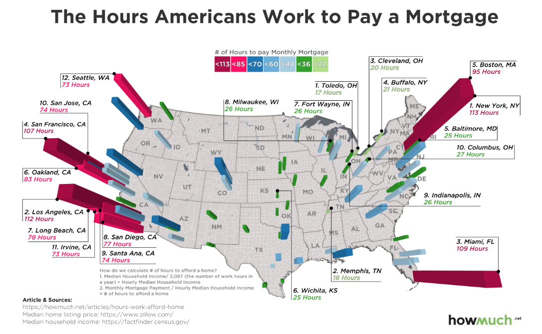
This week’s Makeover Monday project focused on how expensive it is to own a home in major cities across the United States. The original article presented the data as the number of hours of work it takes to pay the median monthly mortgage payment. You can read more about the methodology in the original article.

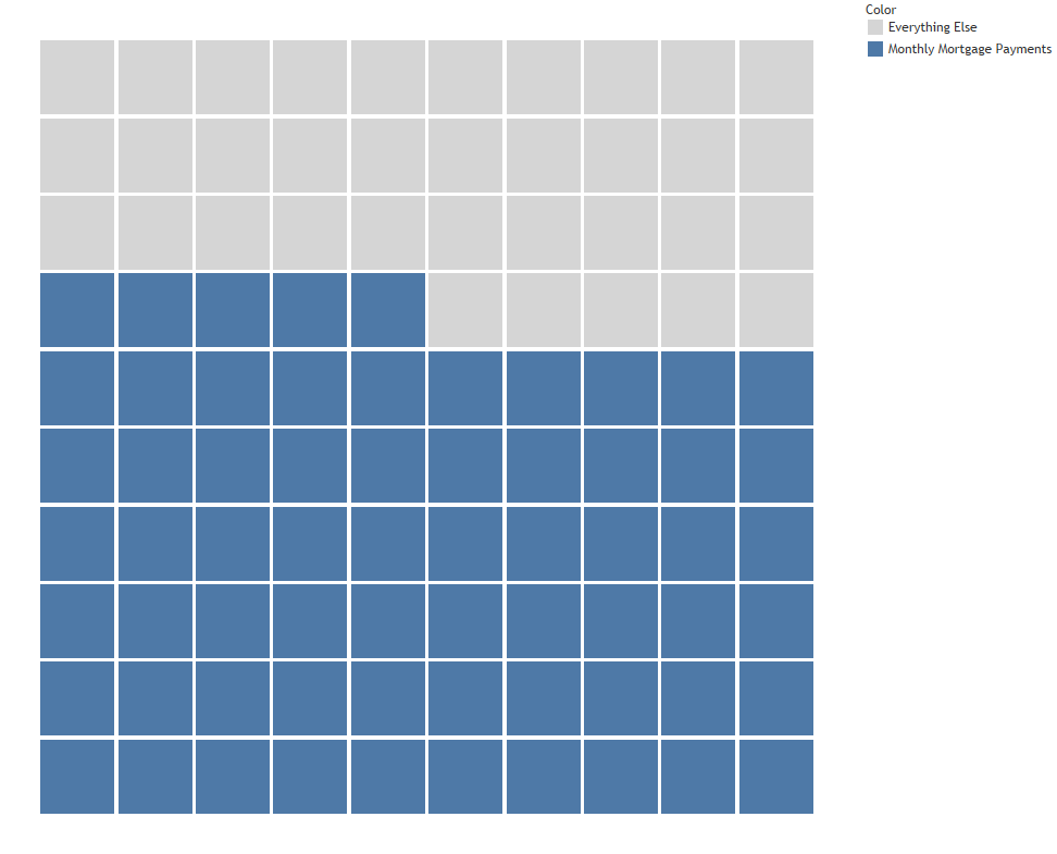
Being a bit of a minimalist, I wanted to simplify the visualization. I decided to focus on a more familiar metric, showing the percentage of income that is devoted to monthly mortgage payments. I originally played around with some waffle charts, thinking that would be a good way to visualize how little money is left over if you live in a city like New York, where 65% of your budget might go towards your house.
Side note: I’d go broke if I lived in NYC because I need approximately 43.2% of my budget for food alone! Good thing I live in DC, which (surprisingly) didn’t even rank in the top 20 for this study.

But back to the viz … It turns out that displaying dozens of waffle charts is a bit busy (and complicated!), so it didn’t quite satisfy my urge to simplify. I changed course and displayed the cities as a scatterplot and used Rody Zakovich’s banding technique (steps are threaded in this twitter post) to draw attention to the cities where it costs the most to own a house—a.k.a. cities Keith will never own a house in because he would starve.
