
When illustrating the difference between UX, UI and graphic design, I like to use the analogy of spoons. Spoons are simple. Everyone uses them. Yet if I were to root around in your kitchen drawers, I’d discover more than one kind of spoon, each with a different look and purpose.
You might have a slotted spoon for fishing eggs out of boiling water or a purple plastic spoon for feeding your newborn. You might have wooden spoons for stirring soups and soup spoons for eating soups. All different. All spoons.
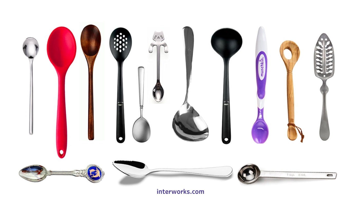
Above: What do these spoons have to do with design? Everything.
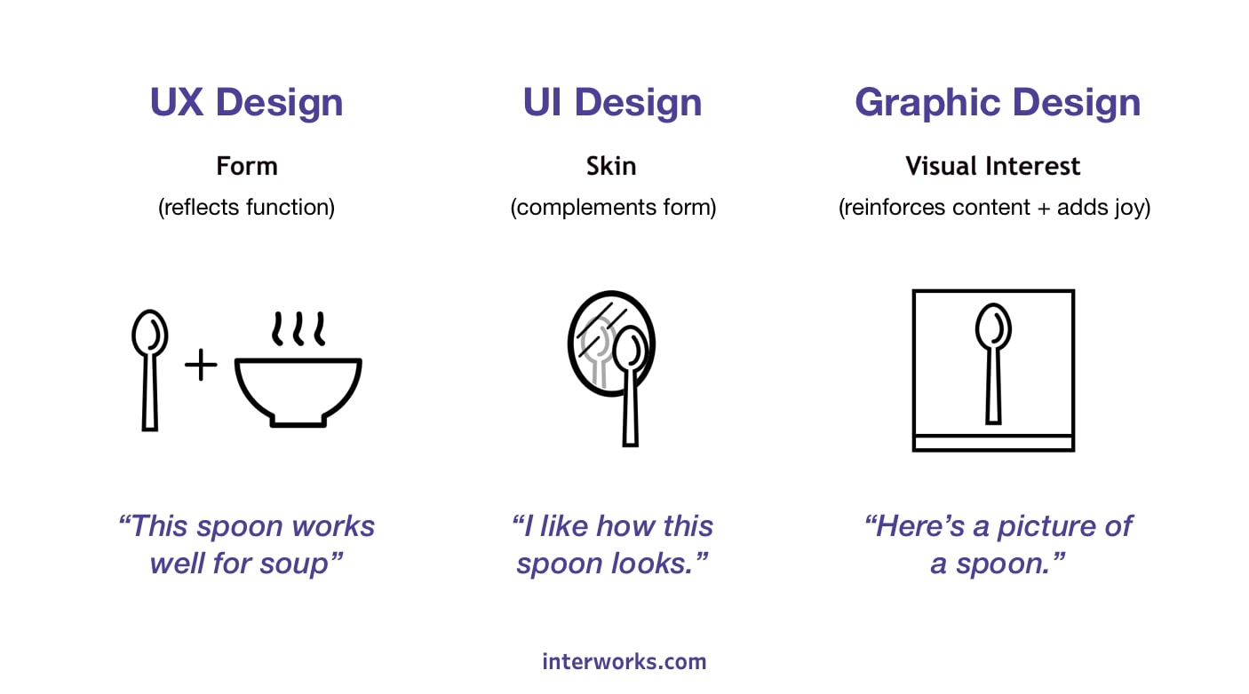
UX Design
The material and shape of each spoon reflects its function. Baby spoons are made of soft plastic to be gentle on little mouths. Slotted spoons have slots for retrieving food from liquids. It’d be frustrating to feed your newborn with a slotted spoon and impractical to use a baby spoon for retrieving hard-boiled eggs. Thus, the form of the spoon (its shape and material) reflects its intended use.
This is User Experience (UX) design.
UX designers design the “form” of digital or physical products. On websites and in mobile apps, this manifests as the site architecture and page layouts (a.k.a. where things are located and how things are arranged). In other words, they make sure the form of the product helps you meet your goals.
UI Design
Back to spoons…
If I asked a dozen people to show me their favorite soup spoon, I’d get a dozen variations of the same design. Some would have wooden handles, others metal. Among the metal ones, I’d find still more variation. Some might have tapered handles while others featured subtle engravings. Some would be ugly and others plain.
This is User Interface (UI) design.
UI designers handle the look and feel of digital interfaces. This is often referred to as the “skin” of an application, and it’s what most people think of when they think of software design. On any given day, a UI designer might do things like select color palettes; design icons, buttons and toggles; select shapes and imagery; and apply or determine brand guidelines. UI designers also tend to be the ones creating high-fidelity mock-ups and interactive prototypes.
But UX and UI design are closely related. Going back to our spoon analogy, a spoon with an over-carved bowl might result in an unpleasant eating experience, and a soup spoon with a wooden bowl would feel rough against your lips. So how do we ensure that look doesn’t override function? The answer is simple: we ask the users for feedback.
Graphic Design
If UX is akin to the form of a spoon, and UI is akin to the “skin” of a spoon, where does graphic design come in to play?
This is where we stretch the analogy.
Think of graphic design as a picture or illustration of a spoon, the thing that reminds you what the heck a spoon even is … because I’m sure you need reminding (Told you it was a stretch). Graphic design provides visual interest that reinforces content, adds joy or provokes emotion. Like this:
Above: This image is an example of graphic design reinforcing the message.
If you struggled to understand any of the concepts thus far, hopefully the above image made things a little clearer. Graphic design is key in communicating emotion, intent and distilling complex material. It can be used for practical purposes (like the above example) or can simply exist to make people happy. Unlike UX or UI design, however, graphic design isn’t limited to digital interfaces. From package design to physical advertising, car wraps to book design, graphic design is everywhere.
All three disciplines have their place in the design world, and all are helpful for communicating with your audience. Don’t believe me? Take a look at this Venn diagram:
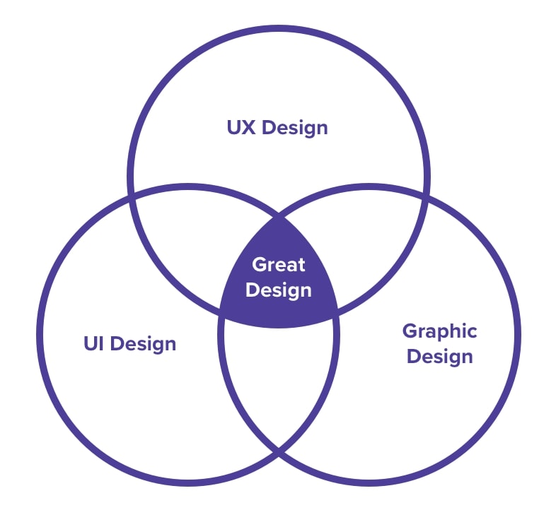
Above: See, I told you.
Great Design
But in all seriousness: Whether you realize it or not, you’ve experienced the results of UX, UI and graphic design just by reading this article.
If you were able to navigate to this article with ease, you’ve experienced solid UX design. If you didn’t vomit immediately upon seeing this page, you’ve experienced good UI design. And if you found the above images helpful (or in the very least enjoyable), you’ve experienced mediocre graphic design via your friendly neighborhood UX designer.