
Because I have just that much free time, I thought I’d take a gander at my spending so far this year using Tableau. The holiday shopping season is coming up, and I wanted to know if I would have any money left to fill stockings with something other than the lumps of coal my wayward teen and pre-teen children so richly deserve. Say it with me: “This Too Shall Pass.”
The Dashboard
How It’s Made
I logged in to my bank website and downloaded a .csv file, which I quickly pulled into Tableau. That’s where all the fun begins! This super-simple dashboard makes use of just three different types of visualizations: a treemap, bar charts and what is quite descriptively named a “circle view.” There was a little bit of manipulation I had to do on the back end in MS Access, namely querying out the different store names that fit in my categories:
- Dining Out
- Grocery (food only, excluding fuel purchases)
- Fuel
- Household (Home Depot, cleaning supplies, sheets, towels, etc.)
- Entertainment (bowling, shooting range*, movies)
- Personal Care (salon/hair cuts, exclusive of prescriptions)
*This is Texas, y’all!
We Start with the Treemap
Once I had that ready, I decided to go with a treemap for my first visualization. I like them because you can color by either a measure (gives you shades of a specific color) or a dimension like Category (gives you a different color for each box). You can then size them by a measure. In my case, they’re sized by Amount Spent. This makes it pretty clear to see that eating out is eating almost 1/3 of my budget! When you combine that with the Grocery category, almost 56% of my budget is spent on food. I have no idea what that says about me. It can’t be good, can it?
Next, the Bar Charts
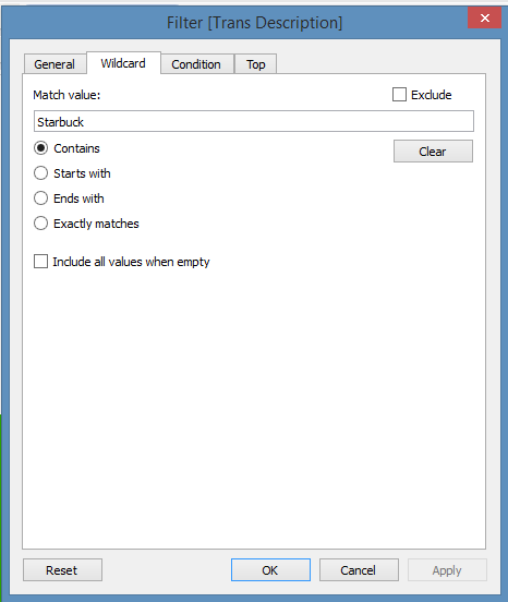
I wanted to dig a little deeper and try to figure out where that dining-out money was going, so I used a Wildcard filter to isolate any purchases made at Starbucks.
By turning it into a bar chart based on Week of the Date Purchased, I saw right away that I go to Starbucks at least once every week. I even saw that during most weeks, I actually go on multiple days. You can tell this by hovering over any given bar to find out the amount spent and the number of transactions that week. Tableau may or may not have just exposed my very serious pumpkin bread and Orange Valencia habit.
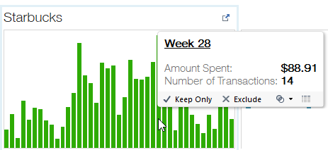
What was interesting is that I go to Starbucks twice as often as I go to the salon, meaning my addiction to the habit-forming pumpkin bread is much stronger than my addiction to styling products. Also, you can see by the height of the bars on the Salon/Hair Care chart exactly which weeks I spent getting my hair colored/cut/highlighted vs. the boys in the family getting their buzz cuts trimmed. Thank you, Tableau, for exposing that little tidbit. Don’t worry honey, I do it all for you!
We Round It Off with the Circle View
Finally, when I played around with the circle view, I decided to use # of Transactions to disaggregate my data. Then, I colored by category and used Amount Spent as my measure.
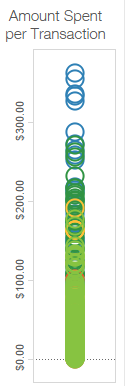
While the Household purchases tend to be high in actual dollars spent per transaction, it’s still not the largest category overall. The sheer volume of transactions in the Dining Out category, indicated by the thick swath of light green overlapping circles, is what pushes it to the top ranking on the treemap.
That’s what makes Tableau such a great tool. Depending on which chart type you use and how you use marks for color and size, the data tells a different story. It also serves as a reminder that visualizations don’t need to be fancy or use a ton of bells and whistles to be useful. “Don’t make it more complicated than it needs to be” is sometimes the best policy.
And so is avoiding Starbucks, if you want to have money for gifts this holiday season. Just sayin’. 🙂
UPDATE: Check out part two to see how I stepped up this viz by adding Action Filters.