
Sam used to live in Excel for financial analysis, that is until he discovered Tableau. In this series, he shares how Tableau can be a massive difference-maker for financial teams.
Tableau isn’t just a useful tool for visualising and analysing data. There’s no doubt it has enabled me to improve and optimise my team, but there’s another benefit I did not initially appreciate when I first began using Tableau. Coming from the world of Excel, my approach was often to use my experience in that program to inform my use of Tableau. My view of Tableau and its capabilities was limited, to say the least.
After using Tableau for a year or so, I began to analyse by looking through a Tableau lens rather than my narrower Excel lens. The overlapping data boundaries between departments became more and more clear while using Tableau. I was able to work with other teams to recognise and enhance department connectivity across the business.
Practice Makes Perfect
Connectivity did not appear by magic when I first installed Tableau. Out of the box, Tableau is a powerful and easy-to-use analytical tool, which I already touched on in my first blog. But what it doesn’t know is how your data overlaps or what visualisations will bring teams closer to creating and enhancing connectivity.
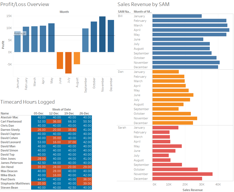
Circling back to my starting point, you may be in the same position as me when I first joined the Tableau world. I used to build dashboard after dashboard of what I thought other team leaders should see. Here’s an example where each visual is coloured by profit/loss to highlight what may have contributed to good or bad performance:

None of these were the wrong visuals to build, but did they enable connectivity and effective decision making across multiple departments by using different analysis and metrics? The simple answer is no, not really. The dashboards were only useful to the finance team and executives because they were built by finance people and then shared with non-finance people. I’m happy to admit it wasn’t an optimal formula.
An Overloaded Dashboard
So, this is all great in theory, but where’s the practical application of this? Once you start to work with other departments to see the data being used, you’ll start to see overlaps and common forms of analysis or metrics. For example, take a consulting firm with a sales team, a consulting team, a finance team and an operations team. Here’s what they may individually track:
- Sales team measures £/$ revenue.
- Consulting team tracks timecards and hours logged.
- Finance team measures profitability.
- Operations team tracks the schedule and resource planner.
In the screenshot below, each of these is on one page and you can easily see how different they are from one another:
It’s difficult to know where to take action and what to prioritise. To connect our teams at InterWorks, it helped us to focus on a metric which could be shared across the teams, but still align with their objectives. Our objectives being: sales wants to hit their targets, consultants want a variety of challenging engagements, finance wants to see a healthy bottom line and operations wants to see solid utilisation. Here’s how InterWorks has gained value from Tableau:
- Sales can easily switch their dashboards from revenue to hours sold.
- The consulting team divided their timecard dashboards into billable hours versus internal hours to differentiate hours that generate revenue from hours that do not.
- Finance pivoted from dashboards focused on consulting team profitability to dashboards focusing on utilisation % and billable %.
In essence, we are looking at the following headline data below (made up numbers) and each team created a range of dashboards that hinged on this:
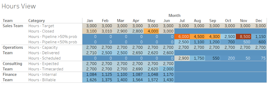
After building a more granular set of dashboards that visualised the journey of billable hours from pipeline to sold, assigned to scheduled, delivered to timecarded and invoiced to cash, the teams were able to talk about the same metric and identify actions.
For example, if hours sold grew consistently from month to month, there would be a cross-team discussion about resource capacity ahead of reaching the point where demand outstripped capacity. If pipeline hours suddenly swelled (see November in image above), we would identify the outlier deals and start to put together a resourcing plan in case the purchase order came through.
If there was a large variance between hours sold and hours delivered, we might identify deals that spanned multiple months, or we might identify bottlenecks in delivery on our side or perhaps on the client side. Each permutation had a derived action that made sense for each team because we had the unified data in front of us in Tableau.
Multiple Departments, One Viz
If finance, IT or any other team took on the project to build a multi-department suite of dashboards in Excel, there would be more resistance in other teams to embed that as part of their analytical tools. Why? Think about how much more you use dashboards or Excel workbooks you or your team have built over ones built by others.
Tableau has a standard method on how to build your first dashboard; it always begins with measures and dimensions before doing anything else. It is so much easier to co-develop with other departments if you have the same starting point. In comparison, Excel is a matter of personal preference.

Above: Dimensions and Measures in Tableau.
It would be rare to find a unanimously agreed upon best practice to build analytical dashboards in Excel. Each finance person will prefer to build out Excel analytics based on the way they were taught, which leads to diverse ways of building. The problem is then compounded when multiple departments build out analytics and dashboards in Excel.
With or Without Tableau? That Is the Question
If I pick up a dashboard built in Tableau from any another department, I can go right ahead and co-develop with them. It’s incredibly powerful to work on dashboards with other teams, because you get to see their view, they get to see yours and you end up with an outcome both departments can use.
Without Tableau, we would have thought this suite of dashboards would take hours to build, be unmanageable in Excel due to its complexity, and be almost unbuildable in Excel due to the need to blend or union multiple datasets from different sources. With Tableau, we were able to align the metrics and share the new dashboards across team management.
Now, if you talk to any team lead or person in management, you can almost guarantee they will talk in hours and refer to the same metrics but in the context of their own targets. To sum up, we all understand what everyone is aiming for, we help them get where they want to be and we are guided in pursuit of our own targets as well. It’s a somewhat symbiotic relationship.