
Sam used to live in Excel for financial analysis, that is until he discovered Tableau. In this series, he shares how Tableau can be a massive difference-maker for financial teams.
So, a little about me, the author: I’m a chartered accountant and my background is in building finance functions and creating financial performance analysis reporting functions. I trained in a public practice and, after around six years, moved into industry. I’ve been working in industry for the last seven years, and analysing/reporting financial performance remains core to my role and the way I add value.
Although Tableau has been around for more than 10 years, I’ve only been using it for just over two-and-a-half years. Initially, my world was largely spent in Excel, so this blog is about my journey from Excel to Tableau.
Consider This, Excel Fans
Now that the scene is set and you know the angle I come from, can I ask you to consider a couple of questions?
- How many times have you exported data from a finance or CRM system to a CSV and analysed the data in Excel?
- How many workbooks have you created for monthly reporting or ad hoc reporting or analysis of financial performance?
- Do you ever worry that your Excel workbooks have become too big, unwieldy and complex?
Up until a couple of years back, it would be a regular occurrence in my routine to be exporting data to Excel. I’ve lost count of how many times I’ve done this and how many workbooks I’ve created that are now frozen in time because they are based on an extract of data that show just a snapshot in time.
I realised one of the limitations of exporting to Excel was that as soon as a new transaction or adjustment is posted in the accounting system, the previous reports became out of date and the export routines needed to be run all over again.
Formulas needed to be checked, report accuracy had to be reviewed and any additional data or changes to the way management wanted to look at the report would also need to be processed. I often did this all at once because of the requirement for timely reporting, and reporting and analysis is just one part of my role; I need to update reports and move on.
Often there is an inherent risk that a formula in a particular row or column isn’t updated correctly or no longer captures the new shape of the dataset, even with controls and checks in place. Time will need to be devoted to checking the integrity of formulas before circulating fresh reports to management, and this is precious time I’d rather have back for another task.
As the formulas we build are complex, take time to build and are often created “in the zone,” when we come back to the formulas at a later date, it is sometimes like reading hieroglyphics! Yes, we’re all proud of building a complex formula which nests aggregations, LOOKUPS, IF statements, combines data from multiple sheets and is 20 lines long … it looks like a work of art!
But the longer the formula gets and the more sources it draws from, the harder it is to control and retain accuracy when updating the source data. In a perfect world, the source data shape doesn’t change and you can just import the fresh data, but that rarely happens. It leaves you wondering whether you built all the formulas with enough flexibility to catch all the new data.
Oh, and did I mention the bigger those formulas get and the bigger the dataset is, the slower they are to update. Excel then hits critical mass and … CRASH! You just lost your work. You hope auto-save is going to recover what you did, but you know you’ve lost maybe 5-10 minutes of work. This will set you back an hour trying to figure out at what point your work was lost and what tweaks to formulas and data that were made since that point.
Wouldn’t it be great to move to a world where those problems don’t exist?
Welcome to the World of Tableau!
The Tableau world is where you can easily combine data sets, create calculations that always include new data, reduce human error, automate your reporting tasks, enable self-serve analysis, share and update your reports, and connect to live data sources.
As I said earlier, my background is accounting; I cannot code, write scripts or anything fancy like that. It took me some time to make the shift to using Tableau instead of Excel for reporting and analytics. Am I glad I took the plunge?
Hell yes, and I wish I did it sooner.
So, let’s assume you’ve reached the stage where you know Excel has reached its limitations and management are expecting reports to be flexible, accurate, timely, robust, updated in real-time and beautiful. I’ll also assume you’re considering Tableau as a potential option, and you’re not sure whether it ticks all the items on your list or whether it’s easy to set up.
The TL;DR is this: Yes, in a vast amount of cases, it will provide what you need and is straightforward to set up. So, if you’re out of time and want to get back to other things, go download a free trial of Tableau and have a play. Come back here if you’d like to see easy steps to get started and a list of the features I use every day to optimise how I do my job and provide the business with critical insights into business performance.
Let’s get into some of the product features I find most useful and how they compare to the old world: Excel. Don’t get me wrong; Excel still features in my world. It just performs a different function, which I’ll go on to explain.
Dashboards and Sheets
Dashboards are containers Tableau uses to bring multiple visualisations together in one place and show them in a clean and orderly way. Visualisations are simply a visual representation of data, e.g. a line chart, bar graph, tree map, etc. Sheets are where you build the visualisations. They are a bit like construction sites where all the pieces are designed, prepared and bolted together.
This probably feels like a Tableau 101, but it’s not the intention. Here I’m attempting to highlight one of the key differences to Excel you will experience as soon as you start using Tableau. It can be daunting and it might feel a bit radical. Hang in there!
The concept of dashboarding is probably familiar territory to you. If not, you probably do it and don’t even realise it. The shift here is not that you’ve never built an Excel sheet with multiple charts on it; it is starting at the very outset to build a dashboard, i.e. to visually display your analysis. When you jump into Excel to build out some analysis, I doubt your first thought is: “How am I going to visualise this?” No, it is probably more like: “I’m going export this data to Excel to see why X happened.” Or it might be: “Why there is a difference between Y and Z?” Or perhaps it’s: “The CFO wants data on sales trends over the last four quarters. Let’s export sales data into Excel.”
The questions of the data are there at the outset, which is incredibly important and something to maintain when you start building dashboards. So, you can see a shift in the way you approach answering questions. “How do I visually represent the data to answer the question?” vs. “Let’s export to Excel and get an answer with the data.”
Visualisation
This is a term explained above and one that I use with more frequency at networking events with fellow accountants. Yes, I do get a few strange looks, a few smirks and a few blank stares. But these are swiftly followed by the question: “What exactly is data visualisation?” In fact, not one person has said to me straight off the bat: “Ah yes, I know exactly what that is.” This, I think, is representative of how far there is to go in thinking about data as a potential picture of answers.
If we pause for a moment to have a look at the following example, we can see how something as simple as colour can make even basic financial summary effective. Hopefully it will also give you the reassurances that you do this already and it’s not someone reinventing the wheel.
Here’s the scenario. The Sales Director wants to know if revenue has varied by more than 10% month-on-month over the past year. How quickly can you get to the answer from Example 1 and Example 2?
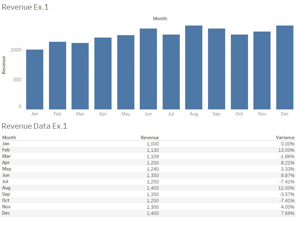
Above: Revenue Ex.1.
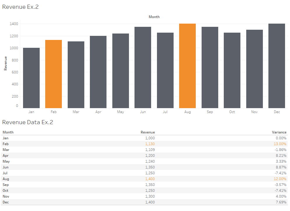
Above: Revenue Ex. 2.
What this is demonstrating is the recipient of your visualisation will, within a few seconds, digest what you are showing them. On top of that they want answers to their own questions very quickly. Providing visually pertinent and well-designed dashboards is the essence of providing recipients what they are looking for.
Is there still a place for tables and crosstabs? Of course there is. Visuals are the headlines – quick to digest, quick to enable the recipient to make a decision. Tables are the granular details. They provide the deep dive that some recipients want to take. The dashboard can serve both the high-level and granular analysis people need.
Self-Serve Data Analysis
Here’s one of the game changers. Not only is Tableau designed to enable you to share dashboards easily, it also enables you to give the intended recipients a way to explore the data themselves without needing to request any changes from your team.
I’m just going to pause for a couple of seconds on this one as it has the power to change the way users digest reports. Ask yourself this: “How many times have you sent a report produced in Excel to a person or team within one of the departments your business (e.g., sales, marketing, C-suite, operations, finance, etc.) and they reply with a request to show the report in a different way? Perhaps this is by quarter instead of by month, individual instead of team, town instead of country, product instead of product category, previous year instead of current year?
This list just covers some of the requests I have seen. Whilst there can be many requests there are often key questions people are trying to find the answer to. We can build a Tableau dashboard in a way that lets the user drill down into time periods, change time periods and switch between filters to answer the question they had when they were putting the request to you. That makes the report personal to them and they become engaged with the data. That is essentially where we try to get to when working in Tableau – answering the questions you have of the data.
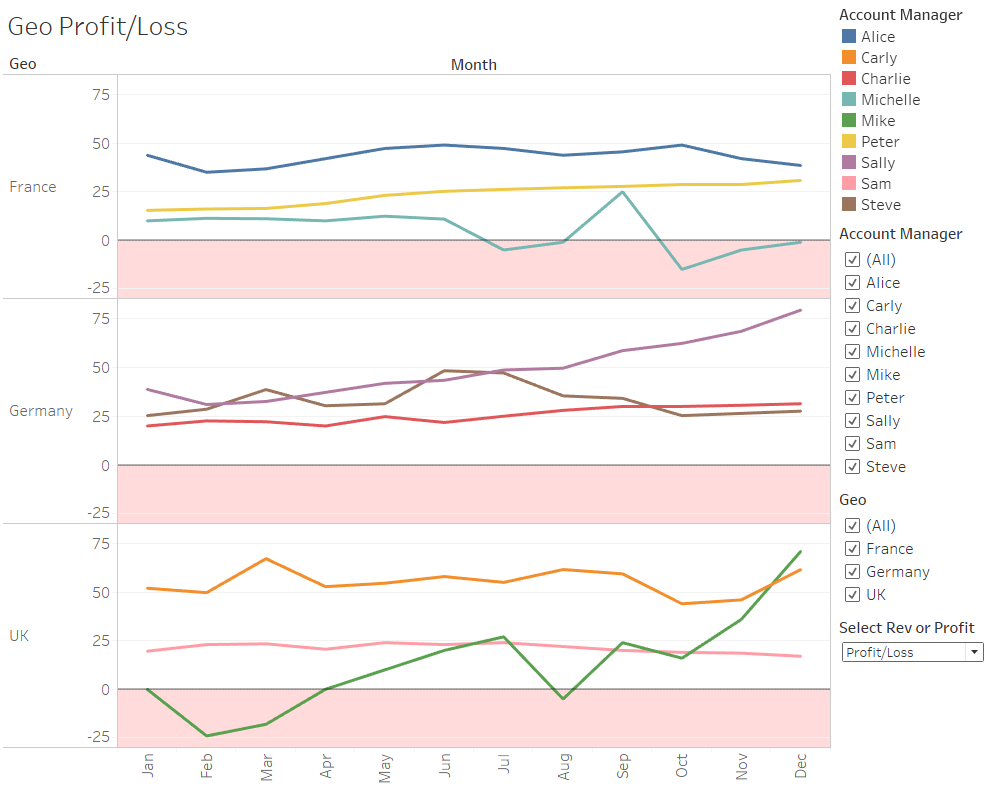
Here is a basic dashboard looking at revenue per geo. Filters have been added to demonstrate how a user can be enabled to change the data in visual to make it bespoke to them.
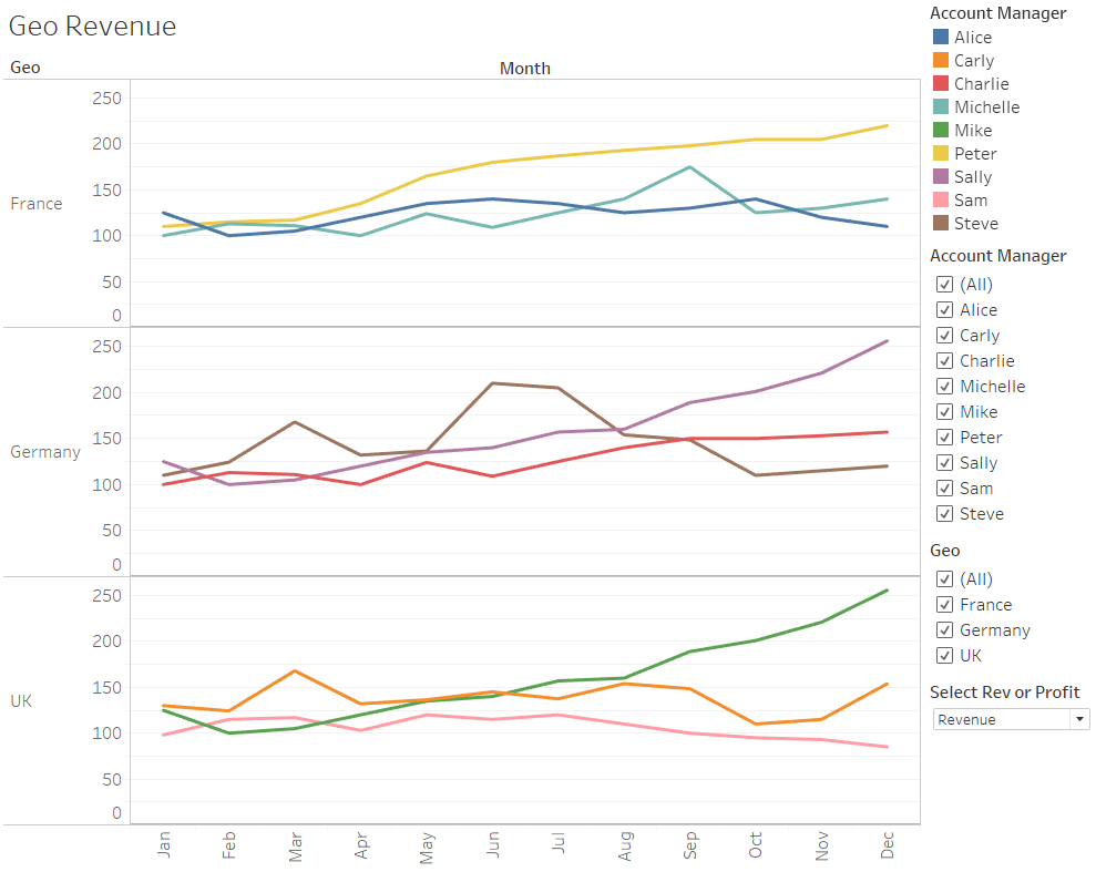
The headline dashboard serves all geos, but say the UK Sales Manager only wants to see how the Account Executives in his region performed over the year. With three regions showing in the view, it’s a little crowded. But if the other regions are deselected, you can find much better definition in the performance.
It took two seconds to filter out France and Germany, and consider how long it would take if the alternative was the UK Sales Manager emails your team for a custom view of just the UK team. You probably don’t get to jump on the request straight away. So, let’s say you’re in meetings all morning and you can’t get to this until the afternoon, but the UK Sales Manager is going into a team meeting in the morning and wants the data back fast. We could do this:
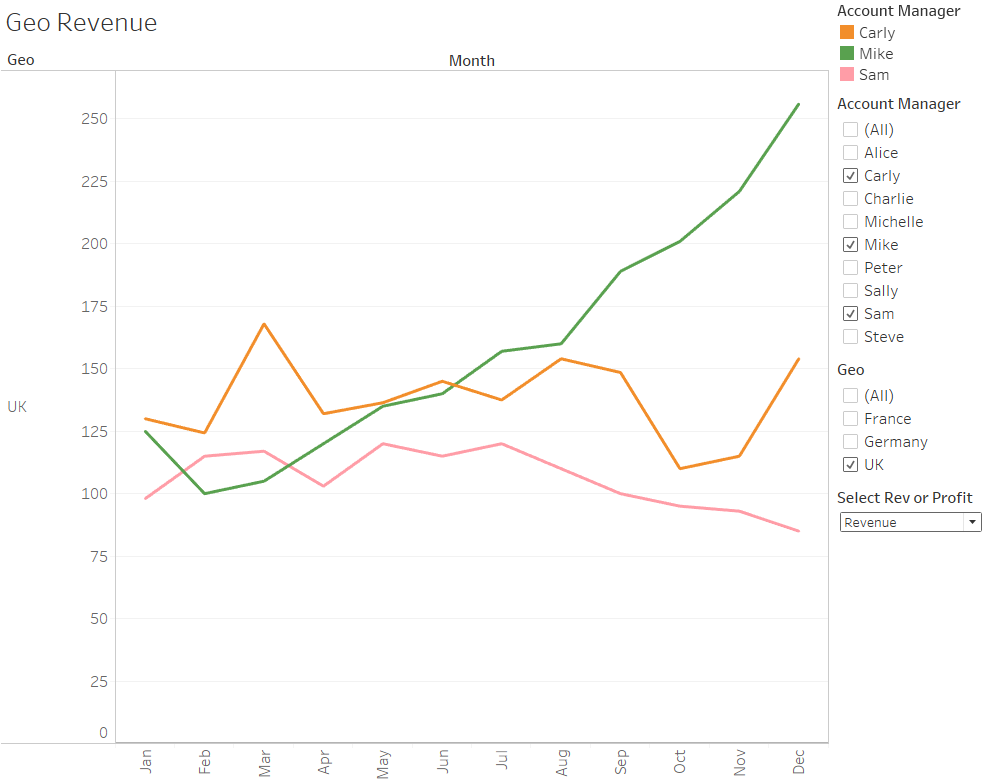
Here is an example of where Tableau enables teams to move quickly. To make this dashboard even more useful, I would usually build a crosstab (i.e. a table) that would show under the line chart when the user clicks on one of the lines. This would give the user the detail they need to find out why Mike is having a great year and why Sam has lost ground.
I would also build a parameter which allows the Manager to switch between Revenue view and Profit/Loss view. Notice how the visual updates the data in the charts as well as the chart title. Neat! I’ve designed the Profit/Loss view with the loss zone shaded red.
Automation / Handoff Time to Finance Team
Let’s start with a question: “How many reports are manually produced in Excel each month? 5, 10, 15?” The number of reports isn’t particularly important here; rather, it’s the time invested in these reports. How much time does your team invest in data prep time, formula building, data checking and report production? What if your team could have a chunk of that time back? Would that be valuable to your business? If the answer is yes, then using Tableau to automate standard reports is a great way to do that.
For example, I have automated the following reports within Tableau dashboards. My role incorporates the operations and finance functions, so you’ll notice that not all views are financial:
- Monthly profit and loss
- Monthly overheads
- Weekly utilisation % and billable %
- Assigned hours and billable hours scheduled
- Timecard analysis: billable vs non-billable
- Travel and expenses analysis
- Hours spent on different client engagements
- Marketing budget overview and detailed spend
- Sales leads generated and # of days to follow up
Automation in this context means that I don’t need to do anything after the dashboard is built. The new data simply updates in my dashboard every few hours when our SQL Server receives data automatically extracted from the various cloud-based systems that we use. Management or I can look at these reports via internet browser any time, any day, without the need for me to take any action.
That is an incredibly powerful feature of Tableau – real-time updates and dashboards accessible any time. We are not programmed to ask questions of our data at specified times in the day, so making dashboards available 24/7 enables a flow of analysis and decision making using data.
Here’s an example of combining dashboards to build a report for the Sales Managers to view the company performance at any time:
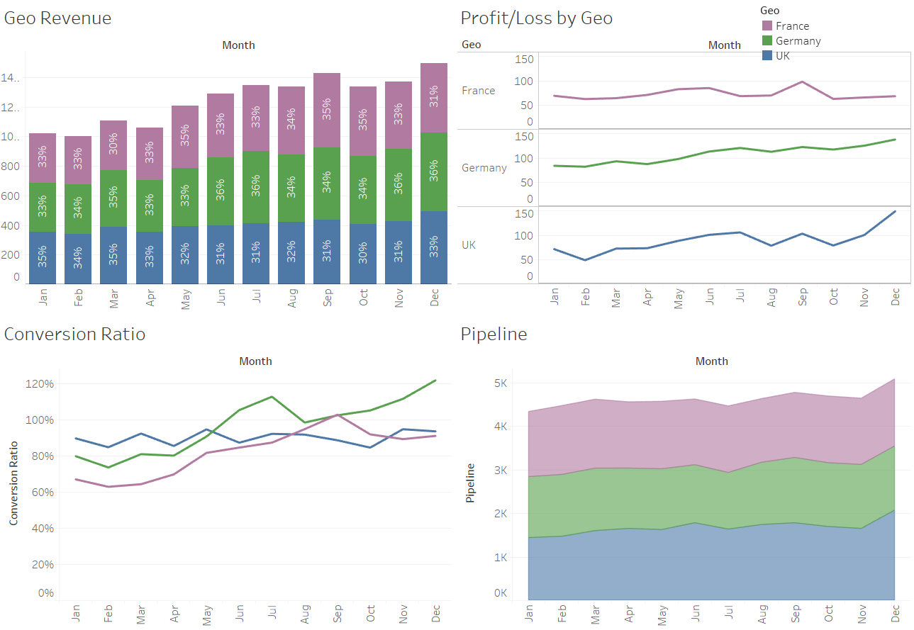
There are nicer ways of showing the visuals above, but the main point here is to show how Tableau makes it easy to build and share key data through visualisations. The row-level data is all sat behind the scenes, protected by Tableau so the user can change filters without amending the raw data.
One Final Question
Last question: “Can you see yourself and your team benefiting from reporting and sharing analysis through Tableau?” Personally, I was hesitant to start, but now I am at home in Tableau. I think of a question of the data, I jump straight into Tableau and I go get the answer.
I hope you enjoyed this piece and found it helpful in your analysis of Tableau. I have many more thoughts on the value Tableau can bring to all sorts of financial applications, so stay tuned for follow-up pieces. In the meantime, if you desire further help evaluating Tableau for your business, reach out to our team.