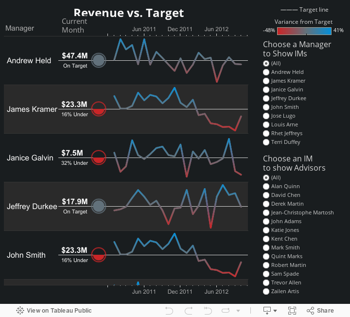
Key Performance Indicators are one of the most common things people need to display in a dashboard. This usually involves comparing current values or historical trends against a target value. Tableau makes it easy to show current values and trends in one dashboard, but this requires two separate views. In this post, I’ll describe a technique for showing both of them in a single view.
The Problem with Separate Views
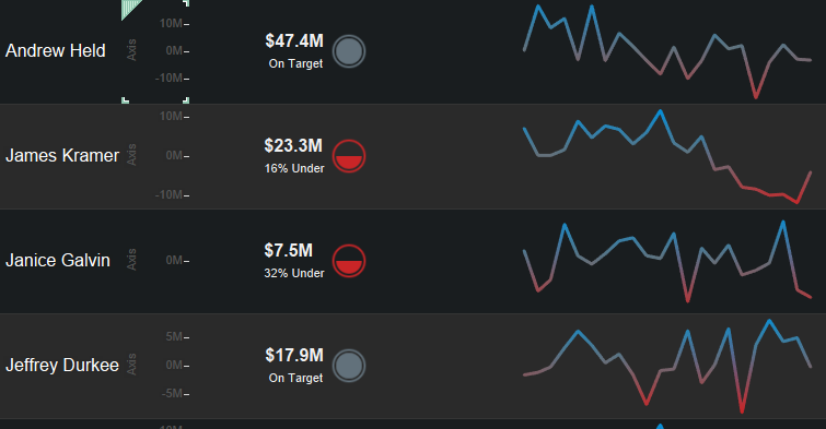
The views below are set up with a white line representing the target value and marks to indicate whether the actual value was above or below that target. Current values are in one sheet, and historical values are in another sheet:
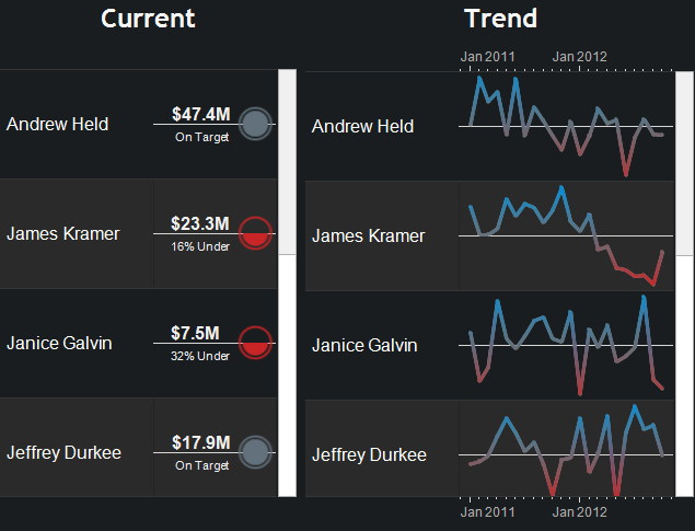
While showing these in two separate sheets is easy to build in Tableau, this can cause some problems. Each one scrolls separately, so if I want to get to the bottom of the trend lines, the left sheet doesn’t scroll together with the view on the right:
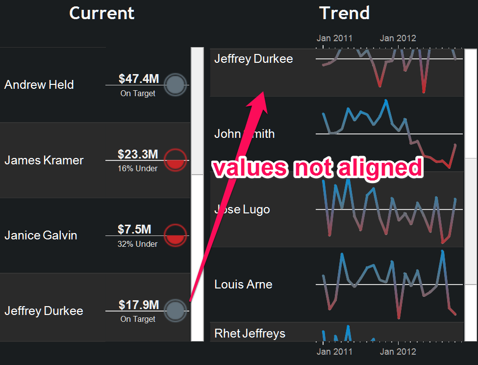
One way to deal with this problem is to apply actions that filter each view on click instead of scrolling. Another option is to simply use quick filters to only show one person at a time. Each of these solutions requires clicks, which could become frustrating when looking through longer lists.
Putting Both in One View
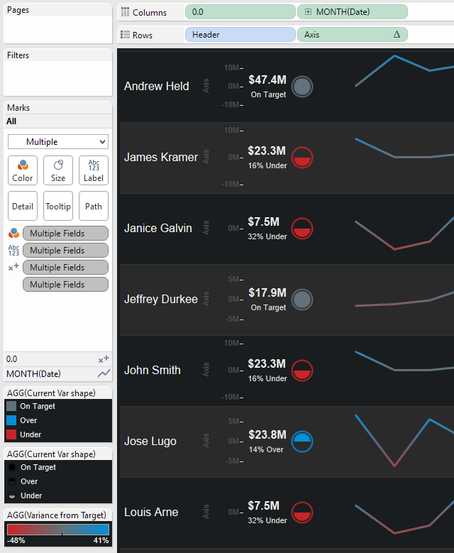
The only way they can scroll together is to put them on the same worksheet. The critical step in this is to show a stoplight directly aligned with the target (zero) axis, then show a trend line that’s a variance from that axis. This can be done with any kind of metric: dollars, percentages or a mix of measures. Here are the steps:
- Set up a sheet with a two columns: one that’s a “dummy” field (I use a 0.0 parameter) and a date field.
- Add your dimension(s) to the view.
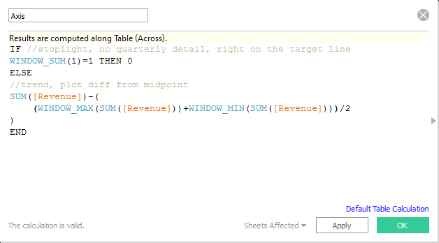
- Create the calculation shown below, replacing the [Revenue] field with your own measure. I’ll explain this in more detail below.
- Assign Shape as the mark type for the 0.0 measure and Line as the type for the date axis.
You can now begin controlling the shapes, colors, etc. as you would in any other view to better highlight performance vs. goals. The complete setup is shown below and can be downloaded with this workbook from Tableau Public:
Aligning the Axis
Both marks share a common axis on the rows shelf, so it’s important to center the “stoplight” in the middle of the row. If we simply plotted everything as a variance from target, the stoplight would be off-center when/if the trend is well above or below target. Therefore, we must plot the current value at the midpoint of the trend line and plot the trend as a variance from that midpoint to always ensure it is centered. The drawback is that this may make it impractical to display a “target” reference line because it could throw off the axis range. Color is one way to show whether it’s above or below target even if the reference line isn’t shown.
This is how the [Axis] calculation (shown above in step 3 works):
- Since the Date detail exists on the trend line but not the stoplight, “WINDOW_SUM(1)=1” returns true for the stoplight shape.
- We can plot the shape at the middle using the above test and set it at zero when true
- Using window calculations for the maximum and minimum values helps us get the midpoint of each line: “(WINDOW_MAX(SUM([Revenue]))+WINDOW_MIN(SUM([Revenue])))/2”
- With the midpoint in hand, we can plot values as a difference from the center: “SUM([Revenue])-()”
Sizing Rows and Columns
Those attempting to recreate this view may notice that the columns are not all the same size. You may find the viz looking more like this, with a lot of empty space:
Getting rid of this blank space is easy. Right-click in the view, and choose Clear Manual Sizing:
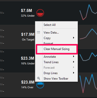
This will reset column sizes to fit better, but it will also reset row sizing. When you manually adjust row size, Tableau will automatically set the measure columns to the exact same width. Since this view is built with a “0.0” parameter, we can control the position of the shape by editing the axis range and move it closer to one side or the other. Consider these options and the trade-offs involved when applying this method to your own data.
A Better Stoplight for the Shape
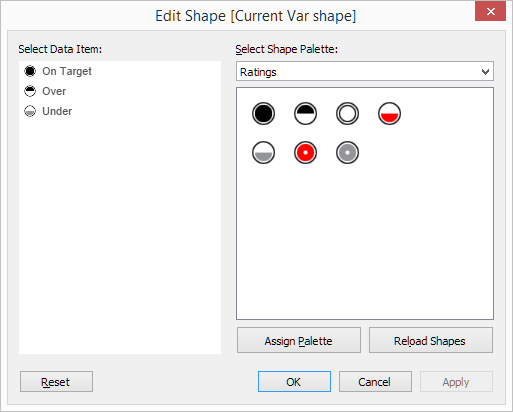
The most common way to show current status against a goal is a stoplight chart, complete with red/yellow/green coloring to indicate variance levels. Since that color palette causes problem for colorblind viewers, these stoplights may become shapes like up/down arrows, thumbs or some other indicator.
I find arrows to be confusing in this case since those are interpreted more as a change over time than as a position vs. a goal. An up arrow tells me we’re “up” since last month, not that we’re “above” target. I like using Tableau’s built-in Ratings shape palette for this. It gives me circles like you might see in a stoplight chart, but the top or bottom halves may be filled in a way that indicates position vs. the target:
The Final View?
The method I’ve described worked great on a recent project of mine and is adaptable for many situations, but it wouldn’t apply to every kind of KPI or data set. I hope to see these ideas expanded to fit more situations to help get past the issues inherent in using multiple worksheets. The final viz below is scrollable and easy to understand where each person is relative to individual metrics. In a future blog post, I will describe how to easily navigate up and down different levels of the management hierarchy within a single sheet, so stay tuned!