
It’s been said before, but what makes Tableau unlike any other data visualization tool out there is the community surrounding it. People don’t just use Tableau – they live it. There are so many helpful resources out there, be it blogs or social media channels, but there is no better place to see this community in action than the Tableau forums.
The forums are a veritable wonderland of data visualization knowledge and networking. It’s a place that where you ask, you shall receive. Tableau employees and users alike unite with the common goal of helping each other use and learn Tableau. It’s also a constant source of inspiration and ideas. I know it’s been a great resource to me personally. In fact, most of the people who have helped me explore the limits of Tableau have never met me and probably have no idea I was reading what they posted.
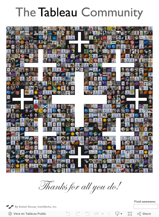
The more I thought about all the Tableau forums have done for me, the more I realized I need a way to say thanks. What better way than by visualizing Tableau forum data? In other words, a viz that visualizes data from a forum dedicated to data visualization (meta, isn’t it?). I collected data on close to 49,000 forum members and narrowed it down to the most active 872 people to recognize their efforts.
Interact with the visualization below:
Breaking Down the Viz
The underlying thought behind this viz is to illustrate that behind every data point is a person. I wanted to emphasize the real people behind this, not abstract representations with bars and lines. Since the community is such a big part of what makes Tableau great, using people to create the Tableau logo seemed like the perfect metaphor. Hovering on a person gives immediate insight into questions like: Are they a Zen Master? What’s their bio? What badges have they earned? Clicking each one leads to their complete profile.
Data Collection Process
The Tableau forums are an ideal place to gather names, faces and activities. Blogs and social media are far more decentralized, making it harder to quantify activity and influence than the points and badges earned at a central gathering place.
The Tableau forums are built on Jive, so I used their openly accessible REST API and the Alteryx Download Tool to get all the names and bios I needed. The points and badges were a different story entirely. Those are created by a Jive plugin called Nitro made by Bunchball, and the lack of a similar API made things a little more difficult. So, since there wasn’t an API, I made my own with import.io to gather everyone’s points and badges. With that in hand, I narrowed down the list of all users to the most active (by points) and gathered avatars using a simple Python script.
More Coming Soon!
As you might imagine, this is a very rich data set, and there are plenty more stories to tell. This post is just the first in a series that will provide in-depth analysis of the Tableau community in a number of ways. Stay tuned for more!