
Many analyses start with a simple question: “How are we doing compared to this time last year?” The quick, easy way to answer that is to add up the numbers and compare prior year-to-date (PYTD) to the results of the current year-to-date (CYTD). However, be wary of the pitfalls that come with that approach. Focusing on only two points in time can skew perceptions by ignoring broader trends or using a poorly chosen baseline. Here I’ll explore the practical implications of variance analysis methods and suggest ways to avoid mishaps.
In a previous role, I was tasked with monitoring the changes in capital spending projections. Every month, our year-end total was either higher or lower than it was the previous month. When projected costs went up, we went about analyzing and explaining why. This sometimes took a lot of work digging into transactions, identifying unexpected cash flows, meeting project managers, etc. Variances were most often explained by the normal ebb and flow of operational conditions. This exercise diverted time from planning and forecasting analytics to lower-value forensic analysis.
The above situation grew out of reporting methods which focused on data at a single point in time subtracted from another point in time. Comparing only those two points did not enable us to answer critical questions that distinguish the “signal” from the “noise,” such as:
- What’s the overall trend?
- Was the prior period a good basis for comparison, or was it exceptional in some way?
- Is this variance within the range of normal fluctuations, or is it unusually high/low?
Choosing a Visualization Type
Take a look at some typical examples of comparing one period to another and think of how you might answer any of those questions given the displayed information.
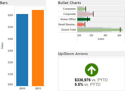
While we can easily see that this year is better than last year, we cannot tell much more than that. Anticipating further questions in the dashboard design process can help avoid wasted effort explaining variances that are well within normal ranges or may even contribute to a favorable trend despite being unfavorable at a point in time.
Augmenting your dashboard with one of several visualization methods can enhance variance analysis by putting it in a broader context. Doing so may even change the business’ perception of performance in important ways.
Year-to-Date Variances Over Time
The above examples are from a dashboard as it would have looked at the end of December. If the same dashboard were shown earlier in the year, all the variances would have been negative. In fact, 2011 would have been in the red until November of that year. Plotting year-to-date sales for the current and prior year makes it clear how things progressed through the year.
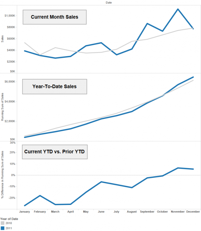
The last chart sets the prior year on the zero axis, showing that while sales underperformed at first, they continued improving and eventually ended the year above target. Adding this context along an “as of” date tells a more complete story. In September, an analyst can report to management that although they have seen negative numbers nine months in a row, the situation has steadily improved and looks to end the year on a positive note.
Changing the Baseline
Yet another story is told by choosing a baseline other than the prior period. Changing it from last year to an average over the last four years tells us how this year compares with normal conditions. In the plots below, the “normal” range is shaded in gray as one standard deviation above or below the average.
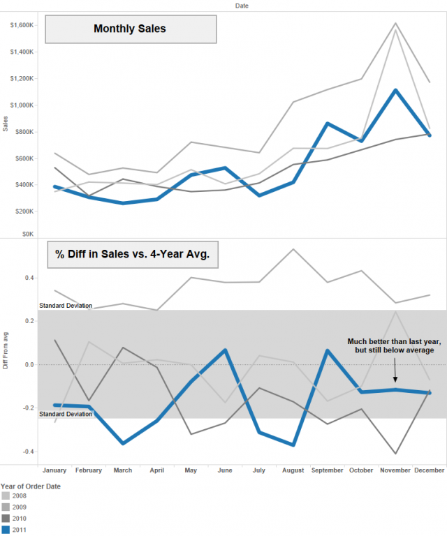
We know from previous analysis that November is the month the current year began outperforming the chosen metrics. Now we can see this has very little to do with impressive sales during the busy season. It is better explained by the fact that last year’s November sales were exceptionally low, and both years were below the four-year average.
Another option to consider is to use a more controllable target such as a budget or key performance indicator. Whether the baseline is the prior-year or a multi-year average, both options result in an ever-changing benchmark. A more static and agreed-upon number ensures consistency over time.
Cycle Plots
The above multi-year design adds important context, but the design is not without its problems. To begin with, it is important to make the current year stand out with a different color and bolder line (inspired by an auto accidents viz by Andy Cotgreave). Even with that, as more years come into in view, it is almost impossible to spot year-over-year trends. An alternative layout known as a cycle plot solves this problem.
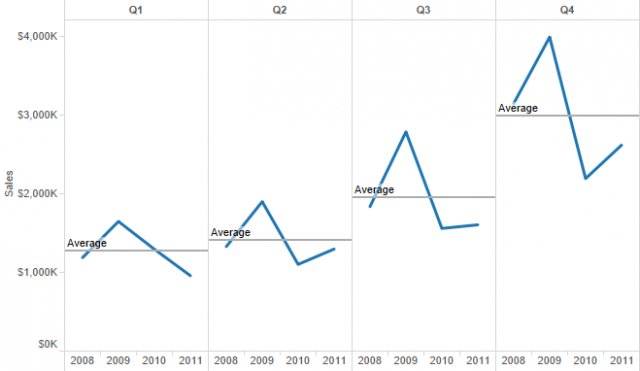
Here it becomes very clear that 2011 outperformed 2010 in all but the first quarter, yet that only kept it from being the worst year for sales in recent history. This plot remains easy to follow as time goes on and more years make their way into the view. By breaking it down into quarters, we can still answer basic questions related to seasonality. Tableau makes it easy to drill down from quarters to months or any other period appropriate for analysis.
I was first introduced to cycle plots through Stephen Few’s book “Now You See It.” Outside of that, I have not seen many of them in use. Viewers unfamiliar with this layout may find them difficult to follow at first glance but should be able to warm up to it quickly.
Let the Data Tell Its Story
The duty of anyone making choices about what to display in dashboards is to ensure those choices tell the most accurate story possible with available data. As we’ve seen, simple decisions about the basis for comparison, range of time in view and chart types can change perceptions dramatically. Let’s review some of the conclusions we could draw from the charts above:
- “We beat last year. Good job.” (as of December)
- “We’ve had nine straight months of poor sales, but it’s getting better.” (as of September)
- “This was our second-worst year, well below average.”
Which one is the real story? Which design tells that story the best? While I would argue that a dashboard with a cycle plot and year-to-date totals would be the most appropriate for this situation, it won’t be the right choice for everything.
Consider how layout options can help or hurt people’s ability to comprehend changes over time or in comparison to KPIs. Understand the consequences of including or excluding data points, how that changes the story and its impact on decision-making. Fit the design to your data instead of molding it into an established norm. In other words, let the data tells its story.