
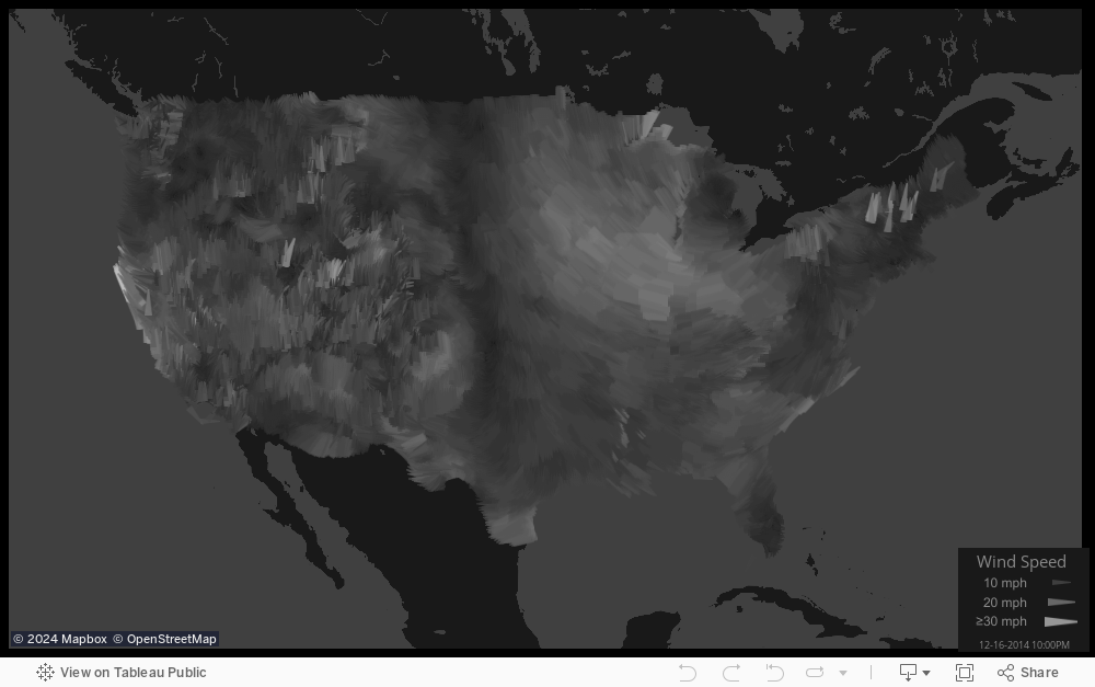
Of the hundreds of data visualizations I’ve seen, only a few stand out as exceptionally striking. The design, subject and uniqueness all come together perfectly. One of them is the animated Wind Map at Hint.fm.
I can practically feel the air moving along the smooth, sweeping lines. It inspired me to try mimicking it in Tableau, but I wasn’t quite sure how to capture the same feeling without animation. An idea finally struck, and the result surprised me. Click the image below to see the result:
Here is a close-up of the Rocky Mountain region:
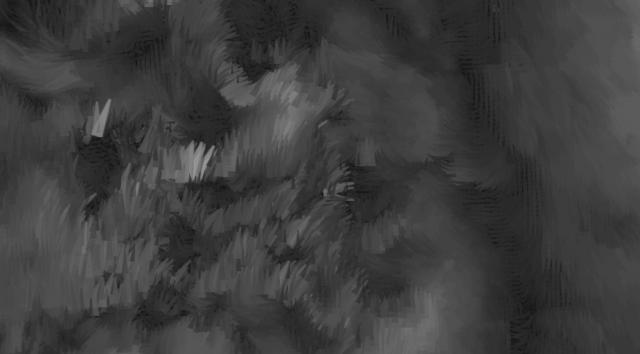
The chaos and fury in the Rockies invokes memories of nights at the Air Force Academy when the wind swept down the mountains and howled through the handrails above my room.
A previous iteration reminded me of a black-and-white pastel portrait by my aunt, Bonnie. New Englanders notice a solitary sailboat-like outlier, reflect a moment on why it’s there, then proclaim: “That’s Mount Washington!” Upon closer inspection, their conclusion is correct. This is something that connects with viewers everywhere in unexpected ways.
What Makes Something “Data Art?”
Usually, when I see something in the category of “data art,” it is one of three types:
- Visualizing outputs from an algorithm related to a mathematical or logical concept.
- Data that is fed into software but abstracted in ways that don’t convey its meaning.
- Artwork that is converted to x,y coordinates in data tables, then visualized as a modified form of the original.
This visualization does not fall into any of those categories. I consider this “data art” because it communicates the story within the data in a way that feels like something different than the perfect digital bars and lines normally seen in data visualizations. It has a kind of softness while the complexity and sense of motion draw interest. I will be so bold as to say it could work equally well as oil on canvas as it does in Tableau.
How It’s Made
The data is from the National Digital Forecast Database, the same source as the Hint.fm wind map. I struggled for a long time figuring out how to get it, so I’ll save others some trouble: Install the Degrib software as explained here, and use it to download CSV files. The grids are not limited by country borders, so I used an Alteryx module from my colleague, Michael Treadwell, to filter points within the contiguous land area of the United States. That left me with 1.3 million data points, which is too much for Tableau Public and too dense to achieve the effect I was after. I filtered it down to every fifth point in the x and y direction to put it in a regular but more sparse grid.
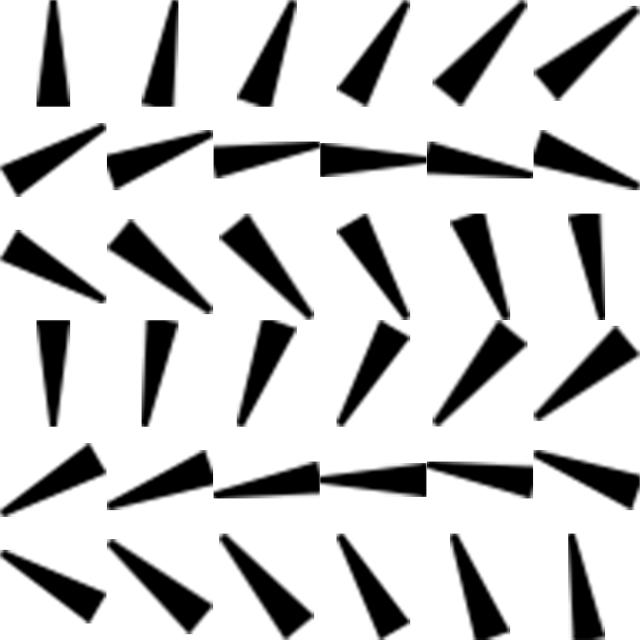
The wind vectors are visualized with a custom arrow shape I created in Photoshop and rotated 36 times (wind direction is defined in 10 degree increments). Everything after that is a matter of tweaking color, transparency and size variations as you would with any other custom shape. A ZIP file of the shapes is at the bottom of this post. Photoshop users with some programming ability can easily rotate their own shapes by following this tutorial with minor modifications.
Further Applications
Vectors can be defined by two endpoints or by a point, magnitude and direction. Tableau recognizes the first definition and connects two points in the order defined on the Path shelf. Many data sets, such as this wind forecast, use the other method. Custom shapes rotated for each degree of the compass eliminate the need to manipulate this kind of data prior to connecting in Tableau.
I can also envision this technique applied to scientific studies related to magnetic fields, particle motion – you name it. I know what some may be thinking: “Could you also rotate a shape like this to make gauges in Tableau?” My answer: “Yes, you can. No, you shouldn’t!”