
Everyone who knows me, knows I love pinball. To me, pinball is a wonderful mixture of art, physics, design and history that’s intertwined into a gameplay that’s both analog and digital. It’s not just me, the U.S. has had a long love affair with pinball, starting with its roots as a cheap Depression-era form of entertainment to an expression of youth rebellion in 1970s arcades to its recent revival as a nostalgic barcade activity.
Also, if you think pinball doesn’t have an interesting history, check out this picture of the NYC Police Commissioner in 1949 taking a sledgehammer to a pinball machine and tell me that’s not interesting! Given my love of pinball as well as having that curious, data-nerdy trait that seems so abundant here at InterWorks, it was only a matter of time before I made a pinball data visualization.
The Data Viz
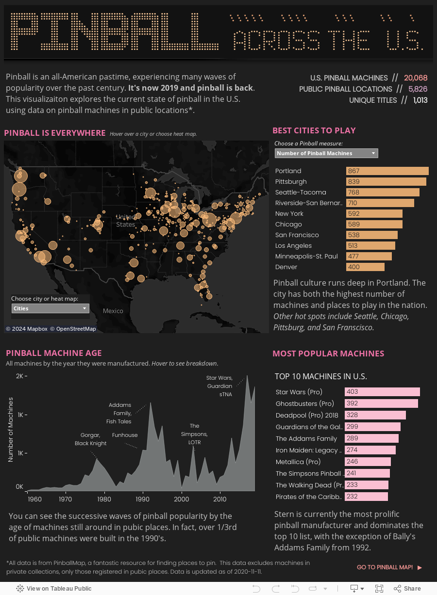
This viz is meant to let you explore the current state of pinball in the U.S. through all the known pinball machines in public places. What are the best pinball cities? What are the most popular pinball machines? From a Tableau perspective, nothing crazy fancy going on here except for maybe two features:
- The Heat Map: Yes, proper geographic heat maps (or density maps) will eventually be native in Tableau as announced at #TC17 (possibly in 2018?).
- Viz in Tooltip: Ah, the long-awaited Viz in Tooltip. In my case, I wanted the user to see the most popular pinball machines were still around plotted by the manufacture year, without excessively bogging down the viz. Here’s how to get started making a viz in the tooltip.
The Data
PinballMap.com is the perfect resource for navigating the pinball world. I want to play The Addam’s Family? I consult PinballMap to tell me where to find one. If I’m traveling to a new city and want to pin? I consult PinballMap to help me find the best arcade in town. They collect user-driven data on pinball machines, locations and quality. Lucky for me, they also provide a handy API for accessing their wealth of data.
The Prep
There a few things I needed to do here:
- Get the data.
- Union a bunch of JSON files together and transform to a usable form .
- Combine with Census data.
- Get the data into Tableau.
I used a combination of Python and Alteryx for the data prep – Python to get the data and Alteryx for the rest.
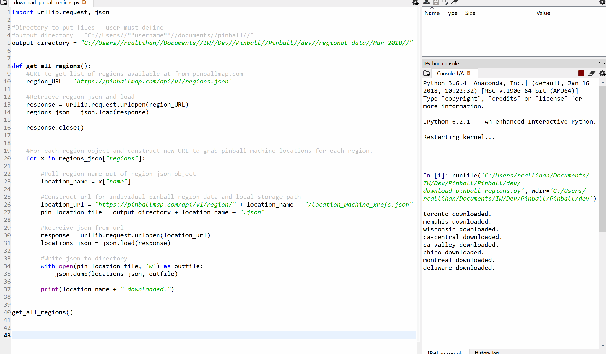
Getting Data with Python
The data is divided into 93 separate regions, which can be individually downloaded. I could take the time to download each region manually, but that’s way too much work. So, I wrote a quick python script to find all the regions and programmatically download all regions. Here’s what that looks like:
Alteryx Data Prep
By all means, the data could be prepped in Python. Though, for a few reasons, I turned to my favorite data Swiss army knife, Alteryx. Here’s why:
- The JSON format played well the Alteryx’s JSON parser.
- I needed to spatial join (or spatial match) pinball locations to Census geometry and population values. Alteryx makes this easy.
- I like Alteryx.
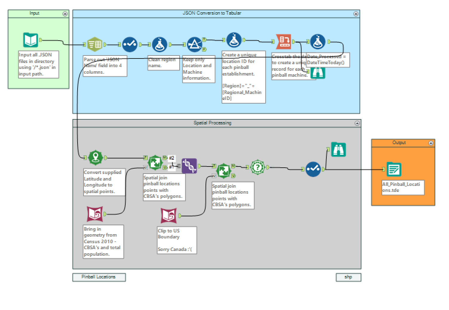
The Basic Workflow
- Point to the directory with the 93 JSON files and union together with Alteryx’s Wildcard feature inside the Input tool.
- Cross tabulate the data to get a unique record for each pinball machine.
- Spatial match (or spatial join in the GIS world) the pinball locations to Census CBSA’s to bring in population data and provide a geographic unit of analysis.
- Clip the points to the boundary of the U.S. (sorry, Canada).
The Population Data
In the viz, I calculate pinball machines per capita, which requires the inclusion of Census population data. I also use Metropolitan Statistical Areas for my unit of analysis. For you Alteryx users out there, you don’t need the spatial data package to access 2010 Census data with their Allocate tools. Just get it here for free. This download is real handy if you need quick access to 2010 Census tables and geometry but don’t want to mess around with Census American Factfinder.
The Heat Map
Heat maps are fun and a good way to visualize relative geographic distribution of a phenomena. Though, the data prep can be a little cumbersome, even in traditional GIS tools. Alteryx is an excellent spatial data tool, and it’s possible to set up the heat map data in Alteryx to display in Tableau. Chris Love put together a really useful macro to do nearly all the work here. I simply put the x,y coordinates of all the pinball locations with a count of pinball machines in each establishment as the “heat” value. I tweaked the distance decay parameters a bit to get a heat map that made sense for the distribution of my points and the area of interest (i.e., the entire U.S.).
Next
Are you a data-nerd and like pinball? Stay tuned. There’s plenty of data in this dataset to splice and dice. You’ll be seeing more on the subject from me soon.