
In the interest of full disclosure, I should let you know that I am a SAS user with a math background. I want to share my experience of exploring Tableau as a new user doing analysis in a relatively unfamiliar environment.
For this first piece, we will look at a multiple regression and examine how Tableau can help us quickly visualize some simple but important relationships within a data set.
What is Multiple Regression?
Multiple regression is a process that helps to understand the correlation between several independent and one dependent variable. Unfortunately, creating an accurate model with this method can be time consuming because the underlying principles of regression can require a great deal of expertise to understand and implement. The good news is that if you need a quick overview of data relationships, then Tableau can help you create and test hypotheses with ease.
Multiple Regression in Tableau
In this example I am looking at a small data set that contains information on wins, runs, saves, etc. from all 30 Major League Baseball teams in 2008; the idea is to better determine which stats can predict wins.
Create a Scatter Plot Matrix
First, we will create a scatter plot matrix using all of our variables. The matrix is created by simply dragging each measure into the Row and Column shelf and setting each variable as a dimension.
![]()
Once the matrix is populated, use the Show Trend Lines option to display.
NOTE: In a regression, it is important to observe not just the relationship between your independents and dependent but also the correlation between the independents themselves. If two independent variables are highly correlated, then the information they add to the model is redundant. A scatter plot matrix is a great way to quickly visualize the univariate relationships between all variables in the model.
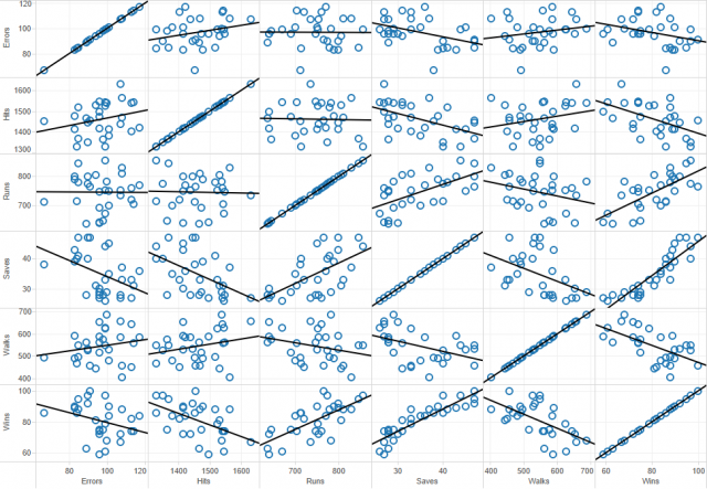
The first thing that is obvious from the matrix above is that every variable except Errors seems to strongly correlate with the dependent variable, Wins. Mathematically, this is not determined by the slope of the trend line but the size of the error. Visually this can be observed by looking at the spread of the data points around the trend line.
Additionally, some of you may have noticed that Wins given Saves seems to be a non-linear relationship. It turns out that, for this model, Saves is ripe for a data transformation.
Use ANOVA Values to Determine Statistical Significance
So for the moment, all of the work we have done has been casual and non-rigorous. Now that we have some general idea about the story our data is trying to tell we can use ANOVA values to determine statistical significance. Under the Analysis menu in Tableau, there is a Describe Trend Lines option that gives an output like the one below.
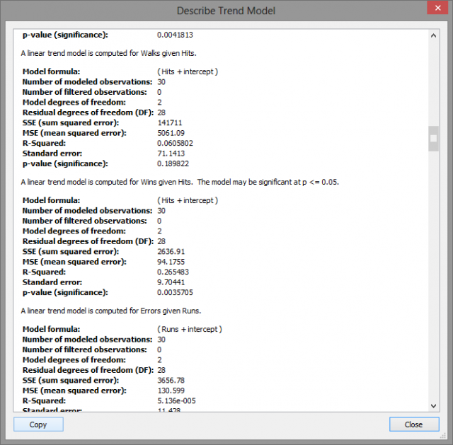
These are the univariate relationships between each variable pair. The best fit trend line is determined by a reduction in the error between the observed and predicted value. This concept is measured objectively by the R-Squared value which can be roughly understood as an inverse relation to the error of the trend line.
A higher R-Squared value indicates a lower error and thus a higher correlation between the two variables. Above, the computer R-Squared value for Wins given Hits is .2655 which means that Hits account for 26.55% of the variation in the Win total. A p-value lower than .05 indicates that the variable is a statistically significant predictor within the usual 95% confidence interval.
Final Analysis
When evaluating a model with many potential variables, the number of pairs grows exponentially. Using the scatter plot matrix, you can pinpoint the important factors through visual observation so that you have fewer pairs to analyze later. With a full statistical software package, you could perform a best subset analysis and determine an accurate regression model if it exists for the most significant variables.
It turns out that one of the most accurate models for the given data uses Hits, Runs, Walks, and the Inverse of Saves to predict Wins. This is not too surprising since you have already quickly determined from this simple analysis that Errors was a seemingly weak predictor, and Saves was a candidate for data transformation.
While our method did not provide a comprehensive model, it gave a quick but in-depth understanding of the relationships within the data without the time spent on outlier analysis or sub-setting variables.
When you’re done here, be sure to check out Statistical Insights Using Tableau: Part 2.