
A little over a week ago, a few of my colleagues and I attended the OpenVis Conference in Boston and had a blast learning about new open source visualization technologies and hearing ideas for creating on the web. The lineup was full of amazing speakers, including Tableau’s Robert Kosara, infographic designer Nigel Holmes and Santiago Ortiz, to name a few. The intimate setting of the conference also made for some really awesome conversations with those in attendance during the necessary coffee breaks in between sessions.
I’d like to share a few thoughts about what I learned at OpenVis this year:
1. Coding Custom Data Visualizations for Web Is Getting Easier
Jeff Heer, a keynote speaker, spoke about having the right tool stack for designing for the web. He emphasized that typically, with the available tools, the more expressive we desire to be, the more complicated the tools become. To deal with this problem, Jeff and his team have worked on quite a few tools, including Vega, a tool that uses JSON format to specify a viz in d3 without programming.
Vega 2.0, which was just released, allows for interactivity to be designed as well. Another tool he introduced was DataVoyager, which is a data exploration tool that allows you to connect to a data set and automatically generate visualizations that can guide your eventual analysis process.
2. Context is Key
Nigel Holmes, British infographic designer, spoke candidly in defense of his style of designing information graphics for a broad audience with different contexts. Holmes has a reputation for “dumbing down” data visualizations to look like cartoons.
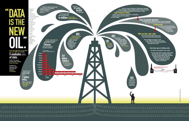
Above: An infographic by Nigel.
In his words, we should, “… use tangible things that people can relate to so that they understand numbers.” He appeals to the scenarios where you’re designing things that will be seen by a large audience. Giving people the tools to accurately understand their data is essential.
3. GIFs Are Here to Stay
In one of the more engaging talks at the conference, Lena Groeger of ProPublica spoke about the power of loops to make ideas sticky. She walked the audience through the history of looping images, the iconic galloping horse images and how today’s GIFs are used to inform as well as provide humor on the internet.
Her demonstrations using repetition sparked a lot of ideas around how to expose people to a new idea or data set and give them key facts that they can remember. Repetition can make things stick in ways we don’t expect – check out this example of Diana Deutsch, a cognitive psychologist who specializes in music. Once you listen to this, you can’t unhear it!
4. Animating with CSS Is Easy and Adds Life to Your Design
Using a picture of her cat and a few simple lines of CSS, Val Head showed us how easy it is to animate web elements using CSS. A little bit of subtle animation can make menus and interactions appear more life-like and feel more engaging.
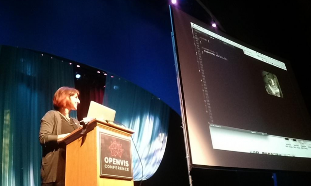
Above: Val head on stage. Photo taken from the @OpenVisConf twitter handle.
When you’re designing a website, data visualization or simply a slide deck, it’s always a great idea to consult an expert in that area of design. Val showed some attention to detail in animation that I had never even considered! There are so many passionate people out there – be sure to connect with them when charting unfamiliar territory. Or even better, when you find your niche, there’s bound to be other people talking about the same thing! Go to a meetup or start a meetup – just get involved!
5. Scrolling Can Be Helpful to Telling Stories with Data
Jim Vallandingham’s word for this is “Scrollytelling,” and he spoke about how scrolling can be used to move the audience along with the narrative flow. An alternative to this technique is the “stepper” – a button to move you from one part of the story to the next. The really powerful visualizations he demoed made me excited to use some of his insights with Tableau’s Story Points feature.
Overall, all of us from InterWorks left inspired and excited to explore more of the tools available on the open web. Can’t wait for next year!