
Times New Roman? How did that happen? That’s not the font I used!
As I walked around the room, I noticed that several of my colleagues were seeing my dashboard with an entirely different font than the one I had chosen. It was one of the first major dashboards I had developed, and I had been very thoughtful about the design, incorporating the company’s font to ensure it looked on-brand. So, you can imagine my internal panic as I discovered that the font wasn’t rendering properly on everyone’s screens.
If you’ve ever ventured from the standard Tableau fonts, you may have had a similar experience where a font looks great in Tableau Desktop but turns out pretty whacky when you publish it. Tableau recommends that you only use “web-safe” fonts (fonts that are installed by default on all web browsers) to ensure proper rendering, but that really limits your options, which can be especially frustrating if you’re aiming for a well-designed dashboard.
So, how can we create dashboards with eye-catching titles and ensure that they show up properly on all users’ computers?
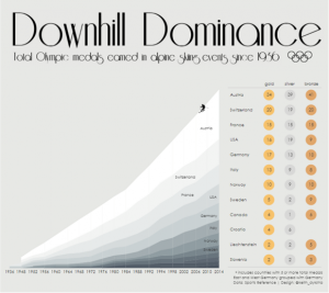
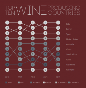
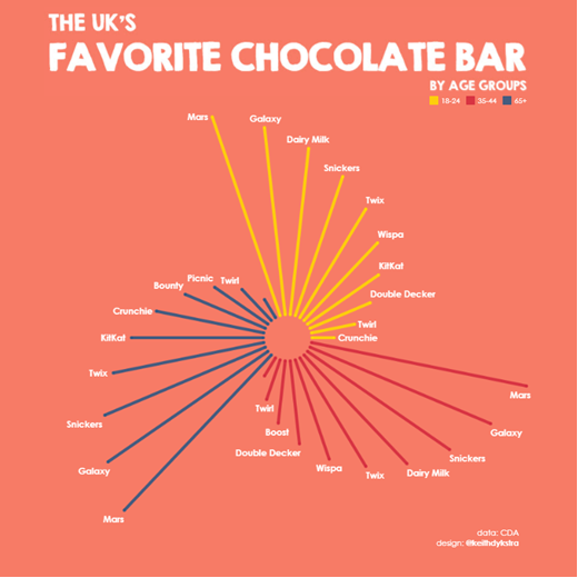
I learned a great tip (well, tips, actually) from the “Hitchhikers Guide to Dashboards” presentation at TC17. Ashley’s overall advice was to approach dashboard design more like we approach magazine layout: Big images. Rivers of white space. Sexy fonts. Lately, I’ve been trying to follow Ashley’s lead by using interesting text and blank space to help viewers find an entry point into unfamiliar dashboards, which has led to some #MakeOverMonday projects that turned out like this:
 |
 |
 |
 |
Dashboard Titles as Images
To avoid another Times New Roman panic, I’ve been including my dashboard titles as an image instead of as a text box. It takes a few more steps, but it’s totally worth it if you want a polished look. Here’s what you need to do:
- Open up a Word document (or PowerPoint, or anything else you can use to lay out some text). Type up your text and apply your custom font and sizing. Pro Tips:
- Ashley recommended 1001freefonts.com as a great place to download free, custom options if you don’t like any of the fonts available in Word.
- You may need to use text boxes to customize the layout in Word if you’re going for really narrow spacing or unique alignment like I did in the examples above.
- If your dashboard has a custom background color, grab the RGB code and set the same background color in your Word document using the following steps:
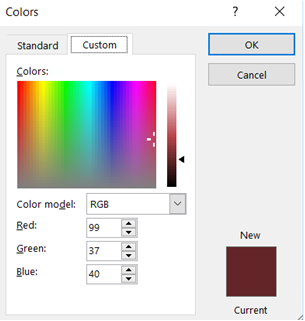
- From the Format Dashboard pane, click More Colors… on the Shading drop-down menu:
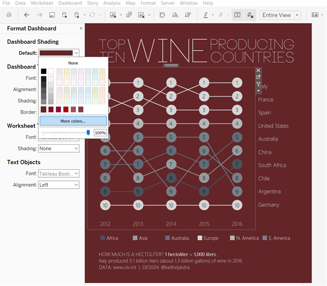
- Record the Red, Green and Blue numbers:
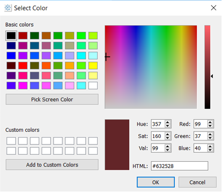
- Click on Page Color in the Design tab in Word and then select More Colors…
- Copy your RGB numbers here to get the same background color:
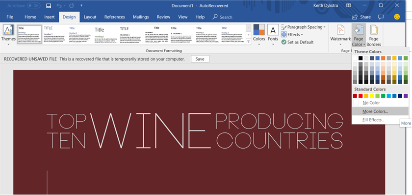
- Once you have your text laid out the way you want it, use the snipping tool on a PC (or Command + Shift + 4 on a Mac) to take a partial screenshot of your text and save it as an image.
- From the Format Dashboard pane, click More Colors… on the Shading drop-down menu:
- Then all you need to do is insert an image container into your dashboard and select your screenshot.
You’ll need to choose a web-safe font to use for labels and axes in your actual charts, but you can upload additional images if there are other headers or titles you want to emphasize in your dashboard. You may have to play around with the size of the container (or even make some adjustments in your Word doc and take another screenshot) to get the titles exactly the way you want it. Once you perfect your layout, you can be sure that it will look just as perfect to everyone else who views your dashboard. No need to fear another Times New Roman failure.
For more tips on dashboard design, check out these Visual Best Practices from our Tableau Deep Dive series.