
Note: As of version 2020.4, creating a map with multiple layers is much simpler than the dual-axis method described in this post. Check out the multiple map layer functionality here.
If you are just looking for the TL;DR quick solution to mapping two spatial files of two different granularities, scroll to the very bottom.
I recently moved to New Orleans, and with a background in public policy, I soon dove head first into understanding some of the community dynamics. One of the first books I picked up, “Bourbon Street: A History,” had a page detailing all of his sources, and as I began combing them through, I found some fascinating data.
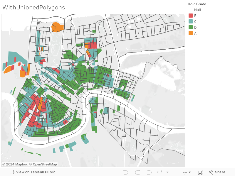
One item that particularly caught my eye was from a project called “Mapping Inequality” that looked at redlining in New Orleans. In the 40s and 50s, many people of color, specifically those of African-American heritage, were denied financing on homes. This map details exactly where banks refused to give loans.
I found this map fascinating and thought it would be interesting to overlay it on a census map to see if I could track if the census blocks that were redlined still experience high rates of poverty or had specific characteristics.
Shapefiles and Tableau
To do this, I downloaded shapefiles from the U.S. Census Tiger files and started my work in Tableau. I was really excited to use shapefiles because Tableau recently introduced shapefiles.
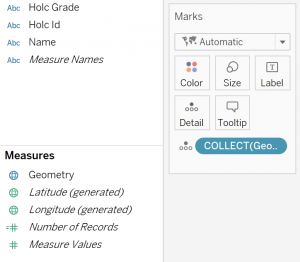
When you load a shapefile into Tableau, you get a new field under your measures called Geometry. When you bring that Geometry to Detail, Tableau aggregates it into a single mark using the COLLECT aggregation:
At first, I brought in each spatial file separately and had them next to each other on a dashboard, as shown below:
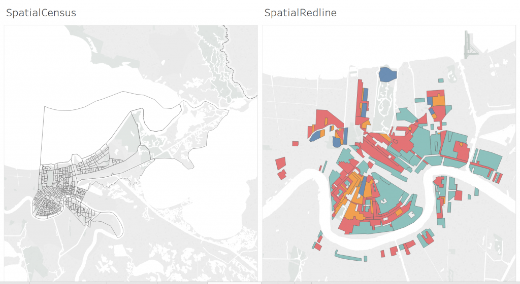
The problem here is that it was difficult to see exactly which districts were in which census blocks; I needed to make a dual-axis map.
For those of you who have worked with dual-axis maps in Tableau before, you know there is one golden rule:
You can only use one latitude and longitude.
Unioning the Data in Alteryx
Having two data sets, I went to work on “unioning” these two shapefiles together. I put “unioning” in quotes because when I teach Tableau, I emphasize unioning is for data that is structured the same, and that’s clearly not the case. The only reason I’m doing it is to get a shared Lat/Long field.
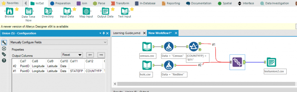
In Alteryx, I imported both shapefiles, unioned them so they shared a latitude and longitude, filtered by census data to only include Orleans Parish and then exported this as a new shapefile.
Loading the New Dataset into Tableau
I loaded that new dataset in, and again, I had that Geometry field in my measures. Once I brought that field to Detail and Tableau aggregated it using the COLLECT() aggregation, all of my data was interestingly treated as a single mark:
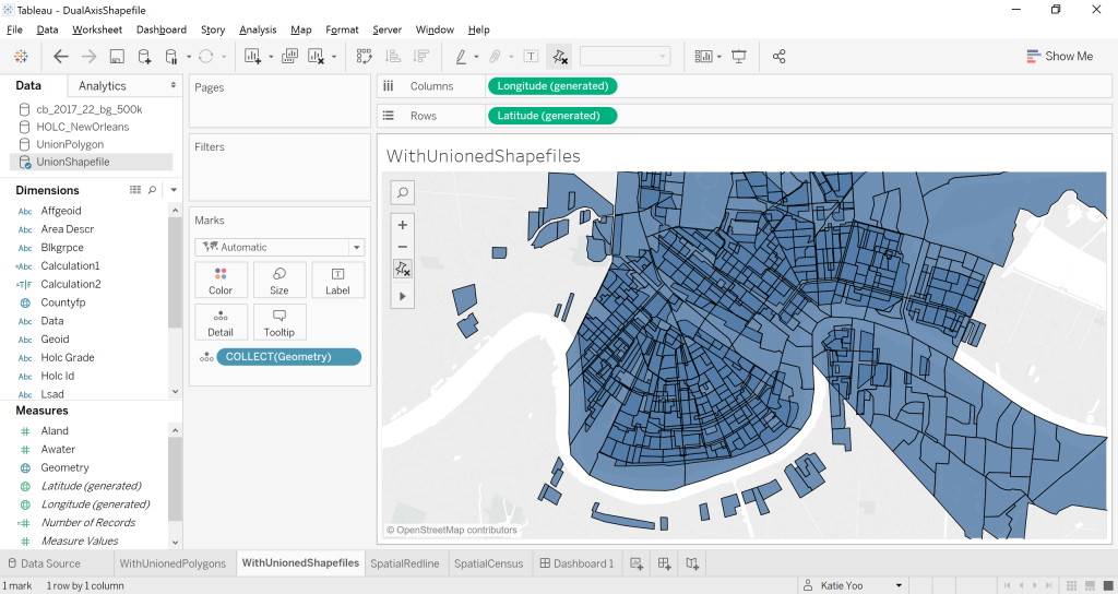
Tableau highlights this single mark when explaining shapefiles, and to change this, similar to maps with non-spatial files, the user must bring an additional level of detail to the view to break it up into separate marks. Since I had two levels of detail I wanted to display, I brought in both of my map levels of detail (Holc ID and GeoID) and was able to see both layers of my data:
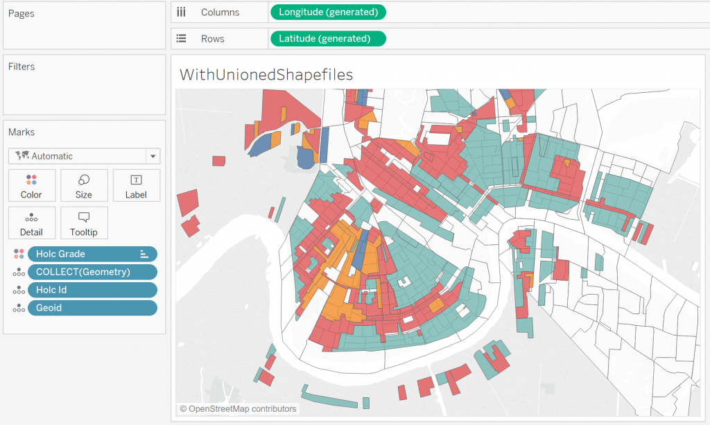
My problem here is that I still only have one Marks card … and one Marks card means the same formatting for both data layers. Since my goal here is to see how census blocks overlay the redlining districts, I want to see the census blocks as the “top” layer. Since Geometry just displays everything, I can only hover over census block groups if they aren’t behind a redlining zone:
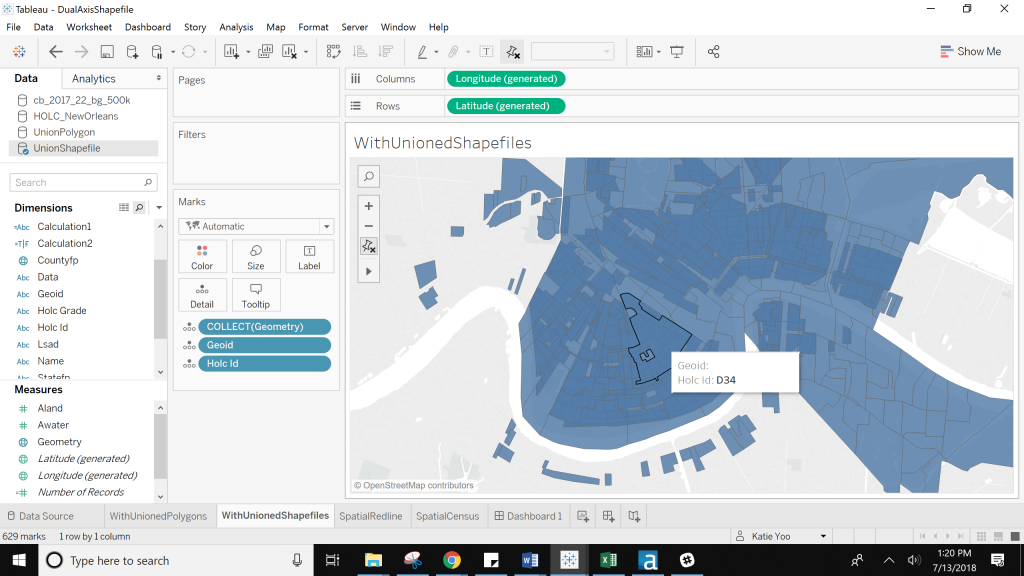
(Notice that I can’t see the census blocks (at the level of detail of GeoID) because this redlining district (Holc ID D34) covers them up.
I could switch the order to see census blocks on top and try to color by the redlining districts, but because all of the census blocks are Null in the redline district column, they have to be colored as well. I try to dummy code them as white, but it’s still hard to see the overlap:
Transforming Shapefiles into Polygons with Alteryx
While that new Geometry field for spatial fields is really handy, given these limitations, I went back to my pre-spatial file mentality and using polygon files. As Chris Sanders has written about before, there’s an Alteryx Analytic App that can transform shapefiles into polygons.
I plugged both my zipped shapefiles into the app and download a CSV of them. I then brought those into Alteryx and ran my workflow again (still unioning on latitude and longitude). I also made a Data field so I can easily check which data source a row was coming from.
Bringing the Polygons into Tableau
Now that I had my data as a CSV that I could use for a polygon map, I brought it back into Tableau. Each data set had a different set of points and paths, so I first calculated different paths for each one:
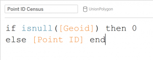
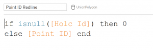
Having changed my Mark type to Polygon, I brought the Avg(Lat) and Avg(Long) to Rows and Columns. On the first Marks card, I looked at the redlining data; I brought the ID to Detail, my Point ID Redline calculation to Path, and then its classification to Color:
I knew I was on the right track because even with this new unioned data source, I was only seeing data from my redlining data; essentially by using that Point ID calculation instead of Geometry, I was able to only see part of my data:
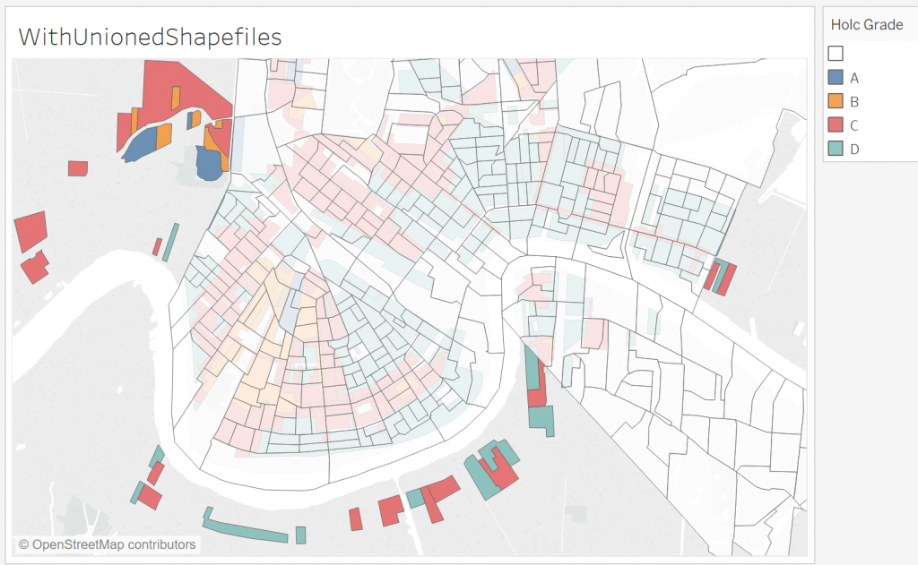
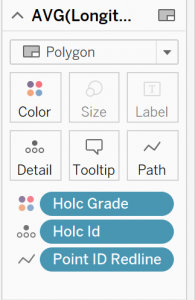
I duplicated my Avg(Longitude) and made a dual axis. On the second Marks card, I brought the census block ID to Detail, my Point ID Redline calculation to Path and then added a border.
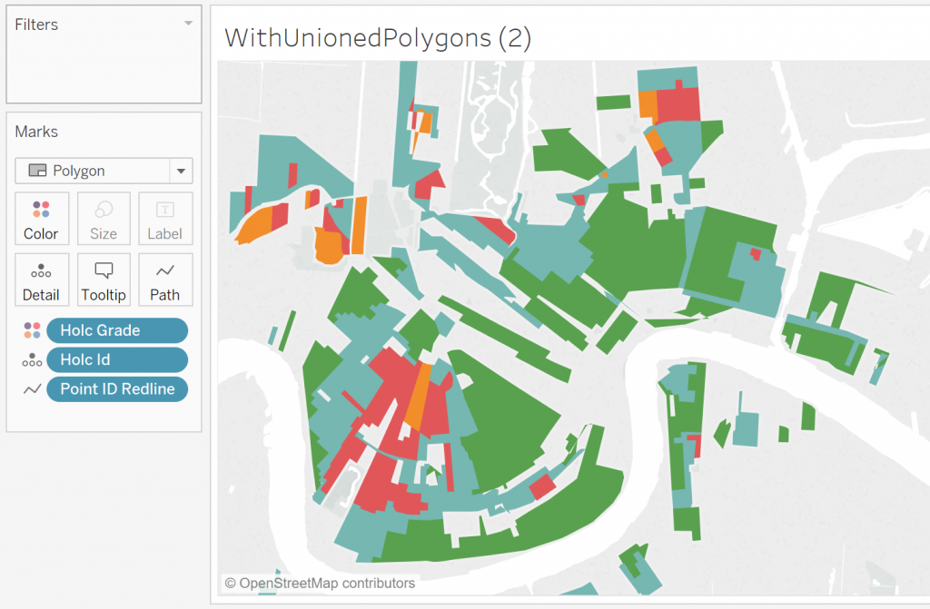
Now, I could see both datasets, formatted differently, yet still on the same sheet:
The Takeaway
If you have two different spatial files that you would like to map in Tableau, that Geometry measure will work across the entire data source. This will work well for datasources that are at the same granularity. However, if you need a dual axis for two different granularities or layers of your data, I recommend converting those shapefiles to polygon files and changing what is on detail and how the path is calculated.