A powerful feature within Alteryx is the Download tool under the Connectors tab. It’s useful for pulling information down from the web. As the amount of data available on the web grows, the value of being able to pull information into a workable format in an efficient manner greatly decreases data prep time, allowing users to deliver analysis, insights and compelling visuals relatively quickly.
For example, a user could schedule data to be pulled from a subscription based service like Bloomberg to update a dashboard built in Tableau each week. Alternatively, a weather-based service’s data could be downloaded to explore weather patterns.
The Sunlight Foundation has a long list of openly available, politically geared data sets that could be interesting to an organization interested in legislation. They could flag keywords to be alerted of their mention in the lawmaking process or monitor floor activity in Congress. The capabilities are limited only by the data one has access to on the internet.
Let’s Demonstrate
For a simple demonstration, we will follow the technique originally employed by Alteryx’s own Chris Freeman in which he pulls data to produce visualizations in Quandl. With a few tweaks and some additional transformations in the process, we can have this data output as a .tde file that’s ready to be loaded into Tableau. In this case, we’ll use the Google Finance API.
For the purpose of this post, I’ve selected 22 stocks from various industries to pull information from since 2010, though the stocks and date ranges can be easily changed to fit the user’s needs. The workflow completes this task in under a minute, allowing you to begin visualizing the data very quickly.
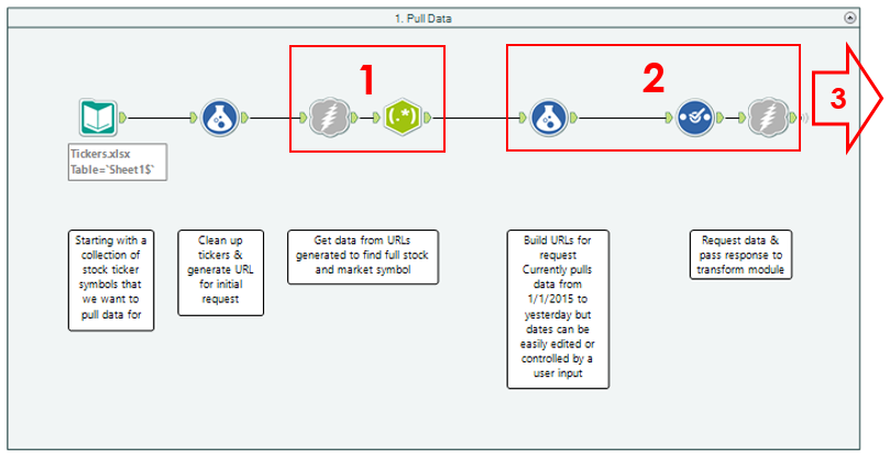
The Google API is very simple to use, as you really only have three moving parts that affect the data your module will produce (there are a couple of other parts used to construct the URL, but those will remain static in this case). These pieces are the start and end dates of the time period for which you’d like data along with the ticker name. So, you’ll simply need a table in Alteryx with a column for each of these variables to run through a formula that builds the URL, which is then sent through the Download tool. The process ends up looking like this:

- The first Download tool searches for the stock symbol in the Tickers file (AAPL, for instance), from which the exchange:ticker format of the stock (NASDAQ:AAPL) is parsed as required by the API.
- Dates are specified in the formula tool as Jan 1, 2010 – Yesterday. These are fed into to the final formula that builds the URL to send to the Download tool, which pulls the specified data for each stock.
- Constructing the request: Using the Formula tool, we want to produce a string field that combines the static parts of the request with the fields containing the ticker and start/end dates. For the Google API, the expression looks like the following:

Note: Dates must be in the format of dd-mmm-yy (01-Jan-10) or mm-dd-yyyy (06-09-2015). - The square boxes denote the fields which Alteryx will pull into the Formula tool and concatenate appropriately, yielding a new field that is called in the Download tool:

- Constructing the request: Using the Formula tool, we want to produce a string field that combines the static parts of the request with the fields containing the ticker and start/end dates. For the Google API, the expression looks like the following:
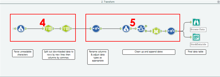
- From here, the data is sent to the second part of the workflow to be transformed into a format useful for Tableau.

- The data comes in as a big .csv file, which is contained within a single cell for each symbol we’ve requested. To separate each value into its own cell, the Text to Columns tool is used first to split to rows based on new lines (each row in the .csv is a single date of information) and again to split to six columns with commas as delimiters. This gives us a column for the various data points associated with each symbol by date (Open, High, Low, etc.).
- From here, it’s just a few more steps to clean up the data – append a DateTime field, change data types and deselect any unnecessary fields to cut down on file size – and output to a .tde file.
The Final Product
I’ve attached the Alteryx Workflow and Tableau workbook below for those who want to pull their own data. Again, the flexibility of Alteryx allows the user to customize this with their own list of stock tickers, new date ranges or even to apply the tool to a different API with a little tweaking to build the appropriate request.
I dropped the basic stocks data into the visualization seen below. For Tesla (TSLA), this view highlights the average closing prices for this year (orange bar) as being slightly lower than that of the previous year (red line). By selecting this bar, the top-right view appears to show that the weekly closing prices have gone up substantially over the last five years. Below that, the chart displays a monthly trend over those years to infer when the best time to buy is.
This chart suggests that the stock is usually at its highest in September and October, denoted by the orange lines showing average for the months over all years in the data. That being said, due to the aggressive growth of this stock seen in the top chart, the monthly trending analysis may not be a robust representative sample of how the stock will perform in the future.
Interact with the visualization below:
Further Application
Jumping back to the data for a moment for the broader application, Alteryx can also be used to combine this information with other data you may have access to. For example, you may be interested in adding in your own personal investment data to monitor performance, portfolio value, trends, etc. to be published to Tableau Server. This data set could then be scheduled to update each night, appended to the existing data set and refreshed to get a personal finance dashboard.
Taking it a step further, you could build some analysis into your Alteryx workflow that flags stocks with high gains or losses from the previous day, week or month, which could then be fed into a daily summary page as a part of your dashboard. Or, to take it full circle, you could find another web-based data set (or data sets!) to download, organize, analyze and join to make an even richer data set. With this new tool in your data-gathering toolkit, the amount of data you can quickly access grows immensely, so you can focus more on generating interesting and valuable insights.

