
Tableau is great tool to dive into data. Sometimes it can be difficult to keep your dashboards nice and clean. Especially, when filters and parameter filters are all over your sheets. This blog will show you a way how to hide and show parameters on a dashboard. If you want to know how to set up a container float for pushing parameters across the dashboard’s borders keep on reading here.
A day to day challenge in Tableau
Tableau is flexible. Tableau is sexy. And Tableau is great with dates. Per default Tableau gives you a couple of options how to setup your date filters. There are many situations when the default solutions are sufficient. But often enough they do not. If this is the case for you. Here is a more elegant solution for you.
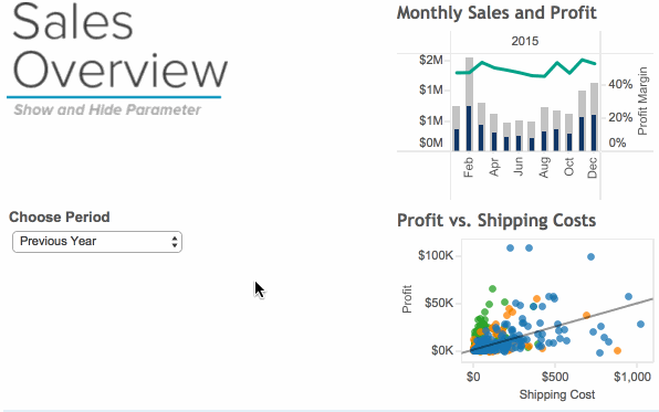
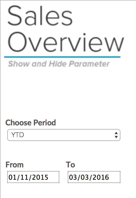
In my case at hand, I have built a sales analysis dashboard that can be seen below. I want to give the user of that dashboard the option to choose from 3 fixed time periods: YTD, Previous Year, Rolling 12 months. In addition, the user needs the option to choose from a custom period. Specifically, the option to set a start and an end date of the custom period, and filter on that. As the custom period is only used 1 out of 10 times max, we want the input fields to be hidden. Sounds like an interesting challenge.
Hide and show parameters from user actions on a dashboard, in combination with fixed and custom date periods. In order to solve this riddle, we need to build the pieces of the solution. Afterwards, we put these pieces together. The pieces are:
- One parameter with a set of fixed time periods
- Parameters for Start Date and End Date
- A filter calculation
- 2 blank sheets to do the magic of appearing and disappearing
Build the Pieces of the Puzzle
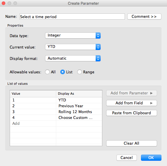
First, we will start with implementing a parameter with fixed time periods. In this example, I’ll choose 3 different time periods and a 4th option for giving the user the option to select a custom time period:
- YTD
- Previous Year
- Rolling 12 months
- Choose Custom Period
I’ll give it the title “Select a time period” with the Data type of Integer and a list of values 1 to 4 displaying the corresponding value as the respective description:
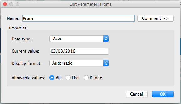
Next, we will create two parameters that allow the user to choose a start and end date of the custom time period. These parameters will work in a similar way to this solution by Nicholas Laurenti.

Putting these parameters as they are on the dashboard will not do much, so we need to add a filter calculation that will adjust the time period according to the selection. Have a look at the calculation below.
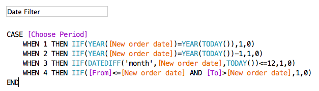
Through this case statement we are differentiating our filter conditions according to each of the options of the parameter. Cases 1 to 3 set fixed time spans that are relative to today. Case 4 looks a little different. Let us go quickly go through them 1 by 1.
- In case the user wants to filter YTD, we only want to show order that share the same year as the today.
- When the user likes to see previous year data, then every order we show should be from one year before the year of today.
- For rolling 12 months, there should be a maximum difference of 12 months between today and the order to be displayed.
- In case number 4 our date comparison is parameter driven. The start date set by the user serves as lower boundary, the end date serves as upper boundary. Every order that was set between the two boundaries are accepted. In other words the condition we are testing the order date against is that it needs to be both bigger than the “From” parameter and smaller than the “To” parameter.
All 4 cases test every row in our dataset, for the different conditions. What they have all in common is that each row that fits gets a 1 every row that does not a 0. Making this calculation a dimension allows us to filter on discrete value. Drag the calculation on the filter shelf and select “1”. This filter needs to be applied to every worksheet of the desired dashboard.
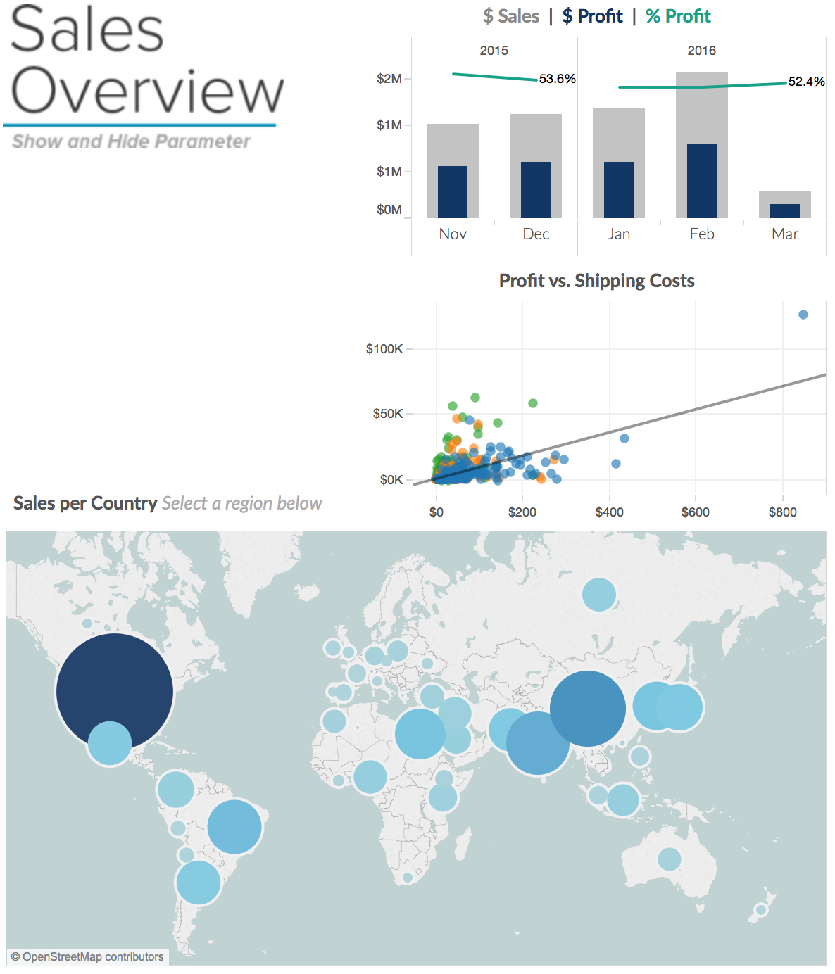
Next, putting these parameters together on one dashboard looks and feels clunky, as is demonstrated below. At this point, it is pretty much a wildcard what the user will choose. Will she use the “Choose Period” drop-down or type into the custom date fields?
Setting Up the ‘Trick’
Well, let’s make it crystal clear to the user what to do. We want to make it such that as long as the user is choosing between the pre-set time periods, the other input fields should disappear. Only when the user selects the option “Choose Custom Period,” the From and To input fields appear.
We will do this with a floating layout container and two empty sheets that will push the parameter in and out of the dashboard.
Let’s go step by step. We start with creating the one empty sheet to push and one to pull the date pickers.
- Therefore, create a new sheet.
- We want the sheet to be white and empty. Start by putting a MIN(1) calculation on the Rows and Columns shelf. By putting a measure on both, we can make the entire sheet appear and disappear through filters. Very useful for our push and pull trick.
- As the sheet should empty, we change the Marks type to Text, add MIN(1) to Text shelf. Open the text editor and delete the text. Remove the axis by right clicking on the rows and columns fields a remove the “Show Headers” tick from the dropdown. With formatting we can give the final touch by removing “Grid lines” in the format window.
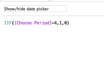
- Finally, we will add a filter calculation to the Filter shelf. We want the calculation to return 1 when “Choose Custom Period” is selected and else 0. Similar to the previous filter calculation, change the calculation to a dimension and drag it on the filter shelf of the empty sheet. Select to filter on 1. Your result should look like this:

We duplicate this sheet and reverse the filter to “Exclude” on the second sheet. That gives us two sheets. One appearing and another one disappearing when the “Choose Period” is set to “Choose Custom Period”. One sheet will serve us to push the parameters onto the dashboard when wished, the other one to push it down from it.
Finally, everything is coming together. We will use a floating layout container with the two parameters for Start and End Date as well as the two empty sheets on the left and on the right side of the two parameters.
This layout container will float half on the dashboard and half outside the dashboard. Frankly, the positioning of the layout container needs a little fine-tuning for a perfect look and feel.

The final result should look similar to the following.
[sb name=”TableauDashboardSalesOverviewv1″]
When Tony Kau introduced me to this feature, I was quite amazed by it. This workaround can be very powerful in keeping your dashboard nice and clean. It is not only limited to datepicker parameters obviously. Any element of a dashboard can be hidden this way. The only limitation I see is that whatever you want to hide through this method needs to be placed at the border of that dashboard. This limitation means also that it can only be used with fixed sized dashboards. When the dashboard is changing in size, the float holding the parameters might get visible even when it should not. The reason is that floating elements are fixed in position.
An extra step for example could be to hide the entire filter bar that is often sitting on top or on the right of a dashboard. Or you might want to give the user a welcome message in a textbox that they are able to hide after they have read it for the first time.
The user is only presented with additional options to filter when they’re necessary to see. What do you guys think? Feel free to comment below and share this solution around.