Quick table calculations in Tableau are a great way to understand and visualise relationships between measure values. The most frequently used calculation types (running total, difference and percent difference) are core metrics in most financial management reports.
What Are Ad Hoc Calculations?
Quick table calculations were created to be used as ad hoc calculations. Ad hoc calculations are calculations that you can create and update on a shelf. They also don’t exist in the measures pane on the left-hand side. For example, here’s a running-total calculation applied to a value in my workbook.

And here’s the ad hoc calculation for it, where it only exists on the Marks shelf.

However, there’s nothing stopping you from dragging this pill out and placing it in the Measures pane as a proper calculated field, as I did below.

You’ll be able to name the calculation and the Marks shelf will automatically update its new name. You may be wondering why or when you would need to do this. So, consider the following scenario:
You have sales data for the last 12 months. You’re required to select certain months to compare and have the comparison expressed as the difference in value from the previous month. This seems straightforward enough. In my example below, I dragged Month to Rows, double-clicked Value and then created a quick table calculation. And there you are!

Let’s Add Some Context
But then the inevitable next question is: “That’s great, but can I see what the first value was?” This is a common enough request in these situations and it makes a lot of sense. Sometimes you can’t or don’t want to include additional columns to show the actual values. In this case, being able to show the starting value of January’s actual sales adds context. Here’s where materialising our quick table calculation comes in handy. We drag our Value pill over to the Measures pane and give it a descriptive name.

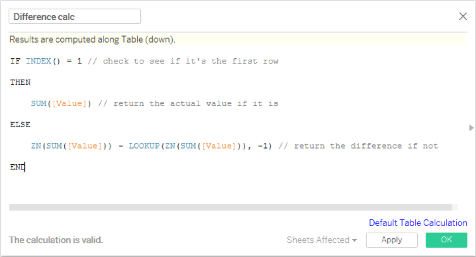
Nothing changes in our visualisation, but what this means is that we can now edit our quick table calculation formula. We’re not going to change the difference formula itself. However, we want the calculation to return the actual value for the first row in our table and return the percentage difference for all other rows.
Here’s how we do it:

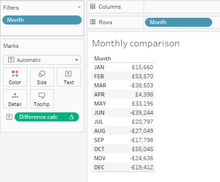
Basically, we wrap the original quick table calculation in an IF statement. Use INDEX to return the row number to find out if we’re on the first row or not. Here’s the result:

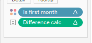
It looks perfect! We have the actual value for January and the difference compared to the previous month. Remember, we’re trying to put some context around this, so let’s make it a little more clear. Create another calculation that returns TRUE in the first row using that same INDEX function.

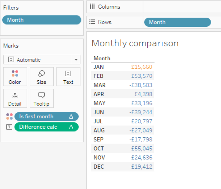
Drag that calculation to Colour on the Marks shelf.

Our table now highlights the first month to make things a little easier to understand.

This also works well with filtering specific months for comparison.

Any Questions?
Further refinements might be to return the name of the first month so we can use it in the worksheet title. This would make things more dynamic and express the difference calculation with a +/- prefix. That way it’s super clear it’s a comparative value.
This is just scratching the surface of what’s possible with materialised table calculations. Hopefully this gives you some ideas!


