
A couple of summers ago, I read a short 577-page book on the dynamics of wealth and income inequality by the French economist Thomas Piketty. This book had kind of become a huge deal in the field of economics. One reason was its huge scope. We are talking economic research that encompassed decades and decades of data, in some instances, running all the way back to the beginning of the first millennium.
The second point of interest was the sequence of massive and contentious theoretical claims Piketty made in the book, backed up by a heavy dose of research-based evidence. These claims and the data backing them up have come under attack from detractors in recent years, but I thought a book so powerful should get a bit of a Tableau remix to really make Piketty’s points pop off the page.
Thinking About Wealth Inequality
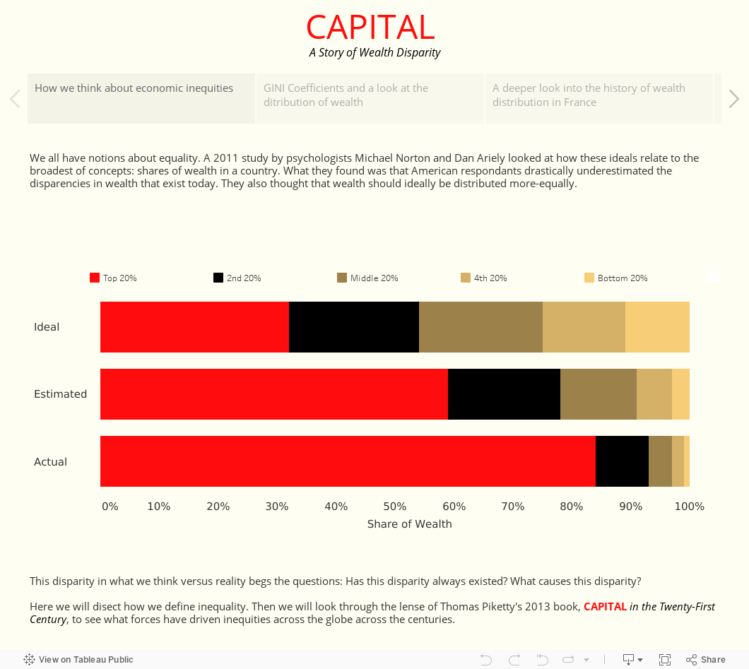
Admittedly, wealth inequality is maybe not something that we think about all too often, but sharing is. A huge part of growing up is learning how to share; we develop a sense of fairness by the time we are adults. So, I decided to bring the viewer into my viz this way: by looking at how the average person views the fairness of wealth inequality.
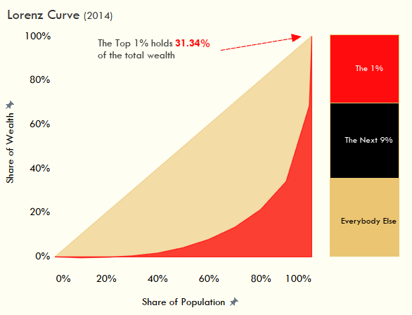
There are a couple of popular models we use today to understand wealth and income inequality: the GINI Coefficient and the Lorenz Curve. The latter is the graphical representation of the former, and allowing users to visually see the distribution of wealth was a must-have for a viz like this. These models of inequality are not the work of Piketty, but they do set the tone for his work.
Sourcing and Prepping the Data
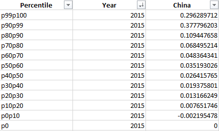
I grabbed my data from the World Inequality Database, which has a great tool for selecting economic data. I was able to grab the wealth share of each decile of a country’s population, with the final decile broken down into the top 1% and the next 9% of the population. The site had this data for China, Russia, the United States and France, so I decided to use these countries as examples of the broader trend.
The data was originally formatted like the picture below, except each year would be displayed for each percentile. I had an ending point that got me up to 100% of a population for my Lorenz curve, p99p100, but the data had me effectively starting at the 10% level. I needed to create a base group at the 0% level with a 0% share of the wealth.
Now, I could push this dataset into Alteryx, perform some Cross Tab, Transform and Formula steps to get to the format I need, or I could just make use of Tableau Desktop’s ability to easily pivot fields. In the Excel file, I highlighted a list of all 209 years in my dataset, copied and pasted in at the bottom of the sheet, gave it the indicator “p0” and values of 0 across the board. Now, when I brought it in Tableau, I could just highlight my country columns, right-click, and pivot them into the format I needed.
I had the makeups of the actual curve of the Lorenz Curve, but I wanted to create the “line of equality” that went along with it in Tableau. I needed another column in my data to show what share of the income that proportion of the population would have if everyone had the same amount of wealth. This I did using a simple IF/THEN statement assigning my deciles a 10% share of the wealth and the odd groups their respective shares: 1% for the 1%, 9% for the next 9%, 0% for my base. With those components put together, I built a dual-axis area chart showing my Tableau representation of a Lorenz Curve. “Voila!”
Breaking Down the Tableau Viz
In the chart above, angle is the big visual clue about how much wealth a certain group holds. Guess what humans are not great at estimating … angles. Think about cutting a cake. Somehow, we always cut our slice a little too big. It’s totally because we are bad with angles and not because we love cake. So, with that in mind, I added a stacked bar chart representing those same shares right next to the Lorenz Curve, just to give it some additional context.
Additionally, time was another factor being ignored in the Lorenz Curve, so I displayed that same information – each group’s share of wealth – on a timeline to show how the dynamics have shifted across the decades. France has an awesome set of historical economic data, stretching all the way back to censuses during the Napoleonic Era. However, these occurred every 10 years, just like American censuses, so we end up with a graph like this:
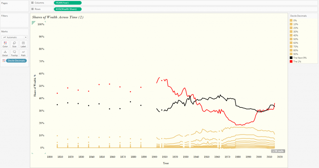
Since I have a continuous axis, all I need to do here is filter out these null values; Tableau gives me an easy shortcut to do just that if I click on the Null Indicator in the bottom-right and select Filter Data. I still have my base group in the view, showing a straight line at 0%, so I can just take my Decile Decimals dimension to filters and uncheck 0%.
So, take a look at the story. What do you think is the ideal distribution of wealth? Are Piketty’s theories and solutions valid? Is this a sweet viz? Leave a comment and let me know your thoughts!