Living in one of the most populated cities in the country, San Francisco comes with many perks. There is an endless number of events, unique neighborhoods around every corner and good public transportation. Of course, with so many people living and visiting in such a confined city, public amenities are bound to become broken, dirty or in need of replacing. This is where San Francisco’s 311 service comes handy.
“311” is a non-emergency service offered by many major cities in the U.S. It is a method for visitors and residents to report issues they see around the city or to communicate with government entities. Most commonly, residents will report a broken streetlight or overflowing trashcan. But in cities like San Francisco, it can also give you a direct line to the mayor’s office to provide feedback on city services. This makes it a powerful communication tool.
The Data
As a resident of the city, I was particularly interested to learn more about my neighborhood and the areas around the city where I spend my time. Since 311 is a government service, all its data is open to the public, which gives us a tremendous amount of insight about the city, what its infrastructure issues are and how it handles these requests. The 311 data is published on its open data site.
The data set itself is massive with several hundred thousand calls logged each year for the last eight years. Among other data points, the location of the issue is recorded along with the day/time the request is submitted and resolved. I decided to include data from 2017 for optimal dashboard performance. There was some data cleansing needed to normalize request categories, improve formatting and remove duplicate entries. By limiting the data to 2017, I was able to accomplish this easily in Excel.
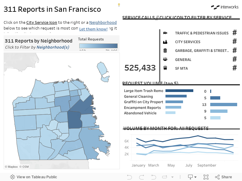
The Dashboard
Once the data was prepped, I was able to connect it to Tableau Desktop and begin creating the visualization. Since San Francisco residents identify with their neighborhoods, I wanted to slice the data visually by neighborhood. Luckily, the 311 data site also contained a spatial file, and I was able to join the two data sources (check out this blog from Robert for more on how joins work) to provide a neighborhood overlay of the city map.
With over 500,000 individual calls to 311 and over 100 different request types, the dashboard is limited to shop the top five types of requests, which covers the vast majority of each service category. For functionality, I opted for an action icon and an interactive map so users could filter the data to the specific service type and neighborhood of interest.
It was particularly interesting to see how the volume of calls and types of requests varied from each neighborhood. I found it fascinating, and I hope you will to! Explore the dashboard below: