
Averages are great. They take up very little space to report, everybody wants them and we all understand exactly what an average is … or do we? An average as we typically think of it is what we call the mean in statistics. To find the mean, we take the sum of all values and divide it by the number of values you summed.
Finding the Mean
For example, let’s say we have a data set containing the numbers 1, 5, 7, 12 and 75, and we want to find the average. Here’s how we find it:
Sum of all values: (1 + 5 + 7 + 12 + 75) = 100
Number of values: 5
Sum of all values divided by the number of values 100 / 5 = 20
In this example, our average is 20. If that’s the only thing we include on our report, we seem to miss out on a lot of information that might influence our decisions.
The Bucket Man Example
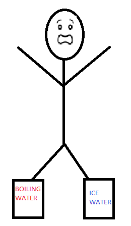 If numbers aren’t your thing, then let’s imagine a man is standing one foot in a bucket of boiling water and the other in a bucket of ice water. He’d average out to be A-OK. But if you were to ask the man how he was feeling, he would say that he was NOT feeling A-OK and that averages don’t mean anything to him. If we treat our business decisions the same way we treat the aforementioned bucket man, we may be using averages in a bad way. We imagined this poor fellow and saw that the distribution of the temperatures was far too extreme. Even through the average was fine, he was not. We will be using this idea of showing the complete picture, Tableau to visualize distributions and the ever-famous Superstore to provide us with data.
How It’s Done in Tableau
- Right-click on “Sales” and drag this to the Text box on the Marks card:
- Choose the option for average by selecting “AVG(Sales):”
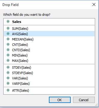
- The value returned should be £229.86
- Choose the option for average by selecting “AVG(Sales):”
So, at this point, we’ve already found our average and all is right in the world. We can now report this value, and things are A-OK. But luckily, we remember the story of the bucket man and have decided that we might need to investigate a bit further.
- Open a new sheet and create a parameter called “Sales Bin Size” that uses the Integer Data Type, a range from 50 to 500, and a Step size of 50:
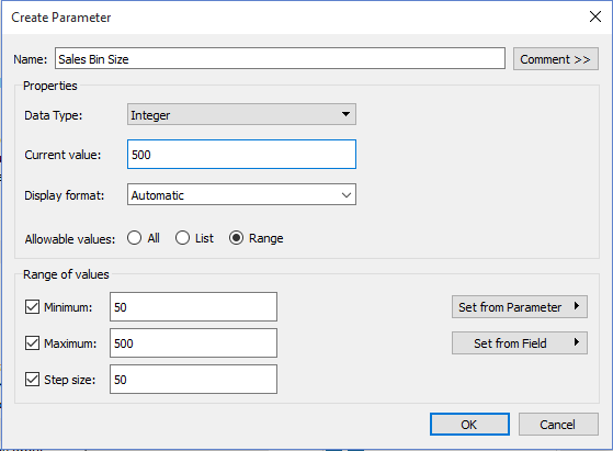
- Right-click in the Data pane and choose “Select a Parameter”
- Name the field “Sales Bin Size”
- Change the Data Type to Integer
- For the Allowable Values option, choose “Range” and select the minimum and maximum to be 50 and 500 respectfully. Change the step size to be 500, as well.
- Choose OK, then right-click on this parameter and choose “Show Parameter Control”
- Create a bin for Sales, using the Sales Bin Size parameter as the size of your bins:
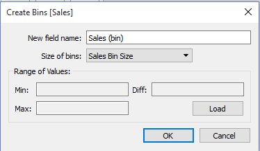
- Right-click on the Sales field in the Data pane, hover down to Create and choose “Bins…”
- In the drop-down box Size of bins: select “Sales Bin Size”.
- Choose OK, we’ve now created a new field in the Dimensions area of the Data pane
Now we will build the visualization to see how our sales data is distributed across the bins. We will be using a histogram.
- Build a histogram view, with Sales (bin) on columns and the number of records onto rows:
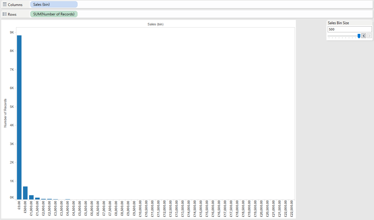
- Left-click and drag Sales (bin) to Columns.
- Left-click and drag Number of Records onto the Rows shelf
- Be sure to change the view to “Entire View”. Do this by changing the view from “Normal” to “Entire View”. This option is located on the far right of the ribbon.
This type of graph is called a histogram. By using our bins and the field number of records, Tableau is looking row by row through the data set and looks at the Sales field. It then checks which bin the sales field falls into. If it is between £0 and £500, it will be placed in the first bin. If it is between £11,000 and £11,500, it will fall into the bin labelled £11,000. By using the sum of the number of records, we get a bar for each bin (you can alternatively use a Count aggregation on your sales field as well), with the height of each bar being the total number of rows where sales fell into each bin. You may also notice that there are some bins without any data. This is because Tableau’s default setting is to show missing values. This is to our advantage as Tableau is encouraging us to see all the bins, even those without sales, in order to better visualize the distribution. To change this default behaviour, you must left-click on the drop-down arrow for Sales (bin) and deselect “Show Missing Values”. It is not recommended that you do this because it skews the representation. Consequently, we fail to get the same idea of how wide our distribution is.
A Recap!
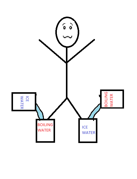 Averages are not bad, they just need to be used in context as part of the story rather than the whole thing. In order to flesh out the numerical story, we might include the MIN, MAX, COUNT and even the standard deviation (more on those another time). But by using a histogram, we are able to see much of this data in a more visually appealing manner. Averages can be quite valuable, especially when we understand the distribution they represent and use the average accordingly! If we understand that the bucket man was in a terribly hot place (MAX) and a terribly cold place at the same time (MIN), we could take action to cool one side and heat the other (or help him out of the buckets). But if we only know the average, we would see nothing wrong and keep moving on.