Does your organization use data to better inform its marketing? Have you heard the words “segmentation” or “micro-targeting” thrown around and don’t quite understand what it means? In the spirit of the World Series, I give you an example of customer segmentation using baseball.
The goal here is going to be two-fold:
- Use data from 2013 to develop statistical groupings of Major League Baseball pitchers, both starters and relievers, and generalize about what types of pitchers make up those groups.
- Use those groupings to develop a predictive model that predicts what grouping a new observation would fall into.
Wait, how is this relevant to business?
In this situation, let’s think about each player as a customer of our fictional company (of course I propose Alex, Inc. as our company name, but I don’t think the board will go for it …). Each customer has data points because they’ve been our customers for at least a measurable length of time. Once we place these customers into similar groups, we can now think of those groups as “types” of customers. That means, in the future, we can custom fit our marketing campaigns to better appeal to each group thus increasing the success of our marketing campaigns.
Now, back to baseball …
Statistical Groups?
Customer or market segmentation essentially tries to find groupings of observations in data using similarity measures or distance measures. Two very popular methods of clustering are hierarchical and non-hierarchical clustering.
Hierarchical clustering essentially looks at a distance matrix, also known as a dissimilarity matrix, and groups observations together into a “hierarchy” of groupings. This can be done one of two ways:
- Agglomeratively: Start with individuals and group the closest observations together over and over until there is only one group.
- Divisively: Start with one massive cluster of observations and split the groups over and over until you only have individuals.
After the hierarchy is complete, we can then look at the distances between groups using a dendrogram to figure out how many clusters we should have.
Non-hierarchical clustering, however, is slightly different. Instead of using a distance matrix, we can use algorithms to group our data after it has been standardized. The only catch is that we need to know how many clusters we want before we run the algorithm. Fortunately, with modern computing, we can do this many times and figure out which number of clusters is best for our data. K-means is a very popular version of non-hierarchical clustering.
For my example, however, I will be using hierarchical clustering. Why? Because one problem with algorithms like k-means is that they don’t handle categorical data very well. Actually, categorical data (like what league our baseball players pitch in) can cause problems with lots of clustering methods. Fortunately, there is a way to get around this. Using the nnets package in R (in RStudio), I can call the Daisy function to create a distance matrix using Gower’s method that not only handles categorical data, but also standardizes it for me.

Wait, standardize?
Preparing Data
Clustering is apt to be influenced by large values, regardless of scale. This means that the variable HR’s would have more influence than something like Opponent’s Batting Average because HR’s could rise to be in the double-digits while Opp. BA will always be between 0 and 1.
Fortunately for me, the Daisy function allows me to standardize my data rather easily. There are, however, lots of ways to achieve this with a number of packages in R.
Ok, We’ve Got a Distance Matrix … Now What?
Now that our data is cleaned up and standardized, and we’ve also got a distance matrix, we’re ready to run our algorithm:

Using the code above, I run hierarchical clustering using Ward’s method. I won’t get into too many details, but Ward’s method is one of the most popular ways of calculating distance between clusters. After my model object has been created, I plot the dendrogram:

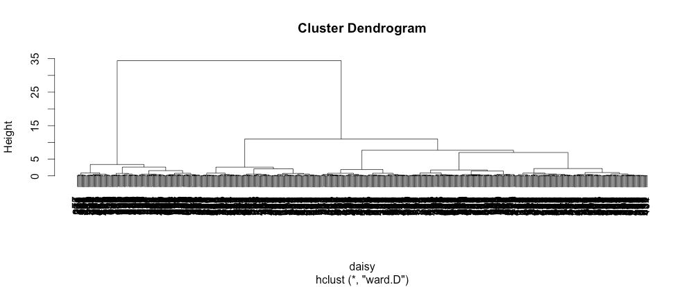
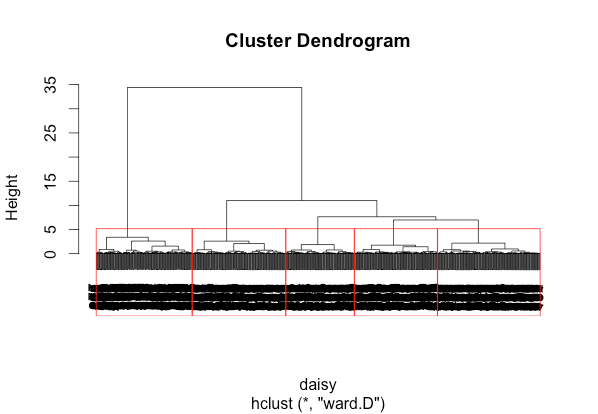
To keep it simple, we’re looking for the longer lines. This indicates a greater distance between clusters. We try to look for groupings with longer lines, and we can see that the dendrogram presents a couple of options. Clearly, there are at least two groups. But, it looks as though we can see five groups. For the sake of this example, I decided on five. This is where clustering can be more of an art. There is no perfect answer here. Our five groupings look like this:

Above: Red boxes highlighting our five chosen clusters.
Understanding Your Clusters
Now, there is much more that goes into assessing the validity of your clusters. Measures such as Chi Square Statistics and Cramer’s V can help you assess the strength of your clusters. Once you are settled on your clusters though, you need to do what is called cluster profiling. Essentially, we want to look at some summary statistics to start generalizing about our groupings of observations. One great use of Tableau for statisticians is this very thing – to get a better idea of the overall picture for each group.
I used Tableau to create rather simple charts to purely explore the data. Using techniques like showing the Inter Quartile Range (sometimes “Middle 50”) in reference bands, I noticed some things. For example, Group 1 seems have great control (high strikeout to walk ratio), they all seem to be veterans AND they have high strikeout numbers. Hmmm. Well, it turns out that this group includes pitchers like Mariano Rivera (remember 2013 data) and Jonathon Papelbon. These attributes lead me to profile them as my Closer group since most of the pitchers in this cluster seem to show attributes known of closing pitchers. Below we’re using Tableau as an exploratory tool:

Above: Looking at the Average K/BB of each group with the Inter Quartiles Range in grey.
Continuing with my exploration, I see that Group 2 is 99.35% left-handed and 75.16% relief pitchers whose group average for complete games in the 2013 season was 0.02. The group also included pitchers like Phil Coke, and with the great majority of pitchers being relievers and left handed, I generalized about the group being mostly Lefty Specialists.
Group 3 was 99.9% starting pitchers with about average K/BB, average to high strikeouts per game and about average age. They are mostly right-handers with higher ERAs. I called this group The Other Starters. I did this because they were mostly average or slightly above average compared to other groups in the statistics that I looked at, but weren’t so overpowering compared to the other groups that I would call them all studs. Seeing that the group included Josh Beckett (the 2013 version with a 5.19 ERA …), I felt pretty good about this conclusion.
With Group 4, I saw mostly right-handed relievers who had high ERA’s, below average K/BB and an average number of strikeouts per game. Since I had already observed a group of Closers and Lefty Specialists, it was pretty easy to see that this group was really The Rest of the Pen. Generally, these are the other guys in the pen who come in and mop up bad games or maybe serve in key situations in the seventh or maybe even eighth inning.
Lastly, there was Group 5 – the group of starters that had low ERAs, above average K/BB, a high number of strikeouts per game and the most experience in the league of any cluster. The group includes household names such as Cliff Lee, Felix Hernandez and Stephen Strasburg. I called the group the Seasoned Veteran group because of their high experience and above average statistics compared to the other groups.
Profiling can greatly increase your knowledge of your customer base and help you to get a better sense for the natural groupings of customers (or in this case baseball players).
Ok. So, what happens when I get a new customer (or baseball player) now?
The Problem with New Observations
In a perfect world, when you encounter a new observation, you have all of the data you want and can perfectly cluster that new observation with your other, older ones. Unfortunately, that’s not reality. One technique that gets used to place new observations is called short form analysis. Essentially, we take a subset of the original cluster variables to develop a logistic regression that predicts which cluster a new observation would belong to. A simple version for our baseball example: We can collect approximately five statistics from a new observation and predict which group of pitchers they belong in.
Using R, I was able to develop a multinomial logistic regression model that accurately predicted the cluster membership with up to 89% accuracy on validation data. The variables that I used in the model were:
- League (American League or National League)
- Pitcher Type (Starter or Reliever)
- Handedness
- Number of Games Played In
- Strikeouts Per Game
A general rule of thumb is to make sure that your short form model can predict to at least 70% accuracy on validation data. Remember, we’re not using all of the original clustering variables. We’re sacrificing some accuracy for practicality.
Tying It Together in Tableau
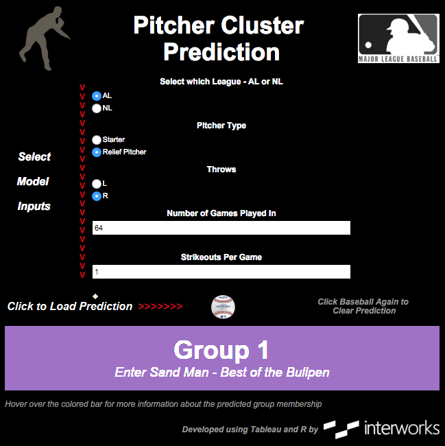
Once a model is built and validated, it’s a great practice to make it both visually appealing and easy for a non-statistical person to use. Tableau with R integration provides one great avenue to do this. After some development time, a simple dashboard can be created that allows a user to input various values of our inputs and view a prediction. Here is a preview of what such a dashboard can look like:
Check out the full, interactive viz here.
The Bigger Picture
The reason for my quick example here is to give a glimpse into the value that is out there for organizations to grab from their own data using advanced analytics. Market segmentation isn’t new, but the ability to do the analysis often is. In the same way that “Moneyball” transformed baseball through advanced statistics, the fusion of big data, predictive analytics and data mining is transforming business from every angle.
Stay tuned for some other posts on predictive techniques. There are lots of other things to cover and some really exciting use cases that I’m sure could bring value to your organization.


