
This blog post is Human-Centered Content: Written by humans for humans.
Processes are everywhere: From small daily activities, such as making a cup of coffee or setting up a group call, to the lengthy evolution of entire ecosystems in nature. While good design and technological superiority are key drivers for productivity, performance on nearly any existing process can be continuously improved with the right methodology and the right data strategy.
Operations Excellence professionals draw on a wide range of frameworks and tools, from common Lean/Six Sigma principles to industry-specific process mining tools and BPM SaaS solutions. While some OpEX initiatives can be costly, intimidating or take years to implement, the modern BI Stack offers Analytics solutions that support and leverage best practice methodologies. With Sigma’s writeback functionalities, teams can comment and shape their data in real time – turning analysis and methodology into action.
Bottlenecks and the Theory of Constraints
Eliyahu Goldratt’s Theory of Constraints is a popular, industry-agnostic approach to process performance improvement. This approach identifies and highlights the process’ bottleneck at a given time and diverts resources to support it. Although focusing on acute bottlenecks, this approach is continuous: When a bottleneck asset is improved up to a point where it is no longer a bottleneck, the “new” bottleneck is tackled.
Think of how you commute to work. If using a car, your “resources” are your car and the road you are taking. If your car’s maximum speed is 220 km/hr but it takes you 45 minutes to drive 10 kilometers, you are bottlenecked or constrained by traffic jams on the road. Improving your car’s speed won’t help here – you should focus on tackling the bottleneck, i.e finding a way to breeze through traffic. You could, for example, take a bicycle: its maximum speed is lower, but its traffic constraints are limited to traffic lights.
Bottlenecks, Cycle Times and Efficiency in Sequential Processes
The Theory of Constraints is particularly actionable in processes with a standardized sequence of distinct phases, because these can be compared and aggregated. Sequential processes are processes where a series of steps or tasks must be completed one after another, in a specific, linear order, where each step depends on the previous one finishing before it can begin. This process type is common in computing, manufacturing and service workflows. According to the nature of each process and its outputs, the steps or tasks can be measured by the concepts of cycle time and throughput:
- Cycle time is the time required to complete one item through a specific step (or the whole process)
- Throughput is the rate of items finished per time unit
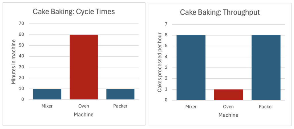
For example: A cake’s baking time in the oven is an hour. The oven’s cycle time in this process would be one hour, and the oven’s throughput in full operation (max capacity) would be one cake an hour.
A bottleneck is the process step with the longest cycle time (or: the lowest throughput), which limits the throughput of the entire system. Improving the overall process starts with focusing on relieving the bottleneck and synchronizing the rest of the process to its rate.
In the example below, the oven (or: the oven stage) is the bottleneck. To increase overall capacity, we could buy another oven (to double the throughput) or reduce the baking time (for example, by using smaller cake molds).
In many cases, performance for the same process shows some degree of variation. The performance efficiency of a specific operation or batch is defined by comparing the actual output to the expected/theoretical output (“max capacity”).
For example:
- Actual performance: The Cake Bakery was operating for 50 hours last week and yielded 40 cakes. The actual measured throughput is 0.8 cakes per hour on aveage.
- Max capacity: Dictated by the cycle time of the bottleneck asset (oven), which is one cake per hour -> the expected output for 50 hours would be 50 cakes.
- Last week’s efficiency was 80% (40 cakes – actual divided by 50 cakes – expected). This could be a result of various reasons, for example: not using the oven back-to-back, downtime between different working days, scrap & faulty products etc.
Quantifying Cycle Times, Bottlenecks & Efficiency in Real Life
Some processes (or steps within a process) are more prone to variation than others. Think of your laundry day: Your washing machine has a fixed cycle time (for example, one hour), which defines its throughput (i.e. 24 machine loads a day). However, the step of folding the clean laundry can vary according to skill, available counter space and the makeup of items in each batch. The drying time (on a rack) is also variable as it depends on temperature, humidity and item makeup.
In processes with high variance where resources and capacities are not recipe-defined, both capacity and actual performance are derived through aggregations:
- Actual performance: Average of selected sample
- Max capacity: calculated using the “golden cycle time”, which is a sum of each stage’s best-observed instance.
Summing each stage’s best observed gives the total “golden cycle time”, which is used to define max capacity. In the example below, the golden cycle time of the whole process is six hours – even though it was never achieved. The “actual” performance can be represented by the average – eight hours and eleven minutes, which translates to an efficiency rate of 73%.
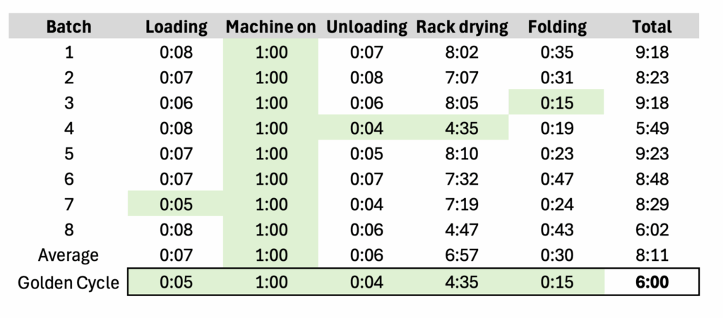
In practice, the golden cycle time can be defined and calculated in several ways according to data quality and judgement. For example:
- Min aggregation: Returns the single shortest observed cycle time for each stage, like in the example above. It can be used in clean datasets where all outliers are trustworthy and meaningful.
- Percentile: Returns the average of the top x% (for example: average cycle time of shortest 10% in sample)
Process Mining in Sigma
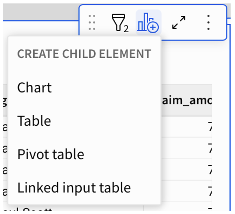
Beyond analysis and visualization, Sigma’s input tables allow end users to add data directly on the dashboard interface – making it an actionable ecosystem. Sigma’s spreadsheet-like interface enables further exploration and deep-dive as bottlenecks shift, and its dashboard UI can be customized to be deployed in mobile or shopfloor environments. Users can either add data to document key metrics that are not yet captured, or comment and cluster existing insights.
In the following example we are using claim processing times of an insurance company. We will use a high-level Gantt chart to visualize each step’s average duration, highlighting the current bottleneck and the overall efficiency. We will then build and visualize an operational input table for tracking the bottleneck.
Creating a Gantt in Sigma
Structure Your Data
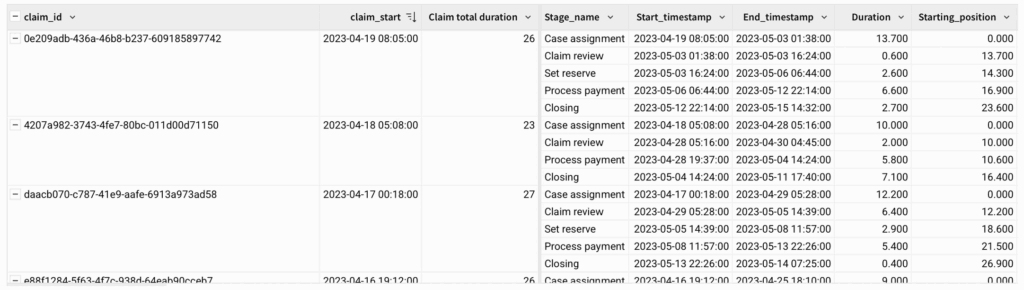
Our data will need to be structured before building a Gantt chart. Each record (row) should represent a specific process stage of a specific instance (claim). Here:
- Claim_ID
- Stage_name
- Start_timestamp (date/time)
- Duration (numeric)
- If using a dataset with “End_timestamp”, add a duration column via calculation:
DateDiff(“day”, [Min of Start_timestamp], [Max of End_timestamp])
- If using a dataset with “End_timestamp”, add a duration column via calculation:
Create Grouping and Calculations
Next, create groupings and add group-related columns:
- Group by: Claim_ID
- Create new grouping calculations
- “Claim_start”
- Min([Start_timestamp])
- “Claim total duration”
- DateDiff(“day”, [Start_timestamp], Max([End_timestamp]))
- “Claim_start”
- Create new grouping calculations
Next, create a new column with a row-level calculation. This column will be used to visualize the timestamp sequence as a Gantt.
- “Starting_position”
- DateDiff(“day”, [claim_start], [Start time])
- *Note that the calculation uses both row-level values (Start time) as well as group-level values (claim_start)
- DateDiff(“day”, [claim_start], [Start time])
Your output should now have the timestamps grouped by claim ID, with columns for each claim’s start time as well as durations and starting positions:
Aggregate and Visualize
Method 1 – Gantts using Relative Start
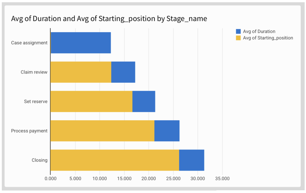
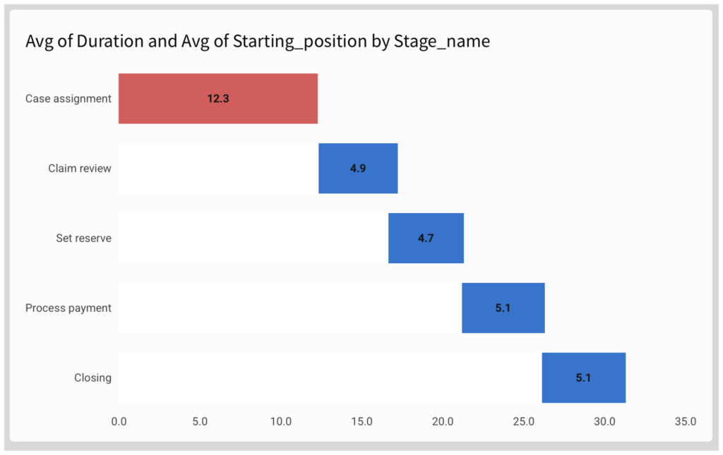
Create a “chart” child element and choose Stacked Bar chart with horizontal display:
- Y axis: Stage_name
- Optional: sort according to preference
- X axis: Drag [Duration] and [Starting_position], changing their aggregation from SUM to AVG:
- Avg([Duration])
- Avg([Starting_position])
Now adjust to formatting options to make it look more like a Gantt chart:
- Remove axis marks
- Remove legend
- Make the “starting position” series invisible by picking a colour identical to your background
- Add data labels as required
To highlight the current bottleneck, use conditional formatting in the “Color” pane:
- Apply to “Avg of Duration” series
- Use formula:
- Rank([Avg of Duration], “desc”) = 1
Method 2 – Sequential Gantts with CumulativeSum
An alternative method to the “relative position” method above is to use the CumulativeSum function. This method is only useful for sequential process, i.e where one stage’s End is a prerequisite for the next stage’s start (without overlap).
We can demonstrate this method to create a Golden Cycle Gantt, i.e: a Gantt showing the “best observed” rather than the “average” performance.
In this case, we chose to define the “best observed” as the average of the top-performing quartile. To calculate this value:
- Create an auxiliary column [Percentile] based on [Duration]:
- RankPercentile([Duration], “asc”)
- Create a new column [golden_duration] for calculating the top quartile average:
- If([percentile] < 0.25, [Duration], Null)
Now configure the properties. To keep your formatting, you can duplicate the previous Gantt and change the axis values:
- Y Axis: Stage_name
- In this Gantt method, the sorting (order) has to match the time sequence!
- X Axis:
- Duration: in this case, use Avg of Golden Duration
- Sequential position calculation (instead of “starting_position”):
- CumulativeSum([Avg of golden duration]) – [Avg of golden duration]
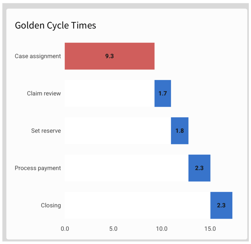
In this method, each stage’s visualization is tied to the previous stage’s end time, so that it would not support time overlap and/or change of sequence.
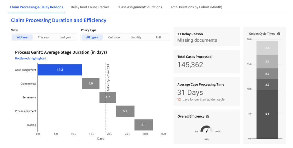
Dashboarding
A meaningful dashboard does not only show the current performance, but contextualizes it in terms of efficiency and root causes:
- Filters enable the user to compare time periods, teams or product segments
- Reference marks (in this case: golden cycle time) visualize gaps to target
- KPI-boxes aggregate the bottom line
Creating and Visualizing Input tables: Pareto of Root Causes
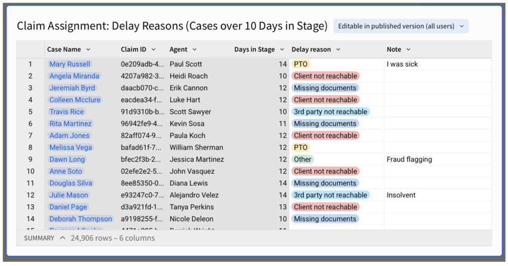
We identified the “Case assignment” stage as the bottleneck stage and want our team to pay close attention to it. Using Sigma’s Input Table, we can create an interface for the team to view specific delays and add info on root causes or delay reasons.
Input Table
Create a “Linked input table” child element and select the columns you would like to display. In this case we would like to show the Claim ID, title (for easier reference), Agent (colleague in charge of processing the claim) and time in stage.
Now that the Input Table is created, you can add writeback columns to it, to be filled in a spreadsheet-like manner by the end-users. You can also dictate the format and requirements of the column’s input.
It is best practice to add both structured and unstructured columns:
- “Category” column with single-select format, for high-level clustering (in this case, “delay reason”)
- Free text column for notes and remarks (in this case: “Note”)
Before moving the input table into your dashboard, it might make sense to set specific filters to apply your selection logic. In this case we are not interested in all cases processed, but precisely in cases that are delayed on “case assignment.” Filters include:
- Stage name: “Claim Assignment” (to enable focus on bottleneck stage)
- Time in Stage > Golden Cycle Time (to focus on potential delays)
- Sort by newest to oldest (to show new cases as they join)
Now, each team member can filter by their name and add information on each case:
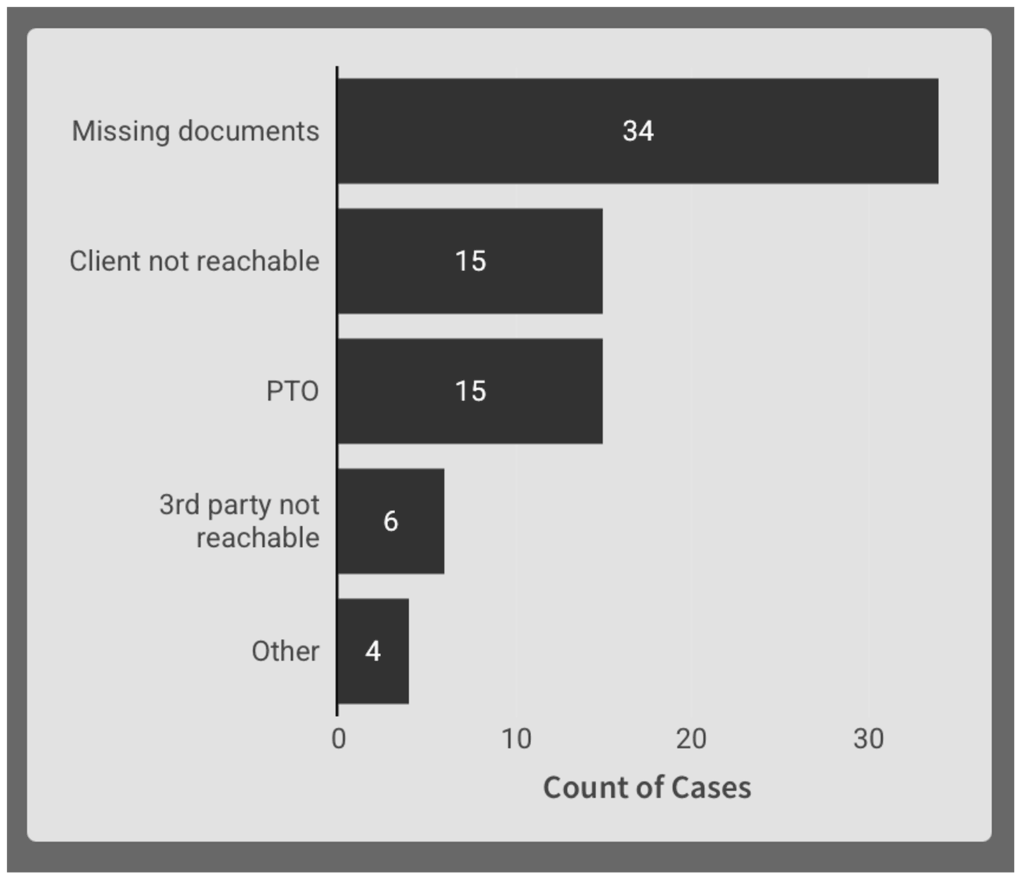
Live Onsights: Display Aggregates in “Child Element”
From this input table, create a chart child element to display the distribution of delay reasons. This will give the most common root cause of the bottleneck more visibility.
Properties:
- X Axis: Count of Claim ID
- Y Axis: Delay Reason
- Sorted by count of Claim ID
Depending on usage, filter logic and legacy data, you might want to filter out nulls.
The output is a Pareto bar chart displaying the most common delay reasons. It updates as users add/edit their cases in the input table it is linked to:
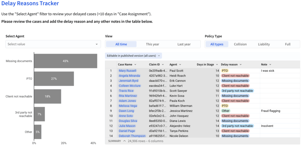
Dashboarding
Input tables can be put in a designated tab / page, built with the level of detail its end-users require.
In terms of input, users can filter the row-level view and add/edit information in the highlighted columns/interface.
In terms of view, users are able to see the outcome of their inputs in a respective aggregation (in this case, at the “Agent”-level).
Wrap Up
Process timestamps can be used to:
- Visualize the process and its durations
- Identify process bottlenecks
- Calculate and visualize capacity and efficiency using “Golden Cycle Time”
- Create row-level action points on specific cases
To implement this methodology, you can use Sigma to create:
- A Process Gantt visualizing the Average / Golden Cycle stage durations
- By using a “starting position” calculation for processes with overlap
- By using a Cumulative column for sequential processes
- An actionable Input table, enabling users to view and comment on specific cases
- A root cause Pareto, visualizing user input
You can view the whole dashboard here: