This blog post is Human-Centered Content: Written by humans for humans.
A video version of this blog is available here:
Typically, the customization of Top N filters in Tableau involves allowing the user to pick the number of records, or N, that shows in a visualization. What if we could add even more customization by allowing the user to pick the field that the Top N is calculated from?
Well good news: we can, and you’ve come to the right place to learn how to do it!
Before we dive into the details of how, let’s first show the results. Below is a screen share of the Tableau Sheet with the visualization and relevant parameters. You can see that selecting a field from the Top N Field Parameter not only changes the field that the top manufacturers are being calculated by, but also the sort on the visualization:
This allows the user to toggle between different fields to learn more about the data, as well as see different perspectives of the same data. It also allows the user to determine their own hierarchy of importance for these fields rather than having the top manufactures by a single field be set by the developer. For example, the sales manager at this superstore may want to know what manufacturers are the most popular by number of orders, but the order fulfillment manager is more interested in knowing which manufacturers have the longest processing time. They both can utilize the same view to answer those questions.
Let’s Recreate It!
- Create Visualization
In this example, the visualization has a series of dual axis charts that show fields that are relevant to the chosen dimension: in this case, manufacturers. Make sure that the fields that you want the user to be able to select between are shown in the view. This will make the filtering and sorting capabilities clearer to the user.
- Create Top N Field Parameter
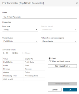
You’ll need a parameter that has a list of the fields that you want the user to be able to select for the Top N filter. These don’t have to exactly match the field names of your data, but be sure they display how you want the user to see them. The screenshot below shows the details of our Top N Field Parameter for this example:

- Create Field Filter Calculated Field
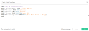
Using the Top N Field Parameter you just created, create a new calculated field that ties the field from your data with the parameter value, as shown below. This is just telling Tableau that when our Parameter value is the string “Profit Ratio,” we want to return the actual Profit Ratio field, and so on. Note the SUM, COUNTD and AVG aggregation functions in the formula. These should match the aggregation of your measures in the view:

- Create Top N Filter
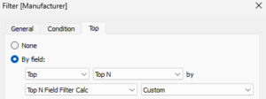
Pull the dimension you’d like to filter onto the Filters card and click the Top tab. Here, add the Top N Filed Filter Calc as the field. The aggregation box should autofill to “Custom.” Be sure to add this filter to context so it is above other filters you may have on the view. Below is a screenshot of what our filter menu looks like:

We also used the trick that allows the user to select the number of values shown, as highlighted in this blog.
- Set up sorting
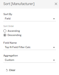
To set up the dynamic sort, right click on the dimension (Manufacturer in our example) and change the Sort By option to “Field.” Select descending for the sort order and add the Top N Field Filter Calc to the Field Name. Again, the aggregation should auto fill as Custom:

- The Results
Be sure to test that changing the field parameter changes the top dimensions and sorting as expected.
Woo hoo! Just like that, you’ve elevated the Top N filter and added a layer of customization to your Tableau Dashboard. If you ever need help with your Tableau dashboards, or data visualization in general, feel free to reach out!
